How to map with Google My Maps
Earlier this year, Google released a simplified mapping engine to make custom maps. If all you need are pinned markers and a simple text box, Google My Maps will work and you can embed it on your site. Here’s the Storybench how-to for building a map on Google My Maps. (Northeastern’s Dan Kennedy wrote a how-to of his own on My Maps. Here’s his spreadsheet. You can map that, too.)
Finding and cleaning the data
The possibilities are endless. For the purpose of this tutorial, I pretended as if I were writing a story about Starbucks growth worldwide. After Googling around, I found the Starbucks Corporation’s 10-K, an annual form submitted by all publicly traded companies to the U.S. Securities and Exchange Commission. In the 10-K, I found a bunch of data on the growth of international Starbucks stores over the last year.
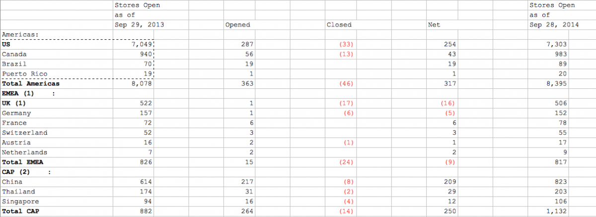
I copied and pasted the pertinent information into a spreadsheet as follows. Google My Maps requires both a name and a location for each marker, so I duplicated the territory names.
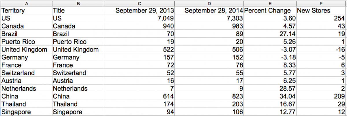
Columns E and F were calculated with very simple Excel formulas. Percent change is =((D2-C2)/C2) x 100 and New stores is =D2-C2. By dragging the formula across the entire column, all values are calculated. I saved the spreadsheet here as starbucks.xlsx.
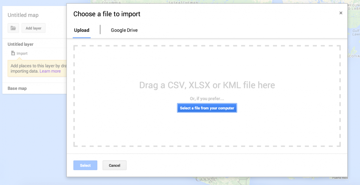
Uploading data into My Maps
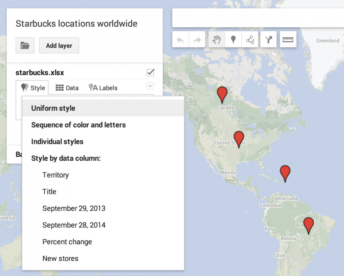
Next I uploaded the spreadsheet as a layer in Google My Maps.
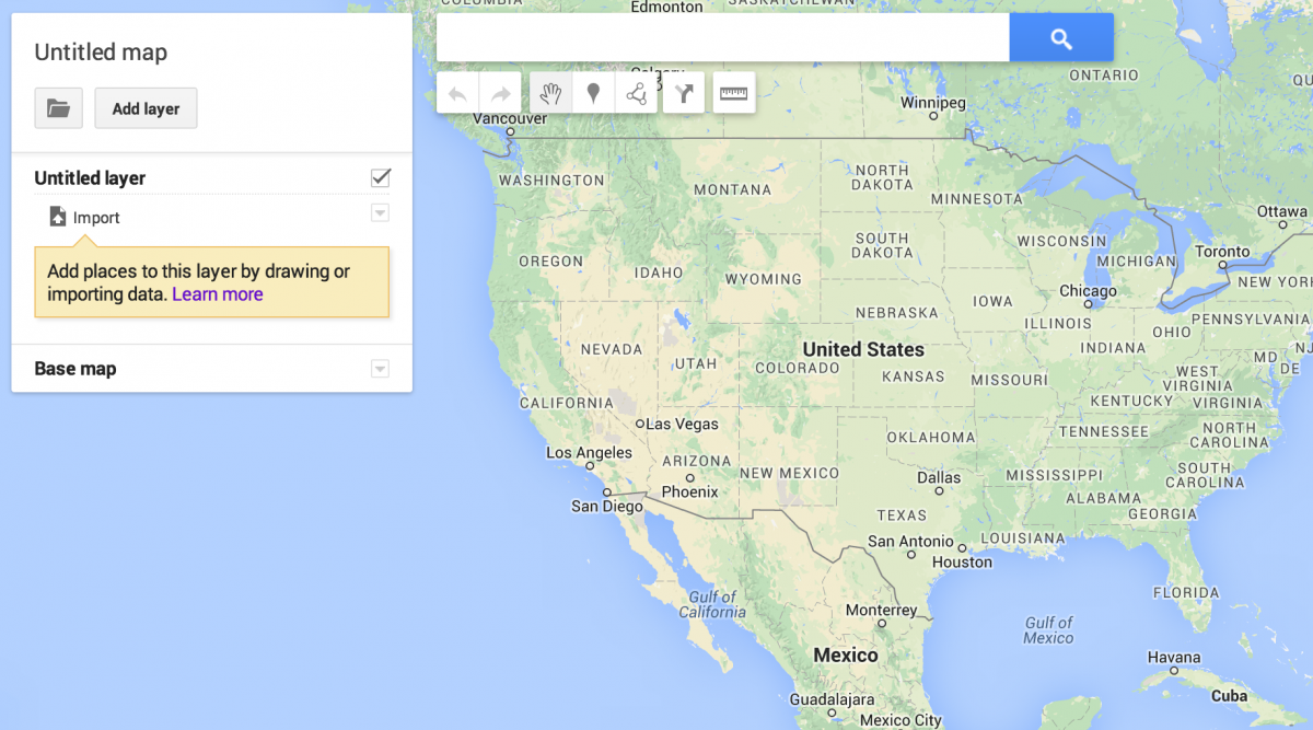
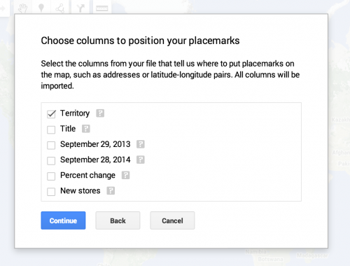
Once I uploaded the starbucks.xls file, Google My Maps asked me which column to use for placemarks. I hoped that the countries and territories listed in the spreadsheet would be read by Google. A column containing latitude and longitude coordinates or full addresses would have worked, too.
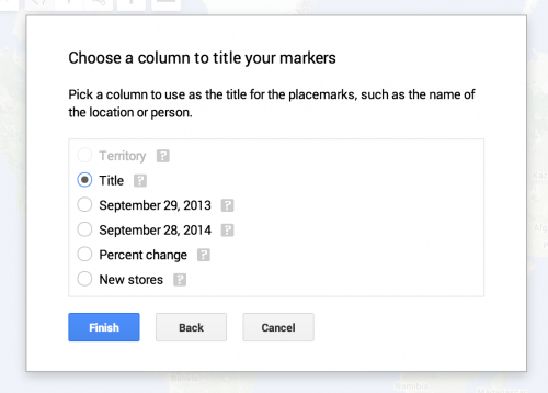
As I mentioned, Google My Maps needs another column for the title of the placemarks, which is why I duplicated the names of the territories.
Styling your map
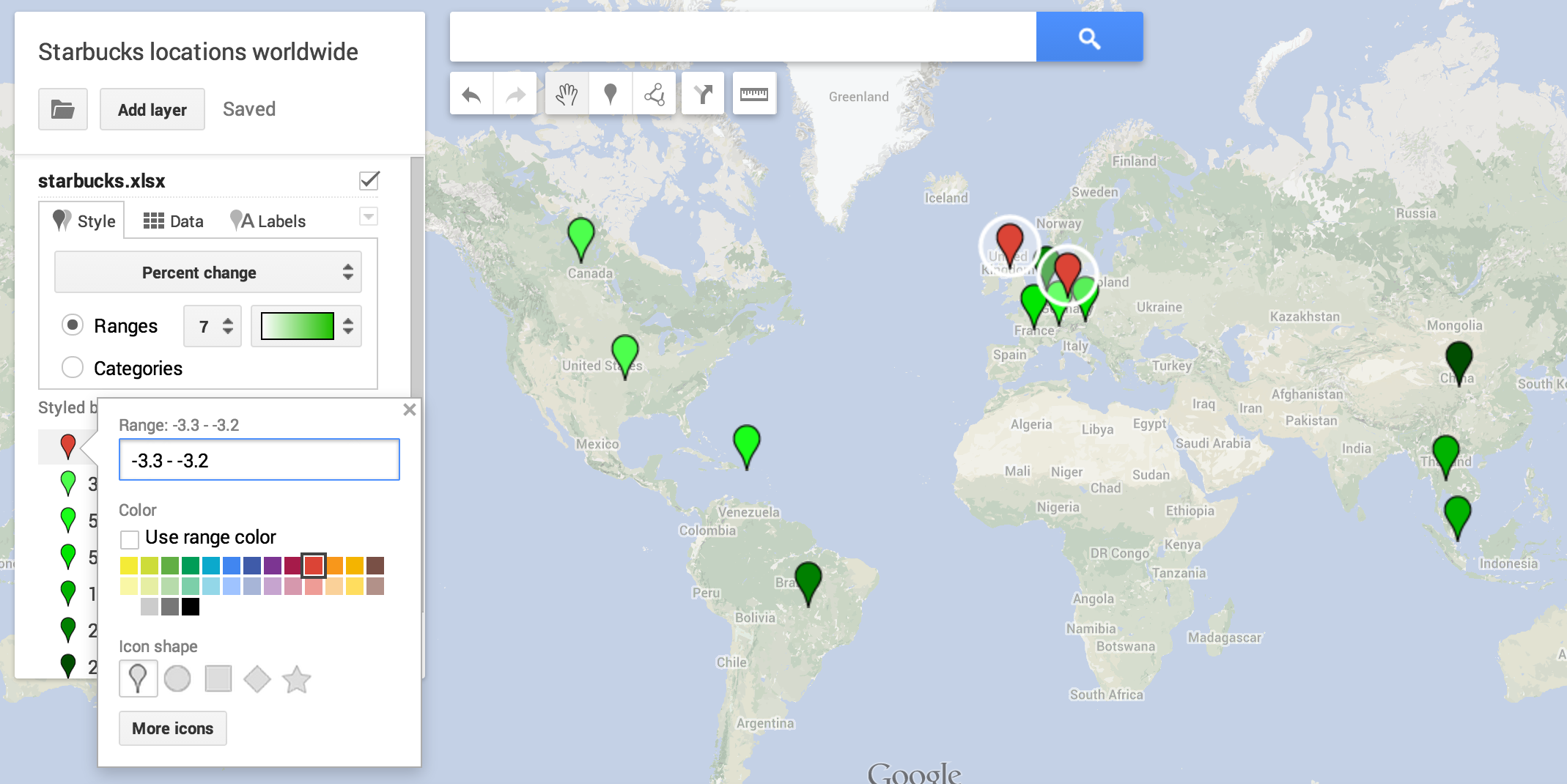
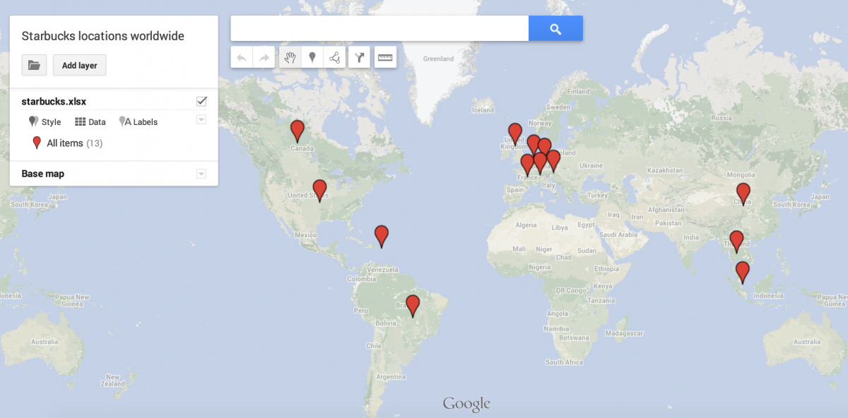
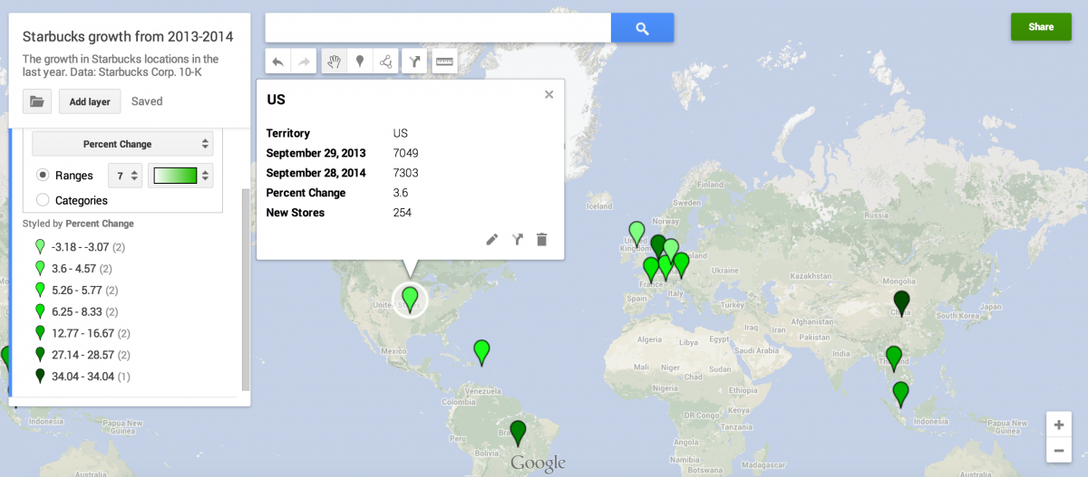
Here’s what the map looks like once the data is imported. Notice there is no ranking of markers. Nor do they have titles. If you click them, though, you’ll see the data from the spreadsheet.
Under the Style button, I select Percent change because that’s what I want to rank these markers by. I want to see where the largest growth in Starbucks locations occurred.
By selecting Ranges, I can change the color and the number of ‘buckets’ the data is spread out into. Lightest green means a negative growth in the number of stores, and darkest green denotes the largest growth in Starbucks locations.
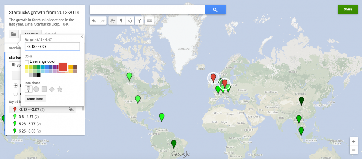
I wanted to denote negative change with the color red, so I simply select the -3.18 to -3.07 marker and change the color. No other ‘buckets’ are negative, so green makes sense for the rest.
If I want to change the base map, I can along the left sidebar.
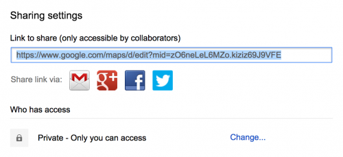
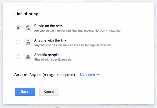
Finally, I press Share on the top-right and make sure the map is public.
And voilá the map is done.
Embedding your map
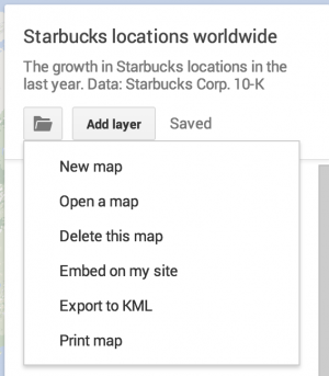
To embed, click the folder icon and click Embed on my site.
That will spit out a code that employs an iframe, which is essentially a window-within-your-website. The following is what I used for the map at the top of this tutorial (frameborder=”0″ removes the thin border around the iframe).
<iframe src="https://www.google.com/maps/d/embed?mid=zO6neLeL6MZo.kiziz69J9VFE" width="740" height="400" frameborder="0"></iframe>


