How to get more bang for your buck out of science photographs
Do science pictures need to be pretty? Is there ever a case for retouching a science photograph? And do good images help researchers get attention for their work?
Yes, yes and yes, says Felice Frankel, a photographer and research scientist in the Center for Materials Science and Engineering at MIT. Science photography are more than aesthetically pleasing, she told an audience last March at NUVis, Northeastern’s Visualization Consortium seminar series. They can clarify scientific concepts in people’s minds, communicate complex scientific information, and help people see what researchers want them to see. Below, a few takeaways from Frankel’s talk.
Make people look and then make them understand
There are two phases to communicating complex scientific information through images. One is to make people look and the second is to make people understand. As a researcher who makes representations, one has to be a translator and has to figure out what it is that must be included and what it is that doesn’t have to.
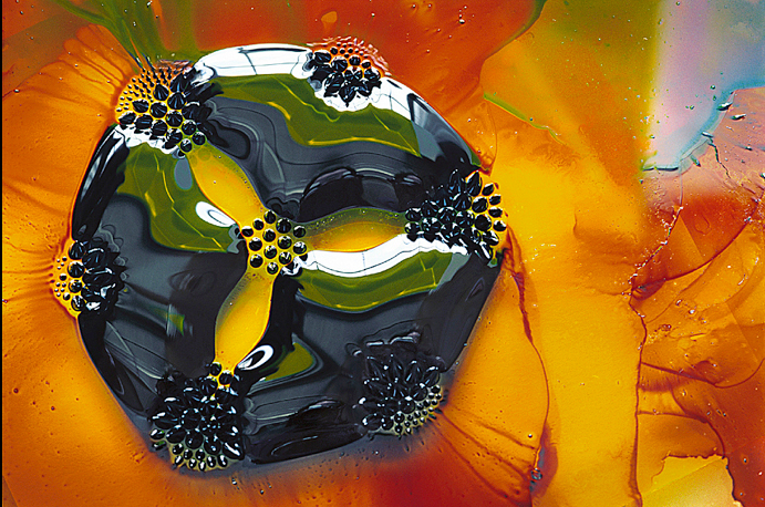
The picture on the right shows a material that has two channels. It could take in black ink and red ink and they won’t mix together. The original image looks fine but what if the researchers could provide a sample with seven channels?
So they recreated the sample. The size of that channel was 50 microns, which is half the radius of human’s hair, so this image is taken with a microscope. There is a little bit of turbulence going on down there in the second picture, but the readers can see more clearly the ink flowing into the channels, exhibiting the concept of laminar flow. That’s in fact what the material was demonstrating. Frankel’s small changes had made the science much easier to understand.
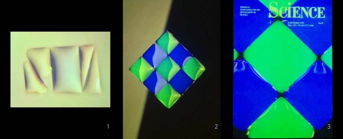
Don’t shy away from design
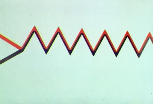
In another example, Frankel showed an image of a surface that had hydrophobic edges. When water was placed on the surface, it would stop at the hydrophobic line.
“How about giving me a more interesting pattern?” Frankel asked the researchers. “And how about if instead of putting just colorless water, we color the water before we put it on the surface?” The researchers made a grid and then applied green dye and blue dye.
Use restraint and follow these tips
Using graphics and images is very powerful but they should not be used too much or be used to explain everything a scientist has done. Design your graphics before submitting them — label them, put scales on them, get rid of extra colors, and delete extra images to give readers the clearest way to understand your work.
Pay attention to the light and the background. By simply playing with light, clearing the background or getting the object in focus, you can avoid redundancy. Before wrapping up, Frankel added:
- Get rid of unnecessary colors and stop using default colors.
- Order pieces in terms of composition.
- Be careful with graphical distractions like parentheses, slanted arrows, numbers of ticks, and redundancies.
- Don’t overuse graphics or include unnecessary data.
Images: Science; Felice Frankel via WikiMedia Commons; Felice Frankel.