How we used math to explore racial segregation in Pennsylvania public school districting
American life is based on American thought. American thought is based on American values. And American values have a foundation in the public school system. So what happens when the American public school system is flawed?
Although the “separate but equal” school system was deemed unconstitutional in the 1954 ruling Brown v. Board of Education, America’s racist history remains prevalent in many of today’s school districts. This issue has not gone unnoticed: In October of 2014, the U.S. Department of Education released a press release stating that “Black students [are] to be afforded equal access to advanced, higher-level learning opportunities” in a New Jersey school district.
However, segregation within a school district is easily avoided when districts themselves are segregated. Throughout the U.S., there are many instances of affluent, mostly white districts neighboring poorer, mostly Black districts as if the districting maps were drawn with the intent to separate white and Black students.
Over the summer, we worked with Professor Diana Davis of Swarthmore College as part of the Program in Mathematics for Young Scientists at Boston University with the following research questions in mind: How segregated are the current districting maps? How can we then make less segregated districting maps?
To answer these questions, we designed and ran an algorithm titled the Tree-Splitting Method For School Redistricting based on ReCom, a political redistricting method developed by Daryl DeFord, Moon Duchin, and Justin Solomon of Metric Geometric & Gerrymandering Group (MGGG) at Tufts University. Unlike political redistricting, school redistricting with an emphasis on racial makeup must acknowledge additional factors such as a school’s location and capacity and a population’s racial distribution.
Data collection
To make districting maps, we must utilize data. We collected race data by block group from the 2018 American Community Survey and a block groups location as established by the U.S. census. We obtained the address and capacity of a school facility from the 2015-2016 School Attendance Boundary Survey distributed by the National Center for Educational Statistics.
Scoring
We decided that a reasonable redistricted map is constrained by three questions: Are districts on this map contiguous and compact? Is the commute of each student reasonable? Is the number of students who have to change school districts minimal? We answered these questions for each
redistricted map by scoring them. We denote them as the compactness score, travel time score and change score respectively.
The compactness score of a district counts the number of block groups in a district that border a block group not in that district, similar to a district’s perimeter. By minimizing this, we can ensure that a district is compact. The Tree-Splitting Method guarantees that every district is contiguous. The compactness score of a redistricted map is calculated by averaging the compactness scores of every district in that redistricting map.
The travel time score of a census block group counts the number of seconds it would take a student in a block group, on average, to get from home to school using Google Maps’ Distance Matrix API and school and census block group location data. The travel time score of a redistricted map is calculated by multiplying every census block group’s population and individual travel time score and summing them, then dividing the outcome by the entire map’s population.
The change score of a redistricted map counts the number of census block groups in a redistricted map that are in a different district than the district they are currently assigned.
Since the goal was to compare how segregated different redistricted maps are, we also gave every redistricted map a segregation score. It is important to note we assigned exactly one school to every district.
We started by scoring each district. To do this, we calculate the difference between the ratios of non-white to total population in one specific district and in the total area. Once we have scored every district, we find the segregation score of the map by first squaring the score of every district. We then sum the squares of the segregation scores over all districts. To put it into scale, we then divide by the map’s total population.
Tree-splitting method
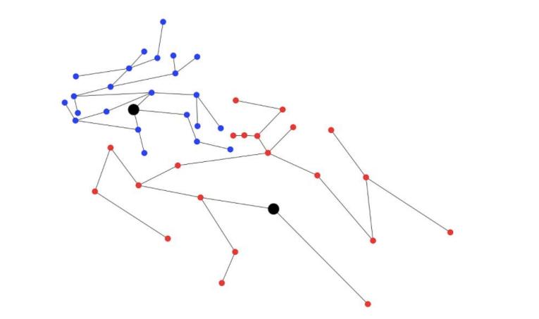
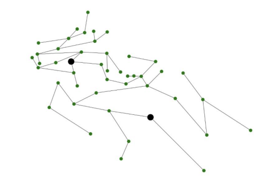
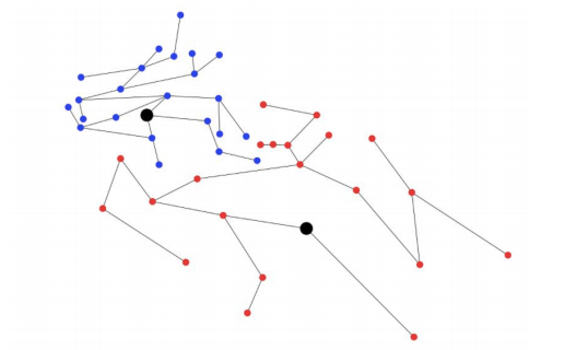
For every redistricted map, we began with a representation of the current districting map as a collection of vertices and edges. A vertex represents a census block group and the vertices of two block groups share an edge if and only if the block groups are connected by some border. We differentiate between block groups containing a school and those that don’t.
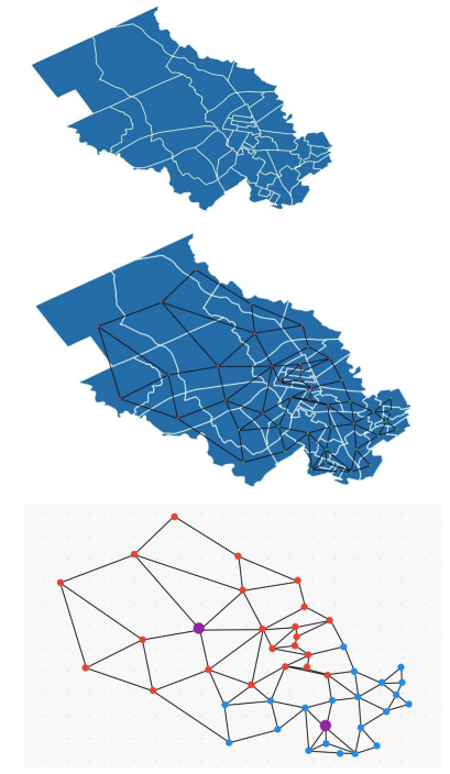
of how a graph is formed from a map of two school districts. White lines on the map mark
census block groups. Red and blue nodes represent two different school districts. The larger
purple nodes represent block groups with schools
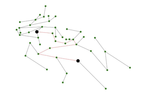
After representing the entire region as a graph, we tell the computer to randomly choose a district and find a random neighboring district.
Once we choose two neighboring districts, we randomly weight the edges between 0 and 1 and use Kruskal’s algorithm to find the minimum weight spanning tree. This simply gives us a random spanning tree of the area.
We then consider the path between the two vertices representing block groups containing schools. From the edges in this path, we choose one to “cut”, creating two separate trees. We consider the two resulting trees to be different districts. Because trees are connected, we ensure that resulting districts are connected. We only consider edges along this path to cut because cutting elsewhere would lead to one district with two schools and one district without a school.
After cutting an edge on this path, the two resulting districts are put back into the overall map, and can be chosen at random to be redistricted again.
overall map is represented by this district instead of the one in figure 1 (the same goes for the red district).
How segregated are the current districting maps?
We studied Delaware county, Pennsylvania, a state where school redistricting laws date back to before Brown v. Board of Education. Many of their laws regarding the topic refer to the approval of a “council of education”. Particularly, we decided to look at Delaware county, 3
where Swarthmore’s Strath-Haven High School is 74% white and 10% Black, while a neighboring high school (Chester High School) is 1% white and 85% Black. Along with the 4 large racial disparity between the two schools, one ranks in the top 500 best public high schools in America, while the other has a graduation rate of 31%. We made 1.5 million reasonable random redistricted maps of the area. We kept the maps “reasonable” by only counting maps with a travel time and compactness scores better than or equal to those of the current map. Because we want to see how segregated the current districting is, we compared the redistricted maps assuming they had no connection with the current districting and did not account for the change score.
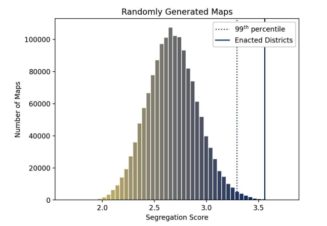
The current districting map has a segregation score of 3.56. This score is within the 99th percentile of the most segregated maps. In other words: the current districting map is extremely segregated.
How can we make less segregated districting maps?
Using our scoring system, we also optimized for low segregation and change scores while keeping the travel time and compactness scores “reasonable”. This optimization occurs in the edge cutting process of the Tree-Splitting Method. At every cut along the path, we scored the outcome. Then we cut the edge that gives us the best scores (in this case lowest segregation and change scores). A low segregation score promotes racial integration and a low change score allows for the redistricting map to be more easily implemented (it will be hard to convince students and parents to change school districts). Here is an example of a “better” redistricting map of Delaware county, PA:
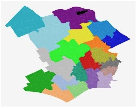
Aesthetically, the districts are connected and of reasonable shape.
In this redistricting, the travel time by car is 7:12 (minutes), an improvement from 7:38 it would take a student on average in the current districting. The segregation score is improved from 3.56 to 2.60 while moving 23.73% of the student population, less than 9,000 students.
Conclusion
When accused of intentionally segregating school districts, officials tend to defer to the argument that the population resides in a segregated manner, thus making it difficult to make more integrated school districts without sacrificing convenience. However, we have found it harder to randomly make the current school districting than to make one that is more integrated, despite accounting for convenience.
We urge school boards to reconsider their boundaries and create learning environments that mimic their surroundings and give every student the opportunity to learn with a diverse group of classmates.