
How IndyStar’s Emily Hopkins helped break a nursing home scandal in Indianapolis
Emily Hopkins, a data reporter on the Indy Star Investigations team, spoke with Storybench about their reporting on improperly funded nursing homes in the time of COVID-19. Hopkins spoke about data collection, the importance of data visualization for complex subjects, and how smaller newsrooms handle investigative and resource heavy stories. Hopkins graduated from Northeastern University Journalism School’s Media Innovation graduate program. You can find their work here and follow them on Twitter.
Why did you approach the topic of nursing homes in Indiana?
I have to definitely give a huge credit to Tony Cook and Tim Evans, who are the other two reporters that have been working together as a team. Before I was on the investigations team, Tony had been working on this story. If you’ve read his August stories about the nursing home fraud, that is where I think the stories really originated. We began to get interested in how much of this federal money was being diverted, and how the nursing homes had been all bought up by county hospitals.
It had really taken over the whole state, that it wasn’t just Marion County, which is where Indianapolis is located. That shifted the focus for the first story. When I I was brought on there were four big projects that were in the works. Different people were leading them. And I was sort of positioned to bring data to the stories.
For this particular one I was fairly familiar with Nursing Home Compare, which is the public facing data portal for the Centers for Medicare and Medicaid Services, and that tells you a lot of information about nursing homes. What we ended up finding was that we had some of the most poorly staffed nursing homes in the country. And that became the real scandal of our first story is that we as a state, the nursing homes in our state, were generating a lot of extra funding, but it wasn’t being used to make the quality of the homes better.
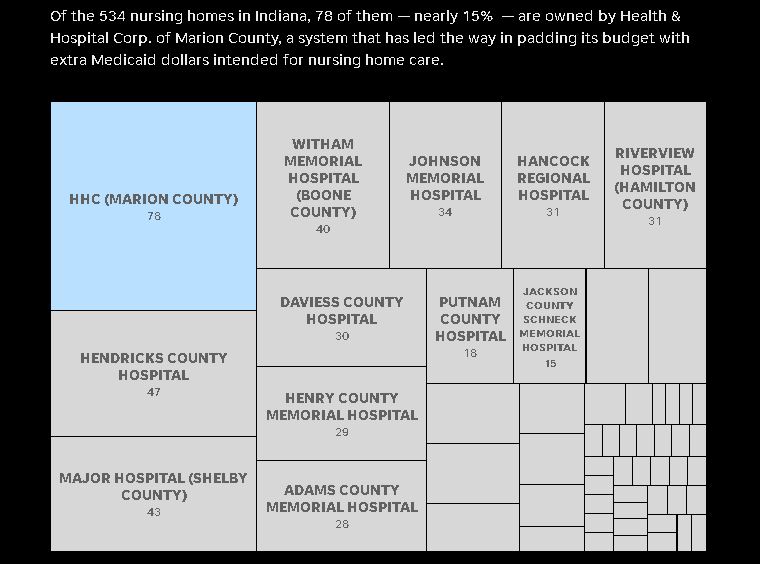
Source: Centers for Medicare & Medicaid Services and Indiana State Department of Health data. Stephen J. Beard / IndyStar
In fact, it was used to build the hospitals and a number of other projects instead. Well, it did go to the nursing homes, but the vast majority, we think went to the hospitals instead.” . Because it’s important to remember that we still don’t know the final number or the final amount that’s been diverted. We only really know that for a few hospitals that have disclosed it. So long story short: the inside baseball is that Tony was chasing something and Tim and I got put on the project to help bring it over the finish line in various ways. And the way that I helped there was to look at the data and to look at the quality aspect of it from CMS’s perspective.
Let’s talk about the data and how you approach data in general. What are some of the go to resources for this specific project? You mentioned a couple, but in general, when you’re approaching research and investigative pieces, where do you like to go for your data?
So the first part of the question: the data that was used in this story was primarily that Nursing Home Compare Data that gives you for every nursing home in the country a series of ratings and staffing, staffing levels, numbers of deficiencies and penalties and a few other other parts of information. Actual work on that data was fairly simple, it’s very fortunate that that’s a relatively clean data set. And it was relatively easy to work with, so a lot of what we were able to do was achieved with a basic pivot tables and sorting and things like that, the other data that we used is data from basically an accountant that analyzes this program is called Upper Payment Limit and it calculates how much money is generated.
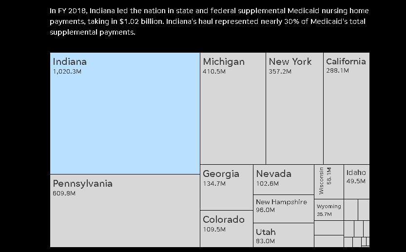
SOURCE: The Medicaid and CHIP Payment and Access Commission Stephen J. Beard / IndyStar
And so we use that to figure out how much money was being generated by the nursing homes and kind of did some math there. So, you know, I do as much as data was really important to the story, especially the first one, because we would not have known the how. I don’t think we could never have known how widespread the poor care was without this data. And that was really the sort of the crux of what made this an outrageous story.
Generating all this extra money for nursing homes, not using it in the nursing homes and then have the care be so poor, but I will say for legal purposes that every single hospital and nursing home (that responded to us) disputes our findings. They don’t think that they have a quality of care problem. And so that’s what they say. I think that this was a story that used every single investigative technique was used.
We had documents provided to us, documents that we requested and were given. We had data that we collected. We had data in some ways, in some ways we took data and put it together ourselves so that all these different kinds of techniques really helped us with pulling this thing together.
When you approach a story that’s data heavy, is it usually that you have data about something and you turn it into a story or you have a story and you feel like, OK, this is a good story, but it really needs some more quantitative information to back it up?
So I think it can go either way. And I would say this at this point in my career, I’m definitely still developing a sense of how I like to work and what stories need what. I will say, I think for the work that I’ve done it actually goes both ways.
You know, there’s a story that I did about traffic crash fatalities now that happened, we just happened to have three really terrible tractor trailer crashes, fatal crashes within like three weeks. And so the managing editor asked me to say, hey, is this a broader trend?
And it turns out nationally, truck crashes are on the rise over the last decade per mile traveled. Those are cases where there was a thing that people were looking into or wanting to look into. And I went out and found data to answer some of those questions. I think that was probably the most common way we work.
There are definitely ways that you have the data and I think with the coronavirus you see that a lot. This has been such a really crucial point in data reporting. For example, about a couple of months into the crisis, I requested COVID-19 cases by zip code. Now, this is obviously a circumstance where I didn’t have the data in hand, but I knew the data would tell a story. And no matter what, we wanted to know where it was and most crucially, were there more cases in communities of color versus white communities? We found what we expected because we had already known from previous studies that that was true demographically. So I used those demographics using the census data to overlay with the COVID-19 data we got from the state, so that’s a case where I had an idea of the data, I knew the data was out there, had to get it and I got the data.
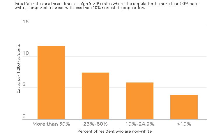
Source: Indiana COVID-19 ZIP code data as of June 18, 2018 American Community Survey 5-Year Estimate.
That leads me to wonder how do you make sure that you’re not assuming the data reflects correlation with causation. How do you make sure that you’re not, as a reporter jumping to conclusions about the data that you have. Do you have a system that you go through or editors that are there to kind of keep you in check?
Yeah, there are probably plenty of stories I didn’t write because I looked at the data and said, OK, it’s not a story. Not because the relationship that I thought existed didn’t exist, but because there wasn’t a relationship at all. It’s the same thing you would do with typical reporting. Which is like you kind of suss it out a little bit, and then if you are on to something, you’re on to something and if you’re not, then you let it go and you move on.
What do you think the importance of data visualization is for a reader to kind of give them that perspective? And what do you think maybe some of the pitfalls of data visualization can be?
First of all, I have to say, shout out to Stephen Beard, who did all those nursing home visualizations. I do the data analysis. He makes it beautiful. I really appreciate him for that. This is something very much I learned at Northeastern, actually. It’s really important to think about a reader as a user. I am always trying to think about what a visualization will help someone understand or how it will help them get localized information. The example I’m thinking of is the tree graph from the nursing home story showed how much money Indiana got versus other states. This is an investigation that has to do with really frail people being injured and dying.
That is very easy to write about, narratively speaking, because a person can understand another person being in pain, but the real linchpin of the story is a very arcane Medicaid loophole. Others call it a feature. Whatever I have to do to keep you to hold on long enough to understand a massive regulatory structure. I think when you get those visualizations, it kind of takes a little bit of that wonky stuff away and at the end of the day, this is more than a billion dollars. A billion dollars is a lot of money. And I even see it. I think that they kind of go hand in hand in that way, especially for these more difficult policy wonk stories.
How do smaller newsrooms balance their resources when it comes to investigative projects such as these?
There is a way to balance what the industry needs and the needs, economically, of a newsroom and investigative journalism. If you look at the stories that we’ve produced in addition to our investigations, we’ve done breaking news about COVID-19 in nursing homes, I’ve done a feature on what reopening means for nursing homes and some election stories. We understand that balance, but if we don’t do this work nobody knows about these people who on one hand are suffering in these homes, and while over here the county has taken the money that maybe could have helped that person and they’ve put it into a hospital. And I’m not saying that the hospitals aren’t important or that they shouldn’t exist, but I think that we really need to ask ourselves if that’s acceptable to us. No one asked that question: should this be the way we do it? And it is just way too easy to find stories, horrible stories of things that go on in Indiana nursing homes. So we took time to really dive in and we lay out the truth.
Is there any other software that you like to use to clean data or to put together data?
I use Excel pivot tables. I’ve used Open Refine. I use both Microsoft and Google, but it depends on if I’m doing a collaborative project or not. I personally like Excel a lot better, but for more simple things where I’m sharing a very simple data set I use Google Sheets because we could all access it at any time.
Honestly, Excel gets most of the job done right now and I’m hoping to move into doing some more complex projects in the next year. Obviously, the pandemic changes all of our plans a little bit, but hopefully I can do a few more like more complicated and bigger data projects next year.
- How David Schechter sees the future of local climate coverage - August 13, 2021
- How and why journalists must navigate the uncertainty of political forecasting - March 23, 2021
- How IndyStar’s Emily Hopkins helped break a nursing home scandal in Indianapolis - November 23, 2020