How to map 2018 ballot initiatives on marijuana, energy and voter registration
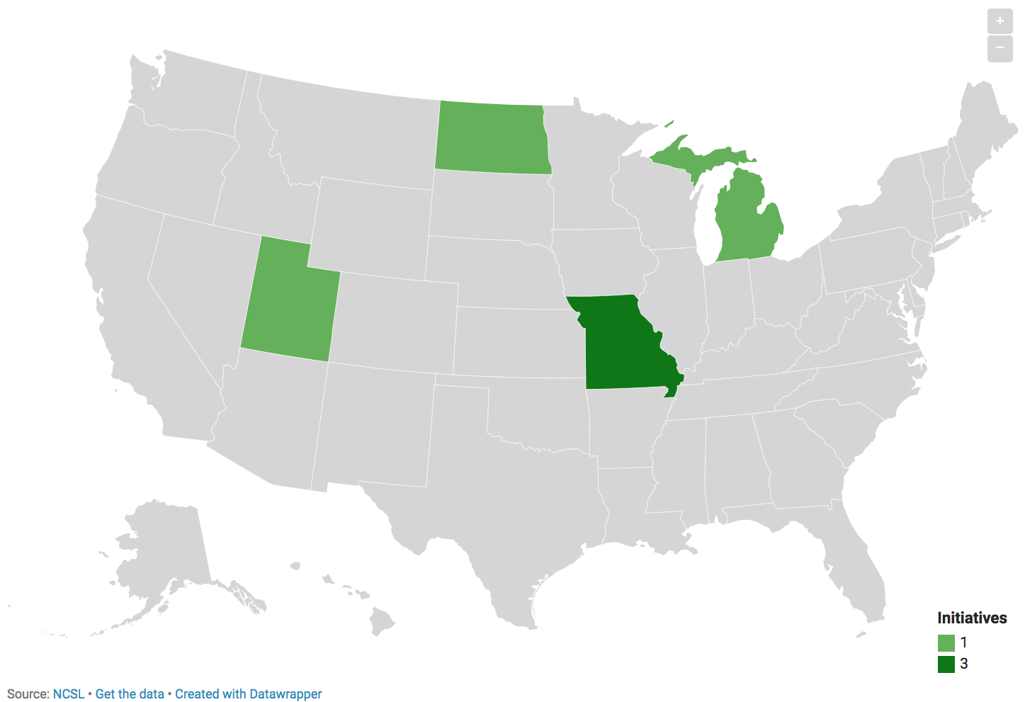
Washington could impose a polluter’s fee on greenhouse-gas emitters starting in 2020. North Dakota may legalize recreational marijuana while expunging existing criminal records for certain drug-associated arrests, though that initiative might well fail. And some in North Carolina are hoping to require photo identification at the polls, even though there have only been a handful of alleged voter impersonation cases since 2000.
Those are a selection of the propositions, initiatives and amendments on the 2018 ballot. To get a clearer sense of what’s being decided by voters this November, we mapped energy, marijuana and voter registration ballot initiatives across the United States, inspired by Bloomberg’s 2016 maps and using data from the National Conference of State Legislatures. The following tutorial uses Google Sheets and Datawrapper to get the job done.
Getting the data
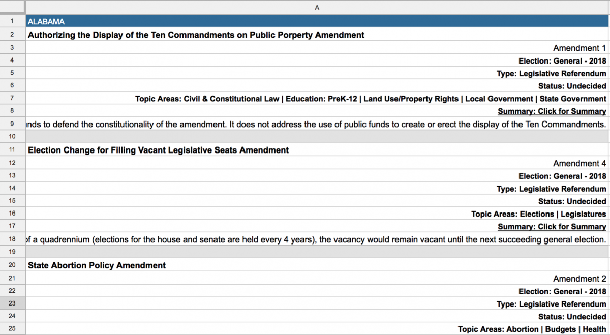
First, I headed to the NCSL website and searched for all initiatives and all states for the 2018 general election. I clicked “Show All Summary” and copied all the 2018 initiatives into a Sheet. If you can scrape with Python, even better.
Cleaning the data
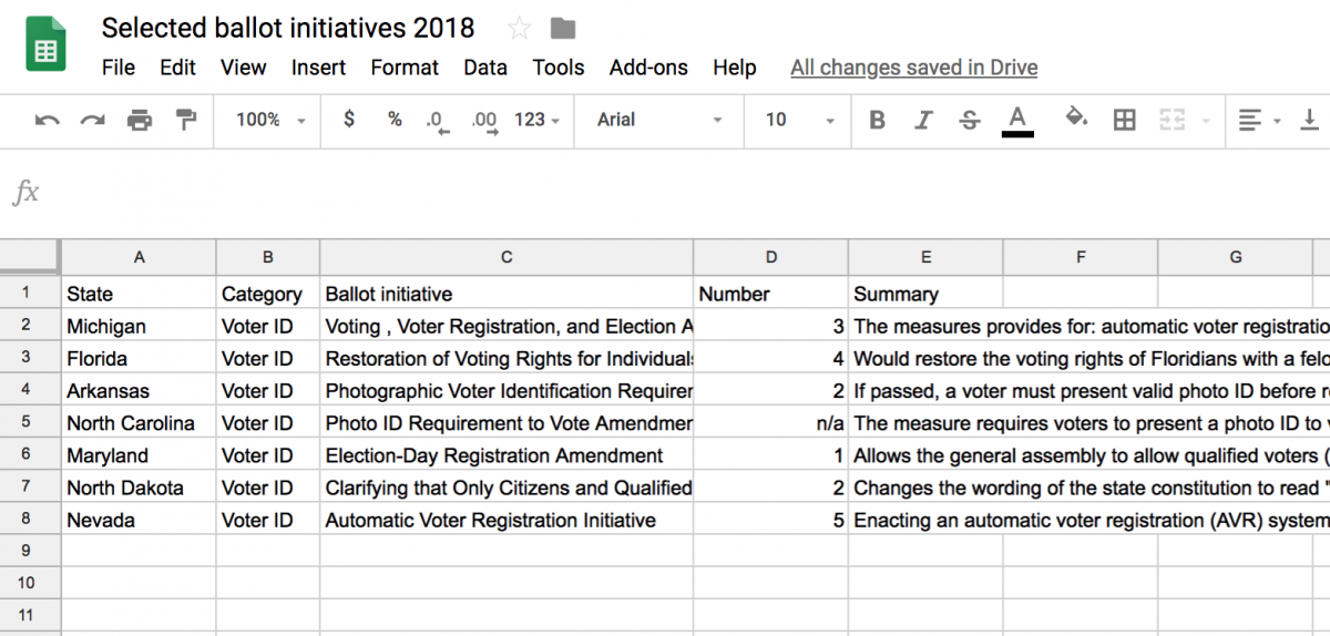
This usually takes the most time. I set up a new Sheet and started coping in information on every ballot initiative that had to do with legalizing marijuana, voter registration or energy projects. I copied over State, Category, Initiative Name, Number and Summary information.
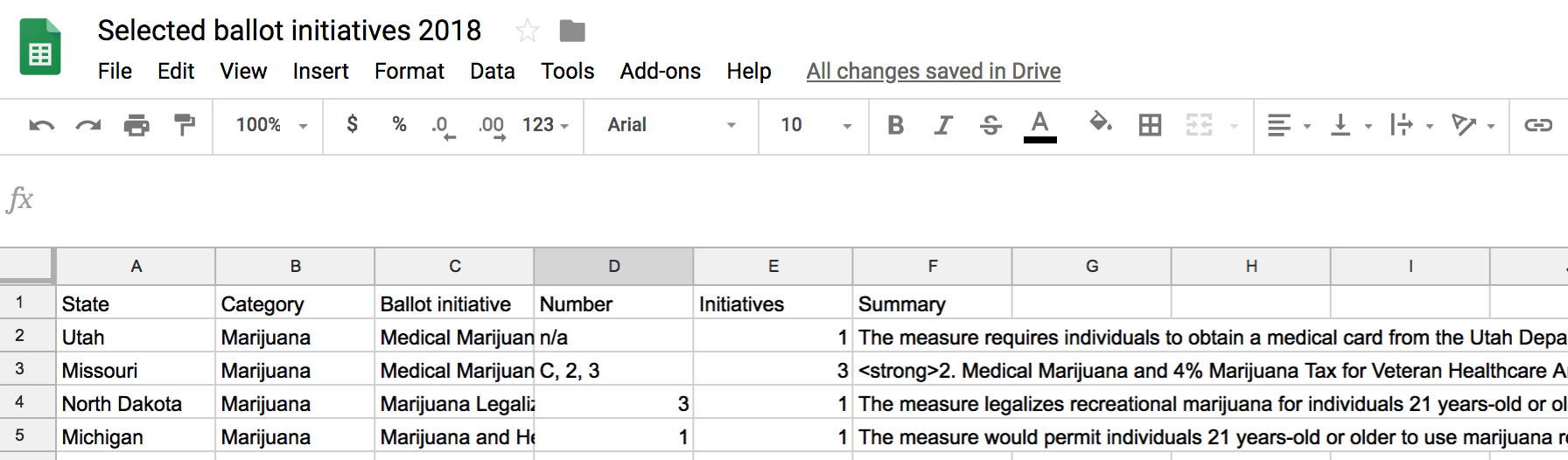
For marijuana and energy projects, there were sometimes more than one initiative on the ballot for a state. In that case, I added a column assigning the number of initiatives for that state and renamed the catch-all ballot initiative something generic.
I then collapsed all the initiative summaries into one row and separated the summaries using HTML line breaks <br /><br /> and <strong> for bold. This will make sense when we import the data into Datawrapper. So for Missouri I renamed the ballot initiative “Medical Marijuana Initiatives” and glued the three summaries and names together into one cell:
<strong>2. Medical Marijuana and 4% Marijuana Tax for Veteran Healthcare Amendment</strong><br /><br />The measure legalizes marijuana for medical purposes and enacts a 4 percent tax on it. The tax revenue would be allocated to veteran healthcare. It is estimated to generate $66 million in revenue and cost $500,000 in annual costs. <br /><br /><strong>C. Medical Marijuana and 2% ….
That should look like:
Once you’re done formatting every Sheet, download each as a CSV. You should have one each for marijuana, voter registration and energy projects.
Load into Datawrapper
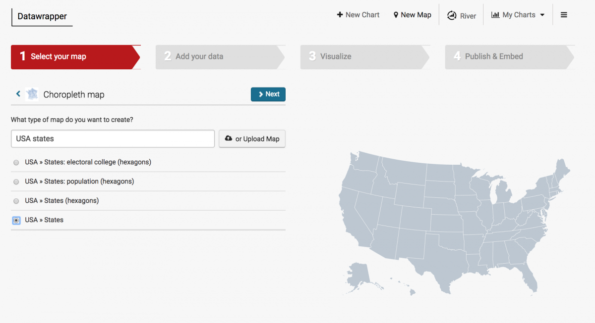
We’ll build each map separately and Datawrapper couldn’t make it easier once the data is cleaned up. Click “Create a map,” then click “Choropleth map” and then search for and click “USA states.” Notice the cool “hexagon” choices.
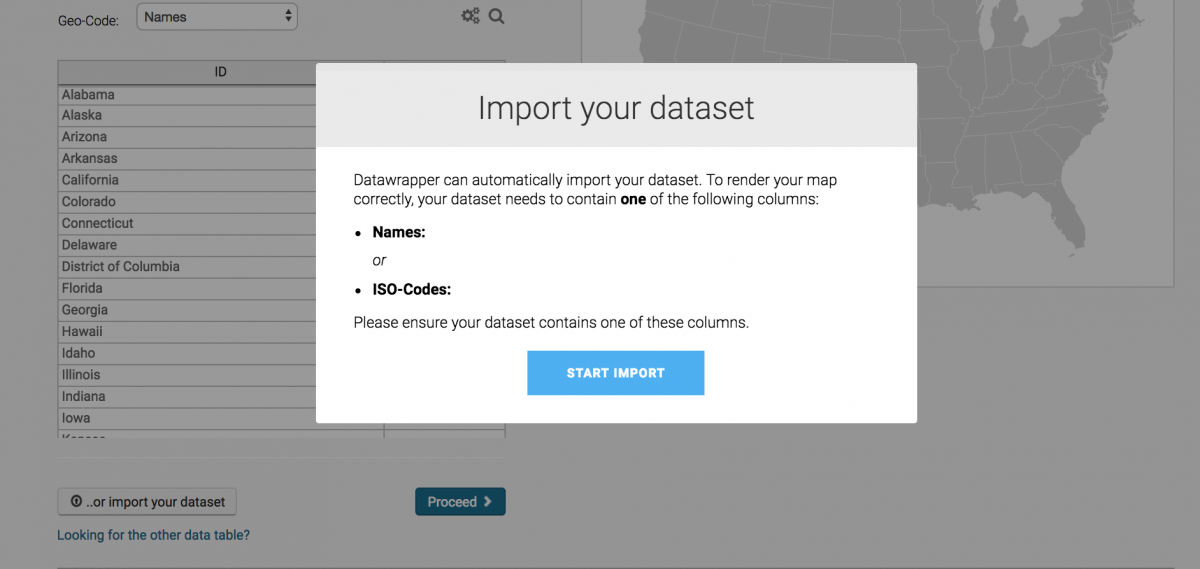
Click “Next” and add in your data by clicking “Import your dataset” at the bottom of the table. Then click “Start Import” to add a CSV.
Upload your CSV
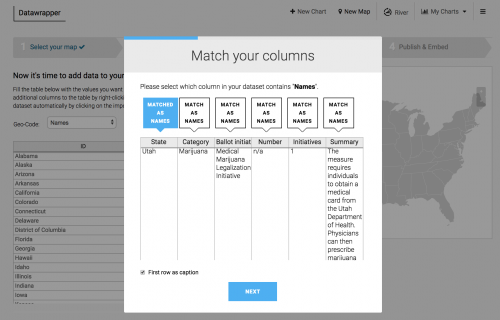
Next, we can match columns to Names and Values. States for Names and Initiatives for Values.
You should then have a map and click “Visualize” to design the map.
Design the map
Feel free to get creative. I customized the legend by unclicking the “Automatically generate legend” and by changing the “Number format” to 0″ to remove decimal points. I also changed the color and dragged the 1 over into the light green.
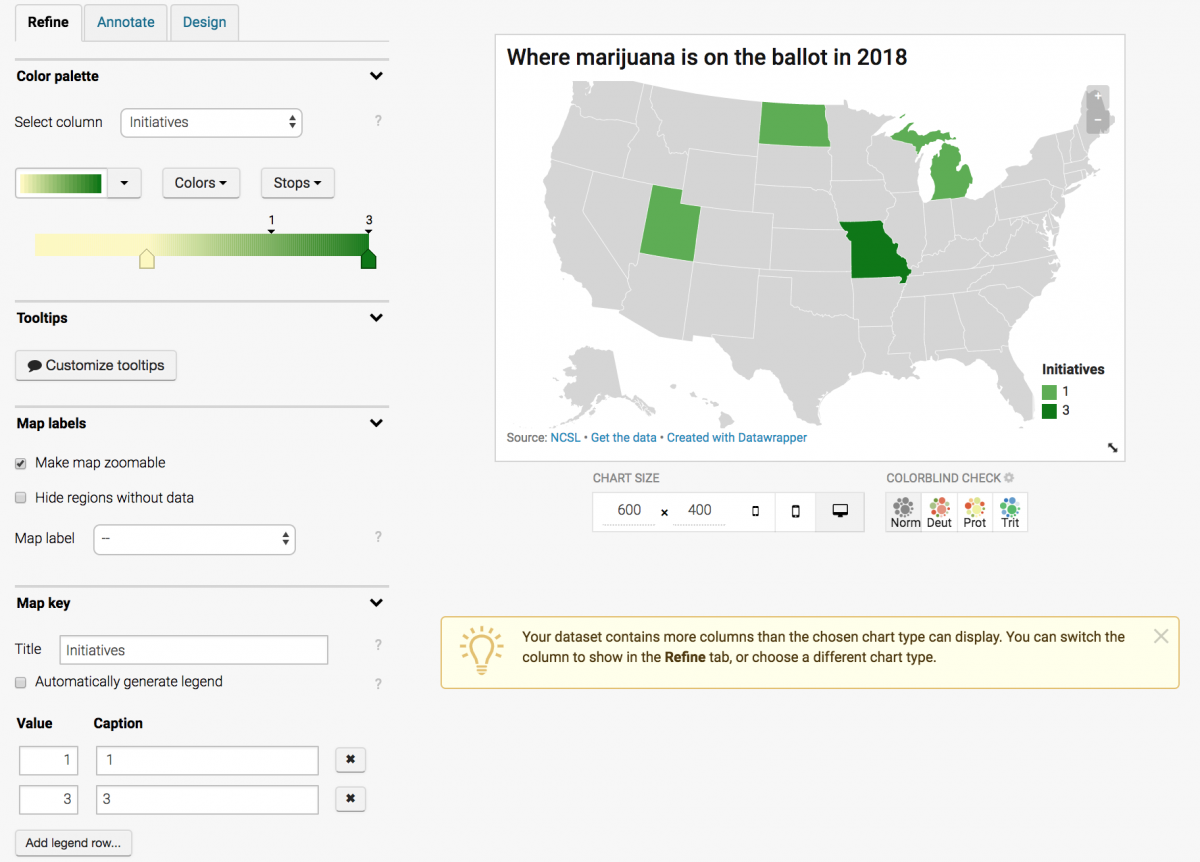
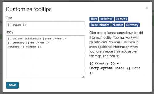
Finally, I click “Customize tooltips” and tell it what data to show when you hover over each state. Below, see the HTML I’ve added to the “Body,” namely line breaks <br /> between {{ Ballot_initiative }} and {{ Summary }}, and between {{ Summary }} and Number: {{ Number }}.
Click “Save” and click the “Annotate” tab to add a “Title” and “Data source.”
Publish the map
Finally, click “Proceed” and then “Publish & Embed” and then “Publish chart.” Do it again for the next two CSVs as two separate maps.
They should look like:


