Smoke, fires, floods: How John Keefe and The New York Times use data to explain extreme weather events
With Hurricanes Hilary and Idalia lashing California and the South, deadly wildfires in Maui displacing thousands and the smoke from Canadian wildfires blanketing huge areas of the United States, newsrooms across the country have increased their efforts to provide innovative coverage of weather and climate. Last year, The New York Times launched the Weather Data team to produce interactive and accessible data stories focused on extreme weather events.
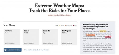
Separate from the Times’ climate desk, the Weather Data team is made up of graphics editors, coders and a meteorologist. The team is behind stories like, “Tracking Tropical Depression Nicole” and “Extreme Weather Maps: Track the Risks for Your Places” that help readers track and prepare for extreme events. They also support the work of other desks.
At the helm is John Keefe, a self-described “weather nerd.” Keefe has long been passionate about telling stories in innovative and visually compelling ways, having done graphics and data visualization work at CNN, Quartz and WNYC. He was also part of the Times’ 2021 Pulitzer Prize-winning team tracking the coronavirus pandemic.
Storybench spoke with Keefe to understand his team’s approach, the challenges they face and the broader impacts of their work.
The following interview has been edited for clarity and length.
How was the Weather Data team formed at the Times?
Keefe: The interest and the service that came with the Times providing COVID data to the world — really making an effort to collect all of this data, pull it together and put it online every day so people can see where the pandemic was — that was a Herculean effort. Those daily counts really grew into data that so many of us relied on.
The way the weather plays a role in our lives is so key. Covering that well and covering it accurately, beautifully is a service to our readers, in the same way that COVID coverage was a service to our readers.
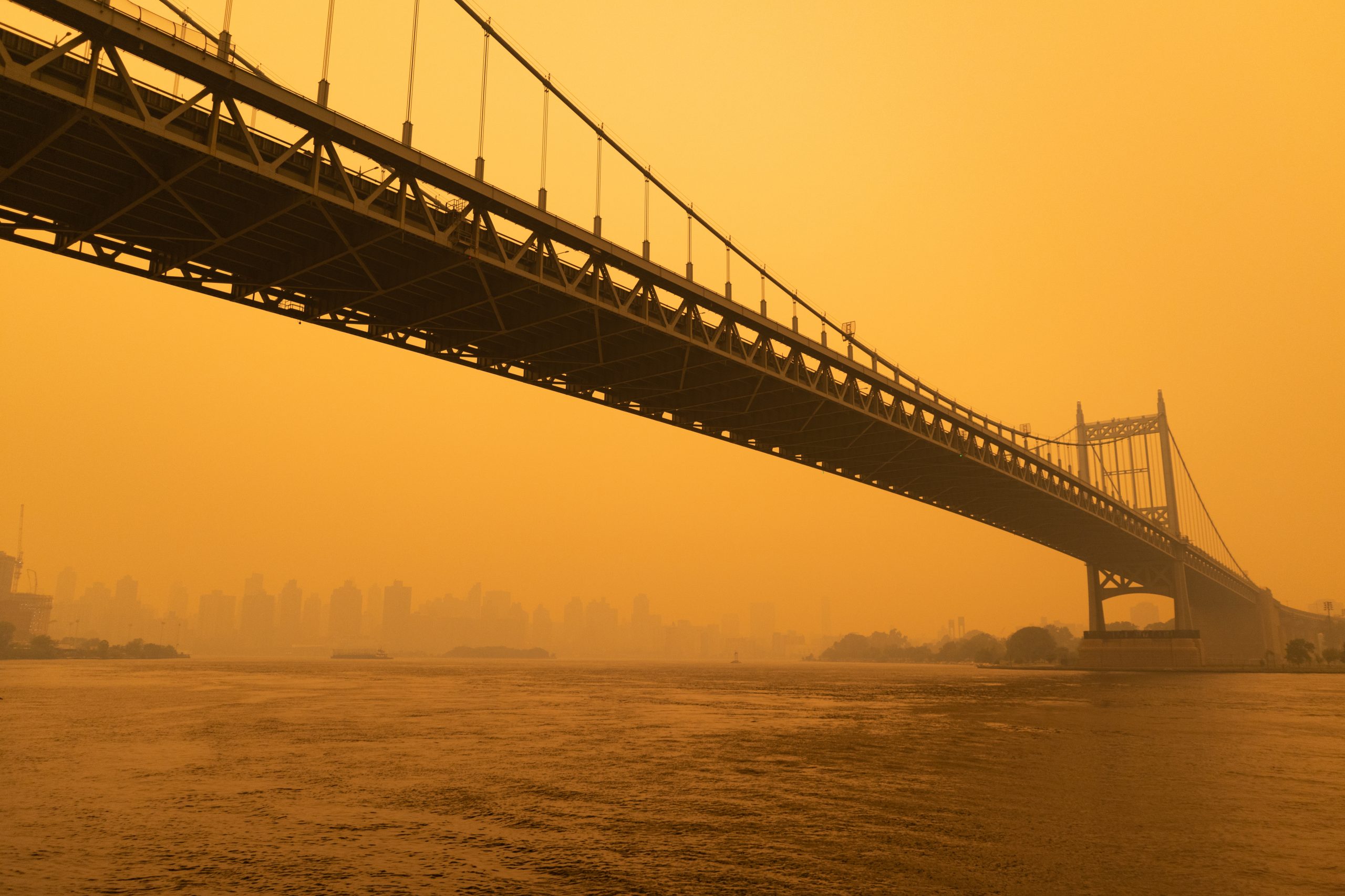
I think one of the most striking examples of that was in June, when the smoke from the Canadian wildfires crossed into the U.S. in a very intense way. We had actually already been preparing a smoke forecast map because it was one of the things we knew readers might need. You could — and still can — click in and see where the smoke is forecast to be for the next several hours. Is this thing going to leave? Is it clearing up? Is it coming toward us? The ability to do that is very much what we’re trying to do as a service to our readers.

Why are data visualizations and other innovative storytelling techniques so important for weather and climate stories?
If you get used to the fact that the number of days that are above 100 degrees have gone up, you might not notice [the change] from one year to the next. We can use visualizations and maps to show you that this wasn’t this way 20 years ago, that this is an abnormal amount of rainfall, that this is an abnormal amount of heat, that this is an abnormal amount of any of these conditions.
Being able to visualize that is super important because, as humans, we can’t necessarily detect that change.
What is your team’s process in creating data visualizations?
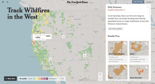
Let’s stick with the air quality example. First thing we want to do is to make sure we can show people where all these fires are, have them understand how big they are and make it easy for them to zoom in. The data may or may not be there. We have to figure out how we get it, what’s reliable and what’s relevant.
With the smoke maps, for example, there are several different smoke forecast maps that are out there, and some of them are more granular. Also, there are different forecasts for what level in the atmosphere the smoke is in. It turns out high-level smoke is really important to track but is not what you experienced in New York in those days. That was low-level or ground-level smoke. So, we had to pick both the forecasts that made sense for the time, the space and the elevation.
Once we have the data, we want to figure out how to present that and how best to do that. Is it a static map? Or is it something you can zoom into? What colors do you use? Then it’s about making it incredibly useful. I’m always thinking, “What does a person who comes to see this story want to know?”
What are some of the difficulties your team has faced in gathering relevant data or in creating the visualizations?
A lot of what we get is from the National Weather Service, but they put things together in a very specific way. They’re trying to inform not just the public, but also policymakers, emergency managers and other organizations and agencies. Sometimes it’s very, very complicated.
I consider myself a weather nerd. I don’t expect my audience to be weather nerds. What’s the difference between a marginal risk, a slight risk and a moderate risk? The Weather Service has very good definitions for that, but I don’t know if I asked you to rank marginal, slight and moderate, you could tell me which one is the least risk and highest risk, at least not instantly.
We had to think, “What’s the best way to put this to people?”
What public weather data sources are there for other organizations and students to take advantage of?
The Weather Service is a big organization and they have lots of different departments where there’s lots of different data sources. There’s a lot of amazingly good free data at the National Oceanic and Atmospheric Administration. The National Hurricane Center has amazing free data on every storm.
The U.S. Geological Survey also has live feeds of earthquakes in the United States and around the world. Our fire data, like data from satellites around wildfires, comes from NASA satellites and data, and that’s also free.
Kelly Chan specializes in feature writing, digital marketing, photography and multimedia storytelling. She is a recent graduate of Northeastern University and is now pursuing a M.S. in Media Innovation and Data Communication there as well.
- Here are Nathan Griffiths’ takeaways from his career journey experimenting with different mediums - June 17, 2024
- Here’s a look inside the data team at the Associated Press - February 13, 2024
- How Alex Lim visualized the colors of Singapore for The Straits Times - September 28, 2023