One Way to Give a National Map Geographical Detail
With the advent of D3, a Javascript library for visualizations, making a lightweight, responsive national map is easier than ever before—particularly, if you’re a fan of the Albers USA projection like me. (More on map projections here). The only problem is how does one easily add geographical detail to a D3 map when the map itself is just polygons? Zooming into a D3 map doesn’t offer further geographical context, it only enlarges the selected polygon.

In Bostock’s example, you can freely pan and zoom into the map, but what does a zoomed in view actually show you? If your story relied on major roads or the proximity of towns to illustrate a point in your data, zooming further into a D3 map wouldn’t help show this. To provide more geographical context, you could always add more shapefile data that contained city names or road networks, but switching between a D3 map layer and a tile map layer on zoom can be particularly effective as well.
Luckily converting between a D3 map layer and a Web Mercator tile map is surprisingly easy, too (Web Mercator is currently the default projection for all tile maps, think Leaflet, Mapbox, and CartoDB). The basic concept is this—take your D3 x, y coordinates and return their latitude and longitude equivalents.
In fact, it only takes two lines of code to do this, using d3.mouse and projection.invert to return the latitude/longitude of your x, y coordinates:
d3.select("svg").on("mousedown.log", function() {

console.log(projection.invert(d3.mouse(this)));

});
Transitioning from D3 to a specific county or state
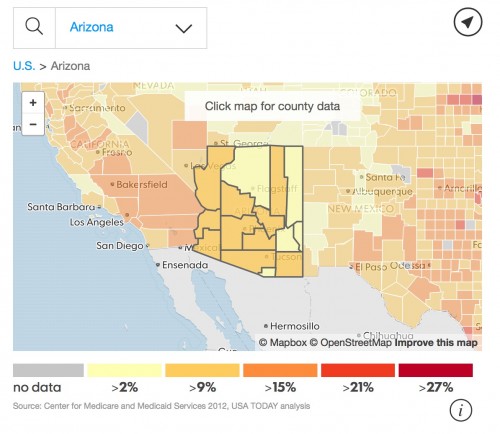
If you’re interested in transitioning from a D3 map to a specific county or state, it’s a little bit more complicated, but Leaflet’s fitBounds method makes it pretty painless, as it takes a set of geographical bounds and sets your map view to fit these bounds at the maximum zoom level possible.
So, if I’m interested in emphasizing all of the counties for a given state like in the example above, I can create an object where I push all all of the county feature data for a state and feed those geographical bounds into Leaflet’s fitBounds method. You’ll note Alaska is an exception to this method, as it’s true geographical bounds extend past the anti-meridian or 180th meridian, meaning Leaflet’s fitBounds encompasses too much territory to actually fit Alaska into our map view, so hard coded southwest and northeast bounds are needed.
The example of setting Alaska’s bounds should give you a better idea of what’s happening under the hood in our getBounds function, as it’s retrieving the southwest and northeast bounds for each county for a given state in our stateBounds object and displaying this in our map view.
if (d.properties.s === 'AK') {

mbMap.fitBounds([[54.113578, -165.835171], [70.568625, -142.547859]]);

} else {

mbMap.fitBounds(stateBounds.getBounds());

}
An example in the wild
Here’s a Codepen with the full code implemented using county level unemployment data found here.
See the Pen yNdzBj by Sarah Frostenson (@sfrostenson) on CodePen.
For more detail and access to the entire code base, check out my repo.
Why might you be interested in using something like this? When building an interactive map, there often exists a struggle between building a national map and building a more localized map that relies on more typical geographical features like city names and roads and even individual city blocks (depending on zoom level) in order to contextualize a national story.
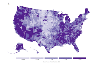
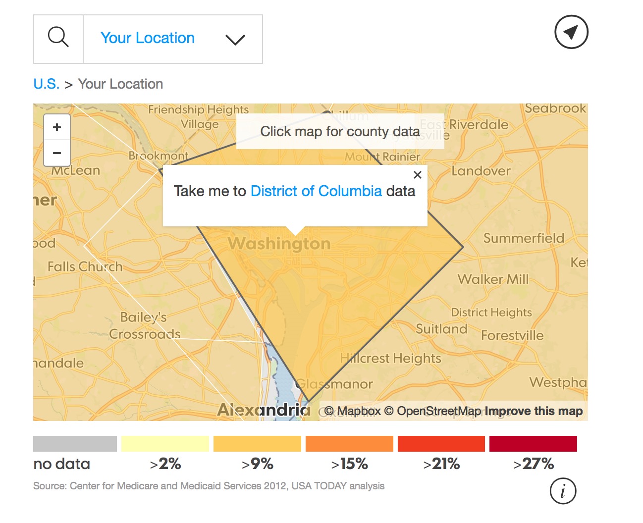
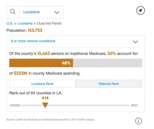
A D3 to tile map transition at USA TODAY
Recently I worked with USA TODAY to show the effect of chronic health conditions at the national, state and county level. We adopted the approach of swapping out a D3 map layer and a tile map layer to give the reader the ability to explore the data based on their location, offering a variety of access points and different slices of the data.
Does more geographic detail add to your story?
When building an exploratory mapping interactive, it’s important to offer multiple slices of the data and various entry points to your user. It’s also important to consider if increased geographical context adds to the story you’re trying to tell. Maps aren’t the only way to tell a story. But they can certainly resonate with readers if location matters.
If you’re looking for resources to help you start mapping, Mapbox has 43 guides (and counting) to get you started. Mapbox also maintains a giant collection of examples that showcases things ranging from swiping between map layers to joining multiple layers of data. In addition to a well documented API, Leaflet also has some great tutorials as well.
Finding good tutorials on mapping with D3 can be a bit more challenging, but the creator of D3, Mike Bostock, has written some excellent guides and examples including Let’s Make a Map, how to build a choropleth map and a tutorial discussing the power of transitions.
Happy trails!
Sarah Frostenson is a news app developer at Gannett and USATODAY. Follow her on Twitter at @sfrostenson.
- One Way to Give a National Map Geographical Detail - August 20, 2015


