How The Pudding visualized the gender breakdown of speakers on This American Life
Last September, The Pudding published “Listen to Her,” an interactive, multimedia piece visualizing the gender breakdown of long-running radio program “This American Life.” Ash Ngu, a computer science graduate student at Stanford, conceived and created the piece as a summer intern at The Pudding.
Storybench asked Ngu how the idea came about, the process of putting the story together, and its impact.
How did you get the idea to analyze gender breakdown of airtime on This American Life?
I would say the idea probably came from a lot of different directions. I realized I had spent more than 90 percent of my computer science life listening to men speak in lecturing. I thought about all the other times I had listened to people talk in TV broadcasting. I also listen to a lot of podcasts myself. So I had this question of how much do women talk in podcasts. This American Life is a well-known, respected show. The show has a lot of fans, it has a great reputation in the radio and podcasting world. It’s a personal favorite of mine.
More on the practical side of things, they had 20+ years of transcripts, and they were freely available online. The audio was available online. It made it really easy for me to put together.
Could you walk us through your design process, especially given the combination of interactive audio and visual elements?
The design of the piece mainly arose from my own data analysis process. I had this bigger process of how much airtime is present with men speaking and women speaking. But further than that, once you start to understand why, that was the part I wanted to lay out for whoever was reading it. First, I was like ‘how much time,’ and I figured that out, saw there was a big disparity.
Then I started looking out how many men versus women there are in different roles: contributors, interviewees, production staff. The production staff is generally pretty good on their general balance, so it was really the interviewees that were the worst and contributors were second. That was affirmed later when Ira talked about how he was very intentional about hiring women.
So I kind of matched it to the structure of a This American Life episode because I thought that would be meta. The idea of me talking in the beginning, I wasn’t sure about it. [My editors] encouraged me. I don’t know if people liked it but I thought it was fun.
How did you choose the specific visualizations you used?
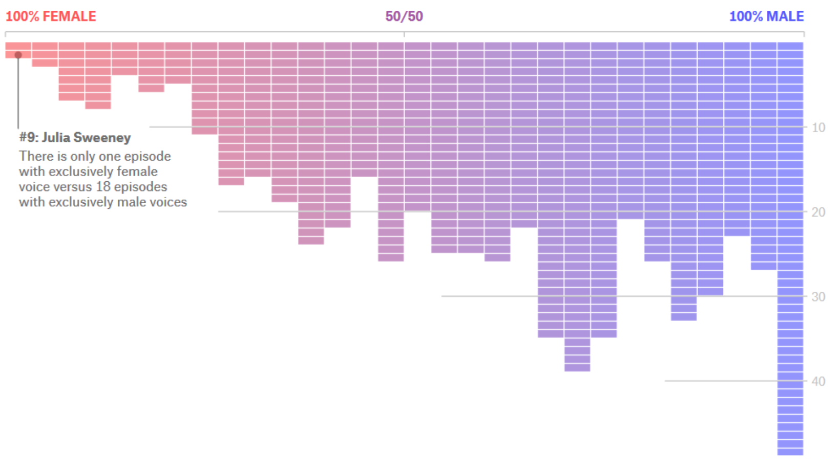
There were two main interactive-y ones in the end and a couple of static ones. I tried a few different ways to represent the information. For example, the first one is basically an interactive histogram. I was going for the simplest chart possible that could be seen well on mobile.

Credit: The Pudding
The swarm chart was tricky because on mobile it’s kind of squished together. I’m not sure if the bee swarm chart was the best way to do that. With the swarm chart, you can sort of see the size of the swarms for the male contributors are pretty weighted, while for the female contributors the “dumbbell” shape is more balanced.

Credit: The Pudding
I know I ended up using blue and red and sort of assigned them as the traditional men are blue, and women are pink. I thought about switching it up. In the end I wanted to emphasize people understanding things, so I didn’t want to just reverse it so that their comprehension would be inhibited. But I think that’s another thing I think people can play with.
How did you retrieve, organize, and analyze the data?
I scraped their website, and their website had a couple of helpful things. Their transcript had timestamps, so when I scraped the HTML, I could link it back to the audio file to play that particular spot, which was really useful because with the classifications of names there were a bunch of names and titles that couldn’t be automatically classified using some gender classifier I found online. I had to go through, I want to say, 2000 names by hand.
I was really worried about the gender classifier. Determining gender is a tricky thing. I was making assumptions, like there are only two genders. It was something I was cognizant of, and I put something in the methodology about it.
There were a few finicky things, like some of the transcripts I scraped were messed up. Basically, those are the kinds of things that aren’t fun, but need to be done. I’m sure there are mistakes in the dataset, but I did my best and did multiple passes. That’s something good about uploading the data to GitHub — so multiple people can peer into it and suggest changes if they find any.
For analysis, I used (Python library) pandas and Jupyter Notebook for the preliminary stuff, then for the visualizations I just used (JavaScript library) D3.
How did Ira Glass respond to the results?
He has been pretty intentional about hiring and supporting a lot of women on staff. Honestly, I think he was surprised that the numbers weren’t as good as he expected them to be. And I think that’s the beautiful thing about doing something like this. I think many people may have a feeling that it’s maybe 50-50, but the numbers are a good actual reference point of where we are and where we should go. I really am grateful that he took time out of the day to do that and I think they were a little grateful that someone random did this.
What were the biggest challenges in this project?
I think the tone was probably one of the harder things. I wanted this to be a reflective piece, I didn’t want it to be putting This American Life in the hot seat. I wanted anybody who was in the radio industry and who was on the staff of This American Life to say this is a fair representation, to be motivated.
What are some of your takeaways from the project?
I guess this project started out of a personal curiosity of mine, and I think many good projects start like that. You have a curiosity, and maybe others do too. As I dove more into it, I could tell there was something interesting. I’m going to make an assumption, but I don’t think there has been an analysis like this of a radio show before.
The project made a difference in getting the staff of This American Life to have a discussion about more female pieces on air. Ira Glass wrote that they were going to do that. That in itself was incredible. Answering these questions that people have and having people change their outlook on the world based on some piece of information that I provided them is something that I will carry with me in future projects.