How I simulated the public school selection process in Chicago to show segregation
School segregation is an issue that we as a society have created and maintained for decades. But despite desegregation programs from the 1970’s showing positive outcomes – including higher median income for black students, higher levels of educational attainment, higher life expectancies, and lower homicide rates – today, we see higher levels of school segregation than ever before.
That’s because desegregation has been consistently challenged and avoided. For desegregation policies to succeed, supporters need to inspire behavioral change from those benefiting from the status quo. But this requires a shift in viewpoints, values and assumptions. How does one start changing minds?
Interactive visualization, and specifically simulation, can be a powerful tool because it has the potential to engage the civic imagination by allowing users to explore the results of various scenarios in a risk-free environment based on real-world data.
In this project, which became my MFA thesis at Northeastern’s Information Design and Visualization program, users experience a parent’s school selection process. They are able to make residential, school and policy choices and then see the consequences – both for their child and for the community. Chicago is my hometown so the data driving this simulation uses census data and Chicago Public Schools (CPS) data.

Chicago has the third-most segregated school system in America following New York and Los Angeles, based on the dissimilarity index, which measures the relative separation of groups across the city. It has the fourth-highest level of segregation between black and white residents and the ninth-highest between Hispanic and white residents. White families with school-age children are less likely to live in the city, and those that do tend to send their children to private schools. While Chicago’s residents are one-third each white, black, and Hispanic, public school enrollment is 11 percent white, 39 percent black, and 45 percent Hispanic.
How I modeled school choice
Below are the factors I included in the model. As users move through the steps, the relationships between race/ethnicity, income inequality, housing inequality and education inequality become apparent. Users can weaken the strength of those links by making choices that support diversity – or they can simulate their choices based on the status quo.
Race: The racial/ethnic distribution of the dot children reflects the make-up of elementary school-age (5-14 years-old) children residing in Chicago. 17 percent are white, 35 percent are black, and 47 percent are Hispanic.
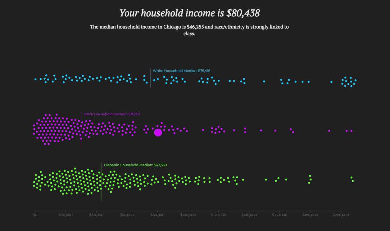
Income: Household income is assigned based on the percentage of households in each income bracket by race.
School Readiness: Children from higher socioeconomic households often have an advantage in the classroom and this influences the students around them. The “school ready” classification is based on “early math and reading skills, learning-related and problem behaviors, and overall physical health.” 75 percent of moderate to high income children are school ready, while 59 percent of near poor and only 48 percent of poor children are school ready. Near poor represents household income between 100 percent and 185 percent of the poverty level. To determine the 100 percent poverty level, I used the average household size for Chicago, 2.55, to set the 100 percent poverty level at $18,710.
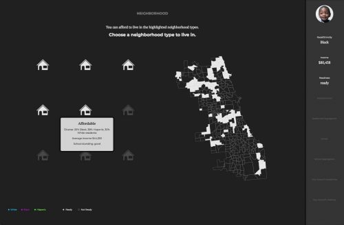
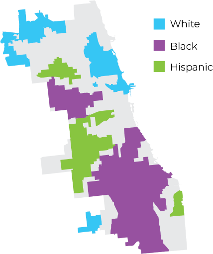
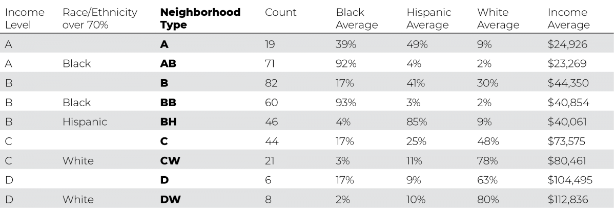
Neighborhood Choice: I used attendance zone boundaries as neighborhoods so that each one has an assigned public school. These are then grouped into types based on income and then broken down further by race. Since racial isolation occurs when any area has over 70% of one race, I separated any neighborhood over that threshold. The classification for each of the 357 elementary school attendance zones is listed in the table below. I used ArcMap geoprocessing tools to estimate the number of children of each race/ethnicity and the household income median in each zone by overlapping census block group data on the attendance zone boundaries.
The segregation levels in the simulation are based on the entropy index where 0 means complete integration and 100 means complete separation. It is rare to see a score above 50, which means that the status quo neighborhood choice entropy index of 40 is very high.
Neighborhood Choice – Low-Income Housing Policy: Addressing residential as well as school segregation will likely be necessary so users can also see what would happen with more low-income housing in higher value neighborhoods. A Stanford research study found that building new affordable housing can raise property values and lower crime rates, attracting higher-income residents.
For this option in the simulation, some low-income residents are able to move to higher value neighborhoods (15 percent of the population from A, AB, B, BB, and BH to D and CW) and a few medium income families are incentivized to move to low income neighborhoods (10 percent of the population from CW to B). This modest low-income housing policy decreases the entropy index to 30.
School Choice: Each neighborhood type has an assigned public school and up to two additional public schools are randomly made available for transfer. If the user’s child is school ready, then the charter school is available. If the child is school ready and the household income is over $50,000, then a private school is also available.
School placement for all of the other dot children follows these same rules and takes into account the rate of enrollment for each attendance school type using CPS data which tracks residence versus attendance for each school. On selection, the diversity score, based on the entropy index, is displayed across the schools.
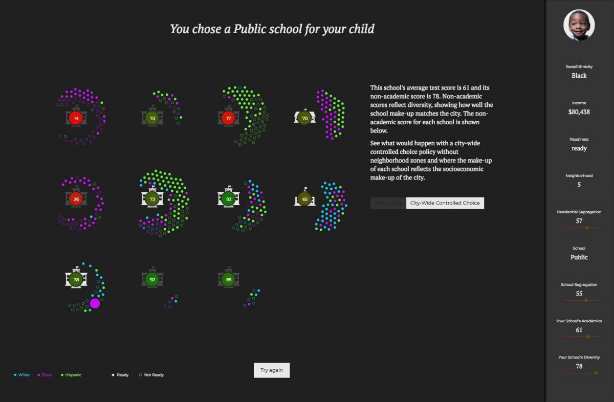
School Choice – Controlled Choice: For the city-wide controlled choice option, I shifted the dot children in a way that matched the overall socioeconomic make-up for the city in each school. This kind of balancing would likely be unrealistic in a large city like Chicago but it provides an interesting goal in a simulation.
Results: On the final page, users can see the results of their selections. The measurements in the sidebar reflect the academic and diversity scores that result from choices made throughout the simulation. One aspect of the game to be aware of is that only certain individuals are able to make choices. Users who play the game a few times will notice that low income families have significantly fewer options and less ability to affect the results.
The simulation forces users to reckon with the uncomfortable reality that the responsibility for creating or diminishing segregation lies in the choices of the mid- and high-income families.
Interact with the simulation here.
