
Sky-high expectations for The New York Times, but Empire State data visualization falls short
In light of the gradual reopening of New York City following the COVID-19 pandemic, a team of journalists and data analysts from The New York Times attempted to summarize the impact of the pandemic in an interactive story titled “Why the Empire State Building, and New York, May Never Be the Same” which analyzes the dwindling occupancy of the Empire State Building.
Journalists from The New York Times researched and tracked down office tenants of the Empire State Building to interview them about the status of their return-to-office plans. The project, published in September, juxtaposes traditional journalistic practices and photographs with data aggregations and visualizations created using stats sourced partially from a Partnership for New York City press release and publicly available 3D models of city infrastructure.
The team of journalists who created the piece includes Keith Collins, Nikolas Diamant, Peter Eavis, Or Fleisher, Matthew Haag, Barbara Harvey, Lingdong Huang, Karthik Patanjali, Miles Peyton and Rumsey Taylor.
Standing not only as a cultural emblem to the United States, but also as a world-famous attraction on its own, the Empire State Building has preserved an unfaltering capacity for enduring any threat of obsolescence or mere unpopularity. However the future of the skyscraper resembles the uncertain realities of the small businesses and large corporations inhabiting it. The pandemic wiped out hotspots for tourism and business alike, in both the Empire State Building and New York City for over a year.
Standards of Interactive Journalism
For nearly a decade, The New York Times has created countless masterpieces of interactive journalism and continues to hold fast to their reputation as the gold standard in digital storytelling. “Scrollytelling,” the technique creators utilized in this story, combines elements of text, audio-visual work, graphic design and data visualization to dynamically engage modern news audiences.
The first frame of the story is a photograph of the iconic New York cityscape. Taken by Todd Heisler, the photograph seamlessly weaves into the graphic design scheme of the piece and is suddenly animated into a 3D interactive model. As the reader scrolls, the buildings initially surrounding the treasured skyscraper fade and are replaced by outlines to provide a clear focal point. Simultaneously, the Empire State Building is transformed from its textural outer covering to gray 3D model.
The Observatory: Graphics
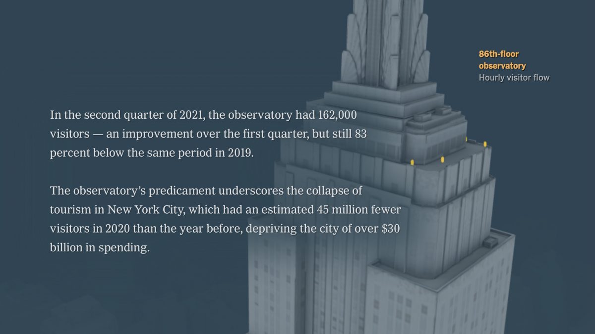
When recalling memories of the Empire State Building, one most likely defaults to imagining the cityscape seen from the observatory a hundred stories up. The 86th-floor observation deck, similar to most tourist attractions in the city, was empty for months.
Visitors are represented by flighty, contrasted yellow figures scattering across the balcony. To demonstrate this phenomena, the scattering figures simply diminish from tens to a pair of two. The article reads: “The observatory’s predicament underscores the collapse of tourism in New York City,” but the animated graphic chosen to illustrate this fails to match the caliber and severity of the problem the authors are trying to communicate.
The Offices: Data Visualization
If measuring activity at the observatory doesn’t illustrate the point, perhaps the rest of the building can. “The Offices” segment highlights just how much of the Empire State Building the average person forgets is there, reminding readers the beloved tourism landmark has purpose other than a lookout point.

The officeholders in the Empire State Building will face the predicament of acclimating to hybrid online and in-person business models, emphasized by the pandemic. The building alone, despite its historical reputation, is losing practical relevance for business and tourism and appears lackluster in the shadows of the many glossy Manhattan skyscrapers.
The team decides to look into reports by floor, from tenants who shared their plans to stay in the building “with the Times or announced them publicly,” according to the article.
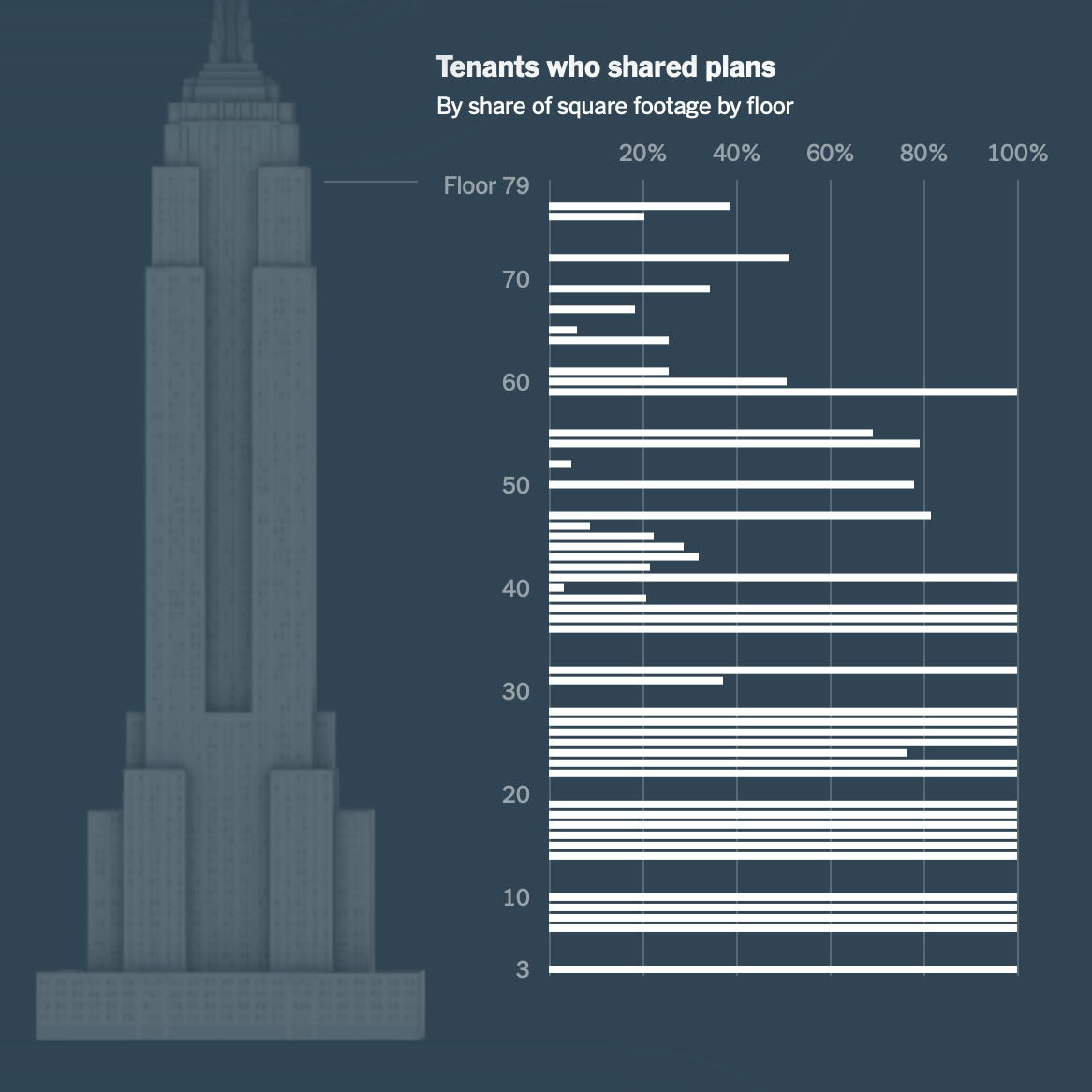
Initially, the first chart in the sequence of three doesn’t quite make sense without its textual description in the body of the story. Scrollytelling runs the risk of being ineffective when trying to communicate very specific ideas, as readers don’t always take the time to thoroughly read the story. While a range of floor numbers are clearly labeled and mapped to the y-axis, the variables mapped to the x-axis could either establish the percentage of tenants who shared plans, or the share of square footage they occupy — it is not entirely clear at first glance.
Simplified wording and labeled units can make a world of difference to readers, whether or not they are proficient in reading data. One must read the description to understand the “share” in “shared plans” and “share of square footage” in the line below are not referring to the same object. “Shared plans” could be interpreted as a share of a floor plan when reading the title in full.
Another interesting choice the data team made was to incorporate the variable of exact floor number, when the narrative does not emphasize a stark difference between floors. While the data may have been collected by floor, the reader cannot deduce whether the graph is communicating that 100% of the tenants on the lower floors shared their plans, or if it is simply showing that the lower floors are filled to 100% capacity compared to the 40% at the top.
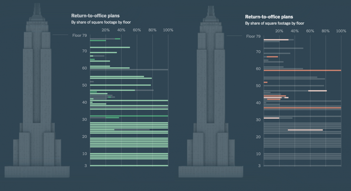
Stylistically, the choice of bar graph is effective for making quick comparisons and allows for smooth shifts in combination with scrolling. The next two graphs are complementary to each other. Of those returning to their offices, the light green shows tenants who plan to use a hybrid model and green for planning to return full time. Of those leaving the property, pandemic-influenced decisions are filled light red, and red for those who would have left regardless. While these charts add material to the article, it can be better synthesized into the column chart that follows it.
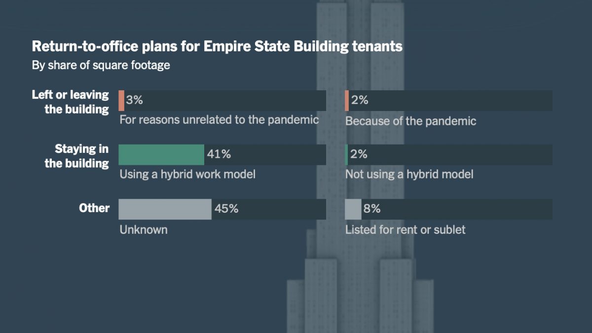
Even when floors are taken out of the picture, the exact units and idea being communicated is unclear. 41% of the tenants in the building may be returning using a hybrid work model, or tenants returning with the hybrid model may be sharing 41% of the square footage. This predicament could easily be avoided by revisions of word choice.
Data visualization, when done correctly, is a highly effective strategy for communicating big-picture concepts in a way that accounts for the skill level of readers. Tapping into the power of effective visuals allows for the fluid transference of data economy from news organization to reader.
Suggestions
Underlying issues reporters need to be conscious of are the crises of low graph literacy and risking potential alienation of significant portions of the readership. In a study on numeracy published by the Program for the International Assessment of Adult Competencies (PIAAC), the United States was reported to rank 28th out of the 38 countries examined.
The New York Times previously acknowledged the intricacies of the graph-generating process in articles pertaining to health and science, topics where graphs are generally commonplace. In March 2020, science reporter Kenneth Chang discussed the key informational differences in displaying COVID-19 data by means of linear versus logarithmic scales.
Although this article is a product of exceptionally hard work, lessening the cognitive load and personalizing the content could be the key to making the discussion of New York’s future more easily-digestible for readers. While it might be an extra step, Storybench staff writers felt this piece could have categorized and reported return-to-office plans depending on the type of business, number of employees and workflow style.
Readers are unable to manually select the information to view more details on a floor they wish to explore. Including an exact floor number in the graphs is not essential to the story if one cannot delve into its distinctive importance from other floors. Otherwise, documenting newer skyscrapers filled with similar businesses and their adaptation to hybrid work models might prove beneficial in telling whether the Empire State is truly a representation of New York City.

Increasing the amount of control and personalization the user has within the piece can drastically change their experience. Instead of solely scrolling, the elevated standard for interactives is clickable features in combination with text, audio, visual or even “games” within articles. Simply presenting the ability to scroll through moving elements is not enough to make this piece genuinely interactive. While scrolling, the 3D model of the Empire State Building evolves automatically without pause. A compelling piece of interactive journalism uses the participation of the modern news reader to immerse them in multimedia integration.
Despite its downfalls, this article demonstrates the wide array of aptitudes found in the modern newsroom. According to the article, reporters at the Times were denied responses from Empire Realty Trust, the company in charge of organizing portfolios for several offices and retail properties in the New York metropolitan area, including its eponymous client. Nevertheless, the team’s determination to obtain answers proves undefeated as documented in a follow-up Times Insider story, which details the journalists’ accounts of “shoe-leather reporting,” a fundamental journalistic practice of hunting down and interviewing sources for information. This extensive operation undertaken by The New York Times, accompanied by fossilized methods of data collection, interactive scrolling and 3D modeling all present their own respective challenges and demand a talented crew to execute.