Tapping digital tools to study how the west was won
The U.S. postal system remains an exceptional feat, a system in which a letter can travel thousands of miles in a few days for a fraction of a dollar. Its network of post offices, distribution centers, and mail carriers is the quintessence of modern infrastructure and a public good that many take for granted. But how was it built? And could a digital analysis of its evolution reveal how the American West was settled?
“It was the largest public institution in the 19th century,” said Cameron Blevins, a historian who is finishing his PhD at Stanford University’s history department. “You could be a Georgia planter or a miner in California or a factory worker in Massachusetts and there was this uniting experience of having a post office. I found that fascinating.”
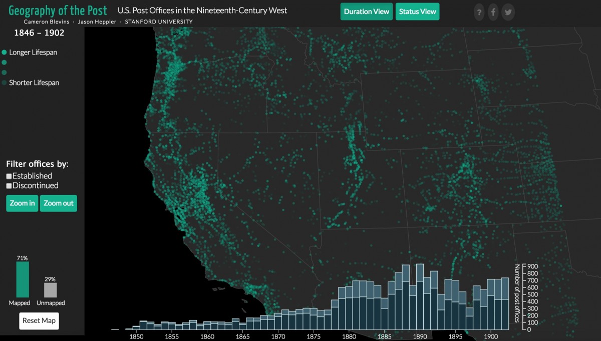
The development of that communications network during the birth of the American West is what Blevins wanted to understand when he began mapping the opening and closing of over 14,000 post offices in the western United States between 1846 and 1902.
From sourcing to analyzing to visualizing 19th century post office data, Blevins is at the forefront of digital humanities, a burgeoning field that applies the latest technologies to study the past. For his project, Blevins employed many of the same digital tools being used across disciplines like journalism and design to tell stories with data. He gave Storybench an under-the-hood look at his dissertation, “Geography of the Post.”
Estimating historic populations
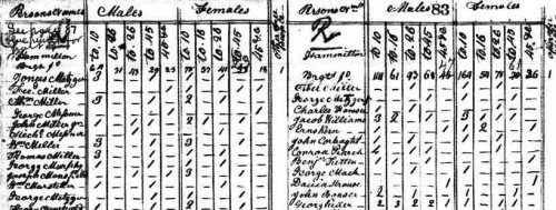
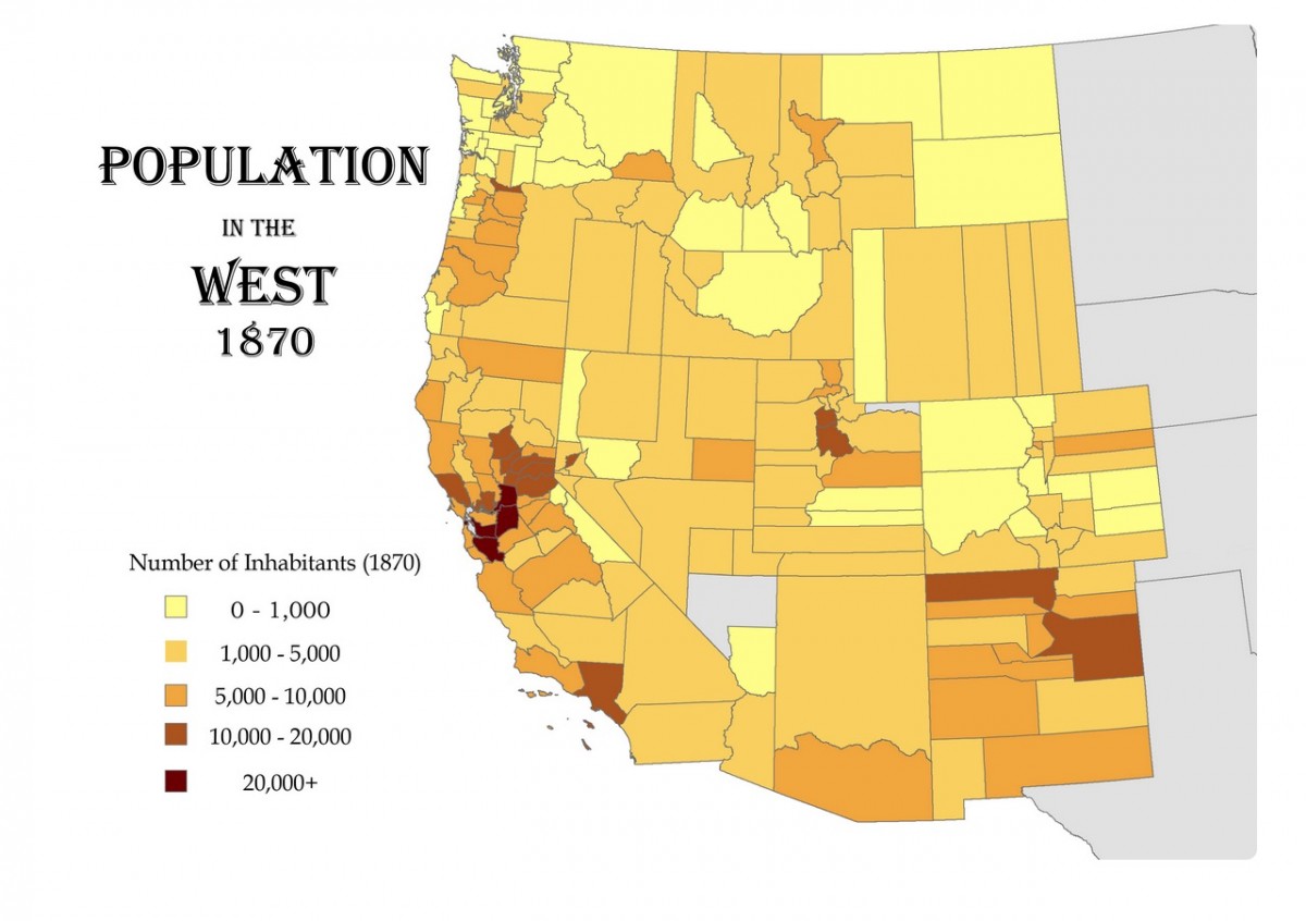
The American West was an unstable region in the 19th century. Whether displaced by violence or drawn by the prospect of gold, the population of the West was constantly shifting. Census numbers were hard to track down. Though started in 1790, the United States census did not provide coherent population distribution data until the 1900s. “The census wasn’t giving you a sense of where people were,” Blevins told Storybench.
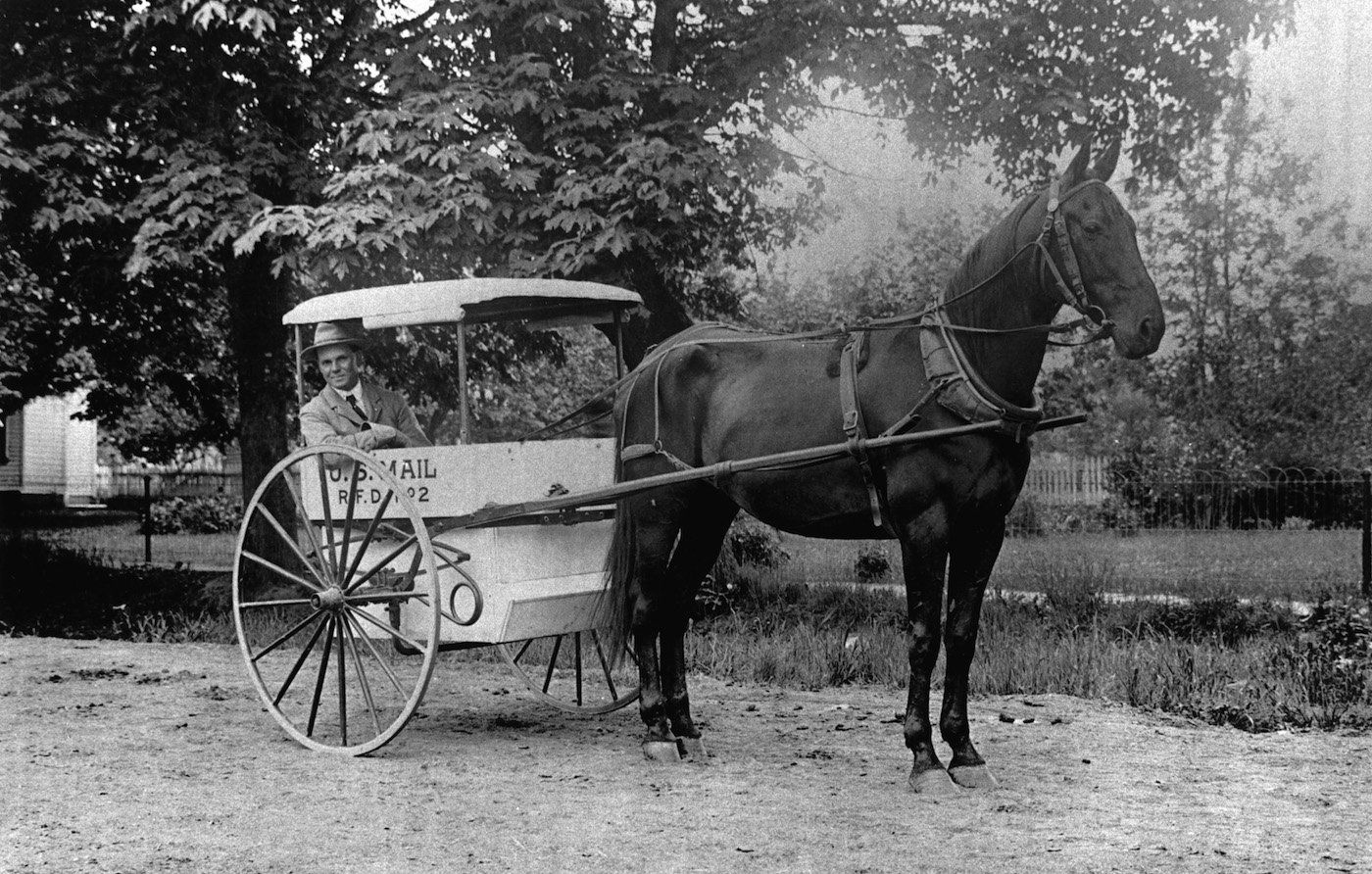
“But with the postal service, if you map out where post offices were and where they were being built, you get an unprecedented look at how the West was being developed in the 19th century,” explained Blevins. “Effectively, there was a post office for every town in the West in the 19th century.”
He reasoned that if he could find data on the locations of each (or most) of these post offices, he could construct a visualization of the geography of the postal network and understand how the West developed.
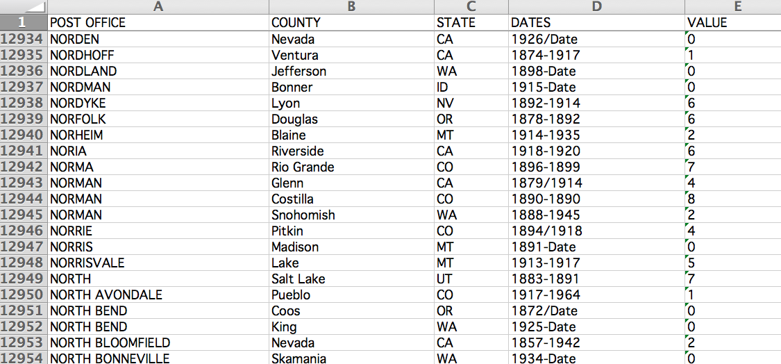
Finding the data, though, proved to be an arduous journey. The U.S. postal service didn’t have a comprehensive record of its 19th century post offices. He spent years laboriously transcribing every post office he could find in old microfilmed records.
The big break
But then he stumbled upon the work of Richard Helbock, a diligent stamp collector who spent decades of his life transcribing and building a database of post offices.
Helbock had compiled data on approximately 160,000 post offices that have existed or currently exist in the U.S., along with information on when they opened and when they closed. Helbock sold the database to stamp collectors to judge the value of stamps. Stamps that originated from post offices that were only open for a couple of years command a high price.
“I was very interested in the data he was compiling so I bought the database; by far and away the best 80 bucks I ever spent,” he said.
Visualizing the data with D3
Once he cleaned the stamp collector’s dataset to the 19th century time frame he was interested in exploring, Blevins ran into the question of how to visualize the results.
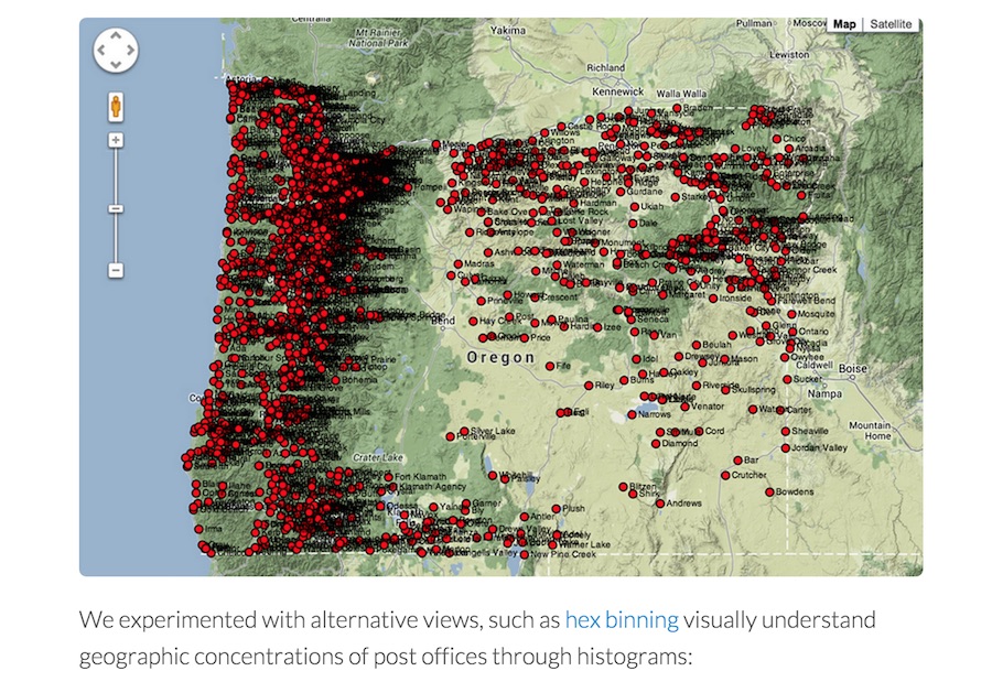
“We needed to visualize thousands of data points across 50 odd years,” explained Blevins. “But actually being able to chart out where, how quickly, and when this expansion happened can’t be done without a visualization tool. I had a fuzzy idea of how I wanted to visualize this on a map.” So Blevins enlisted the help of historian and programmer Jason Heppler, an academic technology specialist at Stanford’s history department.
Heppler and a couple of undergraduate research assistants at the Center for Spatial and Textual Analysis at Stanford built a visualization with Blevins using the Javascript library D3. Blevins and Heppler wanted to learn and use D3 because of its widespread use at news outlets like The New York Times. “It’s quickly becoming the industry standard,” said Blevins.
Visualizations that complement rather than tell the whole story
Blevins thinks that digital historians must make clear the role their visualization is playing. “There’s a distinction between visualizations that themselves tell a story and visualizations that you can use to tell a story,” said Blevins. “You need to be clear in what you’re trying to do. A visualization doesn’t necessarily articulate a narrative but rather allows people to interact with it.” In Blevins’ case, his dissertation was research that used the D3 visualization of the post office data to complement his narrative and findings.
Blevins, who is set to start a postdoctoral fellowship at Rutgers University this summer, wants to turn the “Geography of the Post” into a book and make the online visualization more interactive. “Instead of having it be open-ended without guidance, you could tell a narrative weaving in examples from the visualization. Someone could look at something, zoom out, and look at it in context.”
When Blevins starts his research at Rutgers’ history department, he’ll continue tapping the latest tools for finding, interpreting and telling historical stories with data.


