Tips on data visualization from the Broad Institute’s Bang Wong
Last month, Bang Wong, creative director of the Broad Institute of M.I.T. and Harvard University, visited Northeastern University for a talk entitled “Art and Science: A partnership catalyzing discovery in biomedicine” hosted by NUVis, Northeastern’s Visualization Consortium.
Wong – who works on biomedical visualization projects that are at once blindingly esoteric and visually stunning – shared several insights that students of information design and data storytelling can take to heart.
Gestalt principles should apply to scientific visualizations
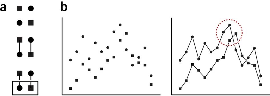
“We’re constantly trying to maximize simplicity while visualizing complexity,” says Wong, referring to two letters he wrote in Nature Methods in 2010 about 1920’s German Gestalt principles. “Gestalt principles of perception are theories proposed by German psychologists in the 1920s to explain how people organize visual information,” writes Wong. The way objects are grouped can have a significant effect on the comprehension of a visualization, he says.
“As readers, we tend to see things that are similar to be more related than things that are dissimilar,” he writes in Nature. For example, we are inclined “to group objects when they are made to look alike, are placed near one another, are connected by lines or are enclosed in a common space,” Wong writes on his website.

Beware heatmaps
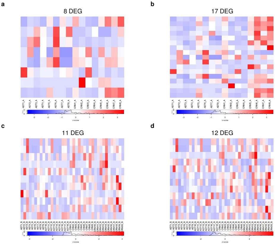
Scientists, and biologists in particular, are fond of using heatmaps to plot multivariate data across several rows and columns. But while representing numbers with colors in this way can be useful – and even yield scientific insights – many heatmaps obscure more than they elucidate, warns Wong.
“Color hue does not always work,” says Wong. “The common agreement is that we can tell 8 to 12 colors apart. Anything more and it gets very difficult.” Data encoded across a three-hue color gradient, for example, can be easy to interpret. Distinguishing between more than three shades of blue, however, is difficult, he says. Grayscale, even with 10-90 percent black hues, works well. But red-green should be avoided, says Wong, especially if designing for the colorblind.
There is always a tradeoff between accurate coding and making a visualization compelling
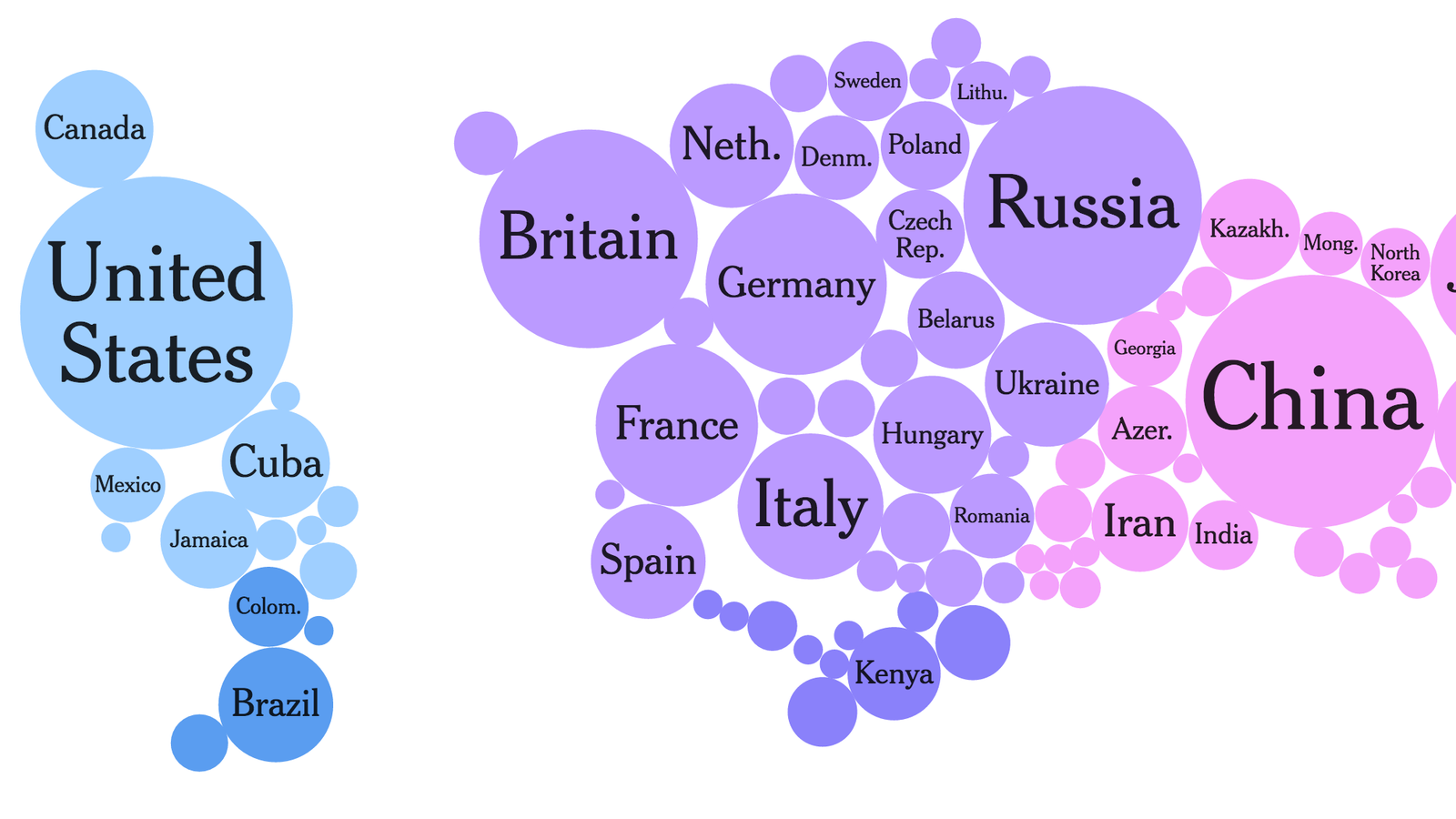
“Imagine showing this New York Times visualization as a bar chart,” Wong says, referring to a map where the size of a country’s bubble corresponded to its Olympic medal count. While the bar chart would allow the reader to more accurately read medal count values and directly compare countries, it wouldn’t reflect the geographic nature of the data nor be as interesting, says Wong. “It would be a very different sort of feeling and not as compelling. There are tradeoffs and we have to make decisions about how things are presented.”

We can develop a sixth sense for looking at visuals
Citing the article “Learning to See Data” by Benedict Carey, a science reporter for The New York Times, Wong says that researchers in the field of perceptual learning are showing that people can learn to extract meaningful patterns instantaneously from data visualizations. “We can develop a sixth sense for looking at visuals,” says Wong. As long as there’s a willingness on both sides, meaning the designer and the viewer, says Wong, “together we can elevate the role of these visualizations.”


Looks very relevant. Come to RISD for a workshop?