Using data and design to compare corruption and transparency across 50 U.S. states
With Senate confirmation hearings for President-elect Donald Trump’s Cabinet picks happening this week, questions of conflicts of interest and financial disclosure are top of mind.
Northeastern University journalism professors John Wihbey and Mike Beaudet, along with Information Design and Visualization professor Pedro Cruz and graduate student Irene de la Torre Arenas, recently published an analysis and visualization comparing the extent of corruption and transparency at the state level.
“The State Financial Disclosure Project,” which was referenced today in The Washington Post and last October in an op-ed in The New York Times, marries the complex investigation of accountability in state politics with the creative, representational side of information design.
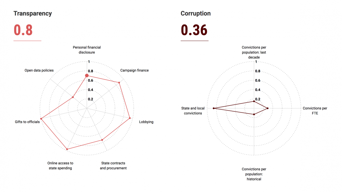
“What we did was try and show the relationship between transparency and corruption across the 50 U.S. states,” says Wihbey, who together with Cruz sat down with Storybench to discuss the project’s origins and development.
Why embark on this project and what were you trying to convey?
Wihbey: Public corruption remains a huge issue in our democracy. It remains a top priority for the F.B.I., and following the 2016 election, questions of political ethics are front and center. The primary research question we were looking at is related to the degree and nature of personal financial disclose at the state level. Of course, there are a lot of areas that are important in terms of detecting and deterring conflict of interest and corruption – like state budgeting, gifts, lobbying, campaign financing. Our contribution was targeted toward financial disclosure specifically.
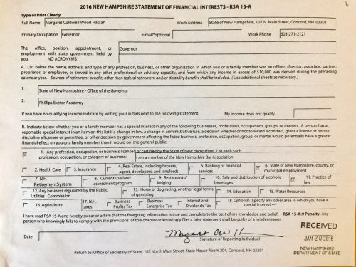
We wanted to get a hold of the forms for each state, talk to the ethics commissions, do a lot of comparison, and try to understand what’s being done and how it’s being done. Then we wanted to fit that information, which in and of itself is only part of the story, into a larger pattern around transparency and corruption, and compare the states.
We tried to build on the work of other public administration and political science scholars who study corruption – whose work often doesn’t get enough attention from journalists – and on the work of great accountability-oriented groups such as the Center for Public Integrity, the Sunlight Foundation and the National Institute on Money in State Politics. Some of our quantitative ratings and measures integrate data from these other sources, giving it a bit of a ‘meta-analysis’ dimension. We also wanted to help inform citizens, so there are some guides and materials for non-specialist users on the site we built.
Cruz: I’m always interested in doing visualization for the general public, even more if the aim is to create awareness of the society for the society. From my perspective, this project exposes information that, although not actively hidden, is passively masked, and this results in a visualization that has an interventional role. When you put the words intervention and visualization close to each other, I’m on it.

The lines, shapes and colors are so vivid. What metaphors were you playing with?
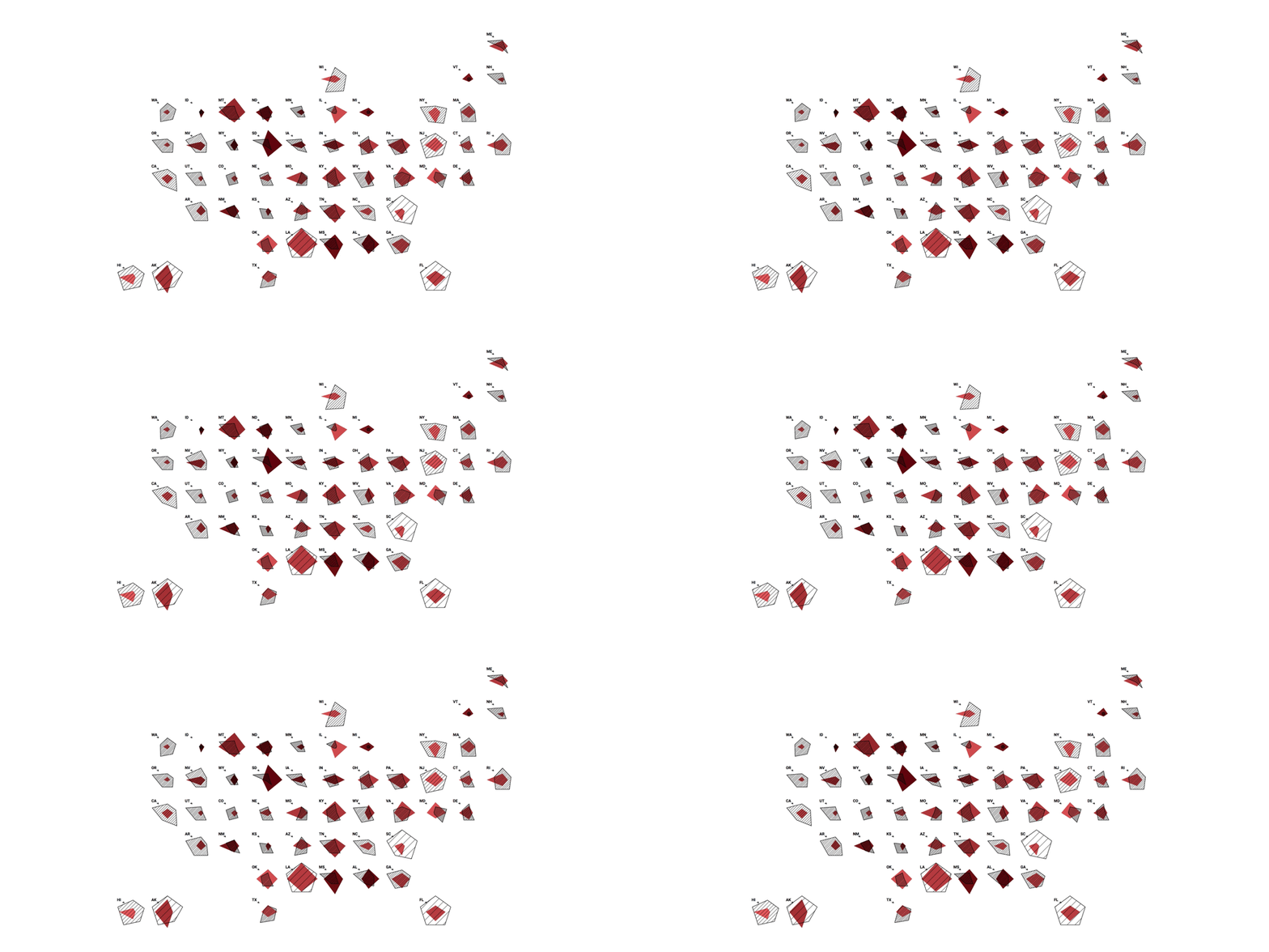
Cruz: Indeed, I often used bright reds in order to call for attention, mainly when the data indicated that the metrics on transparency and corruption could be better. The geometrical shapes that we used enable us to distance ourselves from the choropleth maps that we are tired of reading. From experience, stepping a bit into the unfamiliar is key to make a visualization stand or stick. These shapes are not randomly built, though. They are derived from the data itself, where the area of the shapes works as a rough visual estimate of how high, overall, the metrics are. The data – and intention – of the visualization are sharp, and so too are the edges and corners of the forms at play.
Why did you feel it was important to team up with an information designer?
Wihbey: Pedro had done some really brilliant, thematically similar work with respect to Portuguese public officials, and so we immediately bonded over that. We also recognized that journalistic visualizations, while they can be quite sophisticated and elegant, are often fairly conventional. Part of the mission of our project is to push the boundaries a bit in terms of mashing up data art and data journalism. Sometimes you get breakthroughs when you mash together different disciplines and fields, and we’ll look to continue in that direction. It was crucial to partner with an information designer in order to think about design creatively, and from first principles – to not be locked into conventional ways of thinking. Of course, we want to do more user testing and imagine other prototypes as we move forward, whether with this data or new research directions.
You convey several dimensions of info in one place. What kind of decisions did you make with this particular dataset and what challenges did you face?
Cruz: There are three main dimensions at play: disclosure scores, transparency scores, and corruption scores. The main contribution of this research, as John and Mike put it, is the disclosure score that they devised, so primacy should be given to 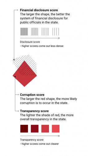 it; so it is mapped to its own shape. Transparency and corruption are collapsed together into another shape. But the thing with disclosure is that it should reward the states that were evaluated as having better results, meaning that it should draw attention to them. But the question was: How to make something that it is bigger, that draws more attention to look at, be at the same time more “transparent”?
If we just played with transparency, then a state with a good disclosure score would be big but invisible. In order to solve this, we played with the density of lines used to fill the shape of the disclosure score. You can still see that a particular state is big, that it scored high, but at the same time you get the impression that you can better look through it. A sparse density of lines on a big shape make it as present as a thick density in a small shape. The metaphor is that higher transparency scores let you look better into other layers of information behind it.
What tools did you use to build this visualization and what advice do you have for students learning to use tools like D3?
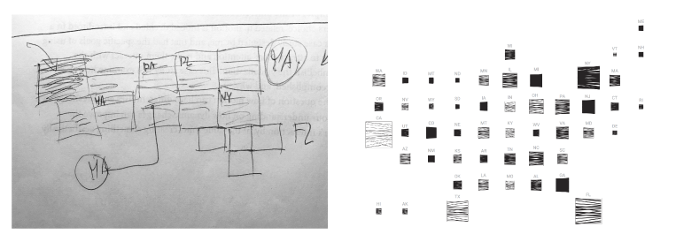
Cruz: The bulk of the implementation work was done by Irene de la Torre Arenas using D3. We used D3 because it enabled us to adapt its graphical visualization models to our sketches. There are times when D3 is not the best option depending on how “outside the box” you want your visualization to look. Jumping right into D3 can bring many creative restrictions if you don’t verse yourself enough in a bit of pure Javascript beforehand. On the other hand, D3 can vertiginously speed up the process of developing visualizations for the web if it fits into its recipe list.
What kind of conversation do you hope this project spurs?
Wihbey: There’s a big conversation going on about federal ethics but we continue to feel, as most state and local reporters do, that this is a conversation that needs to take place as the headcount at newsrooms and the numbers of people who have skills and time to look at transparency and politics has diminished.
“The State Financial Disclosure Project” involved the work of Matt Tota, Sophia Fox-Sowell, Aneri Pattani, Emily Hopkins, Emily Turner, and Gail Waterhouse.
