And the winner for best election forecaster goes to… The New York Times
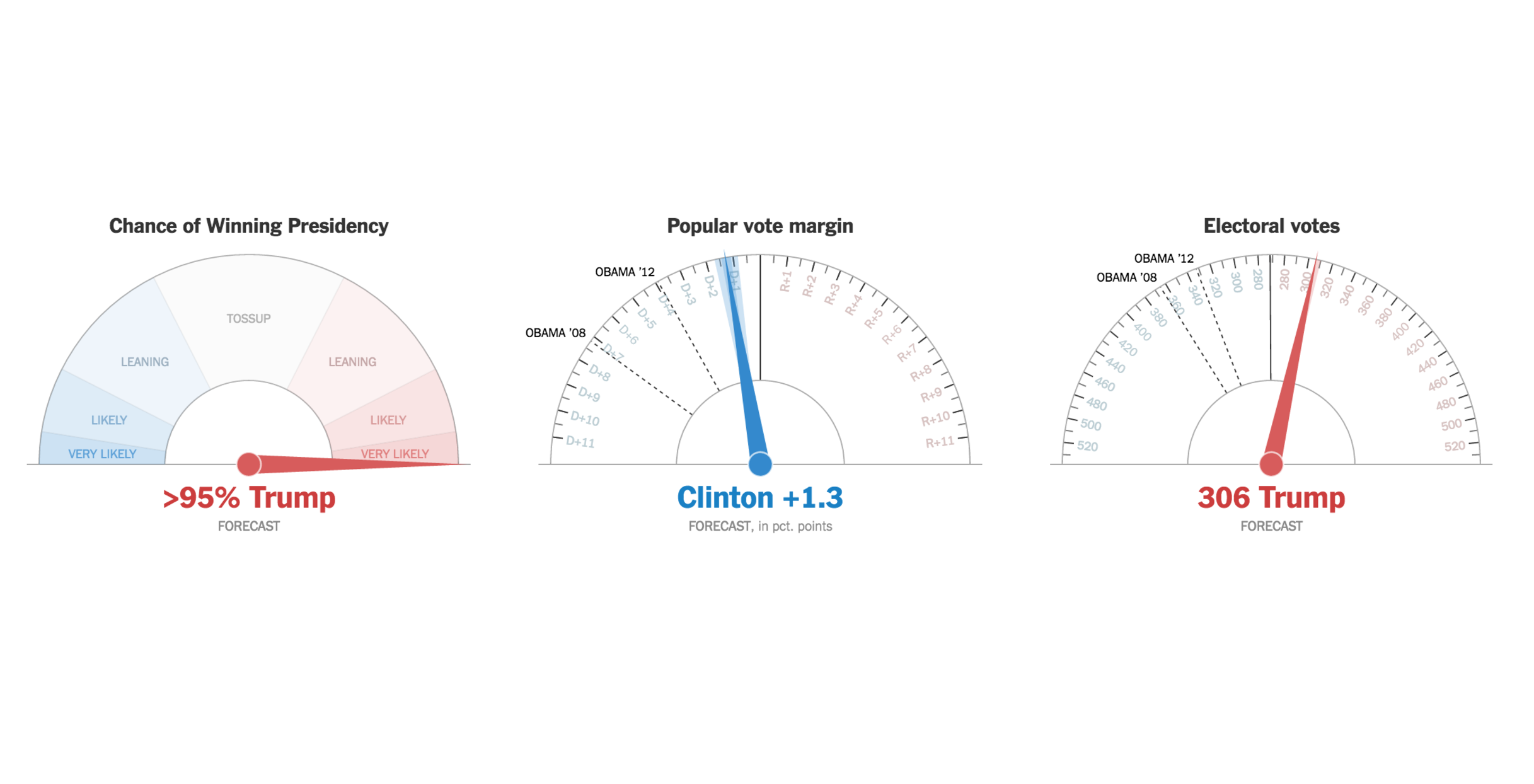
The New York Times pushed the boundaries of live data visualization on Election Night with a second-by-second Live Presidential Forecast application. Using Associated Press results from precincts across the country, the tool projected the election using stylized speedometers with the categories very likely, likely, leaning, and tossup.
The tool effectively portrayed the projections of electoral votes, the popular vote, and the chance of winning the presidency at a given moment as pointers leaned towards Clinton’s blue side or Trump’s red side. Twitter, for its part, was very appreciative of the live tracker:
https://twitter.com/jarehart/status/796190634034024448
Wow. Here is @nytimes' latest: Trump with 95% certainty. pic.twitter.com/TeR74O8XPR
— Cole Knaflic (@storywithdata) November 9, 2016
This graphic from @nytimes has been fascinating to watch throughout the entire evening. pic.twitter.com/1Pttf1i3tq
— Drew Smillie (@DrewSmillie) November 9, 2016
The app also provided insight as to how the race for the White House was playing out state-by-state. Speedometers were created for each state, like Michigan, one of the biggest battleground states of the night.
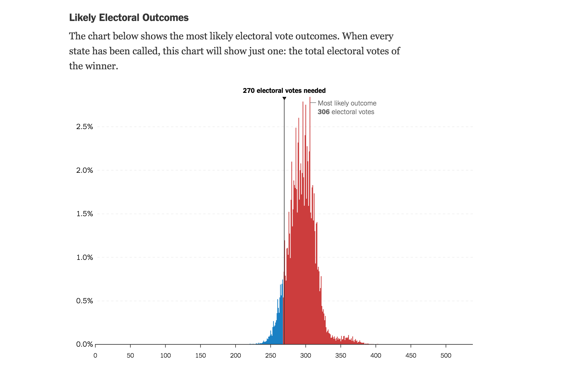
The Live Presidential Forecast app also provided line charts visualizing how the race was changing through the night. These trackers also visualized data from previous elections.
The Times’ Gregor Aisch, Nate Cohn, Amanda Cox, Josh Katz, Adam Pearce and Kevin Quealy built the app.
It's like a television, but without all the meaningless words repeated over and over. https://t.co/gVeSqhnMPi pic.twitter.com/OhMc3TLoab
— Kevin Quealy (@KevinQ) November 9, 2016
- SXSW: ‘Excel is okay’ and other tweet-size insights for data journalists and news nerds - March 17, 2018
- NICAR: Data stories from last year that you could be doing in your newsroom - March 13, 2018
- How to scrape Reddit with Python - March 12, 2018