Exploring Chicago rideshare data in R
Last month, the City of Chicago released detailed rideshare data from companies like Uber, Lyft and Via, making it the first city in the country to share anonymized data on ride-hailing companies.
While the trip dataset covers only November and December of 2018, the passenger behavior it contains can reveal insights about how people are using the ride-hailing platforms – all of which is interesting to journalists, data scientists and marketing teams, which is why we wrote up this tutorial.
Import data
These files are huge, so we took a 10 percent sample. We also removed all missing data because some rides occurred outside Chicago. Read more about this in the data dictionary here.
rides <- readr::read_csv("Transportation-Network-Providers-Trips.csv.crdownload") %>%
  dplyr::sample_frac(size = .1)
Wrangle
The trip start and end times came into RStudio as factors, with AM and PM in 12-hour format. These needed to be converted to dates in a 24-hour format, in a local timezone. We also created ride hour, day of the week, week, and date variables for the trips.
# filter for only Chicago rides
# Based on our data dictionary Pickup.Centroid.Latitude will be left blank for
# locations outside Chicago
rides.chicago <- rides %>%
  tidyr::drop_na()

# rides.chicago %>% dplyr::glimpse(78)

# drop original data for convenience
# rm(rides)

# convert 12 hour format to 24 hr format and extract date features of our
# ride events
rides.chicago$ride_start <- as.POSIXct(rides.chicago$Trip.Start.Timestamp,
                                       format = '%m/%d/%Y %I:%M:%S %p',
                                       tz = "America/Chicago")

# create ride_hour, dow, weekday, week, date_week, trip.mins
rides.chicago$ride_hour <- lubridate::hour(rides.chicago$ride_start)
rides.chicago$dow <- base::weekdays(rides.chicago$ride_start)
rides.chicago$week <- lubridate::week(rides.chicago$ride_start)

rides.chicago$date_week = as.Date(cut(rides.chicago$ride_start, "week"))
rides.chicago$trip.mins = as.Date(cut(rides.chicago$ride_start, "week"))


# create category for each ride's time of day
rides.chicago <- rides.chicago %>%
  mutate(ride_category =
           case_when(
             ride_hour >= 5 & ride_hour <= 10 ~ "morning commute",
             ride_hour > 10 & ride_hour <= 12 ~ "late morning",
             ride_hour > 12 & ride_hour <= 17 ~ "afternoon",
             ride_hour %in% c(18,19) ~ "evening commute",
             ride_hour %in%  c(0, 1,2,3,4,20,21,22,23,24) ~ "night life"))

# set levels for ride_category
rides.chicago$ride_category <- factor(rides.chicago$ride_category ,
                                      levels = c("morning commute",
                                                 "late morning",
                                                 "afternoon",
                                                 "evening commute",
                                                 "night life"))

# set levels for day of week
rides.chicago$dow <- factor(rides.chicago$dow , levels = c("Monday",
                                                           "Tuesday",
                                                           "Wednesday",
                                                           "Thursday",
                                                           "Friday",
                                                           "Saturday",
                                                           "Sunday"))

# create tippers and non-tippers
rides.chicago <- rides.chicago %>%# count(Tip)
  dplyr::mutate(tipper =
                  case_when(Tip == 0 ~ "no tip",
                            TRUE ~ "tip"),
                tipper = factor(tipper))
Visualize
We like to start by visualizing the entire dataset to ensure there isn’t any corruption, missing data, etc. The three packages that are great for this are skimr, visdat and inspectdf. All three packages come with a slew of functions for visualizing your data and underlying variable distributions.
library(skimr)
library(visdat)
library(inspectdf)
# check for NAs
inspectdf::inspect_na(rides, show_plot = TRUE)
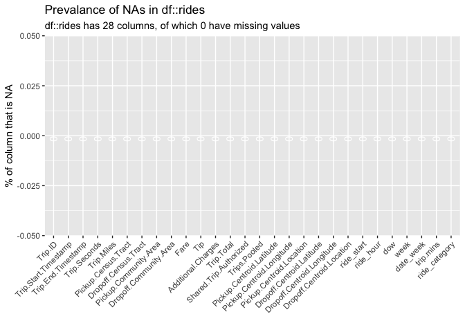
#> # A tibble: 28 x 3 #> col_name cnt pcnt #>#> 1 Trip.ID 0 0 #> 2 Trip.Start.Timestamp 0 0 #> 3 Trip.End.Timestamp 0 0 #> 4 Trip.Seconds 0 0 #> 5 Trip.Miles 0 0 #> 6 Pickup.Census.Tract 0 0 #> 7 Dropoff.Census.Tract 0 0 #> 8 Pickup.Community.Area 0 0 #> 9 Dropoff.Community.Area 0 0 #> 10 Fare 0 0 #> # … with 18 more rows # summarize data types inspectdf::inspect_types(rides, show_plot = TRUE)
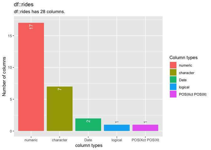
#> # A tibble: 5 x 4 #> type cnt pcnt col_name #>#> 1 numeric 17 60.7
#> 2 character 7 25 #> 3 Date 2 7.14 #> 4 logical 1 3.57 #> 5 POSIXct POSIXt 1 3.57
The problem
Lyft can increase long term value (LTV) and share of passenger transportation budget by targeting high intent times where passengers are most in need of rides. For instance, these might be commuting to and from work, or going out at night on the weekend.
Meeting passengers with timely messaging and personal solutions presents a measurable opportunity to increase LTV.
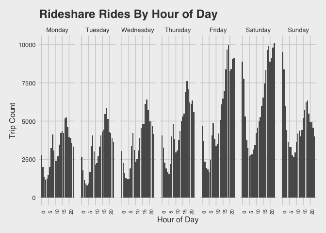
Visualize the trips by hour of the day
We know we want to see trips across at least two levels (day or the week, and time of the day). The visualization below displays the number of trips taken per hour of the day across the days of the week.
Specifically, the rides.chicago data frame is piped (%>%) over to the ggplot2 functions to create histograms, and then faceted by the days of the week to show the rides-per-hour breakdown across each day.
library(ggthemes)
# trips by hour of day
ggRideCountPerHour <- rides.chicago %>%

  ggplot(aes(x = ride_hour)) +

  geom_bar() +

  facet_grid( ~ dow) +

  ggthemes::theme_fivethirtyeight() +

  theme(axis.title = element_text()) +

  labs(title = "Rideshare Rides By Hour of Day",

       x = 'Hour of Day',

       y = 'Trip Count') +

  theme(axis.text.x  = element_text(size = 8,

                                    angle = 90))

ggRideCountPerHour
Tips by ride duration
The plot below shows the tips given at different trip durations. We can sample our data using dplyr::sample_frac() function from for a more manageable data set. We group these data by the two variables of interest (tipper and ride_category), then create a mean of the trip duration (mean_trip_mins) for a more interpretable visualization across these groups.
rides.chicago %>%
  # create trip_mins
  mutate(trip_mins = (Trip.Seconds/60)) %>%
  # get sample
  dplyr::sample_frac(size = .05) %>%
  # group by two variables of interest
  group_by(tipper, ride_category) %>%
  #
  summarize(mean_trip_mins = mean(trip_mins),
            rides = n()) %>%
  # ungroup
  ungroup() %>%

  ggplot(aes(x = mean_trip_mins,

             y = ride_category,

             label = rides)) +

        geom_line(aes(group = ride_category),
                  color = "gray50") +

        geom_point(aes(color = tipper),
                   size = 1.5) +

        geom_text(aes(label = rides), nudge_y = 0.2, size = 3) +

    ggthemes::theme_fivethirtyeight() +

    theme(axis.title = element_text(size = 10)) +

    theme(axis.text.x  = element_text(size = 8, angle = 45)) +

    ggplot2::labs(x = "Average trip in minutes",

                y = "Time of day",

               title = "The Ride time gap",

               subtitle = "difference in average trip times by tippers")
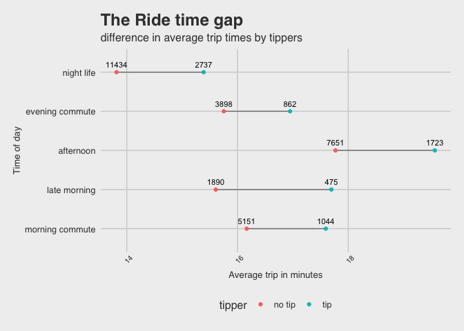
What did we learn?
Motivating passengers to engage in tipping is another source of payment that benefits drivers. Although tipping is clearly less common than not tipping, this is a place where learning more about the factors influencing tip behavior could be interesting.
Tipping and Ride Duration
For riders who do tip, we want to know what the relationship is between the amount of the tip and the duration of the ride. The graph below displays these two variables across time of day.
# tips by ride duration
ggTipsRideDuration <- rides.chicago %>%
  # get sample
  dplyr::sample_frac(size = .05) %>%
  # remove people who didn't tip at all
  dplyr::filter(tipper == "tip") %>%
  # create a trip.mins for converting duration of secs to mins
  mutate(trip.mins = (Trip.Seconds/60)) %>%
  # plot Tip by trip.mins
  ggplot(aes(x = trip.mins,
             y = Tip,
             # color = tipper,
             group = ride_category)) +
  # points
  geom_point(aes(color = ride_category),
             alpha = 1/2,
             size = 0.7,
             show.legend = FALSE) +
  # facet by ride_category
  facet_wrap(~ ride_category,
             ncol = 3,
             scales = "free_x") +
  # add linear smoothing line
  stat_smooth(se = TRUE,
              col = "blue") +

  ggthemes::theme_fivethirtyeight() +

  theme(axis.title = element_text()) +

  labs(title = "Rideshare Tips By Ride Duration",
       x = 'Ride Duration (minutes)',
       y = 'Tip')

ggTipsRideDuration
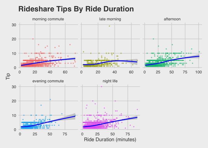
We can see that there isn’t much of a predictable influence of ride duration on tipping behavior, with maybe the exception of “night life” rides. This is an interesting finding because it contrasts very different use cases (commuter vs. leisure time rides).
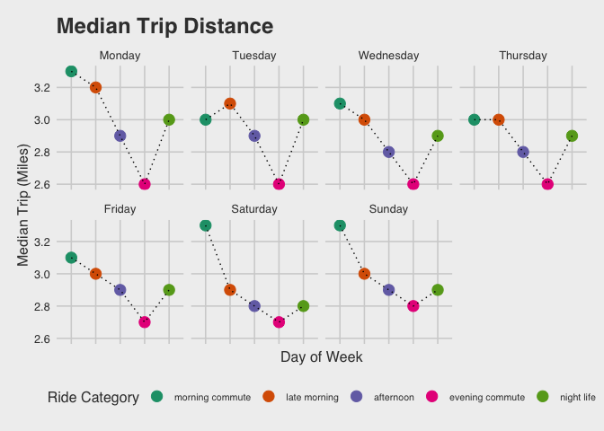
ggTripDistance <- rides.chicago %>%
  group_by(ride_category, dow) %>%
  summarize(median_trip_dist = median(Trip.Miles)) %>%
    ggplot(aes(y = median_trip_dist,
                x = ride_category)) +
    geom_point(aes(color = ride_category),
             size = 4,
             show.legend = TRUE) +
    geom_line(aes(group = 1),
            linetype = 'dotted')  +
    facet_wrap(~dow, nrow = 2) +
    scale_color_brewer(palette = "Dark2") +
    theme_fivethirtyeight() +
    theme(axis.title = element_text(),
        axis.text.x  = element_blank(),
        legend.text = element_text(size = 8)) +

  guides(color = guide_legend(title = "Ride Category",
                      labels = c("morning commute",
                                "late morning",
                                "afternoon",
                                "evening commute",
                                "night life"))) +
      # this is for the legend on the graph
  ylab("Median Trip (Miles)") +
  xlab("Day of Week") +
  ggtitle("Median Trip Distance")
ggTripDistance
Longer ride durations will generate more revenue for both drivers and the ride share service. This maybe a useful signal of LTV if these passengers have a regular use case for taking these longer rides.
Next steps
What have we observed?
Rideshare trips tend to be clustered around early morning commute hours and “night life” hours. The surge in “night life” hours is particularly pronounced on Fridays and Saturdays, not surprisingly, with a sharp decline Sunday evening.
In addition we can see that there are behavioral gaps that influence our passenger’s engagement with both the product and their drivers. One of those behaviors it tipping. Tipping is infrequent overall, but the time of day appears to influence a passenger’s willingness to tip more than the duration of the ride. Longer rides tend to occur early in the week, which suggests a possible passenger scenario where an initial trip is required for the week (such as consultants who only travel early in the week to get to their clients).
These visualizations have helped us uncover some trends and relationships between time, frequency and behavior in the Chicago ride share data. The next step might be a static report, Powerpoint presentation, or PDF. Ideally, we would be able to come up with an intervention, design an experiment, and build a dashboard that would allow real-time data and ongoing results of our investigation.
Peter is an entrepreneurial minded data scientist whose expertise in building analytic solutions and insights to tell data driven stories have impacted organizations including Alibaba, Citrix and Lyft. Peter has lead experimentation design and analytics projects focused on retention, user acquisition and channel optimization in the SaaS and rideshare spaces. The solutions he has produced include incrementality testing, segmentation, ML models and fraud. Peter is a passionate advocate for building analytics teams in cross-functional environments.
- Exploring Chicago rideshare data in R - May 7, 2019