Using French wine reviews to understand TF-IDF, a measure of how unique a word is to a document
“The heady scent of grapefruit and tangelo peel immediately add savoriness to the crisp green-apple fruit that is evident on the nose. But there are also richer hints of honey and yellow apple. The palate remains taut, slender and linear but that tangelo spice is boosted by enticing herbal notes of yarrow and a dollop of yeast. This is an aromatic marvel. The finish is dry and intense. This will keep your interest for years. Drink now through 2035.”
Whether you’re analyzing their evocative language or comparing prices and points, wine reviews are very interesting from a data visualization and textual analysis perspective. Points and bottle prices, for instance, allow for comparisons and correlations between countries, regions, grape varieties, and more. And seeing as how wine is so intimately tied to its geography, it makes sense for us to visualize differences between regions and countries.
This tutorial using R Studio will focus on a valuable method in textual analysis – TF-IDF, or term frequency-inverse document frequency, which surfaces words that are unique to a document by dividing the term’s overall frequency with how common or rare it is across documents. More explanations here and here.
The following analysis uses a dataset of 150,000 reviews scraped in November 2017 from Wine Enthusiast by Kaggle user Zach Thoutt.
Load in the data
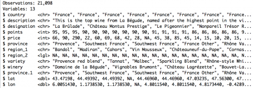
We’ll use the tidyverse and ggplot2 packages to load in and look at the data, which is stored in a csv. The glimpse() function reveals that Thoutt has scraped the following columns from the Wine Enthusiast website: country, description, designation, points, price, province, region_1, region_2, variety and winery. Great!
library(tidyverse)
library(ggplot2)

dataset <- read.csv("winemag-data.csv",
                          header=TRUE, stringsAsFactors=FALSE)
dataset %>% glimpse(102)
Do some quick descriptive statistics
The first thing I like to do is get an idea of the boundaries of the dataset. Using the following R code, I can get a min, max, mean, standard deviation and quantile breakdown for my numerical columns (in this case, price and points). I’ll include na.rm = TRUE with any function that throws an error – it turns out blank spaces and non-numbers tend to confuse R Studio.
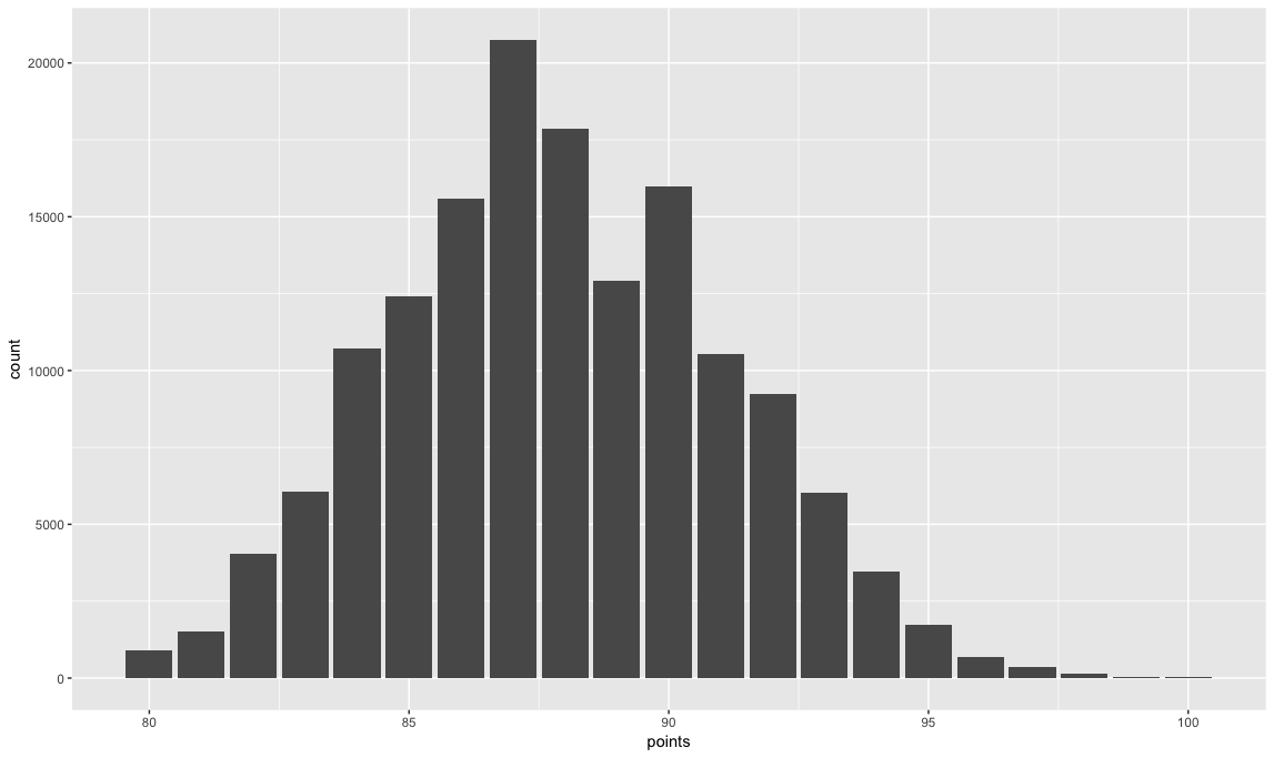
> min(dataset$points)
[1] 80
> max(dataset$points)
[1] 100
> mean(dataset$points)
[1] 87.88842
> sd(dataset$points)
[1] 3.222392
> quantile(dataset$points, na.rm = TRUE)
  0%  25%  50%  75% 100%
  80   86   88   90  100
Notice the points range from 80 to 100, have a mean of 87.89 and a standard deviation of 3.22. We can visualize this normal distribution these with a ggplot2 histogram.
ggplot(dataset, aes(points)) + geom_histogram(stat = "count")
Now, for the prices…
> min(dataset$price, na.rm = TRUE)
[1] 4
> max(dataset$price, na.rm = TRUE)
[1] 2300
> mean(dataset$price, na.rm = TRUE)
[1] 33.13148
> sd(dataset$price, na.rm = TRUE)
[1] 36.32254
> quantile(dataset$price, na.rm = TRUE)
  0%  25%  50%  75% 100%
   4   16   24   40 2300
Notice the price ranges from $4 to $2300 per bottle, with an average cost of $33.13. The quantiles give you a sense of the distribution of the prices – most of the dataset is $40 and under. So let’s only look at wines under $100 with a histogram.
ggplot(subset(dataset, price <= 100), aes(price)) +
  geom_histogram(stat = "count")
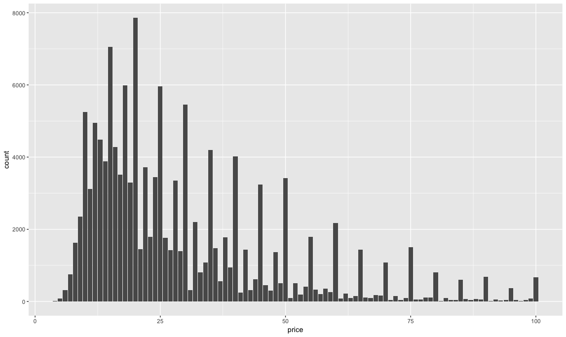
Prices tend to jump by $5's and most of the wines reviewed on the site are under $25.
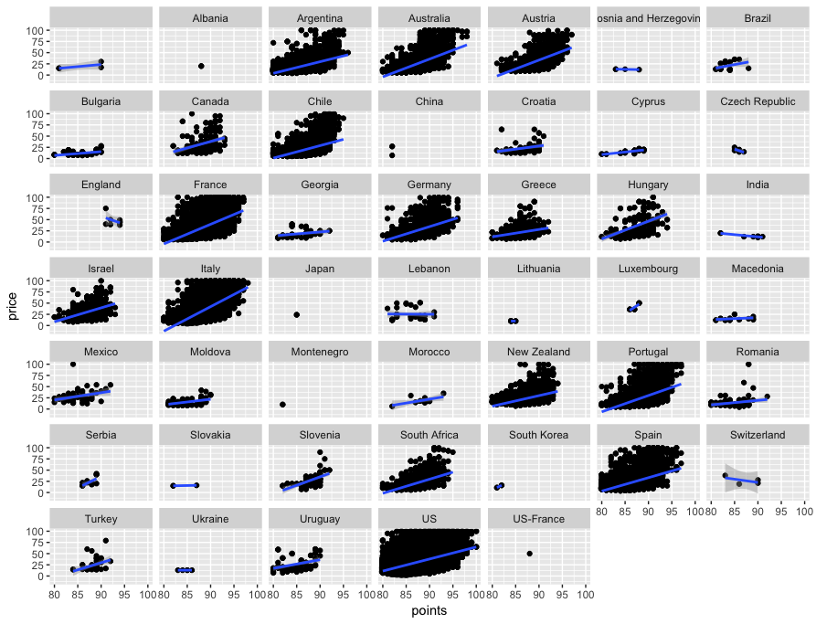
A quick scatterplot of the data will help us compare correlations between price and points. And why not use ggplot's facet_wrap feature to look at scatterplots of every country at once? I'll use subset(dataset, price <= 100) instead of the full dataset to cut out all those expensive outliers that will throw off ggplot's geom_smooth linear regression line. Look at the slopes on Italy, France and Australia.
ggplot(subset(dataset, price <= 100), aes(x=points, y = price)) +
  geom_point() +
  geom_count() +
  geom_smooth(method='lm') +
  theme(legend.position = "none") +
  facet_wrap(~country)
Looking at wine reviews by region
First, let's filter down to just reviews about French wine.
dataset_filtered <- dataset %>%
  filter(country == "France")
Next, we'll use the tidytext package, which you can learn to use here, to select our filtered dataset, split every review into its constituent words with unnest_tokens, remove stop_words like "and" and "the," remove the word "wine" because it appears too often, group by province and then count the words with tally().
library(tidytext)

tokenized_comments <- dataset_filtered %>%
  select(description, designation, points, price, province, region_1, variety, winery) %>%
  unnest_tokens(word, description) %>%
  anti_join(stop_words) %>%
  filter(word != "wine") %>% # need to take out the word "wine"
  group_by(province, word) %>%
  tally()

tokenized_comments %>% glimpse()
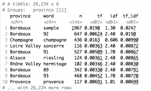
Looking at tokenized_comments, we'll see 26,234 rows with a count of words grouped by province. That's easy to visualize with ggplot2:
tokenized_comments %>%
  group_by(province) %>%
  top_n(15) %>%
  arrange(desc(n)) %>%
  ggplot(aes(x = reorder(word, n), y = n, fill = factor(province))) +
  geom_bar(stat = "identity") +
  theme(legend.position = "none") +
  facet_wrap(~ province, scales = "free") +
  coord_flip() +
  labs(x = "Frequency",
       y = "Top words",
       title = "Top words used in Wine Enthusiast reviews of French wines by province",
       subtitle = "")
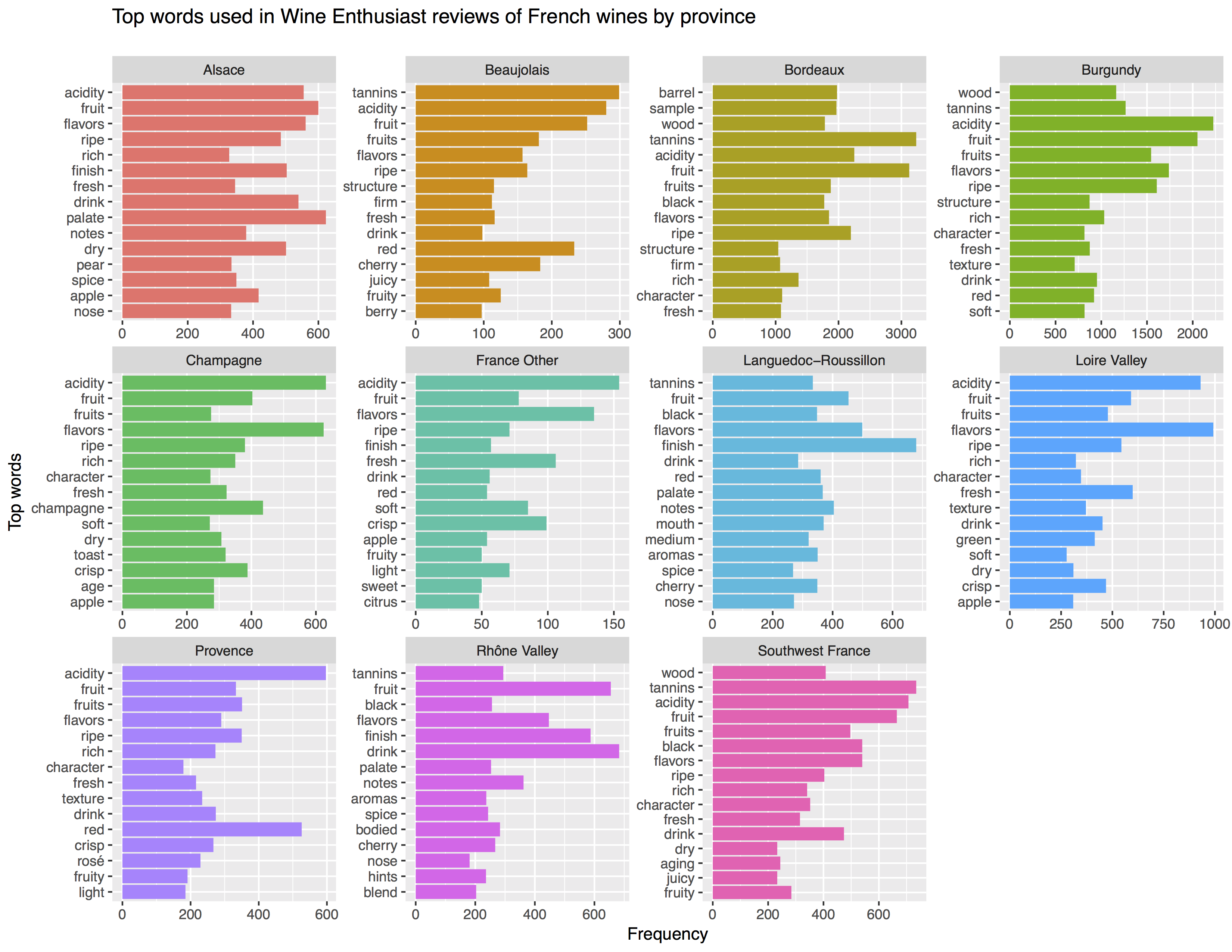
This gives us the top 15 most frequently used terms by province in the dataset. But it doesn't surface unique words. That's why we turn to TF-IDF.
Using TF-IDF to surface terms unique to each province
Silge and Robinson have made it super easy to employ TF-IDF by baking it into their tidytext. package under the bind_tf_idf function.
tf_idf_words <- tokenized_comments %>%
  bind_tf_idf(word, province, n) %>%
  arrange(desc(tf_idf))
tf_idf_words
For each word and province, the following table is calculated. What's clear is that a lot of Wine Enthusiast reviews are written by folks lucky enough to taste samples of Bordeaux wines. If you arrange by arrange(desc(tf)) or arrange(desc(n)) you can make conclusions about the most frequently used terms (n) and the most popular terms as a proportion of total words used in all reviews for a province (tf).
The next step is to remove words that are throwing off the analysis by virtue of appearing very frequently in a single category, like "sample," "barrel," province names like "bordeaux" and "provence." I'm also using the stringr library to detect and remove any word starting with an 8 or a 9 to remove mentions of points. We'll use the top_n(15) function to isolate the top 15 terms for each province.
library(stringr)

tf_idf_words %>%
  filter(!str_detect(word, "^8")) %>%
  filter(!str_detect(word, "^9")) %>%
  filter(word != "sample") %>%
  filter(word != "barrel") %>%
  filter(word != "bordeaux") %>%
  filter(word != "loire") %>%
  filter(word != "beaujolais") %>%
  filter(word != "champagne") %>%
  filter(word != "provence") %>%
  top_n(15) %>%
  arrange(desc(tf_idf)) %>%
  ggplot(aes(x = reorder(word, -tf_idf), y = tf_idf, fill = province)) +
  geom_col() +
  labs(x = NULL, y = "tf-idf") +
  coord_flip() +
  theme(legend.position = "none") +
  facet_wrap(~ province, scales = "free")

To a French wine connoisseur, the words surfaced by TF-IDF will mostly come as no surprise:
- Grenache and Syrah are wine grape varieties that are typical of the Rhône and Provence and they appear highly ranked in those categories.
- Margaux and Médoc are appellations on the Left Bank of Bordeaux and have no business showing up in any other province, just as Sancerre is a Loire appellation and Gaillac an appellation from the South of France.
But what may be more informative to the casual drinker are the descriptive words associated with flavor and aroma, like "yeast" and "cocoa," that show up in specific provinces:
- Bordeaux wines tend to be described as having notes of blackcurrant and blackberry.
- Languedoc-Roussillon's wines are described with words like lush, bouquet, florals and gripping.
- Banana has snuck its way into Beaujolais, for better or worse.
- The Loire's wines are commonly described as herbaceous while Alsace's are slender.
Try increasing the top_n to 25 and filtering by specific provinces to create your own tables and visualizations.
Let's map this just for fun
This dataset does not have any latitude and longitude coordinates. But I decided to add some to the French subset. I used Google maps to find the lat, lon for the center of each French wine-growing province and I put them in a spreadsheet, wines-france.csv, by province.
francewines <- read.csv("wines-france.csv",
                    header=TRUE, stringsAsFactors=FALSE)
francewines %>% glimpse()
Next, I load the maps package and call up a map of France. Using geom_polygon we can call up the map and plot it.
library(maps)
map('france', col = 1:10)
francemap <- map_data('france')

ggplot() + geom_polygon(data=francemap,
                        aes(x=long, y=lat, group = group),
                        color="white", fill="grey92")
         + theme_void()
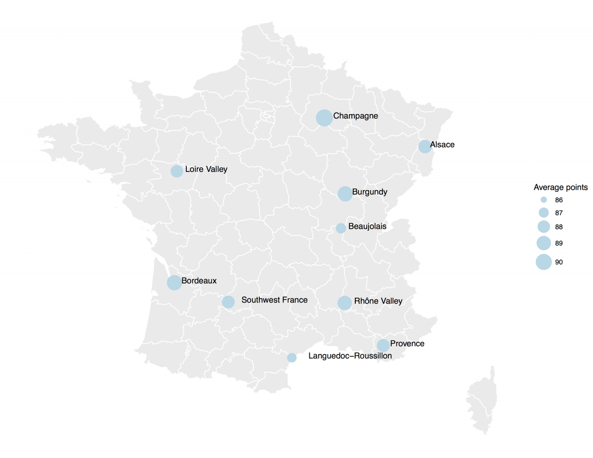
Next, we group by province, list the lat and lon, get a count of the number of reviews, and take an mean of the price and points by province. (Recall that I need na.rm = TRUE for price to remove any blanks.) The summarise feature creates new columns for each of these functions. I store all of this in a counts data frame that can be visualized with ggplot2.
counts <- francewines %>%
  group_by(province) %>%
  summarise(lat = lat, lon = lon, count = n(),
            mean_price = mean(price, na.rm = TRUE),
            mean_points = mean(points))
counts %>% glimpse()
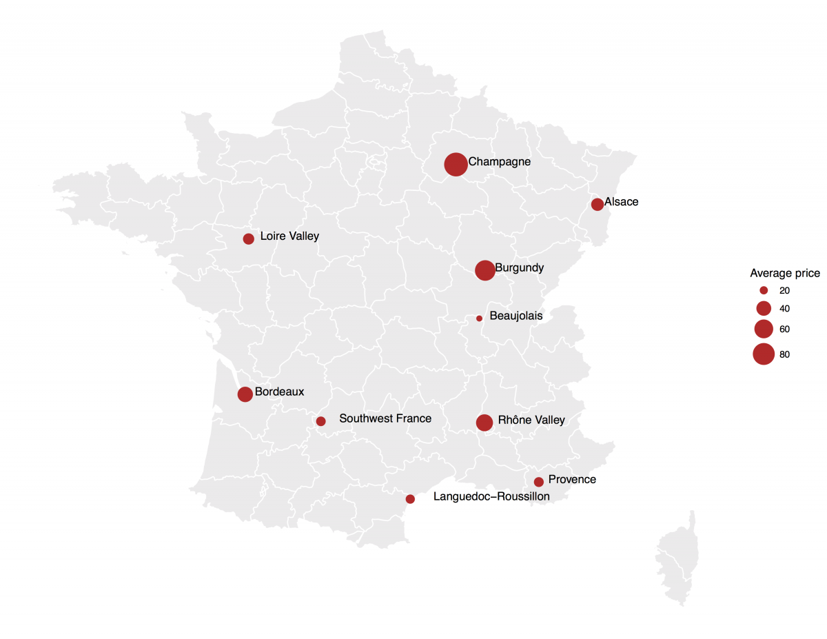
Finally, we'll add the counts data frame as a geom_point, building one map with size = mean_points and another map with size = mean_price. The geom_text pulls province names from the count data frame and we add a bit of math to offset the labels. Done!
ggplot() + geom_polygon(data=francemap, aes(x=long, y=lat, group = group),color="white", fill="grey92" ) +
  geom_point(data=counts, aes(x=lon, y=lat, size = mean_points), color="lightblue") +
  scale_size(name="Average points", range = c(1, 10)) +
  geom_text(data = counts, aes(x = lon, y = lat, label = province), vjust = 0.1, hjust = -0.2, check_overlap = TRUE) +
  theme_void()

ggplot() + geom_polygon(data=francemap, aes(x=long, y=lat, group = group),color="white", fill="grey92" ) +
  geom_point(data=counts, aes(x=lon, y=lat, size = mean_price), color="firebrick3") +
  scale_size(name="Average price", range = c(1, 10)) +
  geom_text(data = counts, aes(x = lon, y = lat, label = province), vjust = 0.1, hjust = -0.2, check_overlap = TRUE) +
  theme_void()


Thank you for this tutorial.
A suggestion for correction on the script:
Instead of:
counts %
group_by(province) %>%
summarise(lat = lat, lon = lon, count = n(),
mean_price = mean(price, na.rm = TRUE),
mean_points = mean(points))
counts %>% glimpse()
It should be:
counts %
group_by(province) %>%
summarise(lat = mean(lat), lon = mean(lon), count = n(),
mean_price = mean(price, na.rm = TRUE),
mean_points = mean(points))
counts %>% glimpse()
Thanks.
Thank you Aleszu for this tutorial.
I do not know if it’s just me or if everybody else experiencing problems with your blog.
It appears as if some of the written text in your posts are running off the screen. Can someone else
please provide feedback and let me know if this is happening to them
as well? This might be a issue with my browser because I’ve had this happen before.
Kudos