David Yanofsky mines Instagram for sources
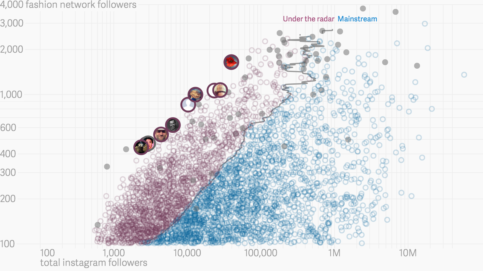
When Quartz deployed an interactive chart back in September analyzing the connections between fashionistas on Instagram, the news site revealed something valuable to journalists: a list of industry sources with clout. Quartz had somehow managed to quantify the influence of 1.8 million Instagram users in the fashion world through an analysis of who-follows-who in the network.
Whether fashion is your bag or not, this kind of analysis is useful because it can be applied to any network (to 15th century Florentine nobles, or more usefully, 21st century financial titans) in order to identify well-connected sources and find unexpected connections between people. Imagine applying Quartz’s special analytical sauce to Jamie Dimon’s network on LinkedIn.
 We recently got in touch with David Yanofsky, the Quartz reporter and developer who built the Instagram project. Together with lifestyle reporter Jenni Avins, Yanofsky analyzed the complex network of Instagram’s fashionistas—the followers as well as the followed. “Finding outliers and understanding a community is something that has always been a part of journalism.” We asked Yanofsky to explain further.
Tell us about the project.
David Yanofsky: Quantifying influence is something people have been trying to crack. Just looking at how many followers someone has doesn’t tell you a whole lot. But in social media, that’s pretty much where it ends. Klout and others have been trying to quantify influence. You have to look at a whole network to be able to qualify. Are the followers a user has of interest to the user? This analysis can isolate or reveal who is hitting the market and who isn’t. For the people outside of the market, there is a tendency for people to follow the underdog or the up-and-coming. Those outliers are interesting to journalists, too.
Can you breakdown the process?
We took 50 Instagram accounts, then looked at who those 50 accounts follow on Instagram. That gave us a list of almost 13,000 accounts that were public. Then we said: who do they follow? We got to 1.8 million. But you can only make 5,000 requests an hour to Instagram’s API. If someone is following 100 people it take five requests to find out the details of those hundred accounts. Then we asked: of this group of about 13,000, how many have followers from that group of 13,000? In the graphic we split it down the median. Visually, you get to explore the data of this network.
How many on your team?
One programmer, one reporter.
How many hours did this project take?
More than three weeks.
Give us the nitty-gritty.
We used Python (a programming language) with the Instagram API (which automates a request to Twitter every 0.75 seconds), did ian nitial analysis in R, quick sketches in Excel and R, data consolidation in R, then published an interactive graphic using (Javascript library) D3 that pulled from a three-column spreadsheet.
Is the project open source?
On its way.
What would you do differently?
The next time around it won’t take so long. You learn things. The scrape took two weeks with all of the various issues that came up like changing parameters. Instagram’s API system was rate-limiting so I had to slow it down. The coding of the interactive took a bunch of time; getting the infographic to work smoothly on a desktop with 9,000 moving parts. It still doesn’t work as smoothly on mobile as I’d like. I’m working on that.
Where do you go to see the work of your peers?
I follow my peers on Twitter, I have a dedicated Twitter list for people that are doing similar work that I’m doing, everything from people designing article pages to data scientists that aren’t even in media. Not only does that reveal interesting work but exposes me to work they find interesting. I go to conferences like SRCCON.
What are two things every journalism student should learn?
There’s a big “learn to code” movement. I partially subscribe to that. If you want a job really quickly, sure, learn to code. [inlinetweet prefix=”” tweeter=”Yan0″ suffix=””]I believe very strongly that coding has made me a better journalist but I’m a weaker reporter [/inlinetweet]because I’m not as good at interviewing people. I’m not as good at public records requests. There are all these other aspects of journalism that still need people able to do them.
Finally, what’s an example of a blazingly fast data story deployment?
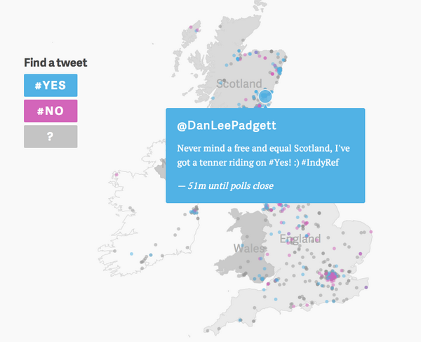
Nikhil Sonnad’s Scotland election map was done in less than a day. That’s becoming more and more important. Everyone’s focused on big blowout pieces. But just as you flip through a newspaper and see briefs and long features, we need to do that with data visualization.