A dummy’s guide to mapping Daesh
Dietmar Offenhuber researches the relationship between visual representations and urban governance. He heads the Information Design and Visualization graduate program at Northeastern University and tweets @dietoff.
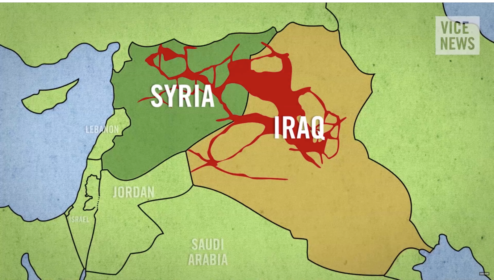
I saw a map of the “Islamic State” for the first time in a documentary aired on Vice in 2014. The conquered territory depicted in this map was unlike any other representation of a state that I have ever seen before (Fig. 1). I associate country maps with colored shapes describing a continuous area, surrounded by a boundary that neatly separates it from other national states, although there are of course exceptions. This state, in contrast, appears to be sitting like a giant, blood-red spider between Syria and Iraq. It shows a fragmented, network formation with many tentacles, holes, blots and other irregularities not found in world atlases and history books.

Given all the atrocities committed by this group, musing about the concept of a rhizomatic state, not bound to mutually agreed national boundaries and constantly changing its shape based on tactical or strategic considerations may seem intellectually detached. But it is also an honest attempt at making sense of a disturbing reality that I only know from an endless stream of media images. The dummy in the title of this piece is me, not the reader.
The distinct shape of this post-nation state evokes all kinds of mental images: the shape of cancer, the networks created by slime mold, the international symbol for bio-hazard, or the logo of the fictional organization James Bond is ever-so-busy fighting against.
Today I know that by thinking about Daesh in all these terms, I fell for the oldest game in political communication, played by all sides: how to construct and reify statehood through maps and representations. As we all know, but often forget, [inlinetweet prefix=”” tweeter=”” suffix=”says @dietoff”]maps are never neutral: every map comes with its own agency[/inlinetweet], represents a particular worldview. As Mark Monmonier notes in his classic How to Lie with Maps, every map distorts reality, it has to. He describes this conundrum as the cartographic paradox: “to present a useful and truthful picture, an accurate map must tell white lies.”
Without any particular knowledge about the Middle East, I started collecting and comparing maps published by different organizations across the world, standing on various sides in the conflict. Through this comparison, I found some salient themes.
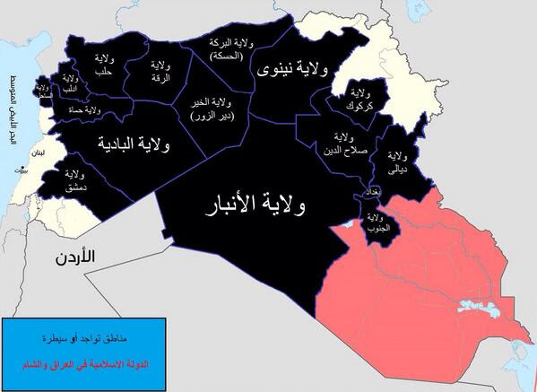
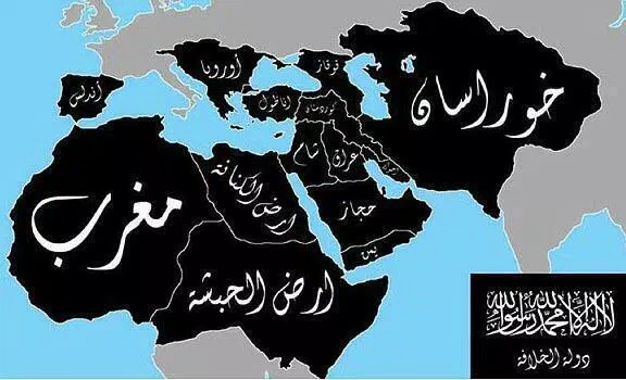
First of all, the self-proclaimed Islamic State never shows anything resembling the rhizomatic tentacles in its own maps. Quite the contrary: Daesh likes to represent itself like a traditional state, with convex boundaries, provinces and administrative areas (Fig. 2). Daesh’s proclaimed five-year plan, which went viral in the Spring 2014, but was later revealed to be fan-fiction by supporters rather than an official document, nevertheless shows that the organization and its supporters have no interest in exploring new concepts of post-national statehood or rhizomatic structures. Their maps show a very ambitious, but ultimately conventional image of an empire (Fig. 3).
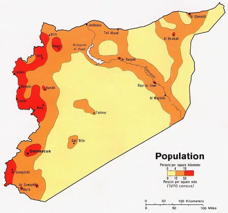
So where do the tentacles come from? A map of the population density distribution provides the answer. The valley of the river Euphrates, part of the fertile crescent where the earliest civilizations emerged, stands out as a densely populated ribbon, while large areas of the country are arid and sparsely populated (Fig. 4). The map (Fig. 1) from the Vice News documentary lacks geographic details — like all maps shown on TV, it serves the purpose of an icon that can be quickly glanced, rather than explored and scrutinized. Nevertheless, the correspondence with the densely populated areas, transportation corridors, natural resources (in other words, land of strategic value) is easily apparent even for people like myself ignorant of the local context.
If the large majority of the Syrian and Iraqi population is concentrated in relatively small areas, who controls the rest of the territory? The maps I have seen tell different stories.
One has to tread carefully when comparing maps: it is difficult to pinpoint the exact time when a map was created, which stage of the conflict it represents, and whether it is based consistent data. But let us for a moment not focus on the relationship between map and reality — or how truthful the representation is.
Instead let’s examine the relationship between different maps and their respective map makers.
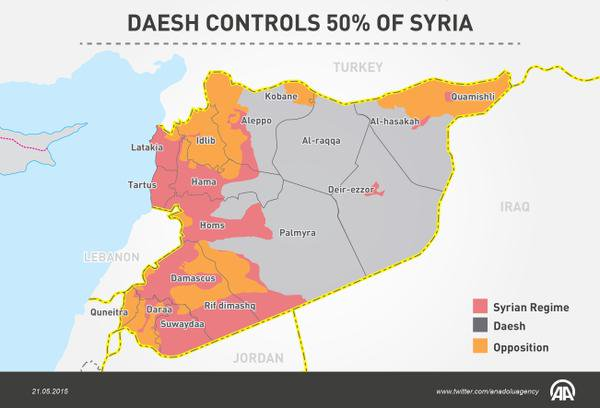
The map in Figure 5 uses three colors to represent the territory held by Daesh, the Syrian regime and the opposition — suggesting that more than half of the country are under the control of Daesh.
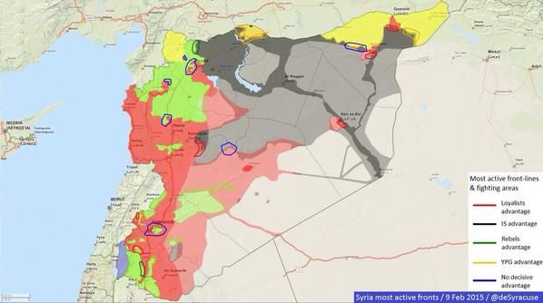
The map in Figure 6 shows a more a nuanced thematic shading, using different opacities to account for the variances in population density, suggesting that the area of Daesh’s territorial control is much smaller.
The map in Figure 7, including Iraq, finally takes this reduction to densely populated areas to the extreme, bringing the familiar rhizomatic pattern to the foreground.
These design differences correspond to the agenda of the different mapmakers. By using continuous shading, Daesh exaggerates its territorial influence, while international media that use the “spider-web” map downplay its power — “IS owns lots of sand” as a now defunct twitter account noted. Through such design choices, every map reifies the reality of Daesh in a different way. It should also be noted that there are more different agendas than conflict partners — even within the United States, different world views are negotiated through mapping symbols. “Does This Look like Stopping ISIL’s Advance?” the conservative blogger Patrick Brennan (@ptbrennan11) asked in January, citing a map published by the Daily Mail suggesting that the territory of the Islamic State has doubled within six months.
Besides area symbols, almost all cartographic elements can be instrumentalized for such purposes. The framing of the issue begins with literally how the map is framed: only Iraq or Syria; Syria and Iraq; the whole Arab world including North Africa; or the global scale, including Nigeria? By framing the map, the conflict can either be characterized as regional, local or global.
Also line symbols can be used in different ways — some maps show the main corridors in broad strokes, some shrink them into a web of thin lines. In some cases, the map is only represented as individual points, representing individual cities held or fought over by insurgents.
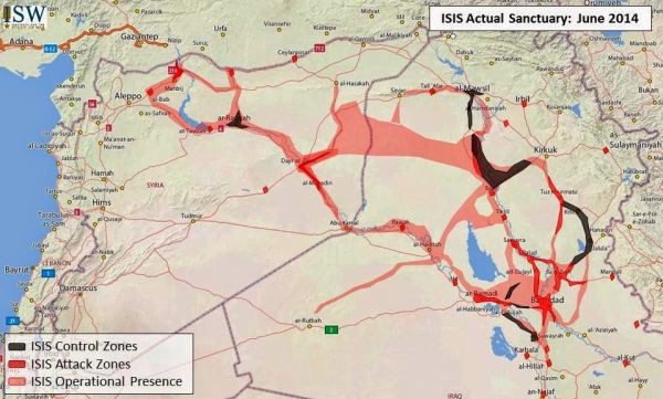
Lines and points are also important when mapping activity and events rather than territory and population. For example, the likelihood that someone might encounter insurgents in a particular area. The maps published by the Institute of the Study of War differentiate between control-zones, attack zones, zones of operational presence and support zones (Fig. 8). This view dissolves the image of a stable, continuous state into a fragmented patchwork of localized fights and conflicts, representing Daesh’s control as a precarious accomplishment, limited to merely a few metropolitan areas.
But a map is not just a picture of the world, it is also a computational device, a tool for exploration and spatial reasoning. Maps allow us the comparison between different spatial variables and investigate their mutual dependencies.
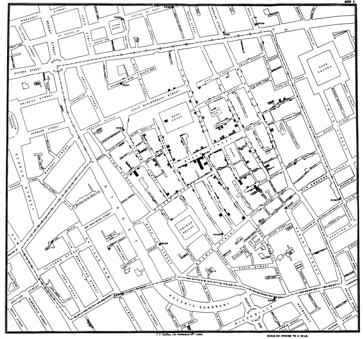
John Snow’s cholera map (Fig. 9), allows us to compare the locations of water pumps in relation to the spatial distribution of cholera deaths in the 1854 London outbreak. The map became an icon for spatial analysis because it presents a convincing visual argument for the close association between the pumps and cholera deaths. The locations of the recorded cholera mortalities conspicuously clustered around the Broad street pump, supporting Snow’s hypothesis of the water-borne pathway for communicating the disease (the familiar story is of course a bit more complicated).
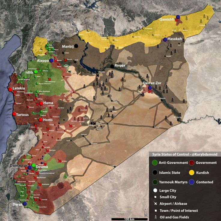
In order to understand the complex case of Daesh, we can bring in other spatial variables that can explain its shape. A number of maps that can afford such comparisons — instead of water pumps we have oil-fields, transportation infrastructure, or otherwise locations of strategic interest (Fig. 10). Here we enter the world of military campaign maps, allowing to compare the benefits and risks of different strategies. Under this perspective, the armed conflict between Daesh and its various enemies seems not so different from other military conflicts — a struggle for territory, resources and infrastructure.
This brings me to the ethical dilemma of mapping — should one produce maps of Daesh at all?
Is the practice of creating state-like maps of a terror organization’s area of influence a form of acknowledgement and even legitimization?
I think these concerns are justified. Representations of a new state are an effective way to capture public awareness. It can be assumed all parties with stakes in this conflict are aware of this fact. To avoid implicit approval of statehood I use the abbreviation Daesh as it is used in the Arab world, and use ISIS and such only in references to other sources. As the appropriate name for the group is now widely discussed, we need to have the same discussion for its appropriate representation in maps.
Cartographic language is expressive and malleable, can be tweaked to either support the claim to statehood, cast a picture of a global threat or downplay the importance of the conflict. It is not a revolutionary insight that maps are to some extent always subjective. But since nearly all our information about global events is mediated through emotionalized and anecdotal media images, maps can provide a way to restore some level of sanity and make sense of the bigger picture … as long as we don’t confuse the map with the territory.
More info:
The author’s Pinterest board “Maps of Daesh” can be found here.
@IUCAnalysts Institute for United Conflict Analysts. updated maps and visual forensics
@deSyracuse interactive, updated conflict maps made by a historian
http://isis.liveuamap.com/ another live updated, zoomable map with polygon and point data
@arabthomness regularly updated GIS maps made by 19-year-old Dutch student Thomas Van Linge. Storybench covered some of Van Linge’s work here.
@TheStudyofWar Washington D.C. based Institute for the Study of War, publishes regularly updated maps and news at understandingwar.org
- A dummy’s guide to mapping Daesh - December 7, 2015


