How a museum unveiled Pixar’s creative process to teach the art and science of digital storytelling
Pixar, the celebrated animated film studio that first made it big with Toy Story, is famous for building worlds from scratch and breathing life into characters fashioned from pixels like Buzz Lightyear and WALL-E.
All that animation magic comes from major technological muscle. In the film Cars, Pixar artists and engineers modeled thousands of buildings to create a virtual 3D layout of London. For one frame in the movie Ratatouille, there are 230 lights illuminating Remy, the cooking rat, and his French kitchen. And for Monsters Inc, more than 25,000 “key” hairs were used to guide the motion of Sulley the monster’s 2.3 million hairs.
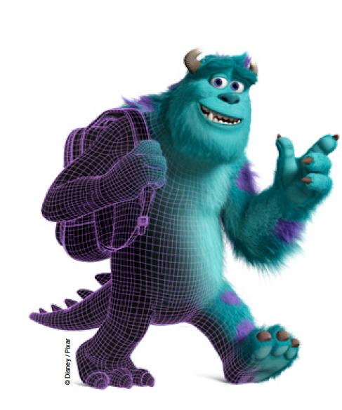
Why such an incredible amount of work for even a single scene? It’s so the films are as realistic-looking as possible, so viewers focus on the story instead of being distracted by the fact that they’re animated, according to their makers. But how does Pixar make its characters bound and dance and run in such an accurate way? What goes into making every blade of grass and flower look as if they were plucked from the real world?
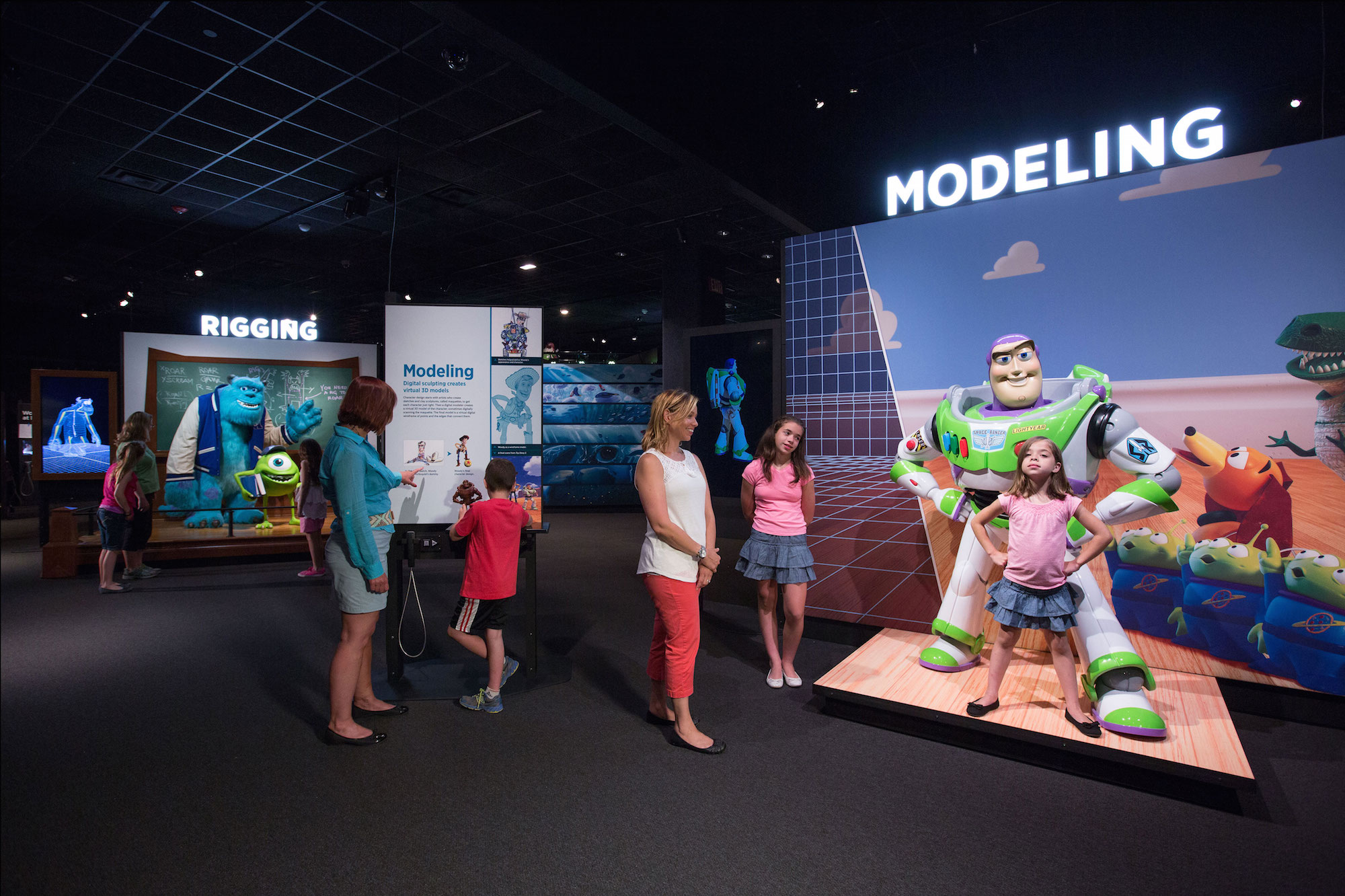
Boston’s Museum of Science recently debuted the exhibit “The Science Behind Pixar” to answer those questions. Alana Parkes, lead content developer for the exhibit, spoke with Storybench about pulling back the curtain at Pixar and curating an exhibit that contains dozens of lessons in computational thinking without showing a single line of code. Science, technology, engineering and math (STEM) educators aside, journalists and storytellers can learn a lot from the museum exhibit design tips she offers.
Breaking down the Pixar process
Designing a museum exhibit all starts with a big, central idea, says Parkes, that you must first be able to communicate in person succinctly before developing into an exhibit. What they settled upon was, she says, “Art, technology, science and creativity are inseparable in animation … that’s the heart, the meat of the exhibit. After that, you can figure out the structure.”
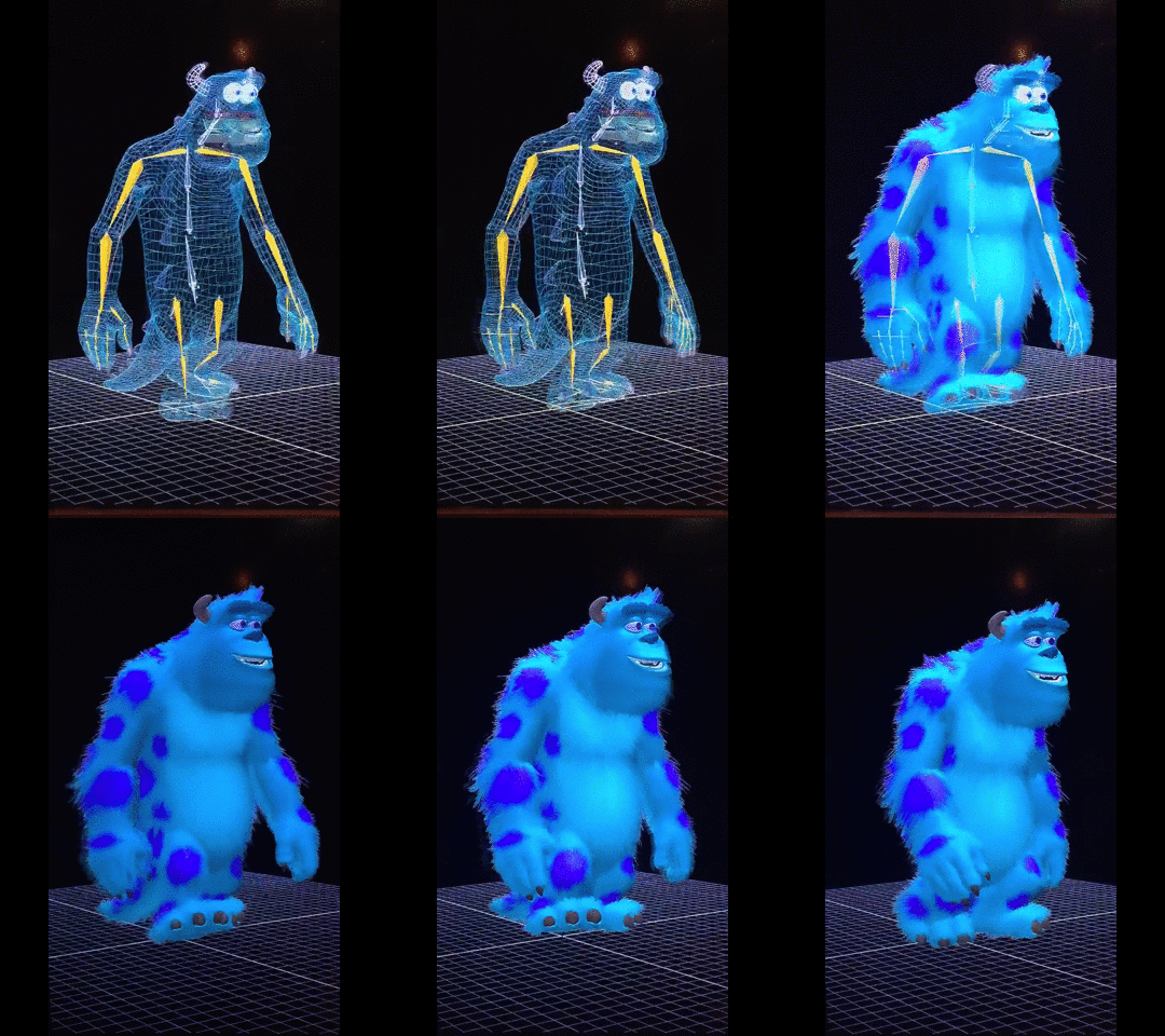
The exhibit’s structure mirrors the Pixar production process, which Parkes and her team broke down into eight parts:1) Modeling 2) Rigging 3) Surfaces 4) Sets and Cameras 5) Animation 6) Simulation 7) Lighting 8) Rendering. These became eight separate areas arranged in an open floor plan at the museum.
To illuminate the art and science that underpin each of these processes, Parkes and her team developed interactive stations with names like “Design your grass” and “Sculpt by numbers” that guide visitors through each part of Pixar’s creative process.
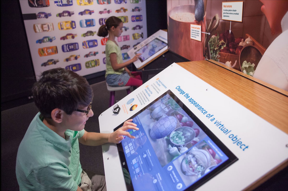
Teach them how to think like a coder
Using touchscreens, levers and building blocks, visitors can manipulate Pixar scenery and characters to understand what parameters control natural variety in landscapes, what it means to render video, how to light a scene, and how to build a model world using virtual building blocks. Breaking down Pixar’s process into these individual steps turns out to be key to communicating the art and science behind the movies.
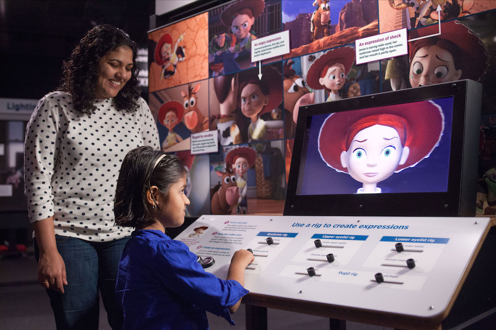
Each station is an exercise in problem decomposition using computational thinking, explains Parkes. This means using Pixar to teach the concepts of computer science—namely, problem engineering and reverse-engineering—without mentioning a lick of code. Instead, by allowing visitors to manipulate the flexibility of Mrs. Incredible’s arm or the facial expression of Jessie the Toy Story cowgirl, Parkes hopes she can ease audiences young and old, into computer science.
The exhibit design led to a National Science Foundation grant to fund a research study using these stations to introduce coding concepts to middle school students, Parkes says. So far, the results are promising. The early results? There’s an increase in interest in careers in computer science and animation among those students after using those stations, she says.
Museum exhibit design tips from Alana Parkes that storytellers can borrow
Start with a mission statement
If you can’t express this succinctly in conversation, you won’t be able to build an exhibit around it. Organize your exhibit around one central idea.
Prototype
When designing your exhibit, iterate, perform user testing and exit interviews, and constantly ask yourselves:
- Are we communicating what we want?
- Are we communicating what we don’t want?
- Are things useable?
- Have we created any unintentional barriers (to the blind, to the disabled)?
- Is our exhibit durable (both sustainable and sturdy)?
Choose your own adventure
An open floor plan encourages exploration. Research shows that people make their own connections between things when they do it on their own rather than following a set path, explains Parkes.
Hide the scary math
Computer programming can be intimidating. Be intentional about placing math equations in the video and not on placards.
Write better labels
Just like a good Powerpoint presentation, limit the amount of text you use on a label, placard or callout. Try using a full-screen photo with speech bubbles or callouts with limited text.
Adding a human element
Sprinkled throughout the exhibit are television screens airing interviews with Pixar employees that reveal more details about the production process. They also highlight the humans that are behind the Pixar stories, wielding the technology.
Tom Hahn, Pixar’s lead animation software developer, talks about building the state-of-the-art tools that his animators use by balancing the “needs of users and constraints of engineering.” Tanja Kampfert, a character modeler, explains how they study the anatomy of real bears to understand how they move and apply those mechanics to animated models. Mark Meyer, a senior research scientist, describes how math and algorithms define characters, props and sets. And Danielle Feinberg, the director of photography for lighting, reflects on the beauty created when all of the pieces come together:
“There’s this moment in lighting where all of the code and math and moving lights around and the artistry comes together and suddenly the world comes to life and it feels like you can get inside there and meet those characters, and they’re real. And I just became addicted to that moment.”
These brief videos were put together by the Pixar DVD extras video team with feedback on script and questions from the Museum of Science staff. This type of back-and-forth collaboration is how the exhibit content as a whole was created. Parkes and her team would write copy, then have it fact-checked and approved. Pixar would send stills and basic models (they wouldn’t release all of their intellectual property), but Museum of Science programmers (they have two on staff) would have to create videos and interactive stations using these models.
Suspended animation
In 2016, the Museum of Science will take The Science Behind Pixar on the road, starting with a five-year U.S. tour. After that, the plan is to go international. The message will remain the same: art and science come together to create signature Pixar animation – a reminder of how computer programming is infused with great creativity.
The technology originally invented for Toy Story is continually being pushed as Pixar’s teams test the boundaries of computer graphics. They are telling animated stories while taking a deeply scientific approach to simulating our world.
With every new movie, Pixar’s artists and engineers get better at modeling the anatomy of our bodies, and indeed the physics of our world, one pixel and one line of code at a time.
