How to use hierarchical cluster analysis on time series data
Which cities have experienced similar patterns in violent crime rates over time? That kind of analysis, based on time series data, can be done using hierarchical cluster analysis, a statistical technique that, roughly speaking, builds clusters based on the distance between each pair of observations.
Basically, in agglomerative hierarchical clustering, you start out with every data point as its own cluster and then, with each step, the algorithm merges the two “closest” points until a set number of clusters, k, is reached. I put closest in quotation marks because there are various ways to measure this distance – Euclidean distance, Manhattan distance, correlation distance, maximum distance and more. I’ve found this post and this post to be helpful in explaining those.
For the purposes of this tutorial, we’ll use Ward’s method, which “minimizes the total within-cluster variance. At each step [of the algorithm] the pair of clusters with minimum between-cluster distance are merged,” according to Bradley Boehmke of the University of Cincinnati.
Hierarchical clustering using Ward’s method is what Gabriel Dance, Tom Meagher and Emily Hopkins of the Marshall Project employed to cluster cities by violent crime trends in their 2016 article “Crime in Context.” Their dataset, which spans 1975 to 2015 for 68 police jurisdictions, is freely available on Github. This tutorial recreates their analysis.
Load packages and data
library(tidyverse)
library(gghighlight)
ucr_crime_1975_2015 <- read_csv("ucr_crime_1975_2015.csv")
Next, we’ll plot the dataset and, using gghighlight package, highlight the four cities that broke 3,800 violent crimes per 100,000 people.
ggplot(ucr_crime_1975_2015, aes(year, violent_per_100k, color=department_name)) +
  geom_line(stat="identity") +
  ylab("violent crimes per 100K") +
  gghighlight(max(violent_per_100k) > 3800,
              max_highlight = 4,
              use_direct_label = TRUE) +
  theme_minimal() +
  theme(legend.position = 'none')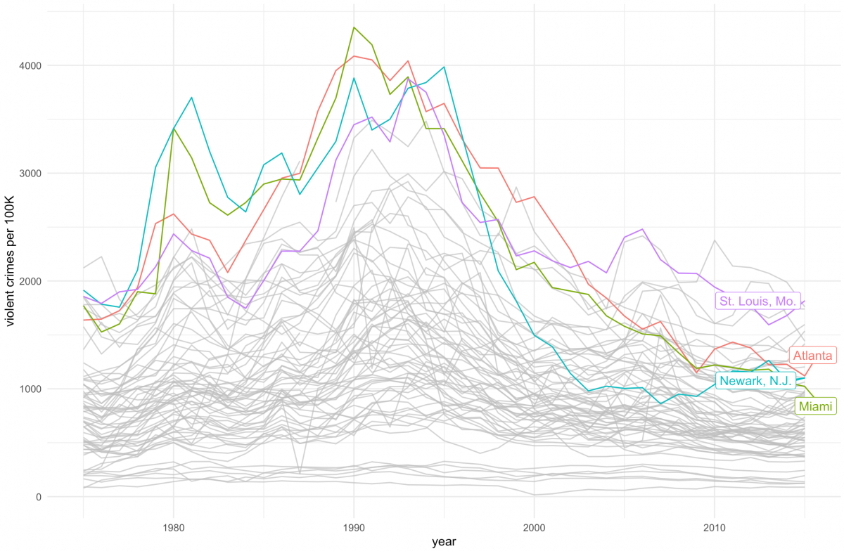
You may notice that many of the crime rates hover around the same level between 1975 and 2015 while other cities peak in the 1990s and then subside again.
Could one tease out the cities that follow similar patterns through cluster analysis?
Prepare data for cluster analysis
We’ll first select the variables we’re interested in clustering the cities with: violent_per_100k, year and, of course, the city (which is listed as department_name for reasons the story goes into).
violent_per_100k <- ucr_crime_1975_2015 %>%
  select(violent_per_100k, year, department_name) %>%
  drop_na() %>% # must drop NAs for clustering to work
  glimpse()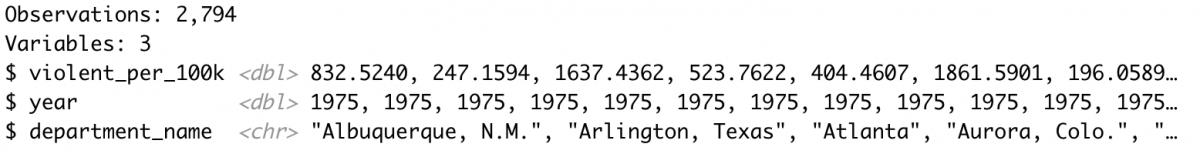
Next, we create a data frame using the spread() function that lists every city with the violent crime rate per year.
spread_homs_per_100k <- violent_per_100k %>%
  spread(department_name, violent_per_100k)  %>%
  glimpse()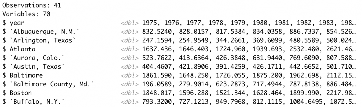
Run the hierarchical cluster analysis
We’ll run the analysis by first transposing the spread_homs_per_100k dataframe into a matrix using t(). This step also removes the year variable using [-1] to remove the first row.
Next, we’ll calculate the Euclidean distance metric using the dist() function. Then we’ll use the hclust() function and the method=”ward.D” argument, see here for more on this function, to run the hierarchical cluster analysis.
murders <- t(spread_homs_per_100k[-1])
murders_dist <- dist(murders, method="euclidean")
fit <- hclust(murders_dist, method="ward.D")
Plot the clusters
I usually plot using base R’s plot() function and highlight a set number of clusters using rect.hclust() and the k= argument.
plot(fit, family="Arial")
rect.hclust(fit, k=4, border="cadetblue")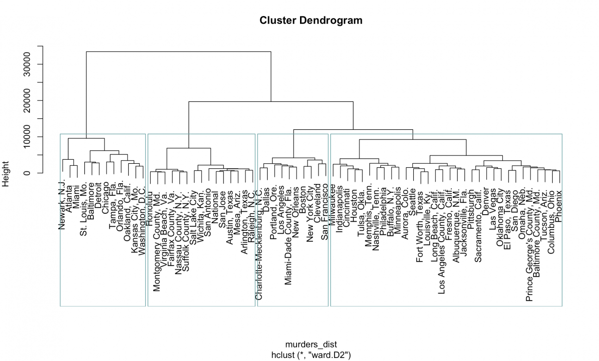
Flipping that 90 degrees we start to see the clusters the Marshall Project identified:
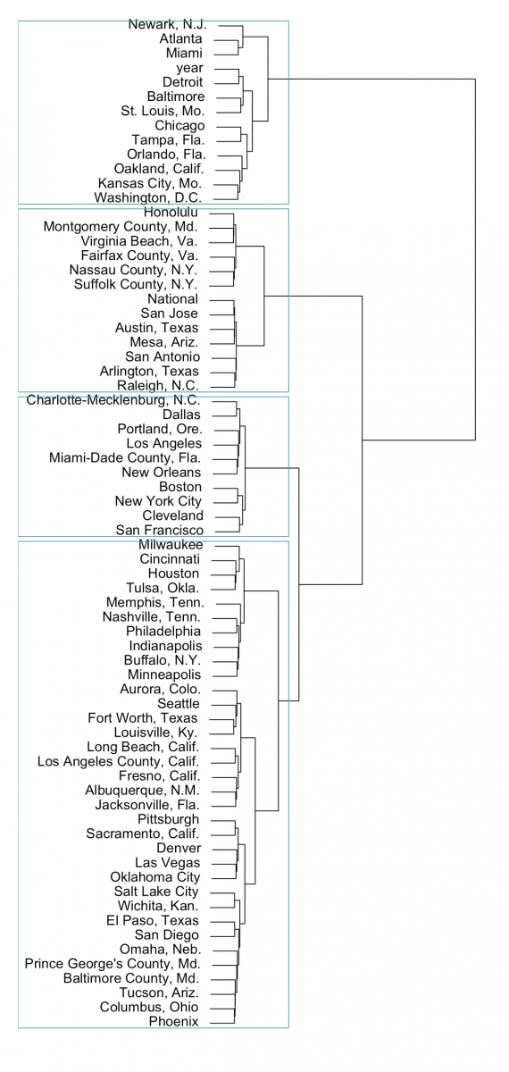
Using the ggdendro package you can also lay it out in ggplot2.
library(ggdendro)
ggdendrogram(fit, rotate = TRUE, theme_dendro = FALSE) +
  theme_minimal() + xlab("") + ylab("")
Right off the bat we notice that those four cities – Newark, Atlanta, Miami and St. Louis – do indeed cluster along with Washington, D.C., Baltimore, Detroit, Chicago and more.
Next, let’s merge the cluster number with the full dataset and visualize like the Marshall Project did.
Merge the clusters into the full dataset
First, we’ll assign the four clusters to the data using cutree() and then, using tidy principles and after renaming columns and recognizing cities as characters, we can merge the clusters with the original dataset.
clustered_data <- cutree(fit, k=4)
clustered_data_tidy <- as.data.frame(as.table(clustered_data)) %>% glimpse()
colnames(clustered_data_tidy) <- c("department_name","cluster")
clustered_data_tidy$department_name <- as.character(clustered_data_tidy$department_name)

joined_clusters <- ucr_crime_1975_2015 %>%
  inner_join(clustered_data_tidy, by = "department_name") %>%
  glimpse()
We may also want to inspect how many cities we have per cluster.
table(clustered_data_tidy$cluster)
So this is roughly what the Marshall Project came up with.
Visualize all cities belonging to one cluster
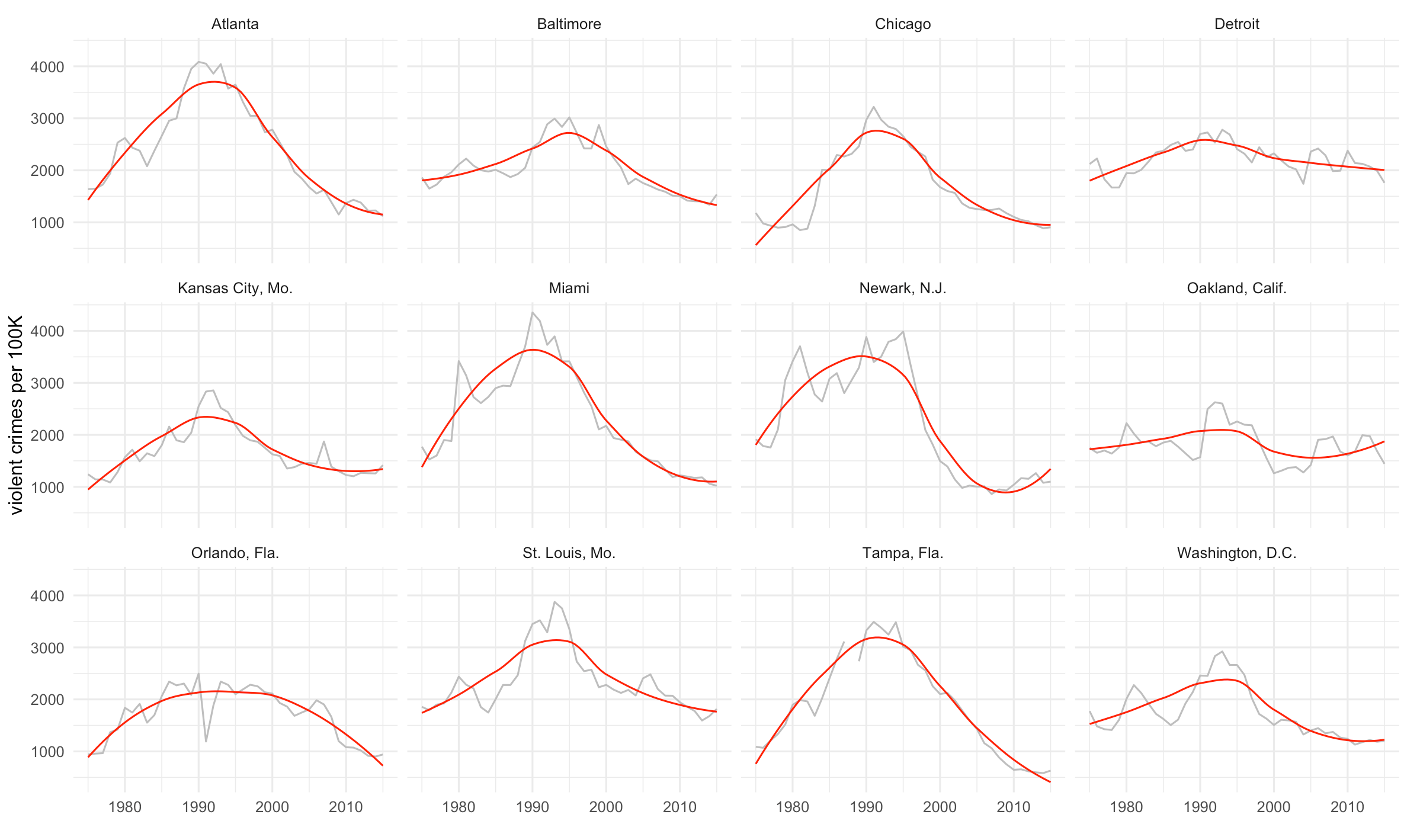
Let’s visualize our most violent cluster, which the Marshall Project deemed Group A.
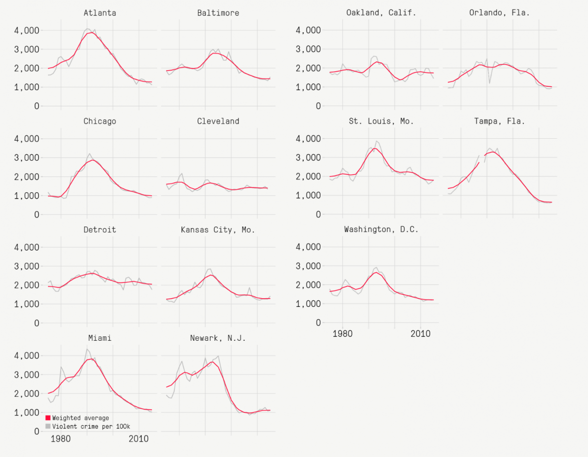
For us that’s cluster 3. The function geom_smooth(method=”auto”, color=”red”) will fit a local weighted regression using the LOESS method in red.
cluster3 <- joined_clusters %>% filter(cluster == "3")

ggplot(cluster3, aes(year, violent_per_100k)) +
  geom_line(color="grey") +
  theme_minimal() +
  ylab("violent crimes per 100K") + xlab("") +
  geom_smooth(method="auto",color="red", se=F, size=0.5) +
  facet_wrap(~department_name)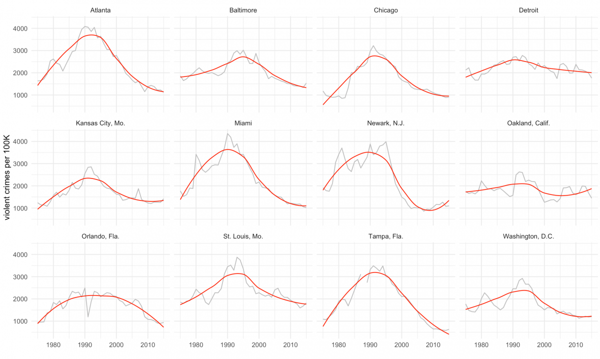
Finally, we can calculate the group’s average violent crime rate for 2015 using the following:
clus3year2015 <- cluster3 %>%
  filter(year == "2015") %>%
  summarize(avg = mean(violent_per_100k)) %>%
  glimpse()
It’s 1240.973 crimes per 100,000 people, just as the Marshall Project reported for that cluster.
Full code
library(tidyverse)
library(gghighlight)

# Pull in data

ucr_crime_1975_2015 <- read_csv("ucr_crime_1975_2015.csv")
glimpse(ucr_crime_1975_2015)

# Plot

ggplot(ucr_crime_1975_2015, aes(year, violent_per_100k, color=department_name)) +
  geom_line(stat="identity") +
  ylab("violent crimes per 100K") +
  gghighlight(max(violent_per_100k) > 3800,
              max_highlight = 4,
              use_direct_label = TRUE) +
  theme_minimal() +
  theme(legend.position = 'none')


# Prep for cluster analysis

violent_per_100k <- ucr_crime_1975_2015 %>%
  select(violent_per_100k, year, department_name) %>%
  drop_na() %>% # must drop NAs for clustering to work
  glimpse()

spread_homs_per_100k <- violent_per_100k %>%
  spread(department_name, violent_per_100k)  %>%
  glimpse()

# Run the hierarchical cluster analysis

murders <- t(spread_homs_per_100k[-1])
murders_dist <- dist(murders, method="euclidean")
fit <- hclust(murders_dist, method="ward.D")

# Plot the cluster analysis
plot(fit, family="Arial")
rect.hclust(fit, k=4, border="cadetblue")

library(ggdendro)
ggdendrogram(fit, rotate = TRUE, theme_dendro = FALSE) +
  theme_minimal() + xlab("") + ylab("")

# Merge clusters into full dataset

clustered_data <- cutree(fit, k=4)
clustered_data_tidy <- as.data.frame(as.table(clustered_data)) %>% glimpse()
colnames(clustered_data_tidy) <- c("department_name","cluster")
clustered_data_tidy$department_name <- as.character(clustered_data_tidy$department_name)
glimpse(clustered_data_tidy)
table(clustered_data_tidy$cluster)

joined_clusters <- ucr_crime_1975_2015 %>%
  inner_join(clustered_data_tidy, by = "department_name") %>%
  glimpse()

# Plot

cluster1 <- joined_clusters %>% filter(cluster == "1") %>% glimpse()
table(cluster1$department_name)

ggplot(cluster1, aes(year, violent_per_100k)) +
  geom_line(color="grey") +
  theme_minimal() +
  ylab("violent crimes per 100K") + xlab("") +
  geom_smooth(method="auto",color="red", se=F, size=0.5) +
  facet_wrap(~department_name)

cluster2 <- joined_clusters %>% filter(cluster == "2") %>% glimpse()

ggplot(cluster2, aes(year, violent_per_100k)) +
  geom_line(color="grey") +
  theme_minimal() +
  ylab("violent crimes per 100K") + xlab("") +
  geom_smooth(method="auto",color="red", se=F, size=0.5) +
  facet_wrap(~department_name)

cluster3 <- joined_clusters %>% filter(cluster == "3") %>% glimpse()

ggplot(cluster3, aes(year, violent_per_100k)) +
  geom_line(color="grey") +
  theme_minimal() +
  ylab("violent crimes per 100K") + xlab("") +
  geom_smooth(method="auto",color="red", se=F, size=0.5) +
  facet_wrap(~department_name)

clus3year2015 <- cluster3 %>%
  filter(year == "2015") %>%
  summarize(avg = mean(violent_per_100k)) %>%
  glimpse()

cluster4 <- joined_clusters %>% filter(cluster == "4") %>% glimpse()

ggplot(cluster4, aes(year, violent_per_100k)) +
  geom_line(color="grey") +
  theme_minimal() +
  ylab("violent crimes per 100K") + xlab("") +
  geom_smooth(method="auto",color="red", se=F, size=0.5) +
  facet_wrap(~department_name)


Thank you, this is great for my time series clustering. Do you know of any methods of evaluating the numbers of clusters to find the most statistically significant one that could be added to this code?