How the Wall Street Journal visualized the 2020 election results
Each time an election year dawns, it brings changes – the candidates campaigning, how the battleground states are polling, and, of course, changes in our national obsession: election maps. But even before 2020 arrived, the Wall Street Journal was having conversations about designing maps. In fact, they were brainstorming around November 2019 — a full year before Election Day.
“One of the things that we have the benefit of is time,” said Andrew Levinson, a graphics reporter at WSJ. “We know that this election is coming. We know it’s going to come every two years, every four years.”
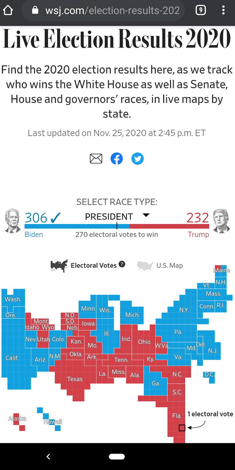
Their early start in experimenting with map designs and robustly testing them on various screen sizes and devices resulted in a smooth experience for readers when Election Day rolled around on Nov. 3.
“When you met the Wall Street Journal practically anywhere [during] election week: on our home page, on our article pages, on our live coverage page in social media, we were up to the minute,” said Louise Story, WSJ’s chief news strategist and chief product and technology officer. “It was lively and it was changing.”
In addition to Levinson and Story, Storybench spoke with WSJ’s Shazna Nessa, global head of visuals, and technical director Dov Friedman about their roles in the project, their process and challenges in visualizing polling data and their perspective on how data visualization evolved in journalism, where it’s headed and how journalists can keep up.
What were each of your roles in this project?
Nessa: I’ve been working in this field for over 20 years. Election night is always a big deal on any sort of graphics teams’ agenda. I was just reflecting how the first project I ever got as a young journalist was covering the 2000 elections, and the web was a completely different thing. Then, it was much flatter, much less complex and no Google Maps, nothing like that whatsoever.
We live in a much more complex digital world now. We needed to put a lot of specialized expertise into these maps because it’s not just the website it’s on anymore. It’s, ‘How’s it playing out on these other platforms on mobile?’ We wanted to focus on our readers. To me, something that was important was, ‘How do we show complexity without dumbing things down?’ We want to show complexity while also teaching and helping our readers understand what this complexity means. I think that’s a big part of the role that journalism can play. Data visualization can play in journalism increasingly as data becomes more complex, more pervasive in everything we do, in how we can lead our readers on that journey. So we don’t simplify everything, but we help them understand the complexity.
Levinson: I’ve been at the Journal for about a year and a half. This is actually my first election. Before working in a newsroom, I actually worked in more of a design space, doing product design software, and even in finance before that. I did a lot of the design work here for the election starting back probably a year ago at this point.
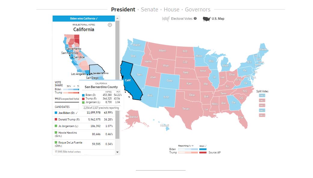
One of the initial things that we looked at was, ‘Do we need a standard geographic map?’ That was really the kickoff of a lot of these conversations, if we could use a cartogram that could help display the data more accurately as a quick scorecard in terms of electoral votes. Just as important in terms of accurate data visualization, we spent a lot of time on interaction design and different screen sizes and different device types. Small mobile devices are really important. You can actually interact better with a cartogram that’s more blocky than a fluid geographic map.
The bigger the size, you can display a bit more information. So it was a lot about balancing, getting enough of a picture on small screen size, and then getting more on a larger screen size where you can interact with things a bit more and even get county-level information if you want it, but we try not to overwhelm the user by putting everything on the screen at the same time.
It was a big design effort — a lot of check-ins, a lot of feedback. There’s probably 80 versions of this thing that no one will ever see that are just stashed away in design files. But that’s the point, you have to do it like that. Ultimately, you end up with the right product that the best of the best made.
How early before the election did this process start, and how long did it take to figure out the best version for readers?
Levinson: It was probably a full year ago. It was in November [or] December of last year that we first started having very early conversations. But it’s great to do that. Like I said, you know the election is coming up. Start as early as you can in terms of just thinking. At that point, there’s no pressure of, ‘We need to lock in a decision and start building.’ It was more blue sky kind of ideas like, ‘Let’s not think about technical limitations. What is like the best way to consume data on election night?’
We know what the data is going to look like, we know what the most important things are. So we did a lot of research on different map types. We locked in some of the bigger visual elements, then we were starting to get into the details. But we did take a detour to do the primaries. We were able to try out a lot of stuff that we talked about late last year in the primaries. And then we were able to take some of that stuff and go back into the general. So a lot of the work in the details happened in the summer.
Story: The team built these cards for Super Tuesday, which I thought was really innovative and a good way to test a different look when you had multiple races in play and it did set us up, from a technology standpoint, to think about some of the components differently.
Levinson: Yeah, exactly. We had a ticker element at the bottom. The primaries are interesting because it’s a single event but they keep building on each other. So we had time between every week or every two weeks or so for the first couple of months until it was clear that Biden would get the nomination. Whether you’re showing a national map and having this far view from the top where you want to know how many delegates someone had, which is kind of the equivalent of that sort of national map, how many electoral votes someone has — it’s the same kind of thinking versus drilling down into a specific state. But, even from a slightly more technical perspective, it’s a lot of mixing and matching of components. It’s taking, ‘Okay, what if I want to know just a little bit of information about a single state or a race or something?’
So we have these things that we’ll call cells, where it’ll just be Wisconsin: 10 electoral votes, Candidate One votes, Candidate Two votes. We could take that and make it a little tag that ticks across the bottom of the map. We can set it to the left of the map, and then stack a bunch of them on top of each other and scroll them. We could place that individually on the homepage or the live blog.
So a lot of how we built this was really thinking about components. Every device requires something a little bit different, but we’re not building everything from scratch every time. We’re mixing and matching different components that adapt to screen sizes and device types.
Friedman: That’s a critical point. We live in such a diverse digital platform nowadays that we have to think about native apps, how that would work. We need to think about all the different places within our own ecosystem on the web. Where are these things gonna be placed? Are they on our live blogs in a specific place? Are they in a header on top of all of our articles? Are they in articles? We have to think about any possible place that these can go. The work that we produce needs to be flexible enough to be placed pretty much anywhere.
What was very unique about this go around in elections was we weren’t sure how long it was going to take for the election to be called. And we still see it’s not quite resolved yet. We were planning for a week or two weeks long of competitive information coming out. We needed to make sure, as Andrew was saying, modular design, modular components that we can plug and play into different places and within different combinations so that we can get the best thing to show our readers.
Nessa: The scope of it was incredibly broad. And that was part of why it took so long. It’s not just the map. I remember, Dov sent me a link, and he called it the ‘kitchen sink’ link. It had every single possible configuration of the module that could be all over the place. The uncertainty was a really big factor of this. We were in meetings with our colleagues and editors, who’d be throwing us edge case scenarios. ‘Well, what are you going to do when this happens?’ Of course, we can plan for so much, but then there’s so much you can’t plan for. So we struck a deal that we also have a graphics team who can do news graphics on the fly, that this is what the live element does, this is its role. And then in some of these edge case scenarios that we can’t predict, we will work on bespoke sort of news graphics on the fly. So that was one way around that.
Were there any real-time challenges you faced when the data from the polls started rolling in?
Friedman: From a data perspective, there really wasn’t much of anything. We had spent an enormous amount of time testing. There were zero data hiccups in our process which was pretty awesome. As Louise was mentioning earlier, the data feed that we have with the Associated Press not only feeds the live maps that we were showing, but it feeds many other things. We were providing information to our colleagues in DC to build graphics off of that information. We were providing information to build these live blog cards that would trigger when a race is called for a particular winner. So we have many different workflows coming out of our data feed, that we’re generating many different things.
Story: A critical part of it is what our audience saw was smooth everywhere and all these different experiences, but also the amount of work that went in well over a year into essentially this pipeline of data coming in on how this data would flow into our editorial tools, into our live coverage page, on our social media cards. When you met the Wall Street Journal practically anywhere [during] election week, on our home page, on our article pages, on our live coverage page in social media, we were up to the minute. It was lively and it was changing. So in some ways, what was built here was really a distributed graphics and data experience, which I think is really exciting and great teamwork and great for our audiences.
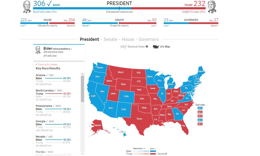
Nessa: I do want to mention a great companion piece to the results page, that also stood on its own called Paths to Victory, which is a great data visualization that allowed people to play around with the battleground states to understand, through a visualization, how each state would tip the electoral vote count.
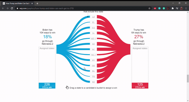
WSJ’s Paths to Victory visualization.
People were addicted to it, I got notes from people saying, ‘this is not good for my health.’ We created a version of it that was live that reacted to the calls of the different states so that people could see the whittling down of what was still left at play.
In the early days, we tried to match that up with the live maps, we were trying to figure out how we could have both the paths to victory and the maps together. That was a great conversation because we realized that was just too much. There’s too much going on for our users and for the spaces that we had. We broke it off as its own feed and that was a very successful decision.
The Journal made election results and its content free for readers for election night. Was there an unexpected traffic surge due to that?
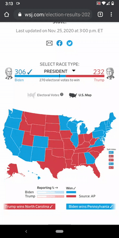
Story: We were prepared for high traffic levels. In fact, we had very high traffic throughout all of the election week. Our preparedness is a general thing we do in technology. But also, of course, we’ve had huge levels of traffic and visitors all throughout [the] coronavirus [pandemic]. So we’re used to a large influx of traffic and it was really a smooth experience for audiences. There was a lot of testing done between the teams to make sure not only would everything look great on every platform, but [also] look at what could withstand different spikes of traffic. There was a big spike when Biden was named President-elect Saturday. But the speed with which our systems just flew over and repaired right away when that happened was great.
What was the process like from getting the polling data to visualizing it on the map?
Friedman: We have a service that we created that hits the Associated Press, voting endpoints at a specific interval, that data is then parsed and cleaned up on our side and then distributed to multiple places. We do dump the raw copy of the information in a database for further analysis by our reporters, which is another great partnership we had with our DC bureau, with creating a robust database so that our reporters and editors could go back and analyze very granular information if they needed to.
Our service would ingest all that information and then dump it to multiple places, depending on who needs what. From the race results, we created multiple static data files that our front end applications would consume and made those available to some of our sister companies like Marketwatch, for instance, who created similar visualizations on their brands using the data that we parsed and provided.
Story: Dow Jones also has a big newswire, and we integrated our live coverage this year with the newswires, that was great. It was going out to people way beyond our subscribers that way.
Shazna, in your 2014 talk at Stanford, you said, “just as humans turned the chaos in the sky into constellations, today, we are turning large amounts of available data into visualizations.” How did the visualization tools evolve in their use in journalism, where are they headed, and how should journalists adapt to keep up?
Nessa: I see two parts to visualization. One piece is for the reporting itself and I think a huge goal for every newsroom should be that every reporter has a level of data literacy. Obviously, there is a lot of complexity to certain types of statistics and things like that, and you’ll always have specialists. But, every reporter should have a base level of understanding.
We have some simple but internal visualization tools and those are powerful for reporters to be able to do their reporting. We don’t have to publish every visualization, but it helps bring patterns to life. In the visualization field, in journalism in particular, in the earlier days, we were very exuberant and we’re doing really complex things. They were really hard to understand and I think mostly we loved them. But I think over the years, we’ve become a bit more disciplined about thinking about our readers and our audience.
We use a lot of D3, it seems to be a pretty standard thing in our world. I don’t think there’s been a ton of tools that have been created for visualization generally. I know there’s Flourish and things like that, but they all have their limitations. The thing with data is every case requires a different thing and so you need somebody with design and data-savvy to come in and make it work to the story that you’re trying to tell.
We’ve done a lot of exploration around exploratory visualizations versus a narrative. We found, oftentimes people are overwhelmed with data and information and really like when we can pull out the most important things for them. So I think that’s also another discipline that has evolved because in the past, we used to do these giant things and expect a user to come in and spend an hour trying to understand what was in there. Although that has its use case, perhaps for a more sort of professional business-to-business type client.
I don’t think data is going anywhere, I think there’s going to be more and more of it amassed. We just have to stay on top of it and be responsible about how we guide people through the complexity without dumbing it down. That’s what I’m really excited about, I really would like to see, in fact, in that video you cite from Stanford, I’m really interested in, ‘How can we design things so people learn how to read the visualization through how we designed it so that they know next time, ‘Oh, this is how I read this’?’
We did that a lot on our maps and tooltips and things like that. In the paths to victory, we walked people through what the various things mean. I don’t think we should assume anything. We shouldn’t assume that people understand that because this is this size, this means that. I actually think it’s worthwhile to provide tips for things like that. So I think it’s just going to get even more and more complex. And I think we’re going to have more and more responsibility to use design and journalism to guide our readers. That’s a perennial thought, but now more than ever.
Are there specific tools that you think journalists must have in their toolkit to tell stories in today’s media landscape?
Friedman: I think now more than ever, the toolkits have to be very robust. Nowadays, the landscape is very complex, there’s a lot going on. There’s a lot expected of these individuals to know how to do a lot of things. Depending on what they’re trying to do, they need to be literate in the command line, they need to know how to write and run scripts. Typically, I guess the landscape is very heavy with JavaScript nowadays, specifically with React as a front-end library. We’ve leveraged a lot of that with the work that we did here and it helped us make components that were easily put anywhere for us. The performance was excellent in terms of how things operated and that definitely was because of the choices we made with the tools that we used to get our jobs done.
Story: I’ll add on to that. Dov knows quite a lot about this, we’re on kind of a big revolution in the way we’re doing our web rendering right now. We’re moving to a much more component-based way of doing it. React as a framework has transformed a lot of different companies and it’s becoming something that’s essential in the way we’re setting up our web experience. I think it’s an exciting time to be a journalist who wants to also build things, even if you don’t have a CS background right now, because of the way React allows you to understand just the part you’re working on, you don’t have to know everything about the page. It’s opening the doors for people to get in, to try things out, to see them live, to learn how they are working in pieces. We have a number of people who are contributing great code on our platforms, who don’t come necessarily from CS backgrounds. Some have been in different lines of journalism, but they’re able because of the way we’re structuring the page and this way, we’re moving to get involved in creating great news experiences. This is relevant to graphics, but also news presentation and I think it’s an exciting period for us and other companies as we adopt this.
Nessa: Our job descriptions are very complicated. There are so many layers to it, and I think that’s where collaboration comes into play at the end of the day. I always look for people who are really good at two things. In some of the journalism jobs, one is going to be around news judgment, but the other will be around whether it’s excellent D3 and design skills or excellent 3D skills, data viz skills, animation. There’s just so much, it takes a village to make some of these projects sometimes, so collaboration is really important, but also to get really good at a couple of things.
Friedman: I’ll also mention how important automation is for what we do. We were using a technology called Next.js to generate all of our election pages, and we were able to very easily create multiple modules based on this technology. So we were able to build all of our state detail pages with very minimal work on our end. We built one component and we were able to output 60 or 70 specific pages just for our state so that we can embed them wherever we needed to. So having automation as something in your toolkit is extremely important.
Nessa: I think what Dov hits on there really well is this idea that we want to think beyond one-offs. When you’re building systems, like what we built for the elections and like what we’re doing across many other areas as well, the ability to think with a systems perspective becomes really important. ‘How does this connect to 50 other things? How can that be automated? Where else might this be replicated? That is a powerful thing to add.
Would you say that there’s always a challenge to balance detailed visuals that load quickly and the amount of information presented?
Nessa: You’ve got to come at it from that system perspective again. It’s journalism but it’s also software. It’s also connected to an ecosystem, which is our platform, but other platforms, social media, and Apple, all of these things. So our job is actually very complicated. That’s where that system thought comes in.
It’s fun, I always say, when you come from a more tech background, you work in sprints. When you do that kind of work for news, you don’t have those sprints. You’re working on something that’s happened, and you got to figure out how to do it right now. Sometimes that’s frustrating for people who come from more classic development backgrounds, but I actually think it is one of the more exciting tensions in these types of roles is to make quick decisions and do that kind of work really quickly. Some of the best innovations come out of things just done for breaking news or done really quickly.
Friedman: A lot of the work that Andrew and I have done for the election, the live results work is already being used in some of our coronavirus coverage. We’re able to have concepts and situations where some of that architecture that we’ve worked on and some of those best practices that we’ve established are usable outside the scope of what we originally created them for.
Story: And that occurs when you focus on audience need, user need, how do people want to consume our information. It moves away from a journalism topic and becomes something that’s reusable for our audiences.


