How ProPublica revealed the threat and extent of toxic military sites across the U.S.
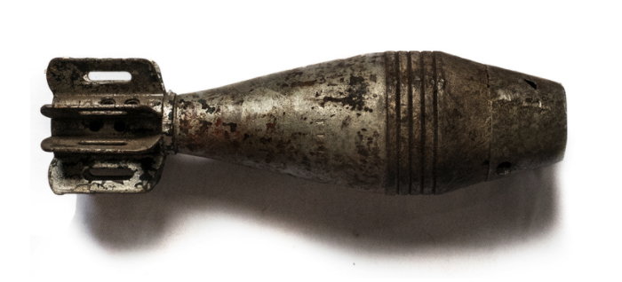
The U.S. military spends over a billion dollars a year to clean up sites it has contaminated with toxic waste or explosives. These sites exist in every state and some are even located near schools, residential neighborhoods, rivers and lakes. Abrahm Lustgarten, a senior environmental reporter for ProPublica, has been publishing a series of stories about the Pentagon’s handling of these sites and how the military’s waste has poisoned millions of acres of American soil, leaving people to guess at the threat to their health.
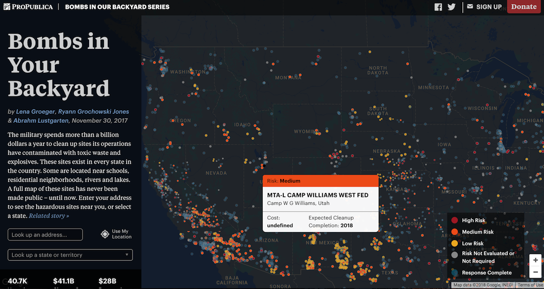
In his series “Bombs in our Backyard,” Lusgarten used audio clips, photography, interactive maps and deep reporting to reveal the extent and threat of toxic sites across the U.S. Storybench spoke with Lustgarten about the process of reporting on and mapping these sites.
What initially drew you to this story?
“I began digging into it and found that the scope of the issue was enormous – not just a handful of sites, but 40,000 of them.”
I’d been hearing about problems on several polluted former defense sites for years and slowly collecting information about them. In particular there is a former chemical weapons testing site in what is now a residential neighborhood in Washington D.C. that is very badly polluted. A source of mine disclosed that there was a criminal investigation into the Army’s cleanup conduct there, and that they may have acted fraudulently.
I began digging into it and found that the scope of the issue was enormous – not just a handful of sites, but 40,000 of them. It seemed like an issue that had gotten almost no attention in the media and that very few people knew anything about. So, it was a very compelling and obvious draw to me. And I’ll be continuing with the project, writing a book about the site in Washington.
Why did you choose to use an interactive map within this story?
In my experience you can write many thousands of words – and I did – telling people that these polluted sites are likely very close to where they live, that they are prolific. But there is no replacing visual communication for that sort of issue. So, it was always a goal of the project to be able to graphically portray the breadth of the military pollution problem, to show how widespread those 40,000 sites are and how many that actually is-the number can seem abstract.
“It was one of the largest datasets that my colleagues at ProPublica had ever worked with.”
We wanted people to be able to go to an image and instantly see that there were indeed bombs in their somewhere nearby, backyard. ProPublica has produced a number of interactive data sets turned into apps, and the successful ones allow people to search and personalize their results.
Then from there, in terms of interactivity, the data and depth of information we had, about specific pollutants, hazard levels, costs, and so forth was too much to put on a single static page. So, it needed to be layered, and that means it needed to be interactive, where a user can dig down into it themselves and follow their own curiosity, digging deeper, finding more information.
Could you walk me through the process for the map, in terms of data sourcing, analysis and visualization?
We couldn’t build a map until we had data to support it. I filed a public records request with the Department of Defense and it took the better part of a year and much negotiation before they agreed to release the data to us. When they did, it was an enormous and almost unruly set of information, kept in a fairly obscure proprietary digital file format (Oracle database) that we then had to purchase ourselves and begin to work in to make sense of the data. It was one of the largest datasets that my colleagues at ProPublica had ever worked with, and it was complex to use. We had to simplify it, excluding about 98% of the information to narrow down to just the information we wanted to use.
Then we mapped it, and spent a lot of time checking and verifying the quality of the data. I didn’t do most of this – we have a very talented graphics and data staff who are whizzes at this stuff. So, they take a subset of data points and check them to verify in the real world – locations, names, etc. Then they come up with a failure rate (i.e., maybe 4 percent of the data is inaccurate) and we try to understand why. Once we can get that number as low as possible then we are comfortable publishing the Department of Defense’s data as being factually accurate.
What advice do you have for journalists who want to build similar digital visualizations and use them in their storytelling?
You’ll need to start with really good data, and work with partners who have the expertise to analyze it. The visualization part is an art form, and I think it’s one of the most compelling ways to communicate complex investigative journalistic findings. The best visualizations are an art form. But the foundation for it has to be accurate, and that data testing and verification can be enormously complex.
“The EPA couldn’t help explain or fix the data, and so we chose not to map it.”
The best tip is to not allow the claims or message of the final product to exceed or outpace the capabilities of the data that you have. We’ve had data sets we ultimately decided not to use. Once, for example, I had a dataset from the EPA of locations where hazardous waste had been dumped and buried. It had tens of thousands of sites, identified by latitude and longitude, and a lot of other information. We found a systematic error where a larger number of the latitude and longitude coordinates appeared to be transposed or were wrong. The EPA couldn’t help explain or fix the data, and so we chose not to map it because we couldn’t tell which site was accurate and which was not.
What are your hopes for the future of this project?
Well, I’m winding down the daily reporting aspect. But I am continuing with a book about the topic, and one particular case. So, I hope that book is well received and widely read. I hope the project overall gets the attention of military planners and Congress and that ultimately it might lead to a change in the process they use to run these cleanups across the country.
For instance, Congress could create a separate agency to handle military cleanups, thereby separating the cleanup budget out of the defense budget and eliminating the competition for funds which is at the heart of so many of the problems I wrote about. But I would expect reaction and change on this subject to come very slowly. I would also hope we’ve provided local individual communities the tools to better understand what environmental risks they are surrounded by, to keep their families safe, to be empowered to speak up locally, or to their representatives, etc, and to take a larger role in guiding these cleanups themselves. Until now, many of these towns/places didn’t even know they had a military pollution problem to worry about.
More information on ProPublica’s methodology behind the mapping process can be found here.
- Is virtual reality accessible to Northeastern students? - April 17, 2018
- How ProPublica revealed the threat and extent of toxic military sites across the U.S. - February 26, 2018
- Alexey Furman dreams in 360: An interview with the co-founder of Ukraine’s New Cave Media - February 9, 2018


