How to calculate a rolling average in R
Rolling or moving averages are a way to reduce noise and smooth time series data. During the Covid-19 pandemic, rolling averages have been used by researchers and journalists around the world to understand and visualize cases and deaths. This post will cover how to compute and visualize rolling averages for the new confirmed cases and deaths from Covid-19 in the United States.
Packages
We’ll load the packages below for ggplot2, geofacet, and hrbrthemes for dope graph themes.
library(zoo) # moving averages
library(tidyverse) # all tidyverse packages
library(hrbrthemes) # themes for graphs
library(socviz) # %nin%
library(geofacet) # maps
library(usmap) # lat and long
library(socviz) # for %nin%
library(ggmap) # mapping
The Johns Hopkins COVID data
The code block below imports the COVID-19 data from the Center for Systems Science and Engineering at the Johns Hopkins Whiting School of Engineering
JHCovid19States <- readr::read_csv("https://raw.githubusercontent.com/mjfrigaard/storybench/master/drafts/data/jhsph/2020-06-22-JHCovid19States.csv")
Wrangling steps
All the steps for wrangling these data are in this gist.
State-level Johns Hopkins COVID data
We ended up with a data frame that has the following new columns.
state – us statestate_abbr – abbreviated state namemonth_abbr – month for data reported (with abbreviation)date – as_date() version of last_update
utils::head(JHCovid19States)
#>  # A tibble: 6 x 19
#>    state last_update           lat   long confirmed deaths recovered active
#>    <chr> <dttm>              <dbl>  <dbl>     <dbl>  <dbl>     <dbl>  <dbl>
#>  1 Alab… 2020-04-12 23:18:15  32.3  -86.9      3563     93        NA   3470
#>  2 Alas… 2020-04-12 23:18:15  61.4 -152.        272      8        66    264
#>  3 Ariz… 2020-04-12 23:18:15  33.7 -111.       3542    115        NA   3427
#>  4 Arka… 2020-04-12 23:18:15  35.0  -92.4      1280     27       367   1253
#>  5 Cali… 2020-04-12 23:18:15  36.1 -120.      22795    640        NA  22155
#>  6 Colo… 2020-04-12 23:18:15  39.1 -105.       7307    289        NA   7018
#>  # … with 11 more variables: fips <dbl>, incident_rate <dbl>,
#>  #   people_tested <dbl>, people_hospitalized <dbl>, mortality_rate <dbl>,
#>  #   testing_rate <dbl>, hospitalization_rate <dbl>, date <date>,
#>  #   month_abbr <chr>, day <dbl>, state_abbr <chr>
Calculating rolling averages
Two states (Florida and South Carolina) have seen an increase in their death rates. We’re going to calculate and visualize the rolling averages for cumulative deaths and new cases in these states and compare them to the other 48 states.
To calculate a simple moving average (over 7 days), we can use the rollmean() function from the zoo package. This function takes a k, which is an ’integer width of the rolling window.
The code below calculates a 3, 5, 7, 15, and 21-day rolling average for the deathsfrom COVID in the US.
JHCovid19States <- JHCovid19States %>%
    dplyr::arrange(desc(state)) %>%
    dplyr::group_by(state) %>%
    dplyr::mutate(death_03da = zoo::rollmean(deaths, k = 3, fill = NA),
                  death_05da = zoo::rollmean(deaths, k = 5, fill = NA),
                  death_07da = zoo::rollmean(deaths, k = 7, fill = NA),
                  death_15da = zoo::rollmean(deaths, k = 15, fill = NA),
                  death_21da = zoo::rollmean(deaths, k = 21, fill = NA)) %>%
  dplyr::ungroup()
Below is an example of this calculation for the state of Florida,
JHCovid19States %>%
  dplyr::arrange(date) %>%
  dplyr::filter(state == "Florida") %>%
  dplyr::select(state,
                date,
                deaths,
                death_03da:death_07da) %>%
  utils::head(7)
#>  # A tibble: 7 x 6
#>    state   date       deaths death_03da death_05da death_07da
#>    <chr>   <date>      <dbl>      <dbl>      <dbl>      <dbl>
#>  1 Florida 2020-04-12    461        NA         NA         NA
#>  2 Florida 2020-04-14    499       510.        NA         NA
#>  3 Florida 2020-04-14    571       555.       559         NA
#>  4 Florida 2020-04-15    596       612.       612.       610.
#>  5 Florida 2020-04-16    668       663        662.       654.
#>  6 Florida 2020-04-17    725       714.       702.       701.
#>  7 Florida 2020-04-18    748       749        747.       743.
The calculation works like so,
- the first value in our new
death_03davariable (510.3333) is the averagedeathsin Florida from the first date with a data point on either side of it (i.e. the date2020-04-13has2020-04-12preceding it, and2020-04-14following it). We can check our math below.
mean(c(461, 499, 571))#> [1] 510.3333
- the first value in
death_05da(132.0) is the averagedeathsin Florida from the first date with two data points on either side of it (2020-04-14has2020-04-12and2020-04-13preceding it, and2020-04-15and2020-04-16following it). We can check our math below.
mean(c(461, 499, 571, 596, 668))#> [1] 559
- And the first value in
death_07da(609.7143) is the average death rate in Florida from the first date with three data points on either side (2020-04-15has2020-04-12,2020-04-13and2020-04-14preceding it, and2020-04-16,2020-04-17, and2020-04-18following it). Check our math again:
mean(c(461, 499, 571, 596, 668, 725, 748))#> [1] 609.7143It’s good practice to calculate rolling averages using an odd number for k (it makes the resulting values symmetrical).
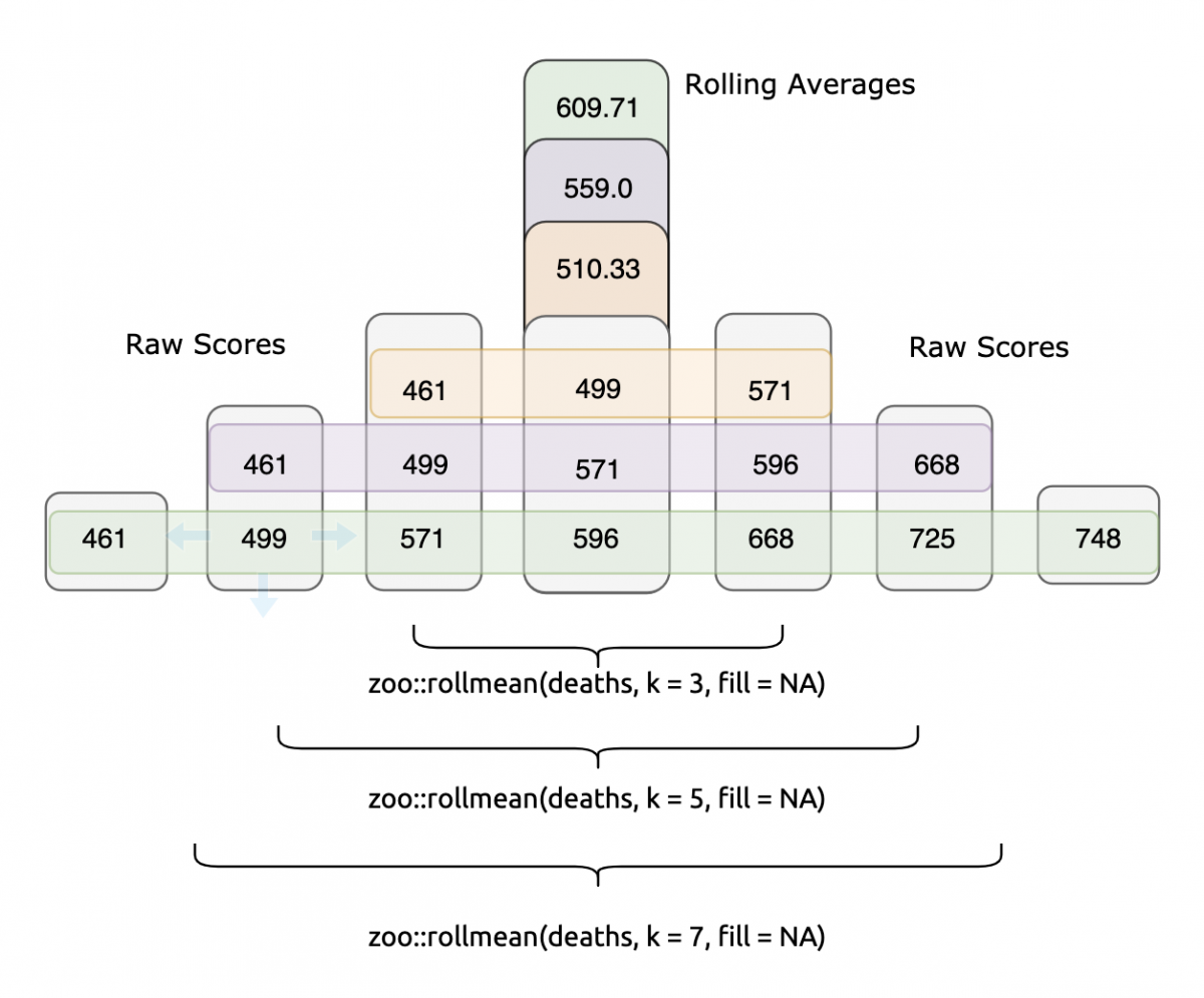
Each rolling mean is calculated from the numbers surrounding it. If we want to visualize and compare the three rolling means against the original deaths data, we can do this with a little pivot_ing,
JHCovid19States %>%
  dplyr::filter(state == "Florida") %>%
  tidyr::pivot_longer(names_to = "rolling_mean_key",
                    values_to = "rolling_mean_value",
                    cols = c(deaths,
                             death_03da,
                             death_21da)) %>%
 # after may 15
  dplyr::filter(date >= lubridate::as_date("2020-05-15") &
# before june 20
                  date <= lubridate::as_date("2020-06-20")) %>%
  ggplot2::ggplot(aes(x = date,
                      y = rolling_mean_value,
                      color = rolling_mean_key)) +
  ggplot2::geom_line() +
  ggplot2::labs(title = "Florida's rolling average total COVID deaths",
                  subtitle = "Between 2020-05-15 and 2020-06-20",
                  y = "Deaths",
                  color = "Metric",
                  x = "Date") +
  hrbrthemes::theme_ipsum_rc()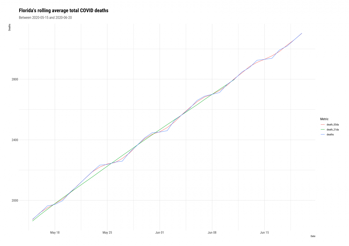
JHCovid19States %>%
  dplyr::filter(state == "South Carolina") %>%
  tidyr::pivot_longer(names_to = "rolling_mean_key",
                    values_to = "rolling_mean_value",
                    cols = c(deaths,
                             death_03da,
                             death_21da)) %>%
  dplyr::filter(date >= lubridate::as_date("2020-05-15") & # after may 15
                  date <= lubridate::as_date("2020-06-20")) %>% # before june 20
  ggplot2::ggplot(aes(x = date,
                      y = rolling_mean_value,
                      color = rolling_mean_key)) +
  ggplot2::geom_line() +
  ggplot2::labs(title = "South Carolina's rolling average total COVID deaths",
                  subtitle = "Between 2020-05-15 and 2020-06-20",
                  y = "Deaths",
                  color = "Metric",
                  x = "Date") +
  hrbrthemes::theme_ipsum_rc()
Which mean should I use?
The zoo::rollmean() function works by successively averaging each period (k) together. Knowing which period (k) to use in zoo::rollmean() is a judgment call. The higher the value of k, the smoother the line gets, but we are also sacrificing more data.
If we compare the 3-day average (death_3da) to the 21-day average (death_21da), we see the line for deaths gets increasingly smooth.
Calculating new cases in each state
Below we get some help from dplyr::lag() to calculate the new cases in each state per day.
We join this new calculation back to the JHCovid19States dataset, but rename it JHCovid19NewCases.
JHCovid19NewCases <- JHCovid19States %>%
  # group this by state and day
  group_by(state, date) %>%
  # get total deaths per day
  dplyr::summarize(
    confirmed_sum = (sum(confirmed, na.rm = TRUE))) %>%
  # calculate 'new deaths' = todays deaths - yesterdays deaths
  mutate(new_confirmed_cases = confirmed_sum - dplyr::lag(x = confirmed_sum, n = 1,
                                              order_by = date)) %>%
  dplyr::select(state,
                new_confirmed_cases,
                date) %>%
  # join back to JHCovid19
  dplyr::left_join(., y = JHCovid19States,
                   by = c("state", "date")) %>%
  # reorganize
  dplyr::select(state,
                state_abbr,
                date,
                month_abbr,
                day,
                confirmed,
                dplyr::contains("confirm"),
                dplyr::contains("death"),
                lat,
                long,
                dplyr::ends_with("rate"))
# check SC
JHCovid19NewCases %>%
dplyr::filter(state == "South Carolina") %>%
dplyr::select(state_abbr, date, confirmed, new_confirmed_cases) %>%
utils::head()
#> Adding missing grouping variables: `state`
#> # A tibble: 6 x 5
#> state state_abbr date confirmed new_confirmed_cases
#> <chr> <chr> <date> <dbl> <dbl>
#> 1 South Carolina SC 2020-04-12 3320 NA
#> 2 South Carolina SC 2020-04-13 3391 71
#> 3 South Carolina SC 2020-04-14 3553 162
#> 4 South Carolina SC 2020-04-15 3656 103
#> 5 South Carolina SC 2020-04-16 3931 275
#> 6 South Carolina SC 2020-04-17 4099 168We can check this math below, too.
3391 - 3320 # 2020-04-13
[1] 71
3553 - 3391 # 2020-04-14
[1] 162
3656 - 3553  # 2020-04-15
[1] 103
3931 - 3656 # 2020-04-16
[1] 275
4099 - 3931  # 2020-04-17
[1] 168
We can see this calculation is getting the number of new confirmed cases each day correct. Now we can calculate the rolling mean for the new confirmed cases in each state.
JHCovid19NewCases <- JHCovid19NewCases %>%
    dplyr::group_by(state) %>%
    dplyr::mutate(
      new_conf_03da = zoo::rollmean(new_confirmed_cases, k = 3, fill = NA),
      new_conf_05da = zoo::rollmean(new_confirmed_cases, k = 5, fill = NA),
      new_conf_07da = zoo::rollmean(new_confirmed_cases, k = 7, fill = NA),
      new_conf_15da = zoo::rollmean(new_confirmed_cases, k = 15, fill = NA),
      new_conf_21da = zoo::rollmean(new_confirmed_cases, k = 21, fill = NA)) %>%
  dplyr::ungroup()
Moving averages with geofacets
We’ll take a look at the seven-day moving averages of new cases across all states using the geofacet package.
First we’ll build two plots for Florida, combine them, and then extend this to the entire country.
Column graph for new cases
We will limit the JHCovid19NewCases data to June 1st – June 21st.
JHCovid19NewCasesJun <- JHCovid19NewCases %>%
      dplyr::filter(date >= lubridate::as_date("2020-06-01") & # after june 1
                  date <= lubridate::as_date("2020-06-20")) # before june 20
Then we will create a ggplot2::geom_col() for the new_confirmed_cases.
We will build these two graphs with hrbrthemes::theme_modern_rc().
JHCovid19NewCasesJun %>%
  dplyr::filter(state == "Florida") %>%
    ggplot2::ggplot(aes(x = day,
                      y = new_confirmed_cases)) +
    geom_col(alpha = 1/10) +
    ggplot2::labs(title = "Florida's new COVID cases",
                  subtitle = "Rolling average between 2020-06-01 and 2020-06-20",
                  y = "New Cases",
                  x = "Day") +
  hrbrthemes::theme_modern_rc()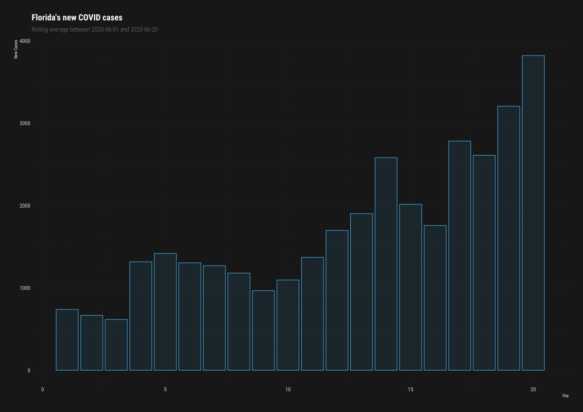
Tidy dataset of new cases
Now we want to add lines for the new_conf_ variables, so we’ll use pivot_longer.
FLNewCasesTidy <- JHCovid19NewCasesJun %>%
  # only Florida
  dplyr::filter(state == "Florida") %>%
  # pivot longer
  tidyr::pivot_longer(names_to = "new_conf_av_key",
                    values_to = "new_conf_av_value",
                    cols = c(new_conf_03da,
                             new_conf_05da,
                             new_conf_07da)) %>%
  # reduce vars
  dplyr::select(day,
                date,
                state,
                state_abbr,
                new_conf_av_value,
                new_conf_av_key)
Now we can combine them into a single plot.
Line graph for new cases
JHCovid19NewCasesJun %>%
  # florida new cases
  dplyr::filter(state == "Florida") %>%
    ggplot2::ggplot(aes(x = day,
                      y = new_confirmed_cases,
                      group(date))) +
    geom_col(alpha = 1/10) +
  # add the line with new data
    ggplot2::geom_line(data = FLNewCasesTidy,
                       mapping = aes(x = day,
                                     y = new_conf_av_value,
                                     color = new_conf_av_key)) +
    ggplot2::labs(title = "Florida's new COVID cases",
                  subtitle = "Rolling average between 2020-06-01 and 2020-06-20",
                  y = "New Cases",
                  color = "Metric",
                  x = "Day") +
    hrbrthemes::theme_modern_rc()
We can see that the blue (7-day average) of new confirmed cases is definitely the smoothest line.
Let’s compare it to the 3-day average using a geofacet for the other states in the US.
Again, we build our tidy data frame of new confirmed case metrics.
NewCasesTidy <- JHCovid19NewCasesJun %>%
  # pivot longer
  tidyr::pivot_longer(names_to = "new_conf_av_key",
                    values_to = "new_conf_av_value",
                    cols = c(new_conf_03da,
                             new_conf_07da)) %>%
    # better labels for printing
  dplyr::mutate(new_conf_av_key = dplyr::case_when(
    new_conf_av_key == "new_conf_03da" ~ "3-day new confirmed cases",
    new_conf_av_key == "new_conf_07da" ~ "7-day new confirmed cases",
    TRUE ~ NA_character_)) %>%
  # reduce vars
  dplyr::select(day,
                date,
                state,
                state_abbr,
                new_conf_av_value,
                new_conf_av_key)
Column + line + facet_geo()
And we’ll switch the theme to hrbrthemes::theme_ipsum_tw(). We also use the min and max to get values for the subtitle.
# get min and max for labels
min_date <- min(JHCovid19NewCasesJun$date, na.rm = TRUE)
max_date <- max(JHCovid19NewCasesJun$date, na.rm = TRUE)
JHCovid19NewCasesJun %>%
    ggplot2::ggplot(aes(x = day,
                      y = new_confirmed_cases)) +
    geom_col(alpha = 3/10, linetype = 0) +
    ggplot2::geom_line(data = NewCasesTidy,
                       mapping = aes(x = day,
                                     y = new_conf_av_value,
                                     color = new_conf_av_key)) +
    geofacet::facet_geo( ~ state_abbr,
                       grid = "us_state_grid2",
                       scales = "free_y")  +
    ggplot2::labs(title = "US rolling 3 and 7-day averages of new COVID cases",
                  subtitle = "Between 2020-05-31 and 2020-06-20",
                  y = "New Cases",
                  color = "Metric:",
                  x = "Day") +
  hrbrthemes::theme_ipsum_tw() +
  theme(axis.title.x = element_blank(),
        axis.text.x = element_blank(),
        axis.ticks.x = element_blank()) +
      ggplot2::theme(legend.position = "top")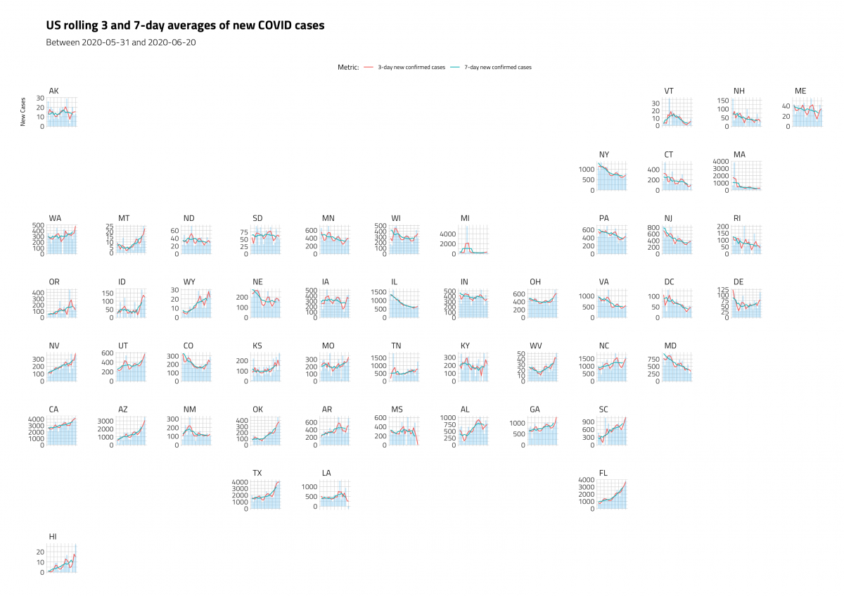
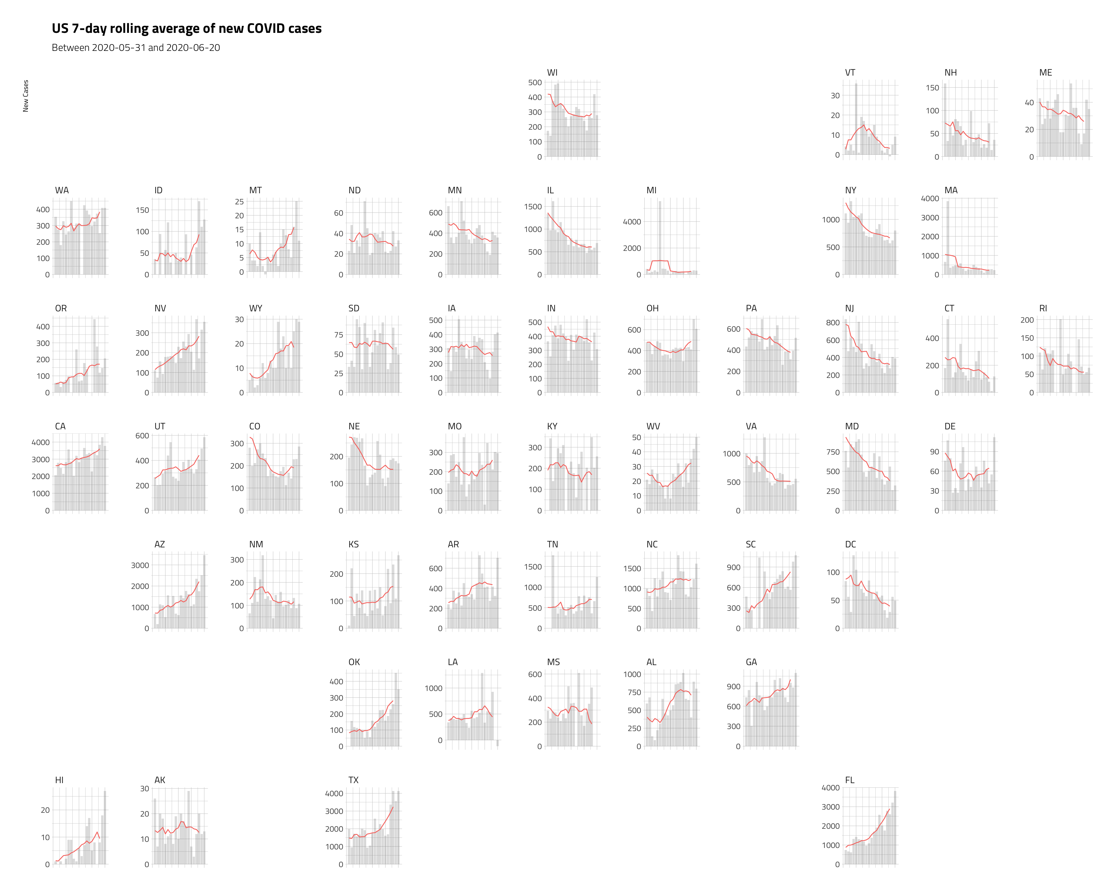
The plot below uses only raw new_confirmed_cases and the 7-day averages with geom_line() and geom_col().
# get data for only 7-day average
JHCovid19NewCasesJun7da <- JHCovid19NewCasesJun %>%
                          dplyr::select(day, new_conf_07da, state, state_abbr)
# get min and max for labels
min_date <- min(JHCovid19NewCasesJun$date, na.rm = TRUE)
max_date <- max(JHCovid19NewCasesJun$date, na.rm = TRUE)
JHCovid19NewCasesJun %>%
    ggplot2::ggplot(aes(x = day,
                      y = new_confirmed_cases)) +
    geom_col(alpha = 2/10, linetype = 0) +
    ggplot2::geom_line(data = JHCovid19NewCasesJun7da,
                       mapping = aes(x = day,
                                     y = new_conf_07da,
                                     color = "darkred",
                                     ), show.legend = FALSE) +
    geofacet::facet_geo( ~ state_abbr,
                       grid = "us_state_grid1",
                       scales = "free_y")  +
    ggplot2::labs(title = "US 7-day rolling average of new COVID cases",
                  subtitle = paste0("Between", min_date,  " and ", max_date),
                  y = "New Cases",
                  x = "Day") +
  hrbrthemes::theme_ipsum_tw() +
  ggplot2::theme(axis.title.x = element_blank(),
        axis.text.x = element_blank(),
axis.ticks.x = element_blank()) 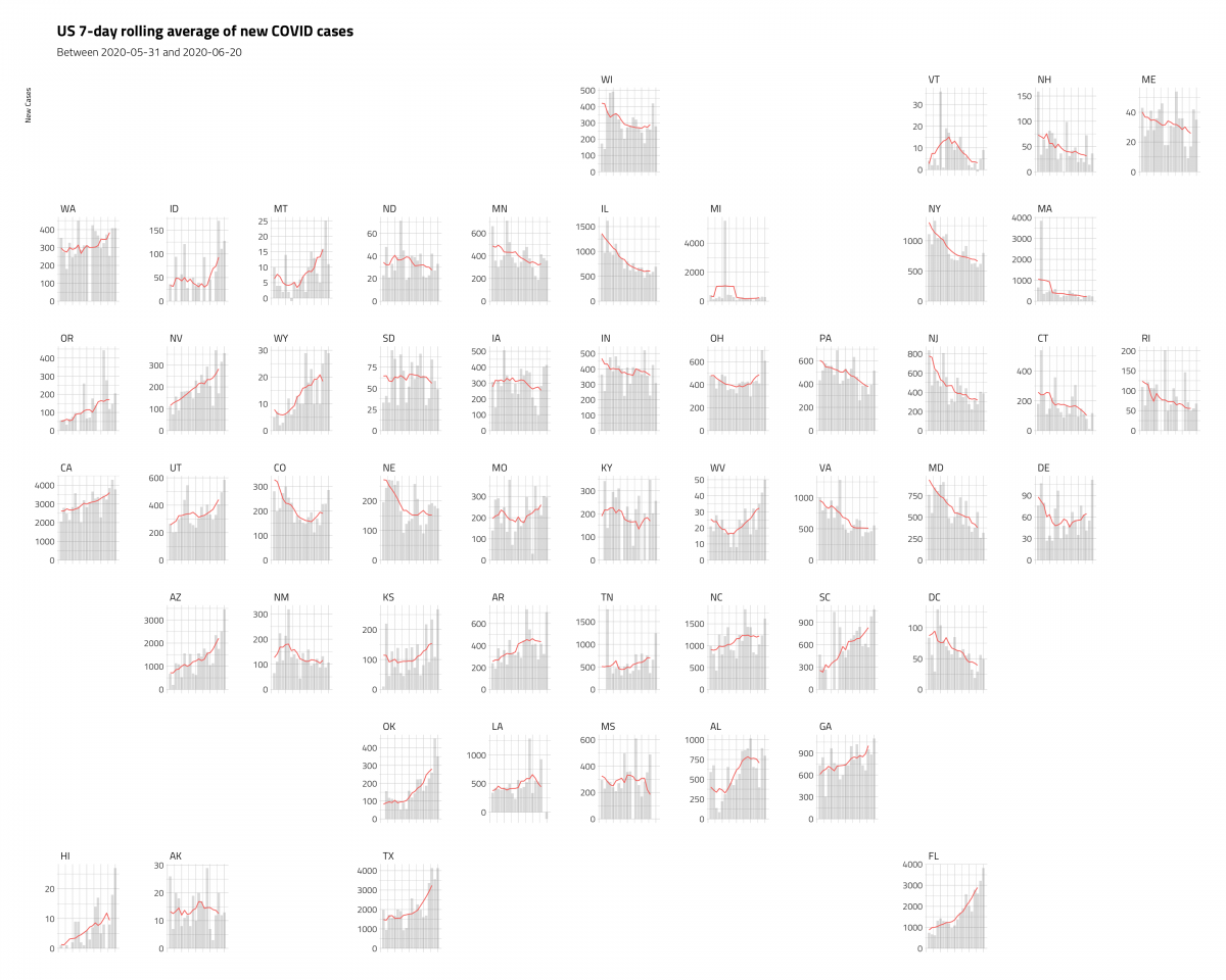
These plots are a little misleading, because we’ve dropped the x axis (but we’ve included the time period in the subtitle), and the y axis varies a bit. But we’re able to cram a lot of information into a single graphic, and see some important trends.
More notes on rolling/moving averages:
- “A moving average term in a time series model is a past error (multiplied by a coefficient). Moving average is also used to smooth the series. It does this be removing noise from the time series by successively averaging terms together” – Machine Learning Using R: With Time Series and Industry-Based Use Cases in R
- “Moving averages is a smoothing approach that averages values from a window of consecutive time periods, thereby generating a series of averages. The moving average approaches primarily differ based on the number of values averaged, how the average is computed, and how many times averaging is performed”.
- “To compute the moving average of size k at a point p, the k values symmetric about p are averaged together which then replace the current value. The more points are considered for computing the moving average, the smoother the curve becomes.“
- Getting started with stringr for textual analysis in R - February 8, 2024
- How to calculate a rolling average in R - June 22, 2020
- Update: How to geocode a CSV of addresses in R - June 13, 2020


Hi!, I´m currently using some codelines from your post, but I don´t know how to solve an issue:
Code:
data_entrada %
dplyr::arrange(desc(foto_mes)) %>%
dplyr::group_by(numero_de_cliente) %>%
dplyr::mutate(saldo_promedio_3_meses = zoo::rollmean(Saldo, k = 3, fill = NA)) %>%
dplyr::ungroup()
But using this lines I get NAs for the first and last months of the dataset, how can I solve this?
Alan, you’ll definitely get NAs for the first two months because those columns don’t have 3 previous months to calculate.
Thank you for this illuminating article!
It’s interesting that you chose Florida as an example as there are two rows for 2020-04-14. I know it’s not an error in data (unless you think that the date for the first one should be 2020-04-13 even though it was updated at 00:42:00 on the 14th) and doesn’t affect the rolling average, but could make one scratch their head in some other situation.
JHCovid19States %>%
dplyr::arrange(date) %>%
dplyr::filter(state == “Florida”) %>%
dplyr::select(state,
date,
deaths,
death_03da:death_07da) %>%
utils::head(7)
#> # A tibble: 7 x 6
#> state date deaths death_03da death_05da death_07da
#>
#> 1 Florida 2020-04-12 461 NA NA NA
#> 2 Florida 2020-04-14 499 510. NA NA
#> 3 Florida 2020-04-14 571 555. 559 NA
#> 4 Florida 2020-04-15 596 612. 612. 610.
#> 5 Florida 2020-04-16 668 663 662. 654.
#> 6 Florida 2020-04-17 725 714. 702. 701.
#> 7 Florida 2020-04-18 748 749 747. 743.
Very interesting information, thanks!!!! As you said, I can understand that first two months don’t have previous months to calculate, but… what about last months? Why last months are not calculated if they really have previous data??
I found function rollmeanr instead of rollmean, it moves the line to the end.
Thank you for rollmeanr – i had same issue lol
Check out the section of the article titled: “Calculating rolling averages”. It explains that the rollmean function calculates a symmetrical rolling average centred on the row of interest. The diagram is particularly useful.
I have year data: 2010, 2011, 2012, 2013, 2014, 2015. If I ask rollmean to calculate the 3 year average for 2012 it looks back one to 2011 and forward one to 2013. That’s why you only have a single NA at the beginning.