How to build a simple narrative web layout
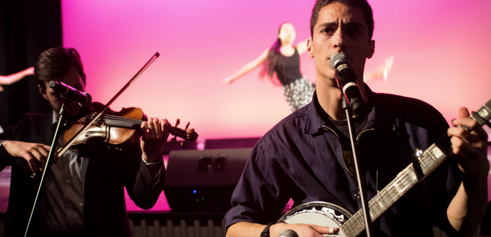
This tutorial was written by Nitesh Gupta and Nick Pfosi, executive online editor and executive photo editor, respectively, of The Tufts Daily, the student newspaper at Tufts University. They offered to write a tutorial on their process of conceiving and coding a story layout for a recent Tufts Daily piece on a multimedia dance performance featuring live music and Sarabande, a French style of dance in triple metre and the name of the dance troupe.
Before rushing content to your web developers screaming “Snow Fall,” keep in mind that powerful story layouts are always a collaborative process. Our piece Motion and music meet in Sarabande’s fall show is not complex but it works because we collaborated and spoke about the narrative arc of the story weeks before the deadline.

In student media, photos and videos can easily become dissociated from the (written) content they are supposed to be “supporting.” This happens because there is a limiting mentality that visual content should “serve” written content rather than help convey it. We wanted to avoid this thinking and incorporate more than just the reporter’s voice. Actively communicating with writer Drew Robertson was critical to not only incorporating her style but specifically capturing visuals based on her angle.
What proved most new to us was the dynamic web-presentation. With the written and visual content prepared, we needed a blank canvas on which to build something that was simple yet engaging.
Setting up a stand-alone article
To do this, we abandoned our normal article layout and set up a new folder outside of our WordPress’s ‘wp-content’ directory using a 301 redirect for the normal WordPress post. (We used the 301 redirect so that our post would still show up in our site search and all the dynamic queries for our homepage and category pages. Upon removing the 301 redirect, the standard article layout would still exist.)
Since we used only HTML, CSS, and Javascript, you can view all of the source code from your browser.
To truly start with a blank canvas we needed to do some CSS resets:
body {
     padding: 0px;
     margin: 0px;
}
Cover image and text
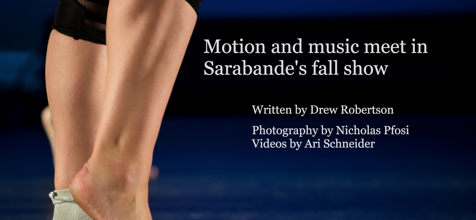
After the CSS reset, we were ready to choose our cover image. We needed something that could convey the subject of the piece and which we could use to seamlessly integrate the title and the author credits. In order to make the title and author credits responsive, we used CSS3’s new viewport measurements. ‘vw’ means 1 percent of the viewport’s width.
This is how we positioned and styled our headline:
.title {
	float: right;
	position: absolute;
	font-size: 4vw;
	color: #DDDDDD;
	top: 0px;
	font-family: Georgia;
	padding-top: 12vw;
	padding-left: 43vw;
	max-width: 700px;
}
The body text
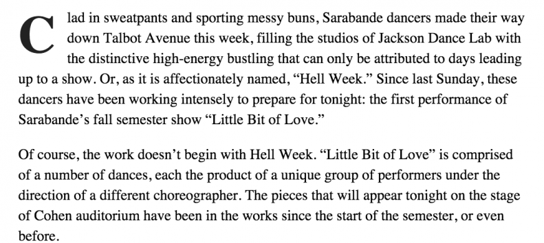
When we set out to work on the body text, we wanted it to be simple and clean. To do this, we centered the text and created a maximum page width to help the aesthetic on wide displays. To optimize it for mobile layouts without having to write in CSS targeted at media screens, we just added a minimum padding on the left and the right.
Here’s what the styling looked like for the text portion of the article:
.pf-content {
             max-width: 700px;
             display: block;
             font-size: 20px;
             line-height: 28px;
             margin-left: auto;
             margin-right: auto;
             padding-left: 15px;
             padding-right: 15px;
}
Embedding videos
We wanted our videos to have a clean and seamless transition as our readers scrolled down. We felt using Vimeo or YouTube would detract from the narrative flow. For this reason, we chose to self-host our short videos and include them using the standard video HTML5 tag. We included both webm and mp4 versions of our videos so that they would load on Firefox, Chrome, and Safari.
<video loop>
<source src=”assets/sarabande-music-video.mp4″ type=”video/mp4″>
<source src=”assets/sarabande-music-video.webm” type=”video/webm”></video>
Since we didn’t want the video to constantly loop, we used javascript to trigger it to play only when our readers scrolled down to it. Rather than reinvent the wheel, we just modified helpful code from rxmesh on Stack Overflow.
<script type=“text/javascript”>
var videos = document.getElementsByTagName(“video”);
function checkScroll() {
for(var i = 0; i < videos.length; i++) {
var video = videos[i];
var x = video.offsetLeft, y = video.offsetTop, w = video.offsetWidth, h = video.offsetHeight, r = x + w, //right
b = y + h, //bottom
visibleX, visibleY, visible;
visibleX = Math.max(0, Math.min(w, window.pageXOffset + window.innerWidth – x, r – window.pageXOffset));
visibleY = Math.max(0, Math.min(h, window.pageYOffset + window.innerHeight – y, b – window.pageYOffset));
visible = visibleX * visibleY / (w * h);
fraction = 0.4;
if (visible > fraction) {
video.play();
} else {
video.pause();
}
}
}
window.addEventListener(‘scroll’, checkScroll, false);
window.addEventListener(‘resize’, checkScroll, false);
</script>
Ultimately these kinds of collaborations teach us a new way to conceptualize storytelling. Through these multi-platform approaches, we can avoid having a reporter adding graphics to a story as an afterthought. Collaborations like the Motion and Music piece are our initial steps to push student media to rise to the challenge of digital reporting in an integrated newsroom.
Tools used
Slack for intraoffice communication.
Canon/Nikon DSLRs for photography.
Photo Mechanic and Lightroom for photography post-production.
Final Cut for video production.
Vim for coding.


