How to build an embeddable interactive line chart with Plotly
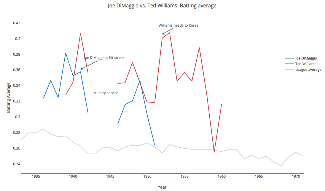
Recently, and mostly for fun, we were looking at what was happening in major league baseball in 1941. Specifically, we were trying to compare Ted Williams and Joe DiMaggio, legendary outfielders for the Boston Red Sox and the New York Yankees, respectively. The following tutorial is a guide through our process, from story idea to ethics to data sourcing to visualization. To bring these numbers to life, we used the visualization platform Plotly. Plotly visualizations can be embedded in websites.
Story idea
The first question we put forward was: What kind of story do we want to tell? Similar to defending a scientific hypothesis, many data journalism projects start with a premise or theory. For example, reporters might investigate if gun ownership has grown in the U.S. in the last 20 years. The data reporters then seek out and interrogate every sliver of data they can find related to the topic to prove or disprove the theory. A deeper discussion on ethics in data journalism can be found here.
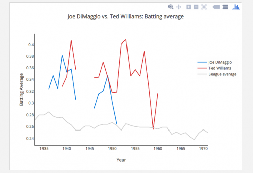
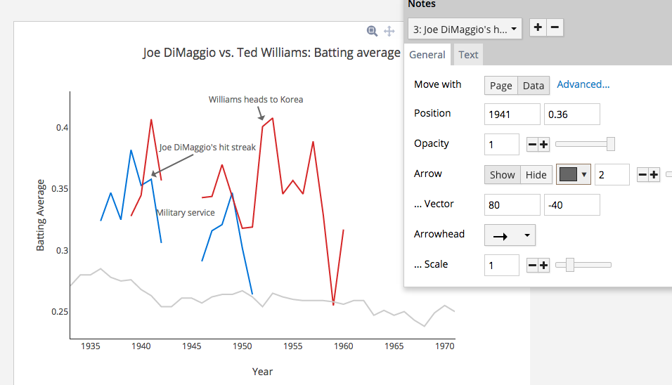
So what story did we want to tell? We wanted to compare performances of Joe DiMaggio and Ted Williams. We decided to look at their batting average, which is the ratio of hits to at bats, as a measure of their seasonal success. Batting average is not the only statistic used to measure a hitter’s success, but it’s one that’s simple to understand and lends itself to comparison across time. Our question was this: Ted Williams may have had a .406 batting average in 1941, but what did that actually mean? Was that uncharacteristically high? How did it compare to his Yankees rival Joe DiMaggio?
After stacking DiMaggio and Williams’ career batting averages against one another, we’d compare them to the league average across time. Finally, we annotateD the line graphs to explain key milestones in their careers. These comparisons and annotations would be included in order to provide as much context as possible.
Finding the data
After asking some baseball fans, we learned that a fairly comprehensive set of baseball data exists on baseball-reference.com. There, we found batting average stats for DiMaggio and Williams for the 1930s, 40s, and 50s. Next, we started a Google Spreadsheet and copied in the data, organizing it by year and player. We also found Ted Williams data and league batting average data on baseball-almanac.com. The league data needed a lot of cleaning up.
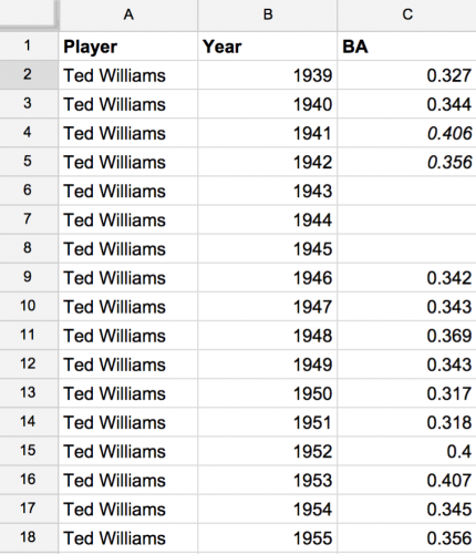
We added spaces for the years that were missing from Williams’ career due to World War II. Note: Do not filter or reorder the columns! Leave them as is.
Booting up Plotly
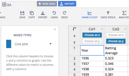
Sign up for a free Plotly membership. Click New Project in the top-right. You’ll see this interface:
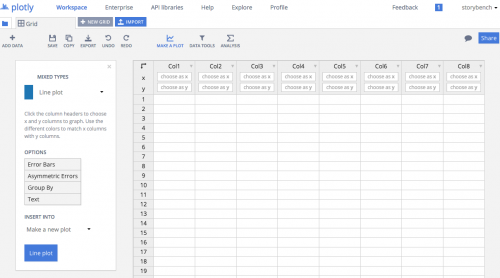
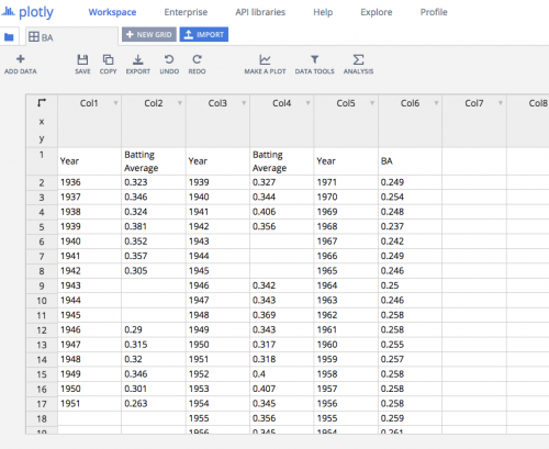
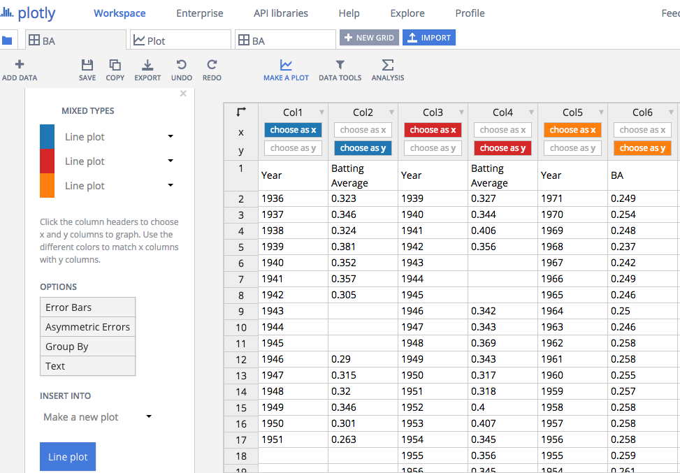
Simply paste in the data you’ve collected in the Google spreadsheet. In the first two columns we have Joe DiMaggio’s batting average data with holes left for the years he was in the war; in the third and fourth columns we have Ted Williams’ batting average data with holes as well; in the fifth and sixth columns we have the league average data.
We originally had data from 1901 to 2014 but chose to limit the range to 1933 to 1972. This was a design choice. We didn’t want the X axis to travel all the way until 2014.
Customizing the line plot
Next, click Make a Plot and then Line Plot from the menu. Now, click choose as x in column 1 and choose as y in column 2. You are mapping the data to the axes.
Do the same with columns 2 through 5. You will notice the color changes for each line graph you are adding. Make sure DiMaggio is one color, Williams another, and the league average another.
Next, click Line plot in the bottom-left. Plotly will bring you to the line graph it has created. Lots of elements can be customized here including the colors, the names and labels on the axes, the grid’s visibility, and more.

Customizing the line plot
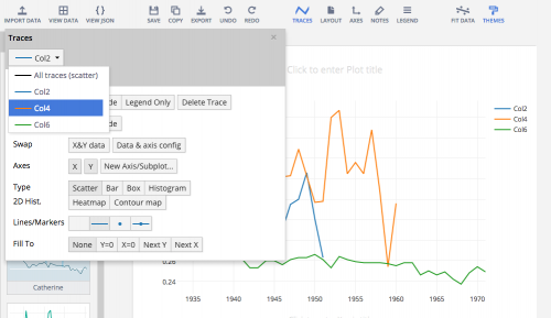
The first thing we did was change the line colors to have DiMaggio and Williams’ names and team colors. Click Traces in the menu and then select the column and click Style. Change the color there.
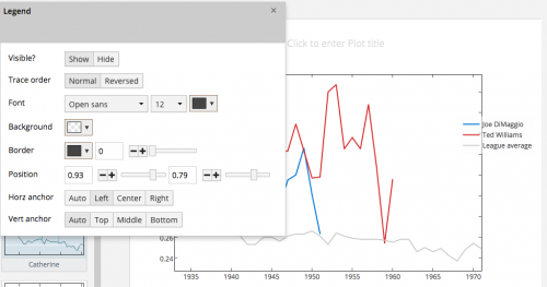
By clicking Legend you can move it over the wherever you’d like.
We removed the square axes and the ticks by clicking Axes and fiddling with Mirror (under Lines) and changing the ticks color to transparent under Ticks.
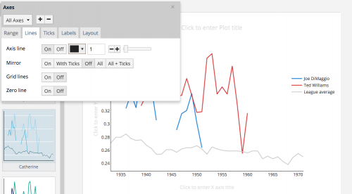
Adding a title and labels on the axes was as simple as clicking where Plotly says Click to enter title.
Adding annotations for context
Finally, we wanted to add some context to the graph. Plotly allows users to add notes. These are anchored to a point, so no matter how large the graph is sized, they move with the other elements. Add the annotations by clicking Notes.
Click the + button and then move the note around by changing the coordinates under Position. We placed a note at the 1944 and 0.33 coordinate. We also deleted the arrow by making the vector lengths 0 and 0. Click New Text to change the name of the note. We made it Military Service.
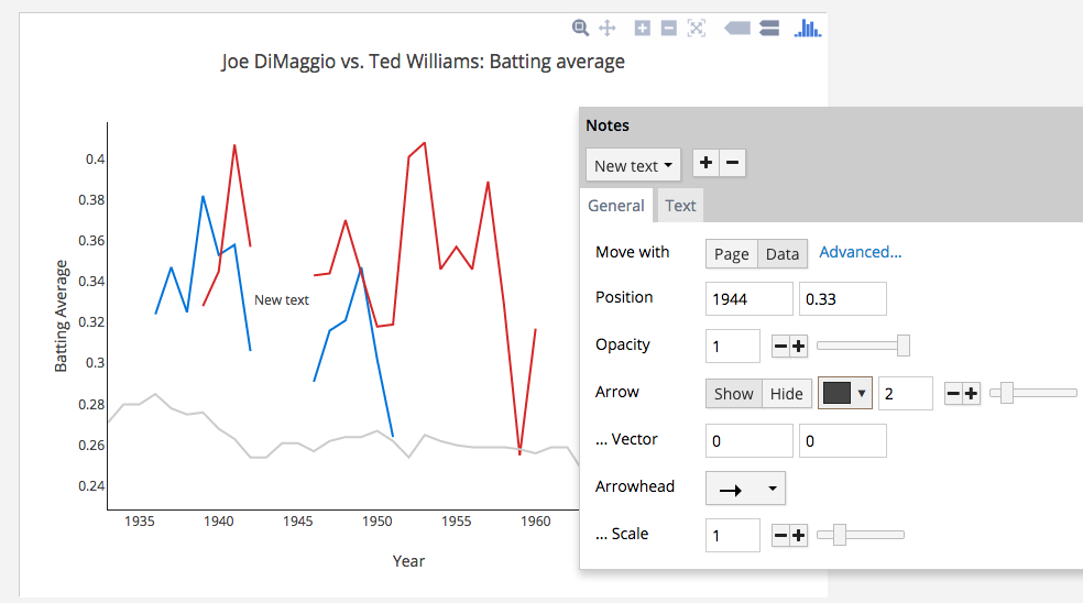
Add another note by clicking the + button again. This time, we want to include an arrow. The arrow head’s location is what the Position coordinates reference. Be sure, then, to customize the Position first. The vector lengths can then be customized to enlarge and lengthen the arrow.
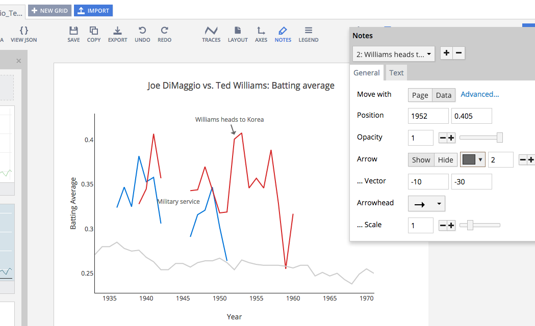
Repeat this for any number of annotations you’d like to add.
Embedding the Plotly graph
When you are ready to embed, click Share in the top-right. Click the </> embed button and then the Prefer an iframe? link. Plotly will provide the iframe code. You need only paste in the URL pointing to your graph. Ours is https://plot.ly/~storybench/96/
Conclusions
The upside is Plotly makes it simple to create and customize an interactive graphic. But unfortunately, Plotly does not allow users to strip out its top menu nor its Play with this data! link along the bottom. This means Plotly gets to maintain its branding on the graph after it’s embedded in your site. Coding an interactive graph from scratch (with D3js, for example) would allow publishers to apply their own branding. This of course is a lot more work than using Plotly.


Hi, a great post. We’ve been trying out plotly but experiencing problems with the iframe embed code on our responsive site. The code provided does not seem to be “responsive” so on mobile the charts are messed up when you view screen in “normal” vertical position but ok when you hold screen horizontally. The same is true for the charts used in your post. Would appreciate any help/insights you might have ad we are very keen on using plotly
thanks
Brian