How to build an animated heatmap in CartoDB
CartoDB is a fantastic tool for visualizing geographic data. The following is a tutorial for building an animated heatmap using temporal data. We’ll be mapping Asian tiger mosquito data, collected between 1964 and 2014, which formed part of the Nature Scientific Data paper “The global compendium of Aedes aegypti and Aedes albopictus occurrence.” The data can be downloaded in CSV form from the Dryad Digital Repository.
This is what we’ll be building:
A heatmap showing occurrences of Asian tiger mosquitoes worldwide since 1964.
Clean the data
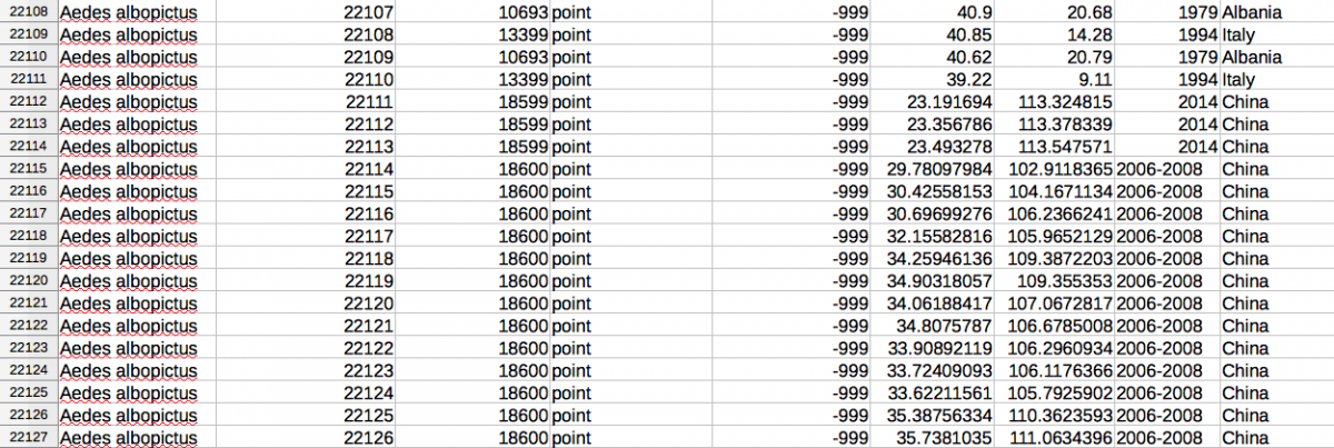
I opened the albopictus.csv file in LibreOffice to check out how the data was structured and to see if there were any holes or problems. It turns out that in the Year column, some of the datapoints were labeled “NA” while others were labeled “2006-2008.” Both will present difficulties later when trying to animate this data. I made a choice, perhaps not the most ethical, to eliminate the 321 rows with “NA” in the Year column and re-label the 24 rows with “2006-2008” in the Year column to simply “2008.” Save the data as a newly named CSV file.
Load in the data
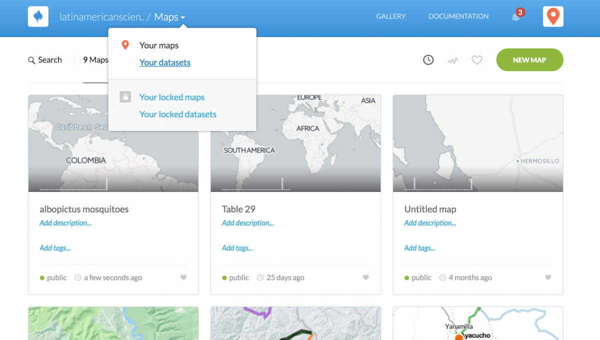
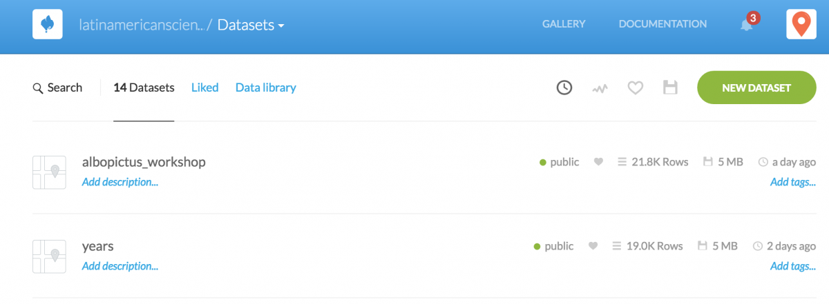
Head to CartoDB.com and log in. Once in, navigate over to Your datasets.
Click the button NEW DATASET.
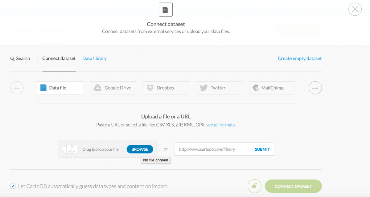
Upload the CSV file by clicking BROWSE. It will take about 30 seconds to connect the dataset given it’s ~22,000 mosquito datapoints.
Georeference your dataset
Once uploaded, you can view your data in DATA VIEW. Notice how column names have all been imported and how each has been recognized as either a string or a number. Had we not cleaned up the Year column, it would have recognized “NA” and “2006-2008” as strings and not allowed us to create an animation based on the years shown in that column.
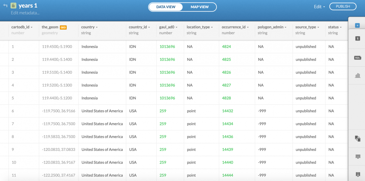
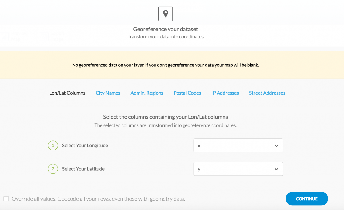
Click MAP VIEW and CartoDB will ask how it should georeference your data. Map the longitude with the X column and latitude with the Y column. Notice your other options, you could create a map based on data that includes city names, administrative regions (like Brazil), postal codes, IP addresses, and even street addresses (with varying degrees of success, depending on the country).
Customize your map
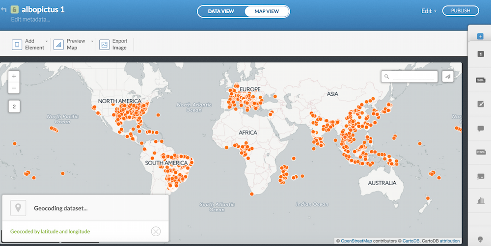
Once you georeference your data, you will be shown a dot distribution map.
Pretty cool. If you navigate over to the wizards tab on the right, you can change the Marker Fill, the marker color, and the Marker Stroke.
A dot distribution map showing occurrences of Asian tiger mosquitoes worldwide since 1964.
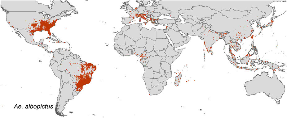
By adjusting these markers, I was able to replicate the map that was published in the Nature study. Cool!
Making a heatmap
In the wizards tab, select HEATMAP.
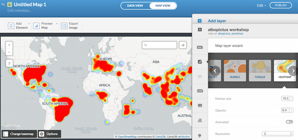
You can adjust the Marker size and resolution, but first move the Animated toggle over to “on.” Make sure to map the Time Column to Year. You can slow down or speed up your animation using the Duration function. The smaller the resolution, the more granularity you will show. Play around with the functions and think about how the story you’re telling might change depending on your choices. Have fun!
A heatmap showing occurrences of Asian tiger mosquitoes worldwide since 1964.


