How to explore correlations in R
This post will cover how to measure the relationship between two numeric variables with the corrr package. We will look at how to assess a variable’s distribution using skewness, kurtosis, and normality. Then we’ll examine the relationship between two variables by looking at the covariance and the correlation coefficient.
Load the packages
The packages we’ll be using in this tutorial are the following:
library(egg) # for ggarrange
library(inspectdf) # check entire data.frame for variable types, etc.
library(visdat) # visualize missing data
library(skimr) # eda for entire data.frame
library(corrr) # correlations
library(skimr) # summaries
library(hrbrthemes) # themes for graphs
library(tidyverse) # all tidyverse packages
library(tidymodels) # meta package for modeling
library(psych) # for skewness and kurtosis
library(socviz) # for %nin%
Set a graph theme
Graph theme’s give us a little customization for the graphs we’ll be producing. If you want to learn more about ggplot2, check out our tutorial here.
# set the theme to theme_light
ggplot2::theme_set(theme_ipsum_tw(base_family = "Titillium Web",
                         base_size = 9,
                         plot_title_family = "Poppins",
                         axis_title_size = 13))
Import the data
We covered how to access data using the tuber in a previous tutorial. For this how-to, we’ll be two YouTube playlists:
If you’d like to see the script for how we downloaded and imported these data, they’re in a Gist here.
# fs::dir_tree("data", regex = "DailyShow")
DailyShowYouTube <- readr::read_csv("data/2019-09-30-DailyShowYouTube.csv")
DailyShowYouTube %>% dplyr::glimpse(78)
#> Observations: 251
#> Variables: 9
#> $ published_at <dttm> 2015-10-05 23:57:09, 2014-12-05 17:01:33, 2014-09-23…
#> $ dislike_count <dbl> 11184, 1065, 722, 2469, 654, 917, 547, 2846, 1449, 22…
#> $ url <chr> "https://i.ytimg.com/vi/yEPSJF7BYOo/default.jpg", "ht…
#> $ id <chr> "yEPSJF7BYOo", "AHO1a1kvZGo", "lPgZfhnCAdI", "9pOiOhx…
#> $ comment_count <dbl> 8130, 2486, 3616, 17629, 2689, 2704, 1887, 3422, 6229…
#> $ title <chr> "The Daily Show - Admiral General Aladeen", "The Dail…
#> $ view_count <dbl> 19159013, 5624319, 5223787, 5134669, 4920942, 4347723…
#> $ like_count <dbl> 161732, 38442, 39755, 47906, 25499, 30986, 25640, 492…
#> $ host <chr> "Jon", "Jon", "Jon", "Jon", "Jon", "Jon", "Jon", "Jon…Visualizations
The DailyShowYouTube contains 9 variables. Some of these are meta data for the videos in the playlist (id, url, and published_at), others contain information on the video related to viewership (dislike_count, comment_count, view_count, and like_count). For more information on these variables, check out the YouTube API documentation.
In this section, we’re going to use visualizations to help us understand how much two numeric variables are related, or how much they are correlated. We’ll start by visualizing variables by themselves, then move into bivariate (two-variable) graphs. The skimr and inspectdf packages allow us to take a quick look at an entire data frame or sets of variables.
Below is a skimr::skim() of the DailyShowYouTube data.frame.
skimr::skim(DailyShowYouTube)| Name | DailyShowYouTube |
| Number of rows | 251 |
| Number of columns | 9 |
| _______________________ | |
| Column type frequency: | |
| character | 4 |
| numeric | 4 |
| POSIXct | 1 |
| ________________________ | |
| Group variables | None |
Data summary
Variable type: character
| skim_variable | n_missing | complete_rate | min | max | empty | n_unique | whitespace |
|---|---|---|---|---|---|---|---|
| url | 0 | 1 | 46 | 46 | 0 | 251 | 0 |
| id | 0 | 1 | 11 | 11 | 0 | 251 | 0 |
| title | 0 | 1 | 22 | 96 | 0 | 251 | 0 |
| host | 0 | 1 | 3 | 6 | 0 | 2 | 0 |
Variable type: numeric
| skim_variable | n_missing | complete_rate | mean | sd | p0 | p25 | p50 | p75 | p100 | hist |
|---|---|---|---|---|---|---|---|---|---|---|
| dislike_count | 0 | 1 | 805.33 | 1705.74 | 3 | 68.5 | 290 | 831.5 | 19236 | ▇▁▁▁▁ |
| comment_count | 0 | 1 | 1356.73 | 2206.23 | 2 | 159.5 | 706 | 1473.0 | 17919 | ▇▁▁▁▁ |
| view_count | 0 | 1 | 1454472.85 | 1830174.80 | 35414 | 272979.5 | 1011540 | 2011034.5 | 19159013 | ▇▁▁▁▁ |
| like_count | 0 | 1 | 13113.58 | 18170.41 | 182 | 2131.5 | 8392 | 16586.0 | 161732 | ▇▁▁▁▁ |
Variable type: POSIXct
| skim_variable | n_missing | complete_rate | min | max | median | n_unique |
|---|---|---|---|---|---|---|
| published_at | 0 | 1 | 2013-04-24 10:02:53 | 2016-11-09 02:32:36 | 2015-10-23 15:39:54 | 250 |
Variation
The amount a variable varies represents the amount of uncertainty we have in a particular phenomena or measurement. We use numbers like variance, standard deviation, and interquartile range to represent the ‘spread’ or the dispertion of values for a particular variable. In contrast to the ‘spread’, a variable’s ‘middle’ is represented using numbers like the mean, median, and mode. These measure the central tendency (i.e. the
middle) of a variable’s distribution. We’ll explore these topics further below in visualizations.
Skewness & Kurtosis
We want to use specific terms to describe what a variable distribution looks like because this will give us some precision in what we’re seeing. The skimr::skim() output above shows us four numeric variables (dislike_count, comment_count, view_count, and like_count), and the hist variable tells us these variables are skewed.
Skewness refers to the distribution of a variable that is not symmetrical. It’s hard to see in the hist column above because it’s small, so we’ll use the inspectdf::inspect_num() to look at the skewness and kurtosis of these
numeric _count variables.
# define labs first so we are thinking about what to expect on the graph!
hist_labs <- ggplot2::labs(
    title = "Comments, Dislikes, Likes, & Views of Daily Show videos",
    x = "Counts",
    y = "Probability distribution",
    subtitle = "Numeric variables in Daily Show YouTube meta data",
    caption = "Includes both hosts (Jon Stewart & Trevor Noah)"
)
# Now we plot!
inspectdf::inspect_num(DailyShowYouTube) %>%
                      inspectdf::show_plot(x = .,
                                           plot_layout = c(2, 2)) + # this gives
                                                                    # us a 2x2
                      hist_labs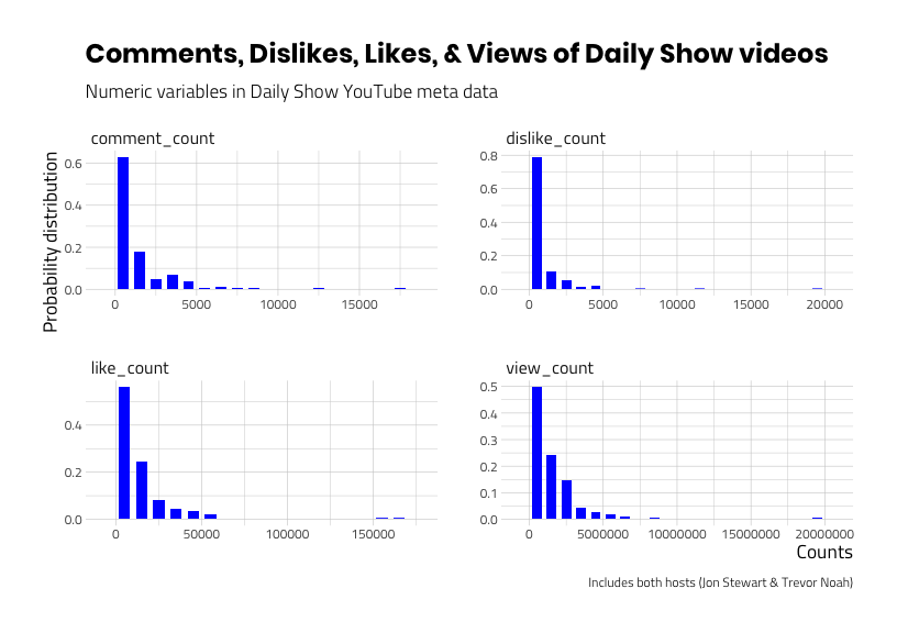
The graphs above display variables that are ‘positively skewed’, which means the bulk of the data are piled up near the lower values. The compliment to skewness is kurtosis, which is used to measure how the data is distributed in the tail of a distribution. Both skewness and kurtosis can be calculated using the psych::describe() function. I limit the output below to the mean, sd, min, median,max, skew, and kurtosis.
knitr::kable(
DailyShowYouTube %>%
    dplyr::select(like_count,
                  view_count) %>%
    psych::describe(x = .) %>%
    dplyr::select(mean, sd, min, median,
                  max, skew, kurtosis)
)| mean | sd | min | median | max | skew | kurtosis | |
|---|---|---|---|---|---|---|---|
| like_count | 13113.58 | 18170.41 | 182 | 8392 | 161732 | 4.432921 | 29.75917 |
| view_count | 1454472.85 | 1830174.80 | 35414 | 1011540 | 19159013 | 4.353605 | 34.17134 |
These numbers tell us the skewness and kurtosis are both positive, but that doesn’t mean much until we discuss normality.
Normality
Normality is another tool we can use to help describe a variable’s distribution. Normal in this case refers to how bell-shaped the distribution looks. Normally distributed variables have a skewness and kurtosis of 0. As we can imagine, variables with high values for skewness and kurtosis won’t be normal because those values are telling us the distribution isn’t symmetrical.
Why are we doing this?
The more we understand about each variable’s distribution, the more equipped we’ll be in predicting how the values in one variable correspond to the values in another variable.
Let’s narrow our dataset down to just two variables: YouTube video views and likes. Examine the graphs below.
# define labs first!
hist_labs_v2 <- ggplot2::labs(
    title = "Likes and Views of Daily Show YouTube videos",
    x = "Counts",
    y = "Probability distribution",
    subtitle = "Numeric variables in Daily Show YouTube meta data",
    caption = "Includes both hosts (Jon Stewart & Trevor Noah)"
)
# Now we plot!
DailyShowYouTube %>%
    dplyr::select(like_count,
                  view_count) %>%
    inspectdf::inspect_num(df1 = .) %>%
                      inspectdf::show_plot(x = .) + # this gives
                      hist_labs_v2                  # us a 2x2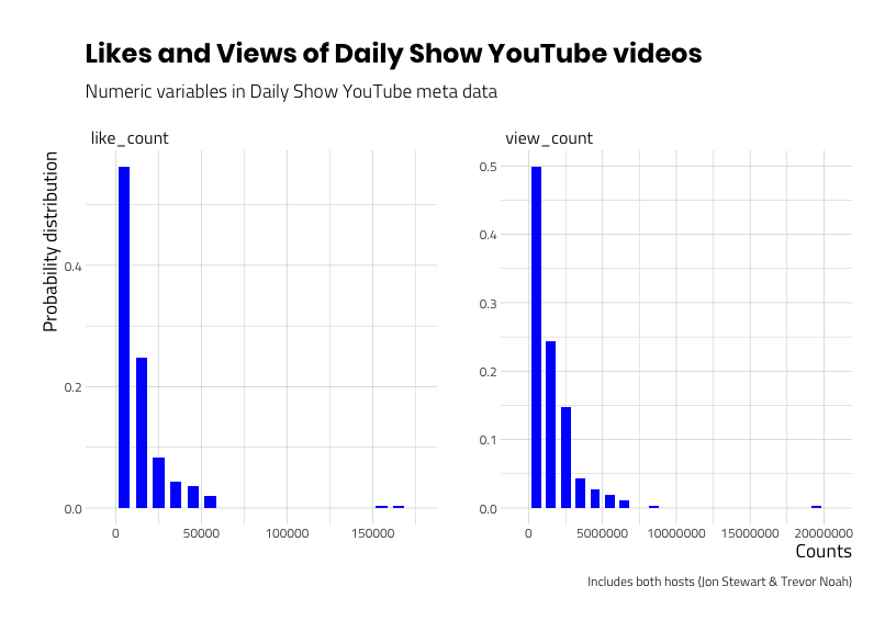
We know both view_count and like_count have positive skewness and kurtosis, but to what degree are these two variables related?
The relationship between views and likes
How do we measure relationships between variables?
When two variables are related, that means changes in one variable result with similar changes in the second variable. In math terms, this is referred to as covariance. If variance is how much a single variable varies from the mean, then covariance is how much two variables vary together. I really like Wickham and Grolemund’s description of covariation in R for Data Science,
Covariation is the tendency for the values of two or more variables to vary together in a related way.
Wickham and Grolemund
If you think about it, the variation of a single variable is not very helpful by itself. But if we can describe or account for ‘spread’ in one variable with the ‘spread’ from another, we can make estimations about one number when we have information on the other.
So if we want to know if the videos that have a high number of views are the same videos that also have a high number of likes? We couldn’t tell from the histograms, but we can combine the two variables on a single plot to answer this question.
Scatter plots
Recall that most of the values for views and likes are low, but this does not necessarily mean they are similar. For example, the mean value for view_count is much higher than the mean value for like_count (13,113.58 vs. 1,454,472.85). If we compare the maximum values (i.e. the extreme values at the tails), we can see the maximum value for view_count is 19,159,013 vs. a maximum value of 161,732 for like_count.
The scatter plot below will show us if there is a pattern between Daily Show YouTube video views and likes.
# labels
point_labs_v1 <- ggplot2::labs(
    title = "Likes vs. Views of Daily Show YouTube videos",
    x = "YouTube Video Views",
    y = "YouTube Video Likes",
    subtitle = "Daily Show videos on Comedy Central's YouTube Channel",
    caption = "Includes both hosts (Jon Stewart & Trevor Noah)")
# scatter plot
ggp_scatter_v1 <- DailyShowYouTube %>%
    ggplot2::ggplot(aes(x = view_count,
                        y = like_count)) +
    ggplot2::geom_point(alpha = 3/5) +
    point_labs_v1
ggp_scatter_v1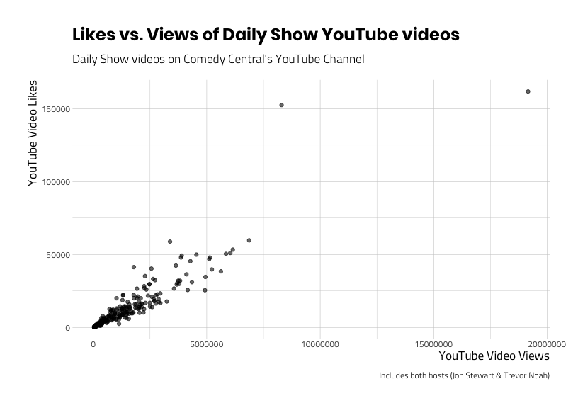
This pattern looks like we might be able to predict some of the values of like_count with values from view_count, but how well? We need to explore these data more with additional visualizations. For example, let’s add labels to the two videos with more than 150,000 likes to identify the extreme values on the graph.
Outliers
First we will filter these data out, then we plot them using another layer from ggplot2.
# first we create some data sets for the top views and likes
TopDailyShowLikes <- DailyShowYouTube %>%
    dplyr::filter(like_count >= 150000)

# then we plot the point with some text
ggp_scatter_v2 <- ggp_scatter_v1 +
  # add labels to states
  geom_text_repel(
    data = TopDailyShowLikes,
    aes(label = title),
    # size of text
    size = 2.1,
    # opacity of the text
    alpha = 7 / 10,
    # in case there is overplotting
    arrow = arrow(
      length = unit(0.05, "inches"),
      type = "open",
      ends = "last"
    ),
    show.legend = FALSE
  )
ggp_scatter_v2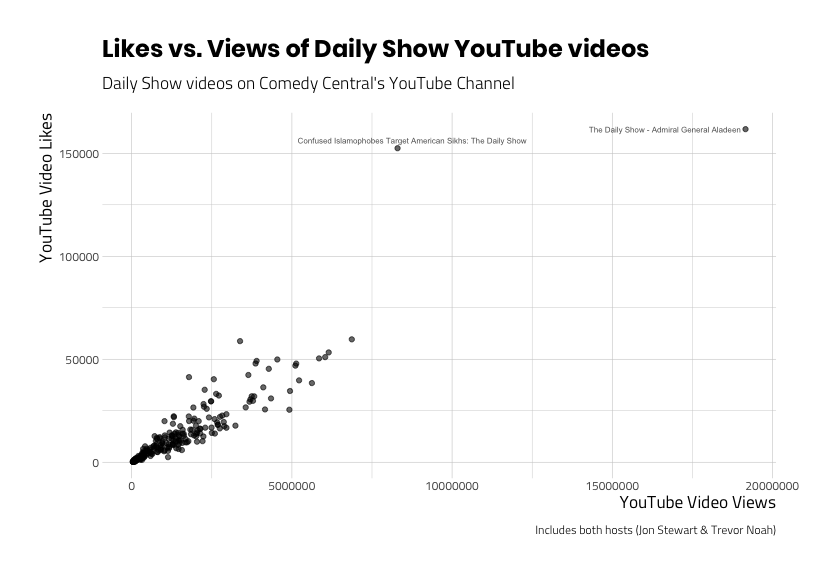
It looks like “The Daily Show – Admiral General Aladeen” and Confused Islamophobes Target American Sikhs: The Daily Show videos are outliers in terms of views and likes. Should we keep these videos in the data set? Well, we can be pretty sure these data haven’t been entered incorrectly. So if the values are legitimate, is there something about the videos that makes them different from the population (the other videos) we’re investigating?
Recall that we’re still including videos of the Daily Show with two different hosts (Jon and Trevor). What happens when we facet the scatter plot about the two hosts?
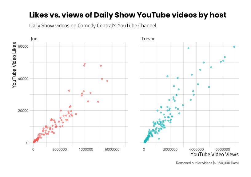
# labels
point_labs_v3 <- ggplot2::labs(
    title = "Likes vs. views of Daily Show YouTube videos by host",
    x = "YouTube Video Views",
    y = "YouTube Video Likes",
    subtitle = "Daily Show videos on Comedy Central's YouTube Channel",
    caption = "Includes both hosts (Jon Stewart & Trevor Noah)")
# scatter with facet
ggp_scatter_v3 <- DailyShowYouTube %>%
    ggplot2::ggplot(aes(x = view_count,
                        y = like_count,
                        group = host)) +
    ggplot2::geom_point(aes(color = host),
                        alpha = 3/5,
                        show.legend = FALSE) +
    # add labels to states
    geom_text_repel(
    data = TopDailyShowLikes,
    aes(label = title),
    # size of text
    size = 2.1,
    # opacity of the text
    alpha = 7 / 10,
    # in case there is overplotting
    arrow = arrow(
      length = unit(0.05, "inches"),
      type = "open",
      ends = "last")) +
    facet_wrap(. ~ host) +
    point_labs_v3
ggp_scatter_v3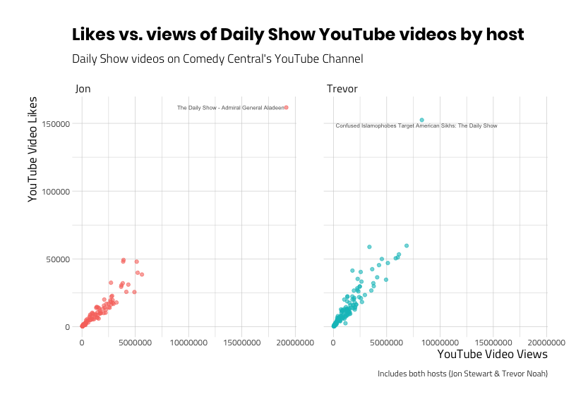
Now we can see that each host has their own extreme value. We can also see that the relationship between views and likes appear similar (as one goes up, so does the other) for both hosts.
I think we can assume these two videos are different in a meaningful way from the rest of the videos in the playlists (and we can explore the details of why this might be later). But for now, we’ll remove the videos and look at the relationship between views and likes without them.
# labels
point_labs_v4 <- ggplot2::labs(
    title = "Likes vs. views of Daily Show YouTube videos by host",
    x = "YouTube Video Views",
    y = "YouTube Video Likes",
    subtitle = "Daily Show videos on Comedy Central's YouTube Channel",
    caption = "Removed outlier videos (> 150,000 likes)")
# outliers
outliers <- c("yEPSJF7BYOo", "RskvZgc_s9g")
# create correlation data
DailyShowCorr <- DailyShowYouTube %>%
    dplyr::filter(id %nin% outliers)
# scatter
ggp_scatter_v4 <- DailyShowCorr %>%
    ggplot2::ggplot(aes(x = view_count,
                        y = like_count,
                        group = host)) +
    ggplot2::geom_point(aes(color = host),
                        alpha = 3/5,
                        show.legend = FALSE) +
    facet_wrap(. ~ host) +
    point_labs_v4
ggp_scatter_v4
This shows a pattern that indicates a positive relationship between viewing a video and liking a video. Can we show this numerically? How about if we calculate the covariance for each host?
Covariance
We will calculate the level of covariation between the two variables using mosaic::cov(). but after we’ve split the data frame by host into two datasets.
# split these data by host
daily_split_list <- DailyShowCorr %>%
    dplyr::group_split(host, keep = TRUE)
daily_split_list[[1]] -> JonDailyShowCorr
daily_split_list[[2]] -> TrevorDailyShowCorr
# calculate covariance for Trevor
mosaic::cov(x = TrevorDailyShowCorr$view_count,
            y = TrevorDailyShowCorr$like_count)
#> [1] 17812574567# calculate covariance for Jon
mosaic::cov(x = JonDailyShowCorr$view_count,
y = JonDailyShowCorr$like_count)#> [1] 14484129962These large positive numbers tell us that as view_count deviates from it’s mean, like_count deviates from it’s mean in the same direction. However, using the covariance can get us into trouble because it assumes both variables are on the same scale. In practice, we typically want to know how two variables on different scales relate to one another–that’s where calculating a correlation coefficient comes in handy.
Correlation coefficients
We will cover two types of correlation coefficients (there are more), but both of these values lie between − 1 and + 1. The first measure we’ll cover, the Pearson correlation coefficient, is the most common, but also has some assumptions that need to be met in order for the results to be reliable.
If the assumptions of normality are violated (as they are in our data) the Spearman’s correlation coefficient can be used because it doesn’t have the same assumptions for both variables.
Using the corrr package
The corrr package from tidymodels lets us explore correlations using tidyverse principles. We’ll start with the JonDailyShowCorr data, which is all the videos in the playlist (minus the “The Daily Show – Admiral General Aladeen” video).
JonDailyShowCorr %>% glimpse(78)#> Observations: 110
#> Variables: 9
#> $ published_at <dttm> 2014-12-05 17:01:33, 2014-09-23 22:12:10, 2013-04-24…
#> $ dislike_count <dbl> 1065, 722, 2469, 654, 917, 547, 2846, 1449, 2295, 102…
#> $ url <chr> "https://i.ytimg.com/vi/AHO1a1kvZGo/default.jpg", "ht…
#> $ id <chr> "AHO1a1kvZGo", "lPgZfhnCAdI", "9pOiOhxujsE", "aqzzWr3…
#> $ comment_count <dbl> 2486, 3616, 17629, 2689, 2704, 1887, 3422, 6229, 4522…
#> $ title <chr> "The Daily Show - Spot the Africa", "The Daily Show -…
#> $ view_count <dbl> 5624319, 5223787, 5134669, 4920942, 4347723, 4160610,…
#> $ like_count <dbl> 38442, 39755, 47906, 25499, 30986, 25640, 49200, 4794…
#> $ host <chr> "Jon", "Jon", "Jon", "Jon", "Jon", "Jon", "Jon", "Jon…To use corrr::correlate(), we select only those two variables we want to calculate a correlation coefficient for and stored the output in JonPearsonCorDf
JonPearsonCorDf <- JonDailyShowCorr %>%
    dplyr::select(c(view_count,
                    like_count)) %>%
    corrr::correlate(x = .)
#>
#> Correlation method: 'pearson'
#> Missing treated using: 'pairwise.complete.obs'The message we get from the output tells us the following:
Correlation method: 'pearson'= The reason we spent all that time above looking at the variable distributions is because the Pearson correlation coefficient assumes normality.Missing treated using: 'pairwise.complete.obs'= This is telling us how the missing values are going to dealt with. If we recall theskimr::skim()output, we have no missing data, so this doesn’t apply.
Pearson’s correlation assumptions
The most commonly used correlation coefficient is the ‘Pearson product-moment correlation coefficient’ or ‘Pearson correlation coefficient’ or just r. One of the assumptions of this test is that the sampling distribution is normally distributed (or that our sample is normally distributed). Neither of these are true. Fortunately, we have another option for calculating a correlation.
One option is to log transform both variables using dplyr::mutate(). Log transforming will make positively skewed variables more normally distributed, as we demonstrate in descriptive statistics below.
DailyShowYouTubeCorr <- DailyShowYouTube %>%
    dplyr::mutate(log_view_count = log(view_count),
                  log_like_count = log(like_count))
knitr::kable(
DailyShowYouTubeCorr %>%
dplyr::select(log_view_count,
view_count,
log_like_count,
like_count) %>%
psych::describe(x = .) %>%
dplyr::select(mean, sd, min, median,
max, skew, kurtosis))| mean | sd | min | median | max | skew | kurtosis | |
|---|---|---|---|---|---|---|---|
| log_view_count | 13.459371 | 1.381061 | 10.474863 | 13.826985 | 16.76828 | -0.4486365 | -0.7596921 |
| view_count | 1454472.852590 | 1830174.800671 | 35414.000000 | 1011540.000000 | 19159013.00000 | 4.3536048 | 34.1713438 |
| log_like_count | 8.673024 | 1.464940 | 5.204007 | 9.035034 | 11.99370 | -0.5084212 | -0.5494696 |
| like_count | 13113.577689 | 18170.413169 | 182.000000 | 8392.000000 | 161732.00000 | 4.4329210 | 29.7591664 |
Although the numbers for skew and kurtosis became negative, they are closer to 0 (which represents a normally distributed variable). We can see the results of this transformation when we create a scatter plot of the transformed variables.
# labels
point_labs_v5 <- ggplot2::labs(
    title = "Likes vs. Views of Daily Show YouTube videos",
    x = "Log Transformed YouTube Video Views",
    y = "Log Transformed YouTube Video Likes",
    subtitle = "Daily Show videos on Comedy Central's YouTube Channel",
    caption = "Log transformed variables")
# scatter plot
ggp_scatter_v5 <- DailyShowYouTubeCorr %>%
    ggplot2::ggplot(aes(x = log_view_count,
                        y = log_like_count)) +
    ggplot2::geom_point(alpha = 3/5) +
    point_labs_v5
ggp_scatter_v5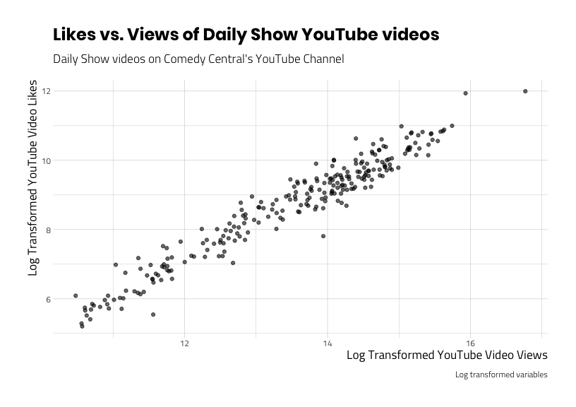
We can see this is a much clearer pattern (the line appears more straight), and the outliers have disappeared.
Why shouldn’t you transform your variables?
First off, taking the logarithm of a variable changes the question you’re asking (i.e. “is there a relationship between log transformed variable x and log transformed y?) , and you’ll have to be very careful about interpreting the results. Fortunately there are other options.
Spearman’s Rho
The Spearman’s rank correlation coefficient or Spearman’s Rho is essentially the same calculation as the Pearson correlation coefficient, only it ranks all of the values first. Ranking removes some of the extreme distances between values, essentially removing any underlying concerns of variable distributions.
We’ll apply the corrr::correlate() function to view_count and like_count in the JonDailyShowCorr and TrevorDailyShowCorr data.frames and specify the "method = spearman".
JonSpearmanCorDf <- JonDailyShowCorr %>%
    dplyr::select(c(view_count,
                    like_count)) %>%
    corrr::correlate(x = .,
                     method = "spearman")
#>
#> Correlation method: 'spearman'
#> Missing treated using: 'pairwise.complete.obs'| rowname | view_count | like_count |
|---|---|---|
| view_count | NA | 0.9788202 |
| like_count | 0.9788202 | NA |
TrevorSpearmanCorDf <- TrevorDailyShowCorr %>%
    dplyr::select(c(view_count,
                    like_count)) %>%
    corrr::correlate(x = .,
                     method = "spearman")
#>
#> Correlation method: 'spearman'
#> Missing treated using: 'pairwise.complete.obs'| rowname | view_count | like_count |
|---|---|---|
| view_count | NA | 0.9554851 |
| like_count | 0.9554851 | NA |
We can see there is a very high correlation between viewing and liking videos for both hosts. It looks like the correlation between views and likes in Jon Stewart’s videos is slightly higher (0.9788202) than the correlation coefficient in Trevor Noah’s videos (0.9554851).
Correlations for > 2 variables
We just looked at bivariate correlations between views and likes, but what if we wanted to check the correlations between all four numeric variables (dislike_count, comment_count, view_count, andlike_count)?
We can do that by passing all the numeric variables to corrr::correlate(), only this time we will add quiet = TRUE to leave the message out. We’ll also add the corrr::rearrange() and sort the table contents according to the highest correlations with (method = "MDS" and absolute = FALSE).
JonDailyShowCorrDfAll <- JonDailyShowCorr %>%
    dplyr::select_if(is.numeric) %>%
    corrr::correlate(x = .,
                     method = "spearman",
                     quiet = TRUE) %>%
    corrr::rearrange(x = .,
                     method = "MDS",
                     absolute = FALSE)
#> Registered S3 method overwritten by 'seriation':
#> method from
#> reorder.hclust gclus| rowname | view_count | like_count | comment_count | dislike_count |
|---|---|---|---|---|
| view_count | NA | 0.9788202 | 0.8665394 | 0.8684701 |
| like_count | 0.9788202 | NA | 0.8911861 | 0.8809044 |
| comment_count | 0.8665394 | 0.8911861 | NA | 0.9477941 |
| dislike_count | 0.8684701 | 0.8809044 | 0.9477941 | NA |
TrevorDailyShowCorrDfAll <- TrevorDailyShowCorr %>%
    dplyr::select_if(is.numeric) %>%
    corrr::correlate(x = .,
                     method = "spearman",
                     quiet = TRUE) %>%
    corrr::rearrange(x = .,
                     method = "MDS",
absolute = FALSE)| rowname | dislike_count | comment_count | like_count | view_count |
|---|---|---|---|---|
| dislike_count | NA | 0.9574204 | 0.8981760 | 0.8657234 |
| comment_count | 0.9574204 | NA | 0.9330886 | 0.8767787 |
| like_count | 0.8981760 | 0.9330886 | NA | 0.9554851 |
| view_count | 0.8657234 | 0.8767787 | 0.9554851 | NA |
The highest correlation for Jon Stewart’s YouTube videos was between the views and likes (0.9788202), while the highest correlation for Trevor Noah’s videos was between dislikes and comments (0.9574204).
Graphing correlations
The corrr package has a few graphing options for visualizing correlations. These are additional to the graphs we created withggplot2 above.
The rplot
The rplot plots a correlation data.frame using ggplot2 (and we can add labels to it). This graph has x and y axes, and plots the intersection for the variables from the cor_df (a correlation data.frame).
# labels
rplot_labs_v1 <- ggplot2::labs(
    title = "Correlations between Jon Stewart's likes, dislikes, comments, and views",
    subtitle = "YouTube videos of The Daily Show playlist",
    caption = "Data accessed from YouTube API")
JonDailyShowCorrDfAll %>%
  corrr::rplot(rdf = ., shape = 19,
               colors = c("yellow",
                          "purple")) +
    rplot_labs_v1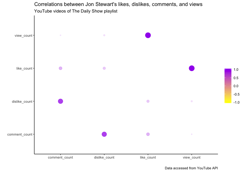
As we can see, the hue of the color and the size of the point indicate the level of the correlation. We can also remove the redundant correlations from the table with corrr::shave().
knitr::kable(
JonDailyShowCorrDfAll %>%
    corrr::shave(x = .)
)| rowname | view_count | like_count | comment_count | dislike_count |
|---|---|---|---|---|
| view_count | NA | NA | NA | NA |
| like_count | 0.9788202 | NA | NA | NA |
| comment_count | 0.8665394 | 0.8911861 | NA | NA |
| dislike_count | 0.8684701 | 0.8809044 | 0.9477941 | NA |
Network plot
The second graph options from corrr is the corrr::network_plot() which takes a cor_df and returns a graph where “variables that are more highly correlated appear closer together and are joined by stronger paths.”
# labels
network_labs_v1 <- ggplot2::labs(
    title = "Correlations between Trevor Noah's likes, dislikes, comments, and views",
    subtitle = "YouTube videos of The Daily Show playlist",
    caption = "Data accessed from YouTube API")
network_plot_v1 <- TrevorDailyShowCorr %>%
    dplyr::select_if(is.numeric) %>%
    corrr::correlate(x = .,
                     method = "spearman",
                     quiet = TRUE) %>%
    corrr::network_plot(rdf = .,
                        colors = c("firebrick", "white", "dodgerblue"),
                        min_cor = .5) +
    network_labs_v1
network_plot_v1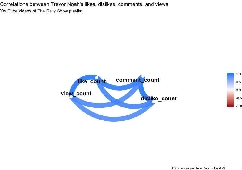
This shows us that the strongest correlations are between view_counts and like_counts, and the comment_counts and dislike_counts. The corrr::fashion() function gives us more fancy print options, too.
knitr::kable(
JonDailyShowCorrDfAll %>%
    corrr::fashion(x = .,
                   decimals = 3,
                   na_print = 0)
)| rowname | view_count | like_count | comment_count | dislike_count |
|---|---|---|---|---|
| view_count | 0 | .979 | .867 | .868 |
| like_count | .979 | 0 | .891 | .881 |
| comment_count | .867 | .891 | 0 | .948 |
| dislike_count | .868 | .881 | .948 | 0 |
- Getting started with stringr for textual analysis in R - February 8, 2024
- How to calculate a rolling average in R - June 22, 2020
- Update: How to geocode a CSV of addresses in R - June 13, 2020