How to keep the user in the picture, some design tips from Vox
As our news world has gone digital, the role of strong design has never been more important. Last month in Indianapolis, judges for The Society for News Design gathered on the downtown campus of Ball State University to pore over submissions from newspaper and news sites from around the world at one of the organization’s design competitions. While they did their work, Adam Baumgartner, a BSU student and designer-developer with Vox Media, and Ryan Sparrow, a journalism professor at BSU, held a workshop revealing how Vox Media designs and builds an online project. Katy Jamison, a visual journalism student and art director of Ball State’s Unified Media Design Studio, attended the workshop and wrote about what she learned for Storybench.
A group of Ball State and Northwestern students along with several Vox Media employees worked side-by-side to imagine a website for student journalists traveling to Cuba. The workshop was convened to teach digital design to aspiring news designers.
Today’s media does not just require a strong and beautiful print presence, but also demands a simple, clean and accessible web presence, something Vox Media embodies. Typically, design projects similar to the one we were given take weeks for companies like Vox Media to execute. We were given one weekend to create a working website. Though time was our biggest challenge, a lack of existing content was another hurdle. Because the students have not yet been to Cuba, no content was available.
Define the scope
At first, it was our understanding that the website would be a journal or blog-like website for students to share their experiences in Cuba. But after speaking with Sparrow, we decided to target an audience beyond these students. Could the website interest anyone who wished to travel to Cuba? We decided it would describe the challenges the students would face and include how-tos and tips for traveling in the area.
Identify your user
To focus our design, it helped to identify and describe a user, someone who we could design for. Professor Sparrow served that role for us. Once we identified what was important to him, we utilized Vox’s design process to develop a style and look for the website. Here are some of the questions and answers we received.
- Will you have content before the trip? (Most likely not)
- What is the purpose of your site? (He indicated it would be more of a tips and tricks site rather than a journal)
- Who is your audience? (Realistically, parents and friends of students going to Cuba will look at it, but he wants it to have the feel of a guide to Cuba)
- Will you add onto the site while you’re in Cuba? (Probably not due to poor Internet access)
- What kind of content will you be gathering? (Mostly written pieces and photography, but also some video)
Create a type board
A type palette is the most important way to set the tone for the rest of the website. Type must have personality, but it also must be clean and compatible with other typefaces. The most difficult aspect of typography is creating diversity between the typefaces while maintaining typographical harmony. I believe we used Bebas Neue (for the feature headline), Walkway (for quotes), and Open Sans (for the headline and body copy).
My group’s particular style was more of a retro, gritty palette. Creating a style that was retro and gritty, but also sophisticated and harmonious was a challenge. We chose the feature headline font because we found a photo that had a similar type style. The airy pull-quote style served as a lighter contrasting element to balance the heaviness of the feature headline style.
Create a mood board
Once the typography was chosen, each group created a mood board. Though the mood board serves as an important inspiration for the final product, it does not have to contain specific elements that would be used to build the final product. Basic headline styles, colors and photos create a certain vibe that can then help focus the overall website.
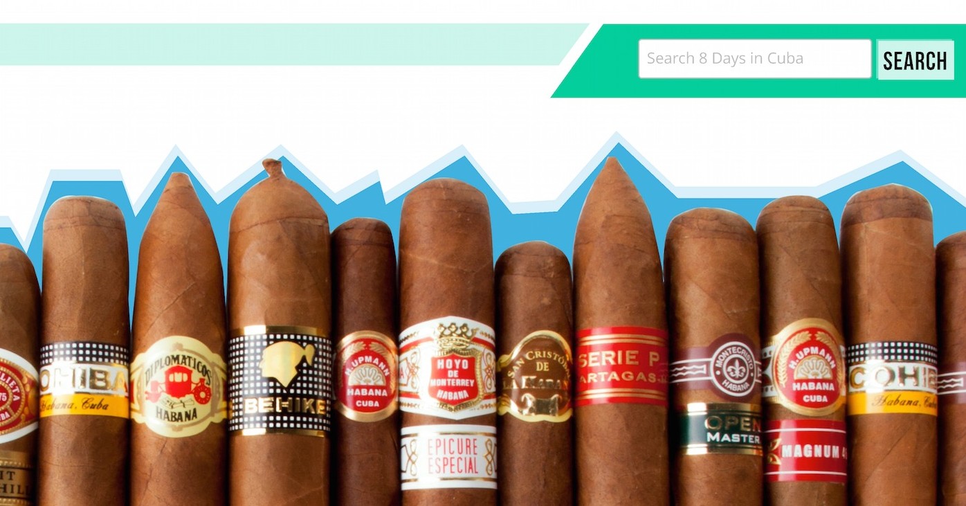
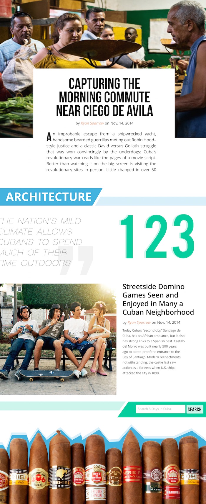
Our mood board elicited a tropical, retro vibe that is still very edgy. The angularity of the style evokes the grittiness of Cuban society that we were trying to convey. The blues and greens are bold and bright which reminded us of Cuban architecture and the salmon color contrasts nicely with those colors and helps gives the design a distinctly “Cuban” look.
Wireframe
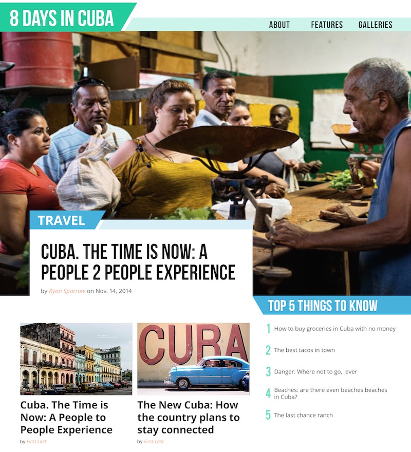
The Vox professionals created wireframes based on the limitations and expectations of the website. A wireframe is a schematic or blueprint of the website’s layout. There were three wireframes for this project: a homepage, a gallery, and an article page. The students then had to take their mood boards and work them into the wireframes that were provided. The wireframes were designed with journalistic content presentation in mind, meaning the most important or most recent content is placed prominently at the top.
Pitching
All of the students who were involved in the process presented their final products to the group of SND judges. One interesting critique that we received was that our wireframes were too stagnant and did not focus enough on user interaction and user experience. Their critique was that the wireframes resembled a print product more than a web product.
Takeaways
The workshop helped me understand the importance of defining the purpose of a website, choosing an aesthetic that appeals to the users, and designing with user interaction and user experience in mind.
We rarely consider our users (also known as stakeholders or personas in user-centered design) in Ball State student media. But without the user’s input, it is very difficult to understand the purpose of a site. Understanding this is important for improving our products in student media. It’s difficult to understand your audience and predict their needs without their input.
Although the workshop was incredibly informative and helped us learn valuable information, it did not include user interaction and user experience, which would have been very useful to students. When we showed it to outside individuals, their biggest concern was how the site functioned, not the colors and typography of the site. Focusing on user interaction could have taken the workshop to a new level.
Currently, BSU’s Unified Media program, a journalism and communications program, is undergoing a transition from older, print media to digital-first. Although Ball State has made progress towards a digital-first mindset, it still faces challenges with placing emphasis on digital content.
Overall, the weekend was a very valuable experience that helped all of us understand better the purpose and process of digital design. The Vox process will be valuable to me in the future to develop not only digital products, but print products as well. Understanding the user will be an important element in the future of student media and this weekend made me realize how little we currently value the user in the process of producing media.
Katy Jamison is a visual journalism student and art director of Ball State University’s Unified Media Design Studio. Follow her on Twitter.
- NICAR: With the right tools, anyone can be a data journalist - March 11, 2019
- Northeastern J-school alumna Rachel Zarrell makes Forbes’ “30 under 30” - December 4, 2017
- How we built an interactive graphic using carcinogen data from the W.H.O. - November 12, 2015


