Nadieh Bremer on thinking outside the (x,y) axes
When data visualization is taught in the classroom, basic bar charts or scatter plots with trend lines are commonly used. But Nadieh Bremer, a freelance data visualization designer operating under the name Visual Cinnamon, likes to break these conventional rules.
From the conception of a potential project to printing the end result, Bremer’s favorite part of working with data is in fact “building up the visualization,” which improves throughout the process.
“It becomes something you are visually proud of,” said Bremer in a virtual interview with Storybench. Seated in front of a shelf teeming with colorful knickknacks and books, she discussed exploring new territories and generating new forms of data art, the key stages of her workflow and how to take the first steps out of the box when it comes to visualizing data.
Starting with an abstract idea
Now based outside of Amsterdam, the former astronomy student first began her career in data science at the accounting firm, Deloitte, where she specialized in customer analytics and consulting. This involved cleaning and joining data to prepare it for statistical modeling. It was there when Bremer discovered her passion for data artistry while transforming raw figures into strategic steps for her clients.
Data-driven art allows the designer to convey complex ideas by using a dataset and its variables to determine patterns. It’s not always straightforward work though, even at her skill level.
“Usually I don’t even quite know how I want it to look in the end, except for a very abstract idea of the visualization,” Bremer said. “But not the colors, [the] design touches. That is hard, the hardest to figure out, but it’s a process that I do enjoy a lot.”
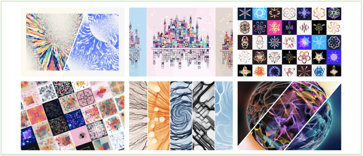
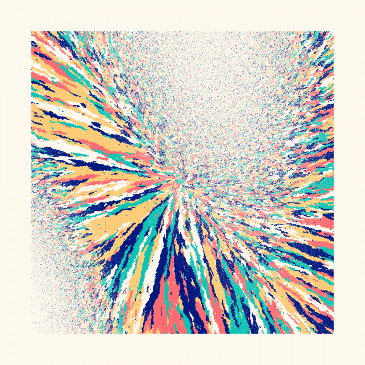
For the past six months, Bremer has shifted her focus to trying something new and challenging for herself. Using computer models to generate randomness curated via an algorithm, she has branched into the new and developing world of generative art. By creating systematic rules, the user provides the computer with a clear process: assign numbers to the data and draw them at random, then perform a certain task if that number is above or below a cutoff value. The computer follows those rules to produce artwork. Rather than knowing what exactly the end piece will look like, Bremer explained that generative art is about leaving the results up to probability. Rather than the average chart, which tells the reader a corresponding y-value for every x, these pieces bridge the gaps from purely number-centric representations of data to artistic ones.


Inspiration stems from a wide range of curiosities and resources
The inspirations behind these seemingly data-heavy projects, however, stem from Bremer’s wide range of curiosities and resources.
Last fall, she spent three months working on creating 1,000 intricate and colorful NFTs, or non-fungible tokens, using combinations of basic shapes for “Patchwork Kingdoms,” a charity collection for UNICEF. The write-up on her website provides an in-depth look as to how Bremer generated a different square for individual schools in several countries, in an effort to represent an imbalance in internet access and connectivity around the world. Her inspiration: the wooden building block set she played with as a child.

“It’s hard to [take] that first step out of the box without seeing what other people have done before you,” said Bremer.
“I remember when I first started with D3, I saw a chord diagram and a Sankey diagram, and other kinds of things that I’d never visualized before. [I] didn’t even know you could visualize data that way.
“It took me like three or four years though, before I felt like I had [reached] that point where I could let go much more Like I didn’t think in the box anymore, I just thought about putting data on the screen in whatever way I felt was best.”

When working on a client’s project, the experienced data artist generally requests two things: a sample or the actual dataset so she can get a grasp of the variables, and an idea of their goal.
“What insights should the visualization give? What questions should it answer? What should it do?” Bremer asks in order to match their aspirations. “Sometimes clients have that pretty concretely. They know, ‘We want to show this.’ Sometimes it’s more that ‘We found this really cool dataset, we think there’s a story there, can you help us find it?’”
Armed with client “mood boards” developed on Pinterest, Bremer draws ideas on how to visualize certain insights after conducting some simple statistical analyses and building a “mental model” of how a dataset is structured.
The rest of the process is a bit more experimental. “Then I just start sketching ideas, seeing how to do this or that,” she added. “Sometimes [there] is just one idea where it’s obvious to me that it should be this way, and sometimes I’m not quite sure and I sketch a few different ideas.”
Engaging visualizations take time. A diverse toolkit helps
Starting in a browser, Bremer routinely uses JavaScript with D3.js library, SVG or Canvas for the trial-and-error process to see if her intended visualization can be applied or whether she will have to compromise.
“Once I have that main way to visualize it, there’s just a really long time to design it, to make it look interesting, to pull out the story better to make side things appear as well, like little side notes,” she said. “I like visualizing large amounts of data where there’s more than one way to look at it. And I like to tweeze that out, but there is no structure to [the process] at all.”
Noticing patterns, finding and extracting stories gets easier over time, she said. However, engaging visualizations don’t always lend themselves to the level of user interactivity promoted for most content found online, especially in the news industry. Bremer’s preferred method of visualizing data actually prioritizes emphasizing certain variables with artistic elements such as shape and color, over the technical difficulties of debugging and verifying a project looks great on every shape and size of screen.
“What I find is that if it is a static end result, so not that interactive or having to resize, I can actually be even more creative in the way that I pull out the story because I know it will always be that size,” said Bremer. “It just gives me so much more creativity in terms of what I can use to visualize the story.”

Her preferred toolkit is made up of widely accessible programs, one of which is RStudio, which she uses in conjunction with D3.js and a code editor, Visual Studio Code. She added she might use Node.js for certain packages and occasionally Python if “something only works in Python.”
Personal projects could be the ideal training ground
Due to the visual nature of data design, generating a plethora of personal projects helped Bremer grow and flourish over the years. The reward is in seeing one’s project materialize.
“With personal projects, you learn so much with each project that you do, even if you feel like you’ve not really learned it,” Bremer said. “Just the experience and the little things that you found on Stack Overflow, you can reuse them again and it’ll become easier the next time.”
She advises creating work on topics that one finds personally interesting instead of aiming for easily-attainable datasets off of government websites. You might have a better grasp of what the compelling stories are in a dataset and what other people would also find interesting to see, said Bremer. These datasets, she advised, can be found everywhere from Google searches, GitHub repositories or websites covering specific topics.
“The most important thing is knowing what you are looking for,” said Bremer.
Data visualization is more than merely a scientific process, as it demands artistic insight and a thorough understanding of design elements – in addition to technical and coding skills. For Bremer, there are “good and bad ways to do data visualization. But there isn’t a best way to do visualization, because that depends on the tastes of people and how everybody’s different and [reaches] things differently.”
- Nadieh Bremer on thinking outside the (x,y) axes - February 11, 2022
- Mapping disinformation and igniting insight with Media Cloud’s Emily Boardman Ndulue - February 4, 2022
- How FiveThirtyEight’s Julia Wolfe addresses data literacy - October 27, 2021


