How FiveThirtyEight’s Julia Wolfe addresses data literacy
As the demand for a statistically literate workforce grows, the ability to produce data-driven stories increasingly provides journalists with distinctive and cutting edge career paths. Effective visualizations are crucial for clearly communicating substantial amounts of information in often interactive and captivating ways.
Julia Wolfe, now a senior data editor, has worked at Nate Silver’s FiveThirtyEight for four years. Her team of data-oriented visual journalists focuses on telling stories through charts and interactives in an industry where “visual” journalism is still defined as video work in many newsrooms.
“The whole team talks about our work and how understandable it is,” said Wolfe. “How much does that understanding vary for the audience based on the kind of story?”
Prior to working at FiveThirtyEight, Wolfe studied computation arts and originally planned for a future in print design. After interning at the Montreal Gazette, she created visuals for several newsrooms including The Wall Street Journal, The Globe and Mail in Toronto, and the Toronto Star.
Storybench met virtually with Wolfe to discuss evolutions in data visualization, as well as questions of accessibility. What follows is a condensed transcript of their conversation.
This interview has been edited for length and clarity.
In data journalism, does the dataset or the story come first?
Definitely both can happen. What FiveThirtyEight lives by is that you have to be willing to let your data findings change the story. It’s a real risk that you fall into a confirmation bias, where there might be a point you want to make and have anecdotal evidence, so you just keep looking for proof while ignoring evidence that doesn’t support it.
One thing we talk about at FiveThirtyEight is when people pitch a story and haven’t done the data analysis yet, the story has to be interesting whatever the analysis shows. We kill lots of stories because the data shows it’s noisy or confusing. Ideally, if you prove it’s true or not, that’s an interesting story so we should run it regardless. If you ever decide to go story-first, that’s fine as long as it can change when the research shows it has to.
Are there set teams of analysts versus visualization people at FiveThirtyEight?
Not at FiveThirtyEight. We’re only about 35 people, so we all wear a lot of hats. Everybody who is a data journalist, to varying degrees, has some analysis, design and journalism skills. In theory, you can write, report the analysis, make the charts — but obviously it’s a lot of work. So we love collaborating with our writers who have more experience on the reporting and writing side.
It seems like datasets are often messy and dense or completely lacking the most crucial information. What are some places to find reliable data for stories?
It varies by beat. One of the reasons FiveThirtyEight has leaned into sports is because sports data is usually miraculously clean and complete in a way that’s not seen in other fields. I’ve done some economic reporting using the Bureau of Labor Statistics and as for politics, American governmental organizations are actually pretty great with providing data. There are also websites like ProPublica that gather and clean data then publish it for people to use freely. We also have our data site, where you can download FiveThirtyEight data directly.
Being a data journalist means learning all datasets are going to be flawed, so you’re not looking for a perfect dataset. You’re figuring out what the flaws are in the data and if you think that invalidates it or if you think there are elements needing investigation that you can be transparent about. That’s a tough judgment call, and we kill stories because ultimately, we decided the data was too flawed. Often we will go with it, and make a core part of the piece explaining why the data is imperfect, which can make for a pretty dry story. Part of being a data journalist is learning how to live with the flaws and how to recognize them.
What programs do you use at FiveThirtyEight?
The CSV into Rstudio, then Illustrator workflow is definitely something we do. We’ve also recently moved onto using Datawrapper. We worked with them to develop a custom FiveThirtyEight theme since ultimately, the accessibility work we’ve been doing clearly shows you can’t meet contrast ratios by using gray on gray. We use lots of tools that go into Illustrator — Raw Graphs is a really great free tool to make weirder chart types. We’ll also use QGIS which is an open source mapping tool, and then for our interactives, we’re coding bespoke in JavaScript often using the library D3.js.
Are you seeing any trends in the industry with regard to switching from raw code to more front-end programs?
Datawrapper has really cornered the market — a lot of newsrooms are switching to it. FiveThirtyEight was part of this when every newsroom had their own bespoke charting tool, but it wasn’t interactive, so we’d have to export as an SVG file and open in Illustrator. That’s making it a bit easier to not code everything bespoke, since we want to spend less time making simple line charts. I suspect there are newsrooms that have been cutting down on D3.js in favor of the things they can do in Datawrapper.
Why bother using ggplot when you can do it in Datawrapper?
Yes exactly. Maps are the biggest game changer for us, because now we can make maps with tooltips. With ggplot, even if you made the map in R, which we’ve done before, you’re not going to get interactivity on the page. With maps, that’s actually the thing people want to be able to find more information about. Datawrapper frees us up to spend more time on more complicated graphics.
What is the role of good graphics in data literacy? How does the perceived friendliness or accessibility of a graph play into the decisions you make as an editor?
Graphics play a really important role in welcoming people into data and helping them understand how to read it. Sports fans have a different appetite for raw data, but there may be an important political story that’s just meant to reach as many people as possible.
The charts team at FiveThirtyEight stands by this, except for rare circumstances, that we don’t make charts that don’t show anything, like a scatter plot without a trend. Every time you show readers a chart, you’re asking them to stop what they’re doing, take time, read the head, figure out how to read it, and there has to be a payoff for that. The more work it takes to read it, the more complicated the chart is, the bigger the payoff has to be. The average reader has more experience with certain chart types, but if it’s going to be a strange chart form, we do as much as we can to make it easier to process.
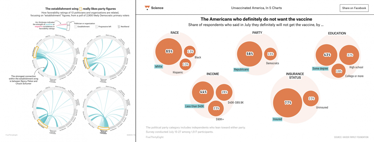
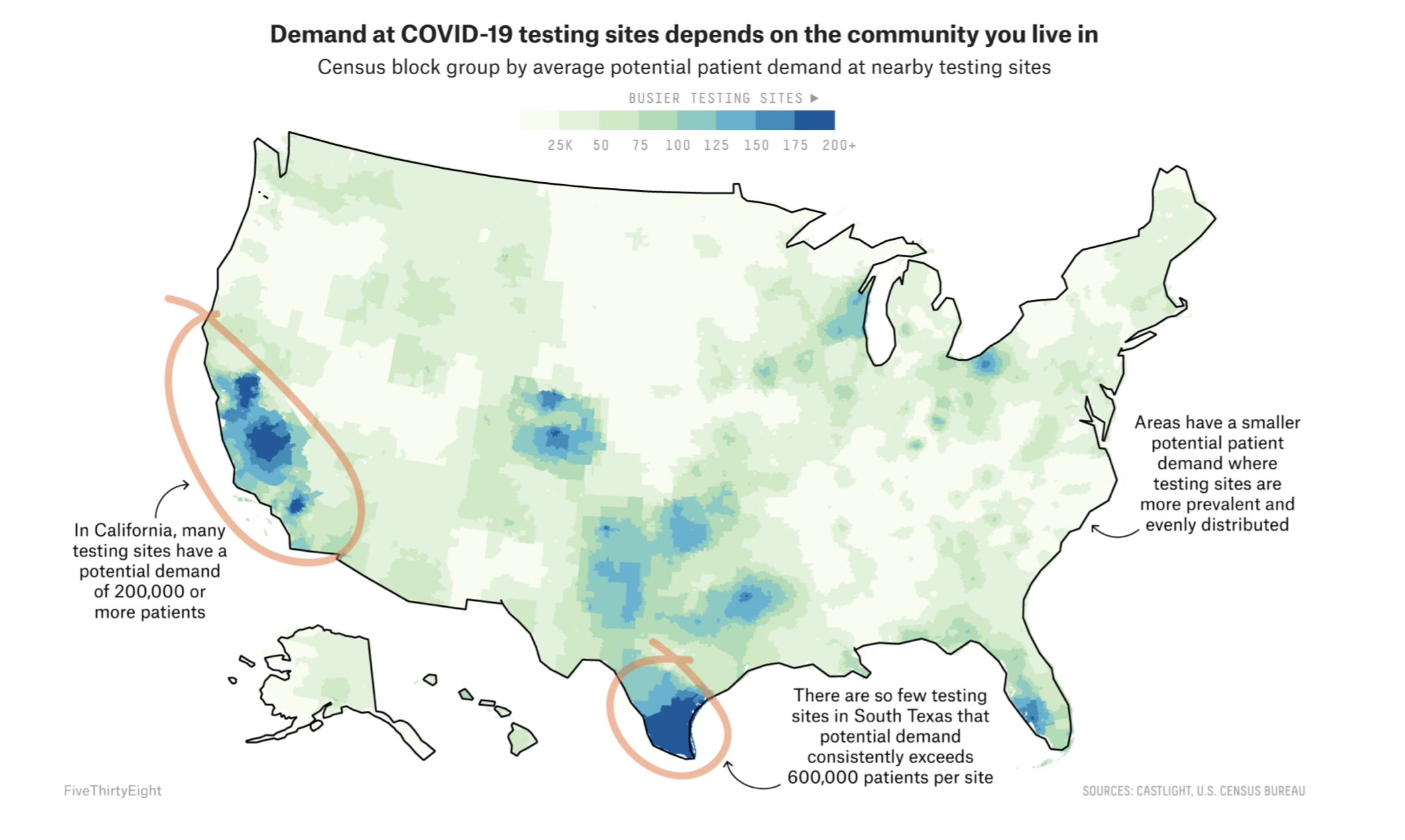
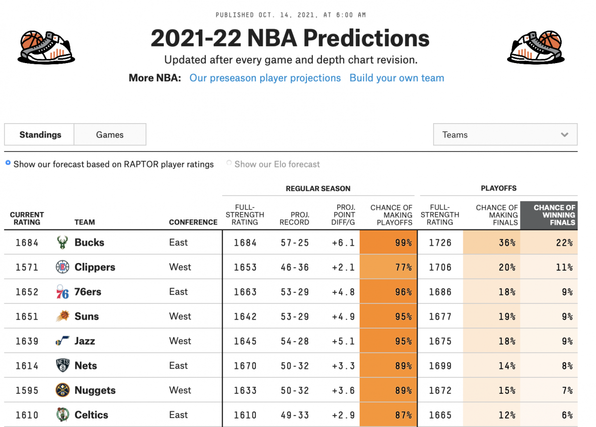
FiveThirtyEight encourages and explores the usage of “weird” and non-linear chart forms, but some are more effective than others. The chart on the left is a bit more difficult to interpret than the one on the right.
Is there a balance between thoroughly covering a topic and managing the cognitive load?
Ramping up our accessibility work has been a primary goal of the team this year. The world of cognitive accessibility has offered us valuable research and insight into what makes some information blockable for people. Maybe it’s hard to understand 400 words describing math, but a really nice visual that brings the trend to the forefront can help with that.
What are some criticisms FiveThirtyEight has received?
One thing that we struggle with sometimes is our audience. We have a segment of our audience who is fully statistically literate, who thinks of us almost more in an academic than journalistic space, and those people can get frustrated when we release our work.
The 2020 Election Forecast is a good example of a time we truly prioritized making sure it was understandable to somebody who didn’t have that background, because we had an influx of readers like that. It was important to us that it wasn’t misunderstood. There were a lot of people who were frustrated that it wasn’t more of a deep dive into the stats. I stand pretty firmly behind that choice, but it can be difficult when you’re trying to serve different audiences at the same time.
Do you have any advice for aspiring data journalists?
Being part of Storybench or the student press is always great. Try to be experimental in your work. When I’m looking at portfolios or resumes, I’m interested in seeing people try new things more so than getting a published clip in a paper — which is cool, but I like seeing someone try to make a weird chart. We also don’t want to mislead people, so be really careful.
There’s people who want to be on the scraping and investigative reporting side, people in the analysis, finding the story-out-of-the-data side. But there’s also people who focus on visualization. Picking one of those three to start with is really important, because you can get to a point where you’re doing all of them. If it’s visualizing, working on design skills is so important because that can be the hardest thing to teach. I can teach people to code, but if somebody has never thought about design principles and learned the hierarchy of color and information design, that can be a lot harder. If visualizing is more of a means to an end for you, then use Datawrapper and work on statistical analysis.
- Nadieh Bremer on thinking outside the (x,y) axes - February 11, 2022
- Mapping disinformation and igniting insight with Media Cloud’s Emily Boardman Ndulue - February 4, 2022
- How FiveThirtyEight’s Julia Wolfe addresses data literacy - October 27, 2021