Investigating the role of motion in visualizations
Information visualizations are great tools for exploring and communicating information. But as they become more popular in the fields of design, journalism and science, a deeper understanding is needed of the visual semantics used to construct them.
Most of the research done on this topic has focused on how to create good visualizations: How to use colors, textures or orientations to help decode quantitative information, or how to design informational graphics that are as informative as possible. However, there is a research area that, in comparison, has not been so much explored: motion in visualizations.
The use of animations in visualizations has long been a subject of discussion. For years, their use was not well considered, and research claimed that motion distracted viewers and could only carry a limited amount of information. However, new research now claims that motion can actually lead to shorter cognitive workload.
Motion can be a very functional component. It is – with color, orientation, size and stereoscopic depth – a visual element that attracts humans’ attention, especially if it happens in the peripheral vision. This characteristic makes of it a great tool for alerting and selectively directing viewers’ attention, for helping in visual searches, for detecting and identifying patterns, groups, subsets through brushing and linking functions, links and nodes in network diagrams, and for contributing to the transmission of emotions or aesthetic impressions.
 While these studies highlight how motion can be a key element in any design, they are either too broad or too specific. If we want to understand the communication role that motion plays in data visualizations, we need to find a middle point between the research of animations in visual systems and the study of specific techniques in specific types of visualizations.
Blurs, zooms, scales and pans are not just design choices. They are elements that explain information, that transition from one way of displaying data to another, that guide viewers through the visualization and that also captivate them. Therefore, they are implementations that take part in how users understand and interact with a project.
Through the exploration, observation, and analysis of different visualizations, I have delineated four categories of usages of motion in information visualizations as part of my master’s work at Northeastern’s Information Design and Visualization MFA program.
These four roles – data as motion, motion as an interpolation of data values, motion as a storytelling device and motion as a captivator – are not mutually exclusive. Together, and individually, they address how motion can communicate and be implemented differently through visualizations.
Data as motion
Motion is used to animate the forms in a visualization to illustrate values of the data. The visual encodings are directly and continuously linked to them. This can be done in two ways.
Through a direct data encoding, when the data has intrinsic movements or transformations. Therefore, the data should be position and time-oriented. Typical datasets that are usually visualized through this motion are geographical flows of populations, geographical weather conditions, or transportation networks.
Blurs, zooms and pans are not just design choices. They explain information.
Through an indirect data encoding, when data that is not time-position based is mapped as motion. This implementation is used to create a visual metaphor, transforming static data attributes into animated visual variables in the canvas.
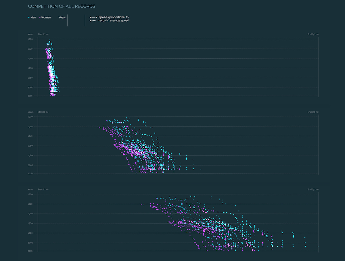
For example, in my visualization Swimming World Records throughout History – Competition of Speeds — a project that was developed to test and explore this taxonomy — motion is being used to visually show how different the average speeds of the records are. The encoding is indirect, because although the dataset is related to how fast swimmers move, the visual representation is an approximation build through different transformations: first, calculating average speeds; secondly, changing distances into fifty meters and, finally, creating the movement (a calculation made by dividing record’s total time to the total distance of the corresponding event).
In the case of The State Financial Disclosure Project, which Storybench profiled here, motion is used to visually convey how the lack of financial disclosure policies prevents citizens to see information. The encoding is also indirect because the score is not related at all to movement nor the data has any type of relationship to it.
Motion here is a metaphor of what corruption and bad transparency policies produce: noise.
Motion as an interpolation of data values
Although data is discrete in its nature, it can be portrayed through animations in a continuous or discrete way. Both categorizations depend on the number of attributes. If their rate of display is high —values per second or minute — the changes in the forms are shown in a continuous way, through data as motion. If the rate of display is low — values per year — the construction of the animation might rely on having interpolations between those values. Those intervals convey for brief moments that there is something real between the data states. However, they are in fact constructed by our code. Its main function is to show that those states are connected and are part of the same item.
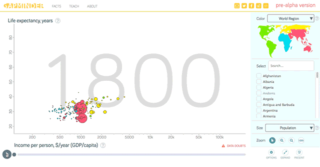
This type of animation is usually used to portray those variations or evolutions and allows users to see the trends in them. Motion as an interpolation of data values is usually seen in chronologies or time-series where historical moments are presented. The best example is the visualization Gapminder, that shows the worldwide evolution of different rates such as life expectancy or GDP per capita.
Motion as a storytelling device
Many researchers have identified motion as a tool to create awareness, transition between displays, give descriptions or provide emphasis. All of these functionalities have the same goal: guiding viewers through the visualization. Transitions not only provide smooth shifts between views but also make users aware of those changes.
As a storytelling device, this type of motion is very akin to cinematic conventions and the uses of time and transitions employed in cinematography. Visualizations also slow time down to highlight important facts or compact the time in fast motion to show long trends — like in the Gapminder visualization — for example.
In my visualization Swimming World Records throughout History – Analytical visualization, motion is used not only to compress more than 100 years in 10 seconds. Its main function is to warn viewers that when they interact with the design and choose to sort the data in different ways, the axes and scales suffer transformations.
Motion as a captivator
While the other three categories were related to the functionalities of motion, it is also important to consider its aesthetic aspect. As a visual component, motion can provide an aesthetic seduction to viewers but it also can improve or undermine the final visualization.
Although the goal of this motion is to make the design something unique and striking, we must always remember what the correct implementation of this visual encoding is: explaining information.
Motion as a captivator can provide information to viewers, such as how to interact with the design, but its use must always bear in mind if its design is actually helping in the overall construction of the visualization’s message or, on the contrary, obscuring the information and confusing the viewers.
For example, in my visualization Swimming World Records throughout History – Competition of Speeds, a small noise was also provided to the circles —that represented the swimmers— in their y axis which made their trajectories not completely straight. The noise was in relation to the average speed: the faster the speed, the jumpier the dot. The goal was to use motion as visually objective as possible in the x axis — through data as motion — in order to reinforce the movements displayed, making it easier to perceive and understand them; while using it in its captivating role in the Y axis making the dots more organic and playful.
These four categories can appear together as they all are related to the data that the visualization is portraying, the story that is being visually told, and the aesthetic appeal that their design can cause.
The ideal implementation would be one in which all the types of motion intertwine and reinforce each other to strengthen the visualization and its message because at the end of the day, when we create a visualization, what we aim to do is explain the information as clearly as possible and captivating our viewers in the process.
- Investigating the role of motion in visualizations - June 22, 2017


