Scrollytelling innovation: New York Times journalists on climate change, visualization, and intense teamwork
As visual storytelling libraries clutter newsroom servers, multimedia projects involving data visualizations, photos, videos, and even augmented reality components are becoming more and more popular. But it is unclear to today’s up-and-coming journalists whether those interested in reporting are also expected to master these complex technologies.
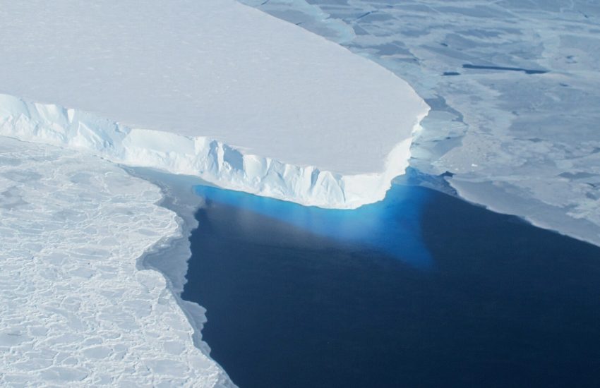
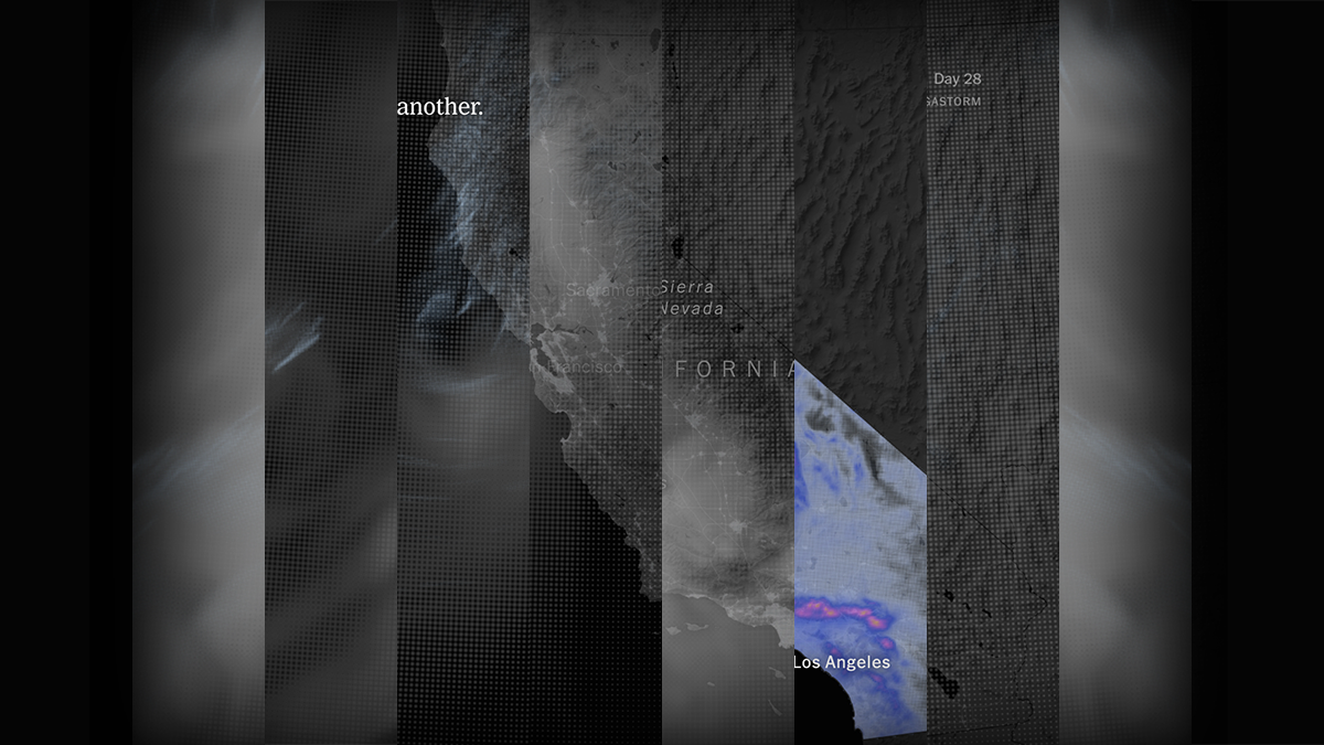
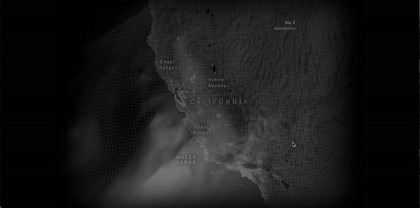
“The Coming California Megastorm,” a New York Times story about a 1,200-mile-long storm likely to hit California in the coming century, is an example of one of these complex visual stories. The multimedia and “scrollytelling” product was itself a mega-story, so to speak, about a megatrend.
The behind-the-scenes creation story also highlights many trends in coding, visualization, and complex teams — in the media industry’s work at the highest levels of ambition and execution.
Storybench spoke with Mira Rojanasakul, the visual journalist behind the story’s introductory animation, and Raymond Zhong, who drafted the story’s text portions, about how stories such as these are delegated between teams and ultimately come together into a single storytelling experience for audiences.

What are your current positions and what are your backgrounds? Did you both study journalism?
Mira: I’m currently a visual journalist on the climate team at the New York Times. I joined just a few months ago. But before that, I was the graphics editor at Bloomberg, so I kind of started my journalism and visual career there. Before that, I studied more art and design.
Ray: No, I didn’t study journalism. I did economics and math for undergrad. I just sort of liked writing and liked the idea of being a journalist. [I] got lucky a few times, got internships and that’s basically where I am. Still getting lucky sometimes.
How did you find out about the subject of this story, the megastorm?
Ray: I got wind that this research was being done and that there was a paper coming out… We really thought about how we could present it… We cover research and scientific findings all the time, but this one felt special, and we started thinking early on how we could make it special for readers as well.
Did you think to incorporate visuals from the get-go?
Ray: Once we had a sense from the researchers that there would be this data and it would lend itself pretty straightforwardly to being visualized, we really got the balls rolling on thinking of how to do that. We thought about a bunch of different ways of visualizing…
There were a lot of possibilities we considered, just based on the amount of time we had and the number of resources we had at the Times… Often times these things are just big project management operations as much as they’re design and visual storytelling.
How did you both go about collaborating on this and making all the pieces come together?
Ray: As the reporter, I was doing the text obviously… But we really wanted to fold the visuals in so that they would complement each other, not just be sort of slapped on the page next to the text.
We would think about specific paragraphs and where they would go next to specific visuals, so that the visuals would reinforce the paragraph and the paragraph would reinforce the visuals.
It’s a different sort of writing process than one you would have for a traditional, text-heavy story. Even down to the length of a paragraph and sort of how much visual time would be spent seeing what was in the paragraph. It became very, very finely detailed collaboration.
Mira: I’ll second that, and just say coming into this project sort of midway through, Ray already had huge ambitions for the piece, which was great…
Towards the end, as he said, that all kind of came together. You really sweat the sentence lengths and trying to balance which parts of the story you want to let the maps and the data tell, versus which parts you kind of need to say in words. So I think at least 50% of the final work goes into sweating those details.
Mira, can you explain your process for creating the graphics?
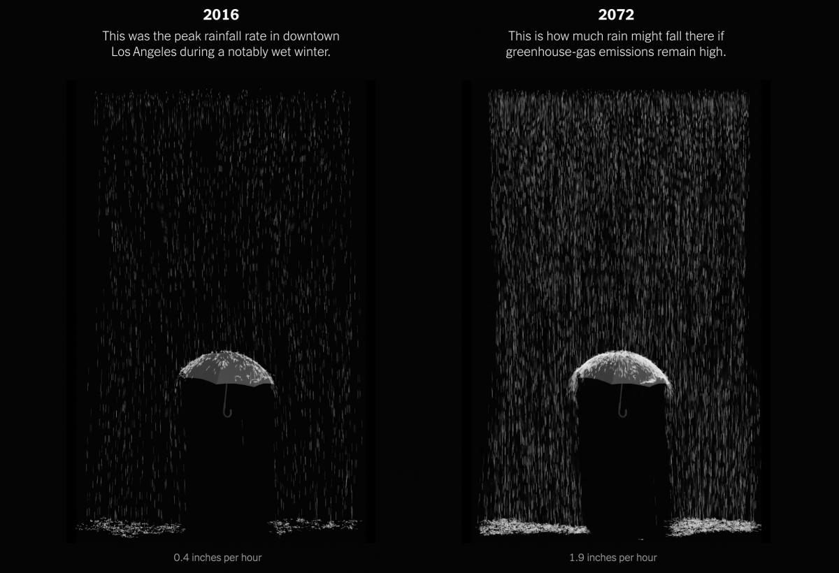
Mira: I can speak to the first 30-day visualization more — that’s the piece I worked on. We also had this fantastic 3D AR team who produced the rainfall visuals that you see further down…
I think coming into it, step one is always sketching with the data and thinking through what all these layers look like. Part of the challenge of covering scientific work — it’s a huge responsibility. They’ve spent months, sometimes years, going as deep as possible, modeling, carefully caveating their findings.
I like to use R just to make some quick sketches, just to have something to gather around and look at. From there, we were able to isolate what felt like the most relevant sort of rainfall, cloud and runoff layers to just get a feeling of how that megastorm might look like.
I’ve done a few of these animated maps before. They’re produced with a Node script that I’ve used a few times. So I kind of just rewrote part of that to more finely tune what the data might look like…
Joining the Times, they have so many incredible tools available to the graphics teams here. So there’s a tool that walks you through a scrollytelling video format, that lets you play the video and animate and add annotations as needed. Kind of knowing that’s a possibility helped shape that intro narrative and how we were going to produce it.
Did you find it difficult at all to have the data visualizations already in the study as a basis or point of reference?
Mira: It’s always 100% helpful to see what the scientists themselves have produced. Again, they’ve spent so much time thinking, looking at these things.
It’s a good gut check always to kind of see what they focused on, and you know exactly how they’re looking at, interpreting the data.
Did you run into any challenges with creating the visuals or making them work with the story?
Mira: I mean nothing ever goes as smoothly as you plan for. I’ve done enough visuals stories where I kind of bake that into the process. I really want to try to get stuff done a few days or weeks ahead of time, so I know there’s going to be time to fix bugs and everything.
This is the first bigger piece I’ve worked on here, so for me it was kind of learning the systems and the dev environment and those sorts of details.
Ray: I think what was new for me was just the degree to which the writing was shaped by the visuals and vice versa.
In the writing, my initial draft was we would go through the storm pretty quickly. In text, you can do that: you can take someone through a 30-day event pretty quickly. But then when you think about that as a visual, that potentially is really slow…
I was really afraid we would compromise either on the text or on the visual, but I think we managed to find a really good meeting point in the middle.
Did you struggle at all with determining how many visuals would be too many visuals or how many were just the right amount to get the message across?
Mira: I think again the team benefits from good editing. We all benefit from good editing. When I’m in the beginning of a project in a really exploratory mode, I just want to see everything, I just want to put so much stuff on the page. A chart could show you this, a chart could show you that. I think it’s just a matter of really reading through, seeing how much is too much.
Ray: We were really conscious to avoid visual overload because there were so many potential things we could’ve done. We wanted it to feel like an experience you could sit through and take away three really solid points, as opposed to five sort of vague points or 10 really fuzzy points.
I feel like I’m seeing a lot more visual, scrollytelling stories online. Do you feel that way as well from within the newsroom?
Mira: I’ve been in graphics long enough that I’ve seen that rise. A few years ago there were more forms of step-through products; there were lots of different ways to move through a piece.
Something nice about scrollytelling — I think some people think it’s overused — but it just walks you so linearly through a narrative… Especially for navigating a more complex dataset, it can kind of handhold you… It’s really not surprising to me that that’s become such a popular format to use.
Ray: I think our editors are aware that it shouldn’t just be something that is used on every story, something that a reader just feels like, “Oh, here we go again.” It should be special each time still. We should use it judiciously. We should be innovating on it when we can. That’s definitely a conversation we have.
Mira, do you feel like there are new tools out there that you’re learning for creating these kinds of stories?
Mira: Yea, all the time. I kind of joke with my friends that eventually I’m going to get too old to learn new graphics libraries because the field is always evolving and you have to keep up with things.
I think certain things are still fairly persistent. D3 is still pretty widely used, Svelte is like the hot new thing that I’m trying to catch up on right now…
Both the creator of D3 and the creator of Svelte worked at the New York Times graphics department. So I think a lot of these tools are informed by kind of the journalistic publishing experience, which I think is really important as well. Real knowledge of how this works and the challenges we face have gone into shaping the next tools that we’re going to use.
Ray, do you ever use any of these tools or do you mostly count on the graphics department to add visuals to the stories you write?
Ray: No, I’m a helpless baby in that respect. Mira sits on the climate team; she’s part of what we think about editorially. She’s not on secondment from another desk, which is amazing.
Not every reporting team at the Times has that kind of firepower within it. Maybe that’ll be the norm in the future. The Washington bureau, for instance, might have more graphics editors — I don’t know.
For now, we can sort of very easily work together and just make the best of each other’s skill.