Vox Atlas: Producer Sam Ellis on his distinctive map animations
If there’s a news story that you may need to draw out on a napkin for it to make sense, it might be a good story for Sam Ellis, senior producer and graphics editor at Vox.
In his role, Ellis dedicates most of his time to producing videos that contextualize a story through animation and maps in the series Vox Atlas. These stories generally have the same layout – maps with animation on top, news clips, photos and data visualizations. The result is an engaging 10-minute piece that provides needed context to a story that may otherwise be difficult to visualize.
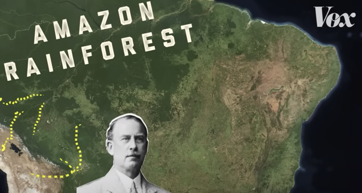
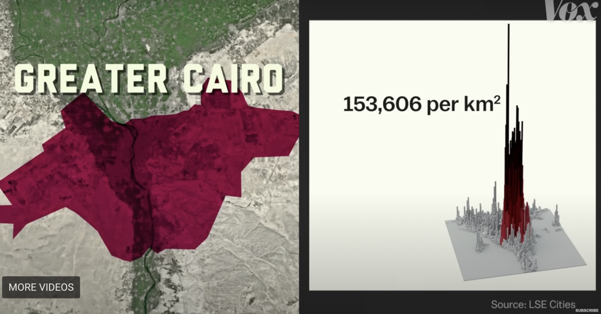
One of Ellis’s most recent stories covers the movement of Egypt’s capital and the presence of abandoned cities surrounding Cairo. The video, which took five weeks to produce, explains the Egyptian government’s mission to build a new capital city outside of Cairo to address the current capital’s overcrowding problem.
Storybench connected with Ellis to discuss the mission behind the videos, the process of creating them, and the future and potential of data journalism.
The interview has been edited for brevity and clarity.
What audience do your stories generally appeal to?
YouTube’s funny because it’s mostly males aged 19 to 29 years old. So when we look at our views, I do very well because I think that what a guy 19 to 29 years old wants to watch is conflict. They love maps for some reason, so I never really struggle with views. We have some really good videos that don’t get a lot of views because they don’t appeal to that audience. But there are some funny things – any thumbnail with an airplane in it does really well. It doesn’t matter what the story is – I guess dudes just love airplanes. It’s kind of a weird audience in that sense.
Your stories often follow a similar formula – maps with animations, data visualization, and a collection of news clips and photos. From a design perspective, how did this come to be?
When I joined Vox in 2016, we had realized that maps are a very good video format. If you’re looking for a visual story, maps are great for that. I read tons and tons of international news, and when I’m reading the article, I’m thinking “I don’t know where anything is. Just show me.” So many of these articles should have a map in them.
Do you ever scroll through a New York Times article and you’re thinking “Well, this is great, but I don’t really get it.” So in that sense, that format had been made in 2016, but we added a little bit more journalistic effort to it. Back in 2016, the stories were like, “This happened, let’s explain the story to you really easy on a map.” So I started pushing more and more on what we could show on a map. I started adding things together that could create a good map story.
So in the case of the Egypt story, there wasn’t one big news story that this broke that I needed to explain on a map. It was more just asking some questions. You’re moving this capital and it’s: a) really far away; and b) they built lots of cities outside Cairo before. Have they not worked?
So in that sense, we’ve pushed these stories a little bit in terms of constructing various stories into a map story, map video. And in terms of the cadence between the archives and data visualization, we don’t go to a lot of these destinations. So it’s kind of the best way, because you can’t just do 10 minutes on a map.
You want to get the concept from a bird’s eye view. So we have kind of fallen into the same rhythm sometimes, but I think it works. Toggling between a map and what’s happening on the ground seems to really help people understand the story.
Which comes first — writing or visuals?
I kind of do visuals first, but it’s very surface-level. I’ll see a map and say it could be a good story and bring context to that map. I guess what I’m saying is that there’s lots of data out there that hasn’t been turned into a map yet, and I would love to learn to take that data and make it mappable. I basically have to work with what someone — a very smart cartographer — has already done. But I think there’s room where someone like myself could’ve learned cartography, taken a dataset, made it mappable, and made a story from it. That would’ve been so much more original than me using what’s already been done.
What do you want to incorporate into your videos that you haven’t yet?
As someone who covers international topics, obviously, I hate being the armchair journalist. I would like to go — we have lots of archive services, and we’ve hired people to go shoot for us. But there’s nothing quite like being on the ground. I really like the idea of syncing footage and maps together.
Drone footage is a good example of that — use drone footage from high up and animate on top of that or on a map. This winter I did a surfing story in Portugal, and I got to go. We shot for a week there. We got to bring the vision, and I could direct what I want. It was great being there knowing what shots I need and what shots are possible.
What else do you want to tell me about your creative process?
I think I’ve only scratched the surface of map-based videos. I know some basic GIS, but there’s so much data out there that could become spatial data, and so much spatial data out there. But it’s sometimes hard to find and hard to parse through. People could make much more accurate maps, I think. If I was a data reporter, I’d be able to find even more stories. So I want to do more of that stuff using spatial data.
What kind of space for this kind of data journalism is available in AR and VR?
I’m woefully not educated about AR or anything like that. But if I could hire someone, I would hire a digital cartographer right now. Someone who could break down spatial data and give it to me. The Egypt video was mostly me tracing maps using old books to trace the maps, but that’s not actually geolocated stuff. But I think there’s a lot more to go in terms of spatial data.
What do you mean by “geolocated stuff”?
Let me think of an example. If a dataset was “Wells in Egypt,” and this dataset said the location of every single well in Egypt, it’s very easy to turn that into a map. I can import it into my animation software, and you’ll see a dot for every well in Egypt. That’s a very basic example, but there’s lots and lots of data that can be turned into spatial data where I can pinpoint locations and stuff like that. And stories could come from that if I knew how to use it — like, “Here’s a cool map of the busiest shipping lanes in the Middle East.” Obviously, we see the final output, which is the map of it, but I wish I had someone who could collect data like that. Someone to say, “Hey, Sam, I have this great dataset: it’s the busiest shipping lanes in the Middle East. Could we build a story around this?” There’s so much of that data out there, but a lot of it’s hidden.
Are there good examples out there of someone doing that? A dream map story?
The New York Times has a visual investigation team. And they do open-source stuff. Bellingcat is a good example, their organization is open source research. They do amazing journalist work — it’s all data that they’ve scraped themselves and turned into maps. But they present it in a very standard, newsy way, and I’d love to mix that with Atlas. I tend to do more of a story arc, with a beginning, middle, and end. Something along those lines would be very cool.
One thing I think we’ve done very well at Vox is we’ve made news interesting. We do the story first. We keep you watching because we write a good, entertaining story.

- Vox Atlas: Producer Sam Ellis on his distinctive map animations - November 1, 2022