Under the hood: Ebola coverage at The New York Times graphics department
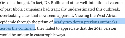
Last week, The New York Times published an in-depth multimedia feature, How Ebola Roared Back. It details the origins of this most recent Ebola outbreak and how top international health officials and experts missed the signs of the coming catastrophe.
Several weeks ahead of publication, The New York Times graphics department was handed a detailed outline of story. The team then began devising graphics, interactives, animations, and maps for it. Storybench spoke about this process with Sergio Peçanha, one of the graphics editors involved in conceiving and designing graphics for the piece.
How many people work on the graphics team and how many worked on this Ebola piece?
The graphics desk has around 40 people. Seven worked on this piece, on and off.
What is the very first step you take when handed a story like this one?
We assess resources, time available, and the visual potential of the story. We’ll generally decide what to invest based on the importance of the story, on its potential for visual storytelling and, of course, on our ability to absorb it in our workflow.
How do you decide which graphics will complement the story?
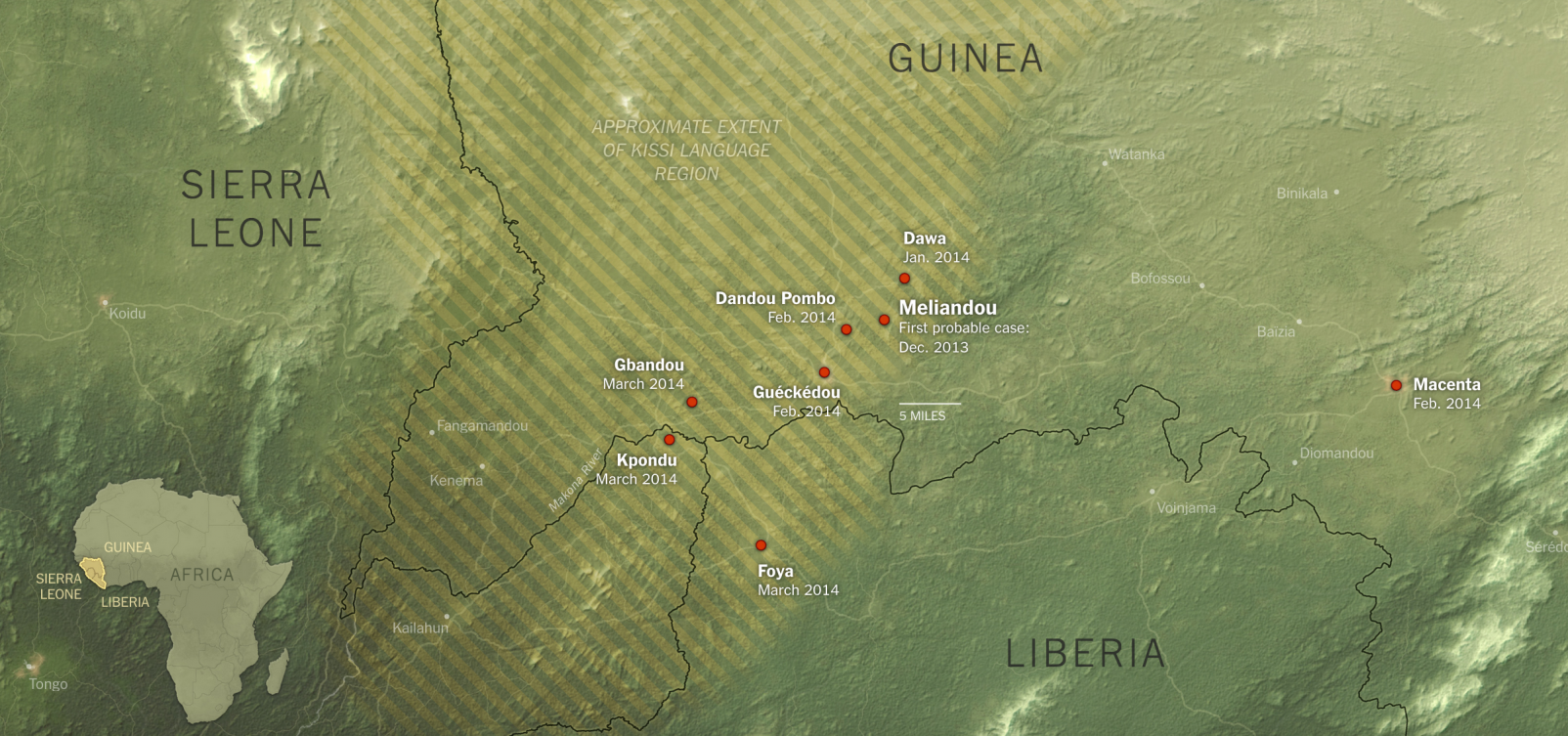
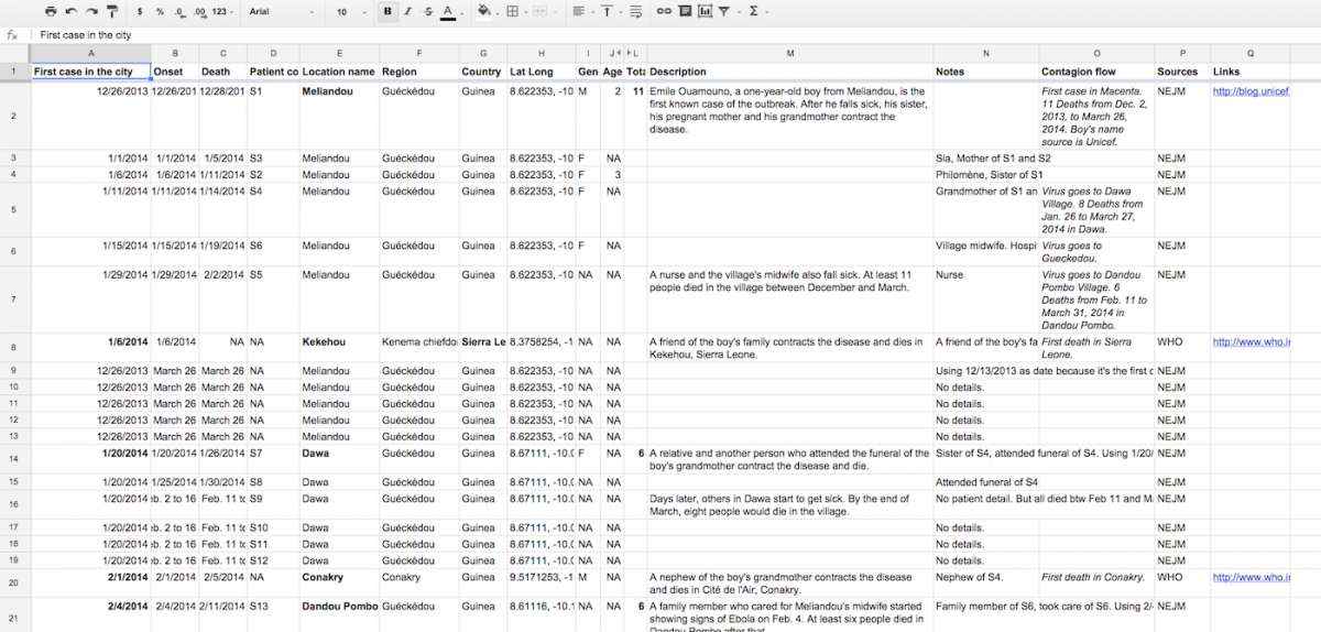
 We read the drafts looking for opportunities. Points that mention statistical trends or locations, for example. We try to find and chart the data and make the maps and diagrams that could support, clarify and illustrate those points.
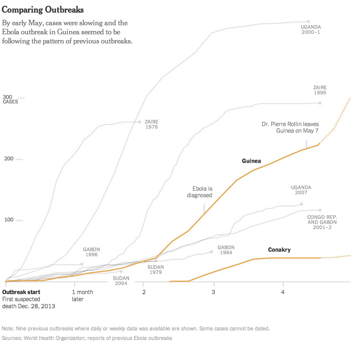
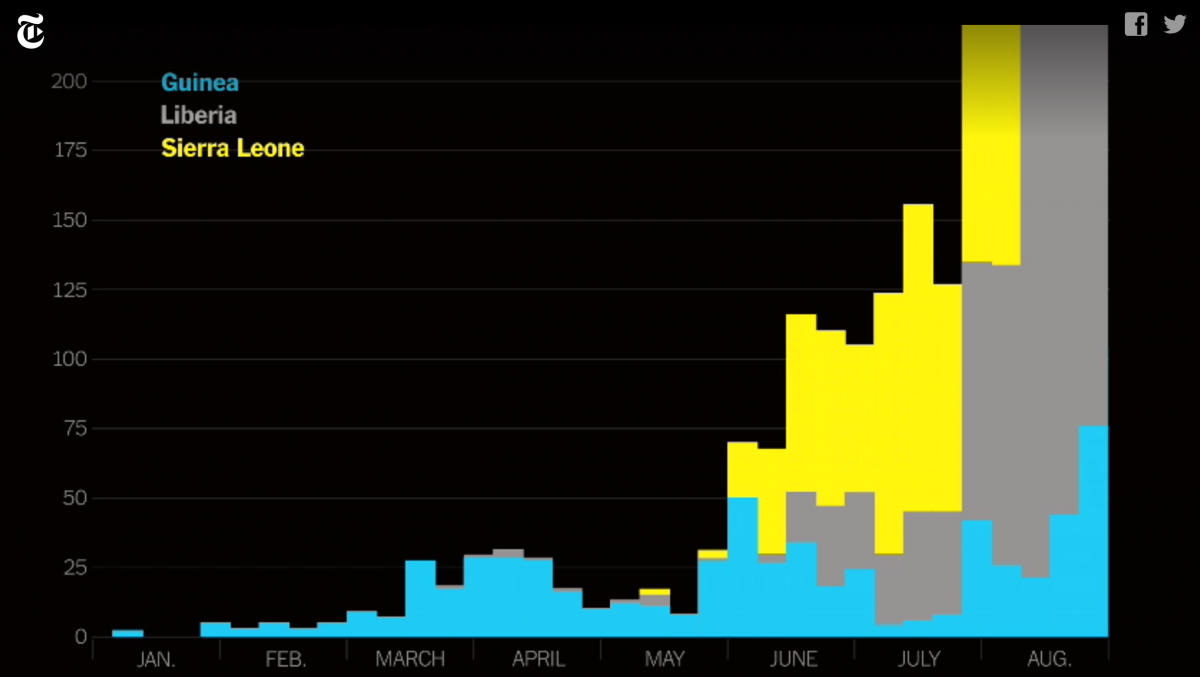
In the graphic below, Jonathan Corum, graphics editor for The New York Times science section, who worked on the Ebola project with Peçanha, sought to contextualize the current Ebola outbreak with data from nine previous outbreaks. Using data from the World Health Organization, he created this graph to contrast the patterns of previous outbreaks with the current crisis:
Can you elaborate on the workflow?
People read the draft and discuss (brainstorm) suggestions in meetings. We do some sketches of what that graphic might become and then try to do it. Some ideas materialize and some die along the way.
In this story, Steve Duenes, the graphics director, was directly involved. He made some of the calls about which graphics would be made. Jonathan Corum, the science graphics editor, made others and I made some. Then graphics were assigned to several people (I did some, Jonathan and other people did others). Once you get the assignment, the graphics editor determines what the graphic will really be. Then the graphics get a final edit by Duenes. He also has the final say art direction for the package and on the placement of the elements along the story.
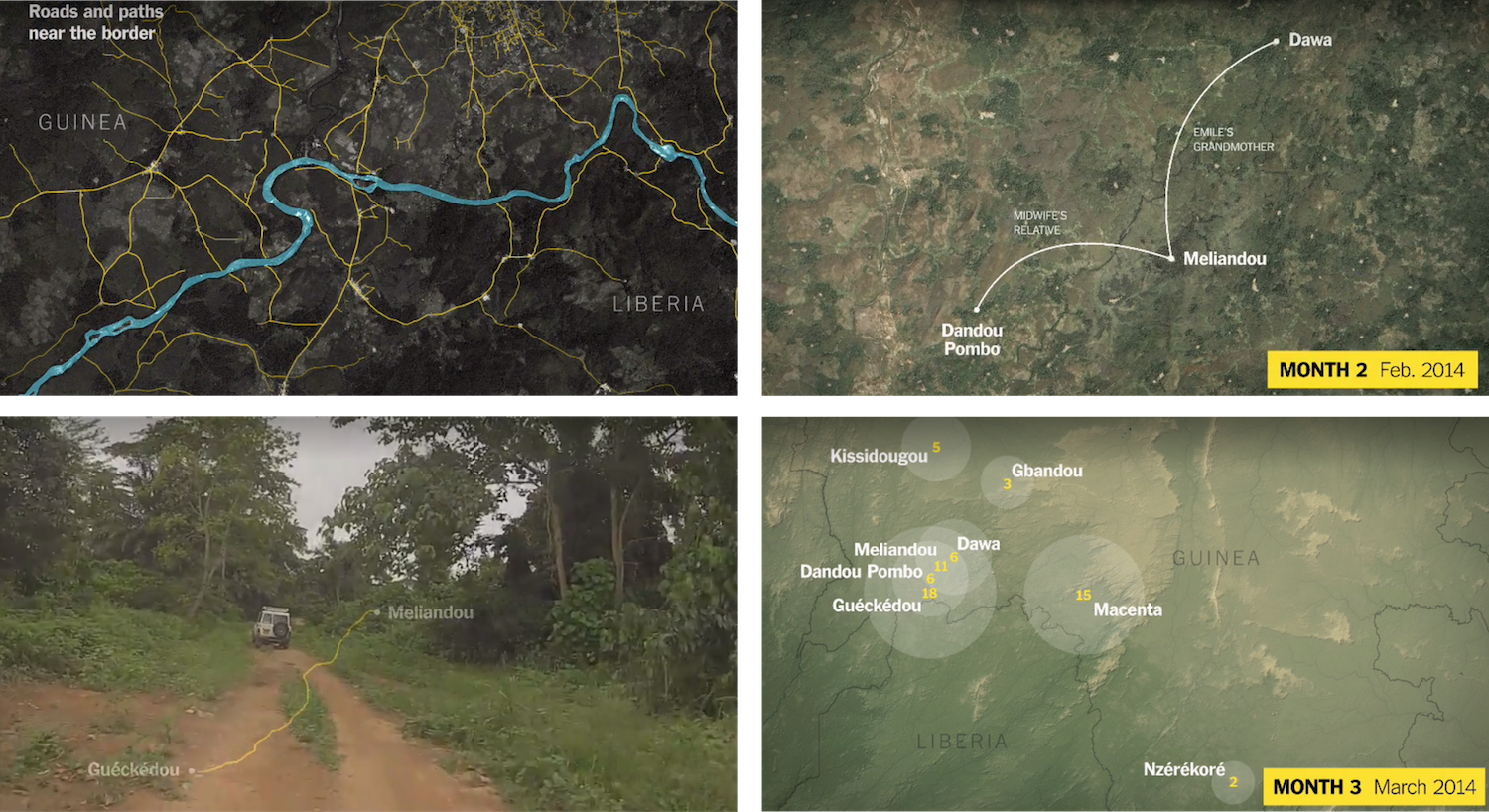
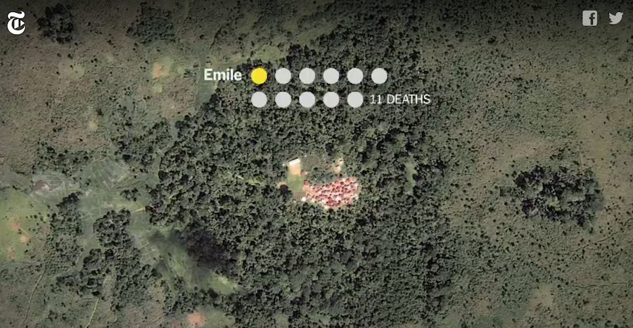
Tell us about the reason for including the motion graphic ‘The Path of the Outbreak”. To show how porous these international borders were? To demonstrate how transportation of the initial patients spread the virus around?
All of these. We tried to explain how the outbreak unfolded over those first few months.
How did the team make it?
The animation was done by Yuliya Parshina-Kottas. Animation is a lot of work. It probably took her a long week to make the horizontal version that’s displayed on the desktop and another long day to make the vertical version that appears on mobile devices. The maps were done by Derek Watkins, and it took him about two weeks between research, making and remaking it as needed. His maps appear on on the video, but there are also the static versions for the desktop and mobile devices. I researched and wrote the script, and that took me about two weeks, if I were to add the hours nonstop.
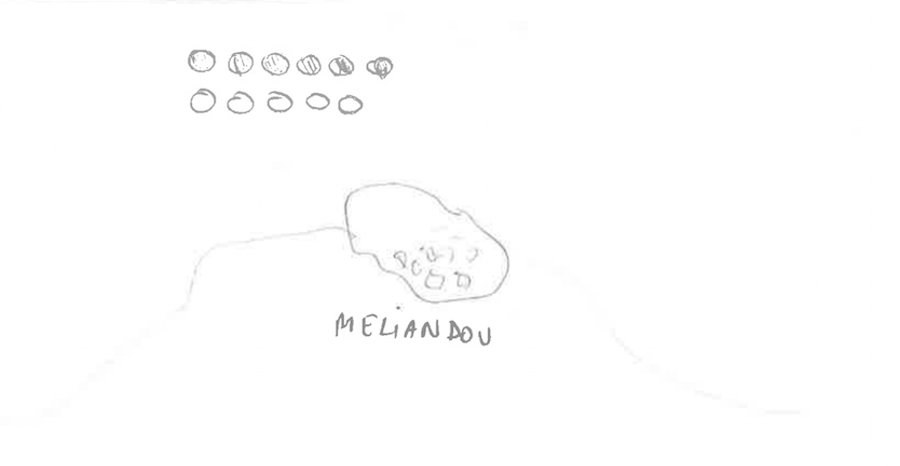
A conceptual sketch of the motion graphic. Credit: The New York Times.
Where did you get the drone and other video footage?
The drone footage and some of the other footage was shot by Dan Edge, from Frontline (PBS). We have a partnership with them and they produced the two other videos published with the story. So I asked and they shared some of their B-Roll. The GoPro footage of the trip from Meliandou to Guéckédou is by Timothy La Rose from Unicef.
What challenges are there to sourcing this kind of material?
It’s not easy to find high quality visual material from places like small villages in Guinea. I contacted La Rose because I had seen some of his video from Meliandou on Unicef’s website. He was the one who told me that Dan Edge had also been there shooting drone footage. But even though we had a partnership with Frontline, I was unaware of it at the time. My colleague Shayla Harris, a senior producer in video, connected us with Frontline. She also lent her voice to the piece.
What kinds of tools do you use?
Illustrator, Excel, R, ArcMap, Photoshop and After Effects are some of them.
Where do you go for inspiration?
I guess we just see what other people are doing in any field, not just graphics. That’s probably what inspires us. We’re a very diverse group: cartographers, data people, designers, writers, developers, etc. That helps, too.
What advice do you have for students or novice designers and journalists who are trying to tell better stories?
Try to put yourself in the audience’s shoes.