How to use CartoDB instead of Adobe Illustrator for rapid mapping
Last week, I published an article on birdwatching for my science news site LatinAmericanScience.org. For the story layout, I borrowed heavily from the HTML5/CSS3 template that the Tufts Daily student newspaper used for a recent article. (The Tufts Daily editors wrote about their process in a Storybench tutorial.)
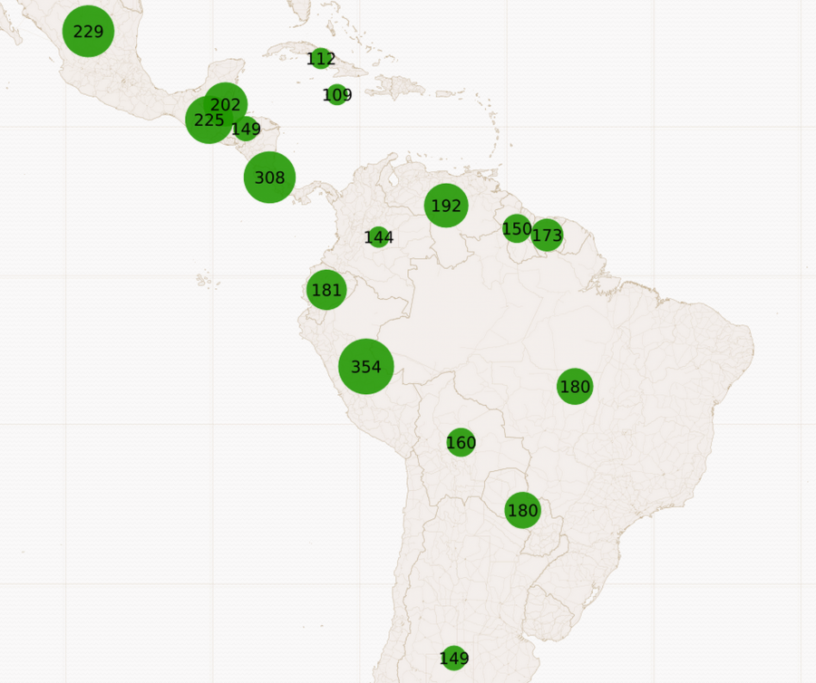
 For the story on birdwatching in Latin America, I wanted to illustrate the magnitude of species diversity the region hosted. My collaborator, Manuel Sánchez, noted that Peru currently hosts the world record for most bird species observed in one day, which is called a ‘Big Day’ in birding. That record is 354.
Finding the data
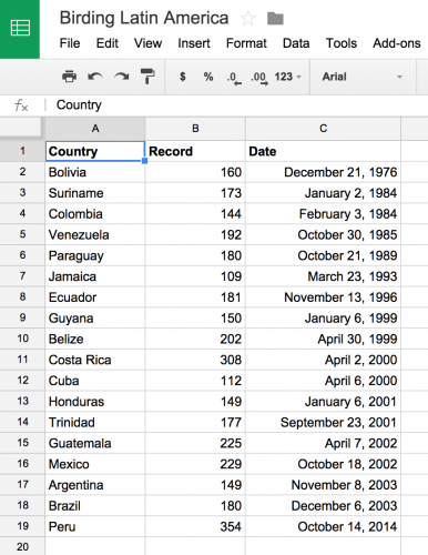
I wanted to contextualize this number for the region. Was it high? What were the other ‘Big Days’ in Latin America and how did they stack up against the Peruvian world record? On the website of the American Birding Association, I found annual reports tracking historic Big Days around the world. I found all the reported data (for ‘Big Days’ with over 100 species) for Latin America and the Caribbean and put it into a spreadsheet.
Choosing CartoDB
I knew I wanted to build and deploy something quickly to visualize this information and contextualize the world record for our article on birdwatching.
First, I thought about making a bar graph with Chartbuilder (Storybench How To) that showed ‘Big Days’ by country. Or maybe I could design some kind of timeline that showed clustering of ‘Big Days’ between October and April?
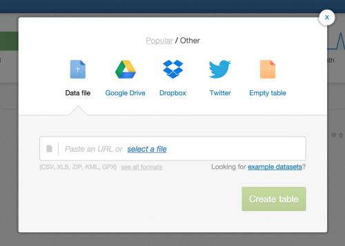
I decided on mapping the data because I had such a rich geographic parameter to play with: namely countries in Latin America and the Caribbean. But I didn’t want to use Adobe Illustrator to create all my design elements and labels. I didn’t have the time. So I fired up the mapping website CartoDB to build a quick map. I knew I could embed it or take a screenshot and use what I had built as a static map.
Importing the data
CartoDB allows you to import data in many ways. The Twitter feature is included with the premium version and allows you to build things like a temporal heatmap (to visualize a hashtag across time, like this Ferguson on Twitter map). I uploaded an .xls file with my Big Day data.
CartoDB automatically identifies the country column and geocodes each one. That means it connects each country with what is known as a shapefile. This means you can click MAP VIEW and see the country shapes for which data has been provided. Back in DATA VIEW, you can explore the geometry column and double-click on polygons to see the data CartoDB has provided for each of your countries. This data is in geoJSON, a format for encoding geographic data into a structure that can be projected onto a map.
Styling the map
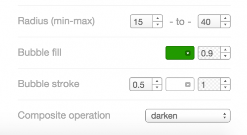
GeoJSON is cool but I wanted to use the pre-loaded visualization tools that CartoDB provides. In MAP VIEW, I clicked wizards in the right-hand menu to reveal a dashboard for customizing maps. I clicked BUBBLE in the visualization wizard.
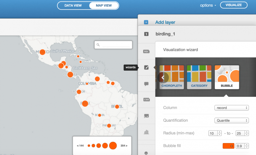
The BUBBLE setting in CartoDB allows you to visualize a column of data as bubbles that vary in diameter depending on the magnitude of each data point. Ideally, these bubbles would be geotagged to a specific latitude and longitude to denote exactly where each ‘Big Day’ was recorded. But my data isn’t that granular. I just have the ‘Big Days’ by country. I then played around with color, radius and other parameters until I got a map that I liked.
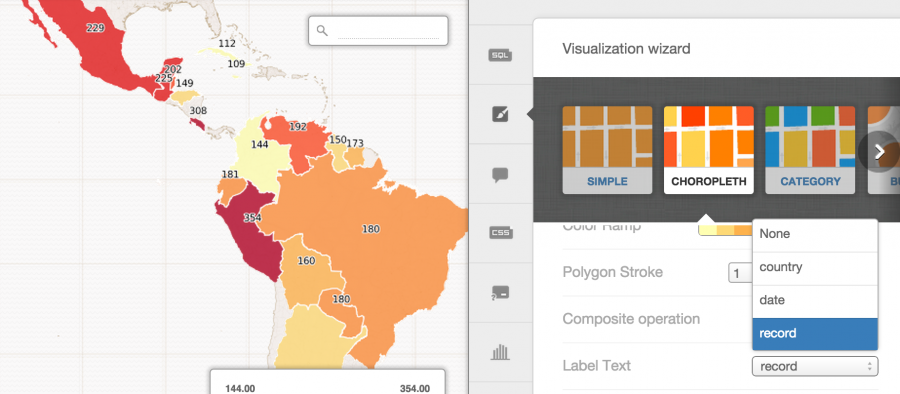
Finally, I wanted to add the number of bird species seen on each ‘Big Day.’ This is a little more difficult than it should be; CartoDB does not have a label text option under BUBBLES. So I went over to CHOROPLETH, which is a visualization where geoJSON and shapefiles really come in handy (and which may have been more appropriate for my level of granularity), and I selected record under label text.
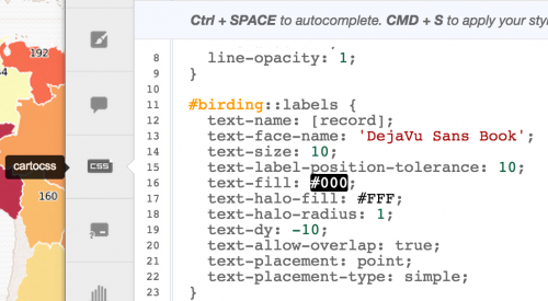
Here’s the tricky part. I go into CartoCSS, which is CartoDB’s custom styling language (geared towards developers who are familiar with CSS), and copy everything between and including #birding::labels and the first curly quotes:
Then, click BUBBLES again, and head back to CartoCSS. Paste in your CartoCSS selection and click Apply style. This has to be your final step in styling your map. Any futzing with color, radius or bubble fill in the visualization wizard will delete the CartoCSS you’ve just inserted.
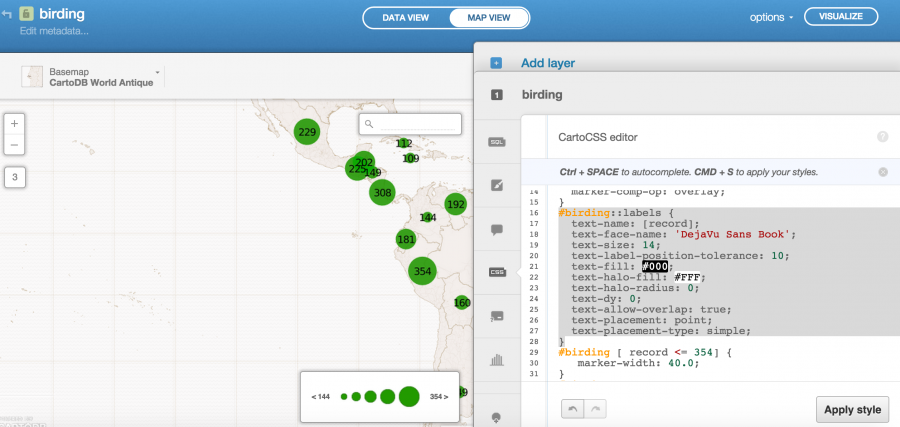
Below is the CartoCSS selection I used for my map labels, where text-size was increased and text-dy was made 0. Play around with some of the parameters and hit Apply style for a crash course in CSS.
#birding::labels {
text-name: [record];
text-face-name: 'DejaVu Sans Book';
text-size: 14;
text-label-position-tolerance: 10;
text-fill: #000;
text-halo-fill: #FFF;
text-halo-radius: 0;
text-dy: 0;
text-allow-overlap: true;
text-placement: point;
text-placement-type: simple;
}
When you’re ready to publish, hit VISUALIZE in the top right-hand corner and see your finished map. By clicking SHARE, you can embed the CartoDB map into your website (as shown below). I decided to take a screenshot and upload the resulting image into our birdwatching article as a static map.
Complicated though this looks, it took about 15 minutes once I had the data in a spreadsheet. Designing, building, and styling a custom map in Adobe Illustrator or similar software would have taken me much longer.


