How to use CartoDB to visualize animal tracking data
This tutorial was written by Peter Desmet for LifeWatch INBO, a biodiversity observatory based in Belgium, and is released under the CC BY 4.0 license. It originally appeared on the LifeWatch INBO blog on September 1, 2015. Peter Desmet is LifeWatch INBO’s the team coordinator. Follow Peter on Twitter or on his website. Mapping novice? Storybench has a simpler CartoDB tutorial here.
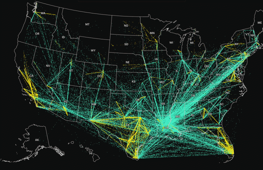
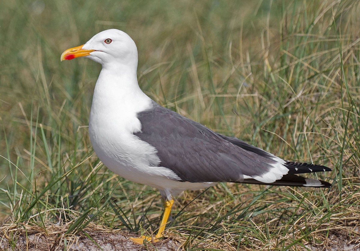
CartoDB is a tool to explore, analyze and visualize geospatial data online. In my opinion, it’s like Gmail or GitHub: one of the best software tools ever. CartoDB is used in a wide area of domains and has great documentation, but in this tutorial I’ll focus on how it can be used for exploring and visualizing animal tracking data. Since we are tracking birds, I’ll use our open data of lesser black-backed gulls in the examples, but the methods can be applied to other animal tracking data as well (I hope). This tutorial is by no means meant to be exhaustive: it’s a step by step guide to get you started and hopefully inspire you to do cool things with your own data.
Note: If you want to follow along with this tutorial, you’ll at least need to do the actions in bold, all the rest in optional.
Create an account
Go to https://cartodb.com/signup to create an account, if you haven’t got one already. Free accounts allow you to upload 50MB of data, but keep in mind that all your data and maps will be public.
Login
- Once logged in, you see your private dashboard. This is where you (and only you) can upload data, create maps and manage your account.
- CartoDB will display contextual help messages to get you to know the tool. For an overview, see the documentation on the CartoDB editor.
- At the top, you can toggle between your
MapsandDatasets. - You also have a public profile (
https://user.cartodb.com/maps). All datasets you upload and maps you create, will be visible there.
Upload data
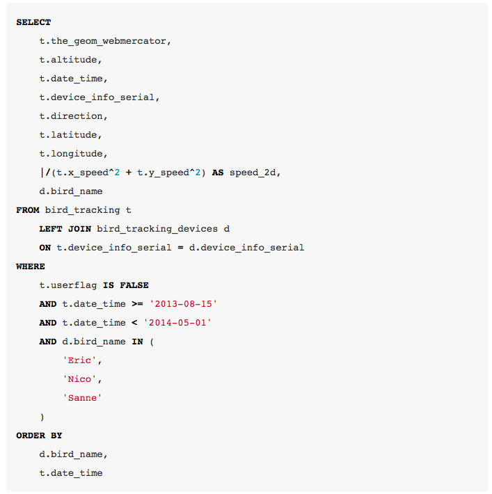
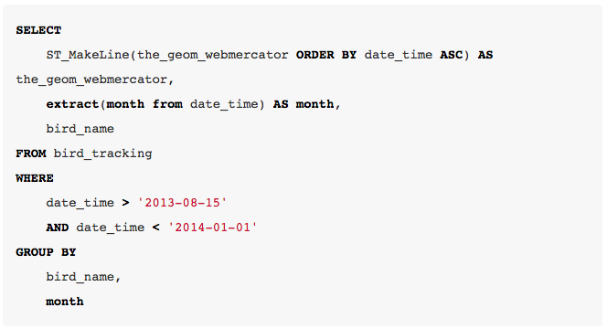
For this tutorial, well use our open bird tracking data. To make it easier to follow along with a free CartoDB account, you can download a subset of the data (2.1MB), containing migration data for three gulls. If you want to know how that subset was created, here’s the SQL query I used.
- Download this zipped bird tracking csv file. Alternate link here.
- Go to your datasets dashboard.
- Upload the file by dragging it to your browser window. CartoDB recognizes multiple files formats.
Data view
- CartoDB is powered by PostgreSQL & PostGIS and has created a database table from your file and done some automatic interpretation of the data types. Some additional columns have been created as well, such as
cartodb_id. - Geospatial data are interpreted automatically in
the_geom. This interpretation assumes the geodetic datum to beWGS84.the_geomsupports points, lines and polygons, but only one type per dataset. - Click the arrow next to field name to manipulate columns, such as sorting, renaming, deleting or changing data types.
- Most of the functionality is in the collapsed toolbar on the right, such as merging datasets, adding rows or columns, and filters.
- Filters are great for exploring the data. Try out the filter for altitude.
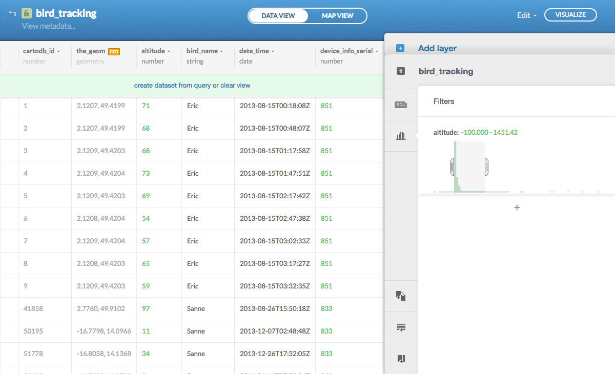
- Filters are actually just SQL, a much more powerful language to select, aggregate or update your data. CartoDB supports all PostgreSQL and PostGIS SQL functions.
- Click
SQLin the toolbar and try this SQL to get some statistics about the scope of the dataset: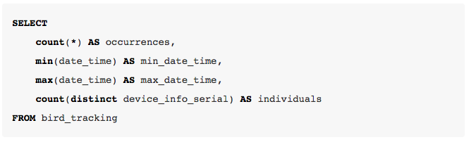
- From the
Editmenu in the top right you can export any query you make, in multiple file formats. This is useful if you want to convert geospatial data from one file format to another, but don’t have the tools on your computer to do so. - Click
Clear viewto remove any applied SQL.
Create your first map
- Click
Visualizein the top right to create your first map. - Once created, click the title
bird_tracking1and rename it toMy first map. - Click
Map view. - You can change the background map by clicking
Change basemapin the bottom right.Positronis a good default basemap, but there are many other options available and even more viaYours(including daily cloud cover maps from NASA). Note that for thePositronandDark matterbasemaps, city labels will be positioned on top of your data, making them more readable. ChoosePositron (labels below)to turn this off orPositron (lite)to have no labels at all. - Click
Optionsin the bottom right to select the map interaction options you want to provide to the visitors of your map, such asZoom controlsor aFullscreenbutton. - The map view also provides a toolbar on the right, where you’ll recognize the same
SQLandFiltersfeatures from the data view. - Click
Wizardsin the toolbar to see a plethora of visualization options. These are all explained in the CartoDB documentation. - Try
Intensitywith the following options to get a sense of the distribution of occurrences:
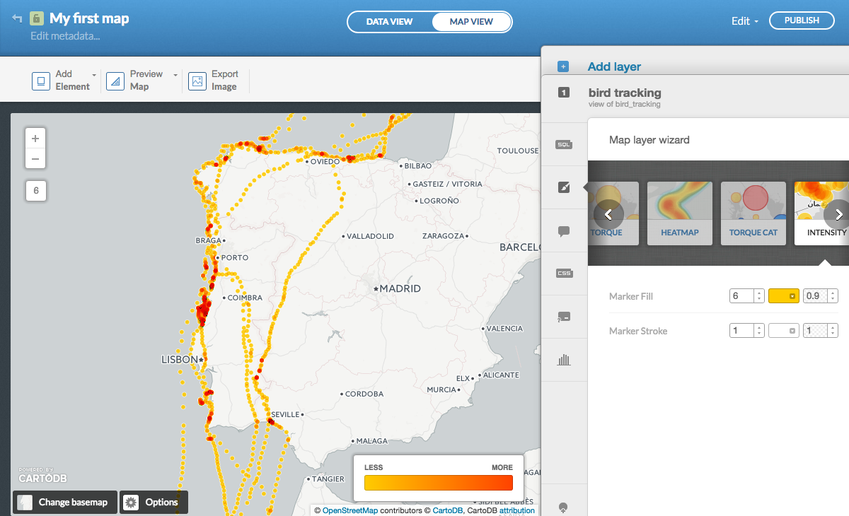
- Try
Choroplethwith the following options to see the relative altitude distribution (see the documentation to learn more about the different quantification methods):
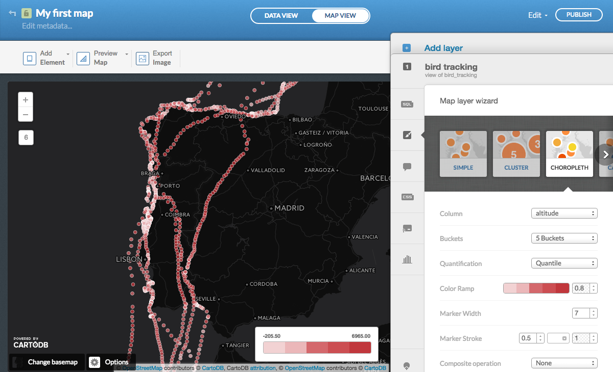
- Just like the filters are powered by SQL, the wizards are powered by CartoCSS, which you can use to fine-tune your map. Click
CSSin the toolbar to discover how the quantification buckets (in this caseQuantile) are defined: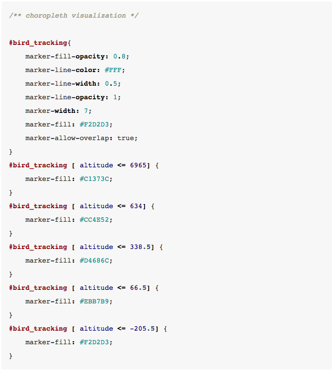
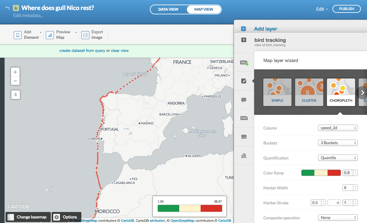
Create a map of migration speed
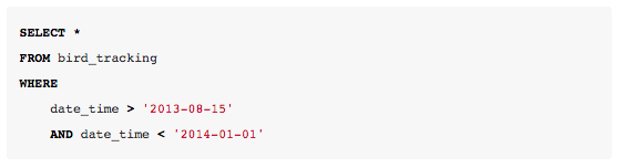
- We want to save our previous work and create another map. Click
Edit > Duplicate mapand name itWhere does gull Nico rest?. - Add a
WHEREclause to the SQL to only select gull Nico between specific dates: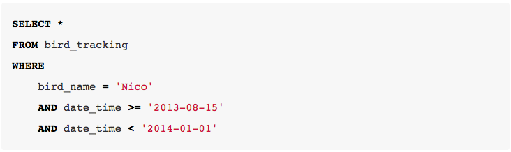
- We want to visualize the travel speed of gull Nico. The best way to start is to create a
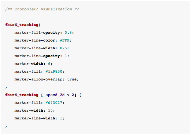
Choroplethmap, with the following options:
- Most of the dots are red and the story does not come across yet. Let’s dive into the CSS to fine-tune the map. We basically set all dots to green, except where the speed is below 2m/s, which we show larger and in red:
- Click
Legendsin the toolbar to manually set what to be shown in the legend (using templateCustom):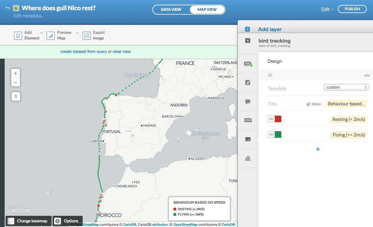
- Click a point and chose
Select fieldsto create an info window.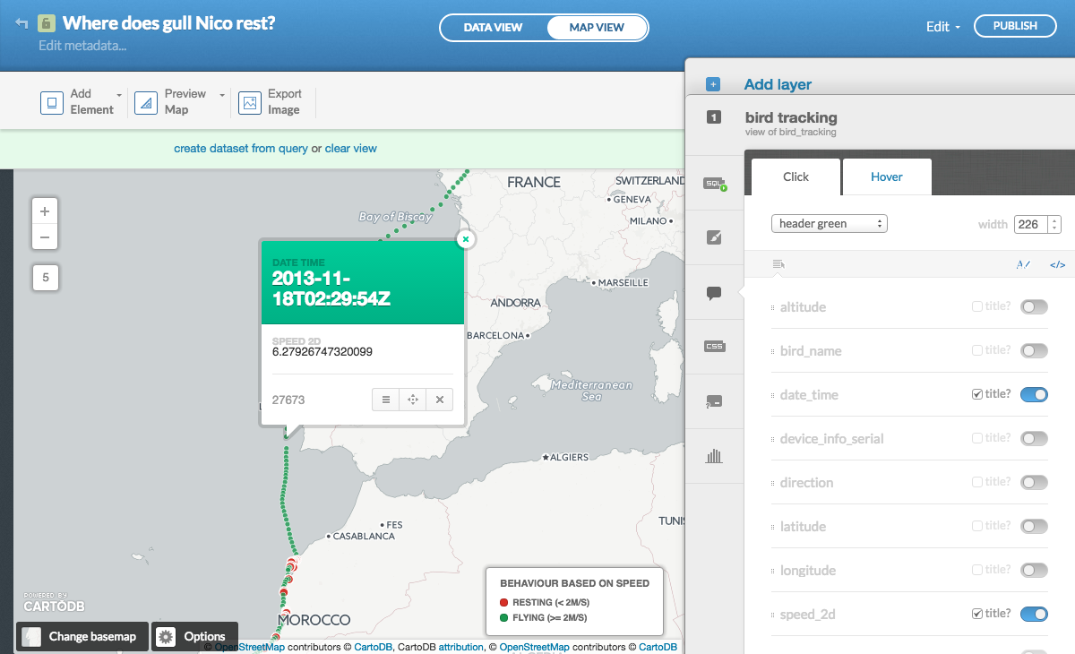
- Describe your map by clicking
Edit metadata...in the top left. - Share your map by clicking
Publishin the top right. The dialog box provides you with a link to the map or the code to embed it in a web page.CartoDB.jsis for advanced use in apps. - Copy the link and paste it in a new browser tab to verify the info windows are working and the bounding box makes sense, i.e. are the interesting part of the data visible? Anything you update in your map (including zoom level and bounding box) will affect the public map (reload the page to see the changes).
- Researchers often ask if they can export the map6. That’s not the goal of CartoDB (which is creating online, interactive maps), but you can create a screenshot by clicking
Export Imagein the top left. Unedited, it’s probably not fit for publication in a journal (e.g. the scale and indication of north are missing, which you could add manually), but luckily the default basemaps are already open data (required by some journals). You just need to credit OpenStreetMap.
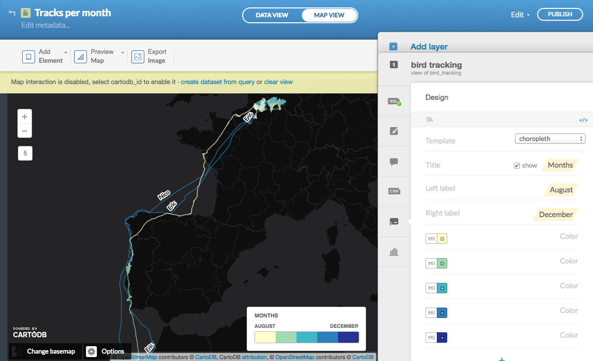
Create a map of tracks per month
- Duplicate your map and name it
Tracks per month. - This time we want to string the occurrences together as lines: one line per individual (with the occurrences sorted by date), per month. This can be done in the SQL. See the PostgreSQL documentation for date functions.
the_geom_webmercatoris a geospatial field that is calculated by CartoDB in the background based onthe_geomand is used for the actual display on the map. Since we’re defining a new geospatial field (i.e. a line), we have to explicitly include it.
- We want to display each month in a different color, so start with a
Choroplethmap, with the following options: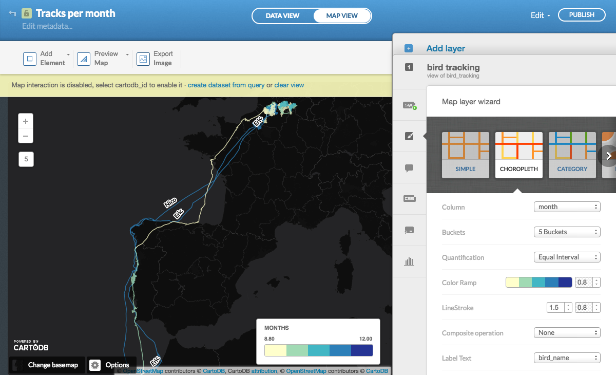
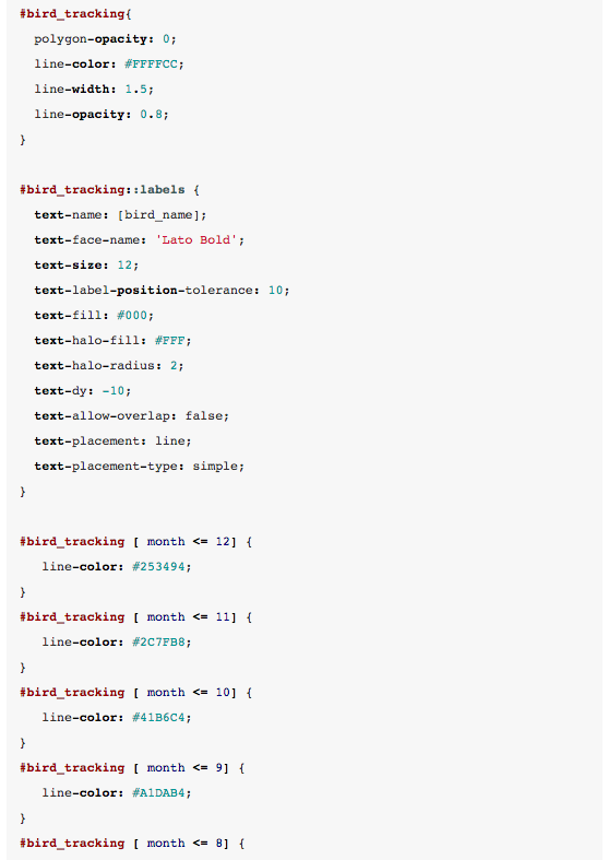
- We will also include labels (start doing this in the
Choroplethoptions), so you can still see which track belongs to which individual. Fine-tune the map in the CSS (note that I’ve changed the months to integers):
- Update the legend:
- To provide some more context, let’s annotate the map. In the top right, click
Add Element > Add annotation itemand indicate summer and winter locations. The position of an annotation element is linked to a location on the map (though placement can be a bit difficult) and you can define between which zoom levels to show it, to avoid cluttering: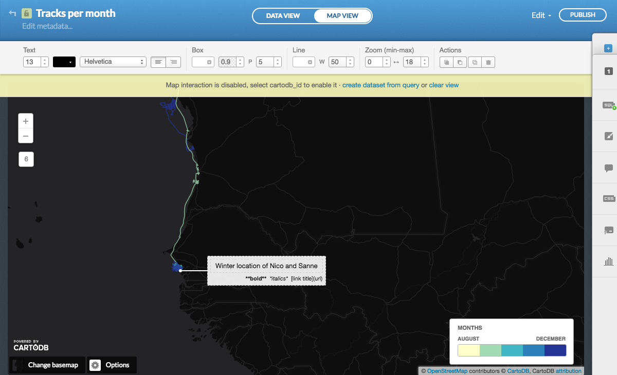
- Finally, update the description in
Edit metadata...and publish your map.
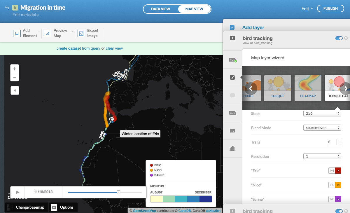
Create an animated map
- Duplicate your map and name it
Migration in time. - This time, we’ll add a map on top of the previous one. Click
+on the right hand side to add a new layer and choose the same tablebird_tracking. - Apply the same time constraints in the SQL:
- From the
Wizards, chooseTorque cat, with the following options. TheTime Columnshould always be your date.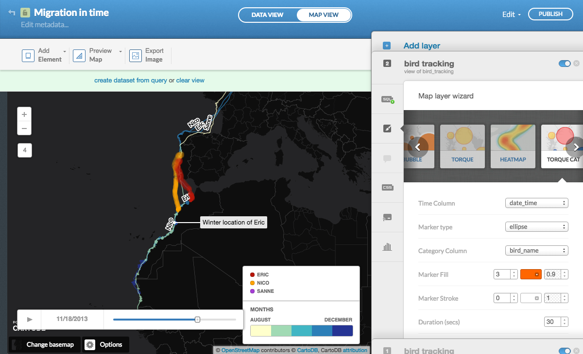
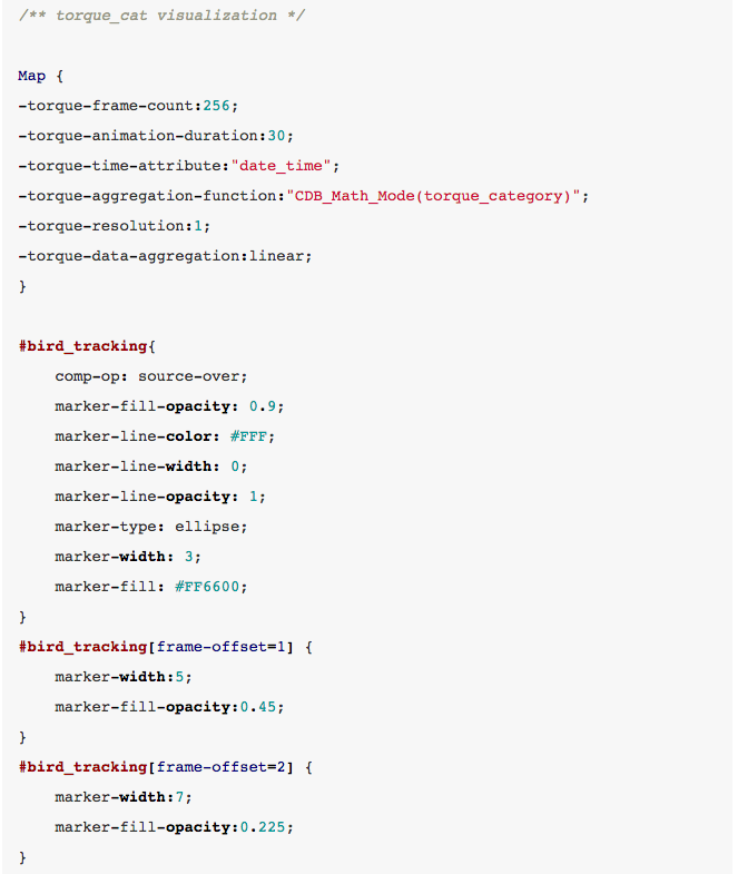
- The final CSS looks like this:
- Update the legend, remove the
bird_namelabels from the other layer (they are no longer required) and publish your map.
Go forth and start mapping
And there you have it. I hope this tutorial helped you to get a better idea of what you can do with CartoDB and that you’re inspired to use it for your own tracking data. Please share your maps or any feedback you have regarding this tutorial in the comments on the original tutorial’s website.
- NICAR: With the right tools, anyone can be a data journalist - March 11, 2019
- Northeastern J-school alumna Rachel Zarrell makes Forbes’ “30 under 30” - December 4, 2017
- How we built an interactive graphic using carcinogen data from the W.H.O. - November 12, 2015