How to build a map and use filters in Tableau Public
A number of publications and organizations have created impressive interactive visualizations pertaining to gun violence in America. From Slate’s 2016 “How many people have been shot in your neighborhood this year?” visualization mapping gun-related injuries and homicides, to the Gun Violence Archive’s yearly maps of mass shootings in America, these visualizations tell a chilling tale of where gun violence is most prevalent in the nation.
So how can you make effective, interactive maps like these? And how can you make them even more interactive so readers can further explore the data for themselves and discover the stories that are most personal to them?
Acquiring data
Tableau is an incredible tool to use for this purpose. Filtering options are fairly simple to incorporate and extremely compelling. To practice using Tableau’s visualization and filtering capabilities, let’s use the Gun Violence Archive’s shooting tracker datasets which track mass shootings in America. There are individual datasets tracking mass shootings for years 2013 through 2017, defining mass shootings as incidents where four or more people were shot and/or killed at the same general time and location, not including the shooter.
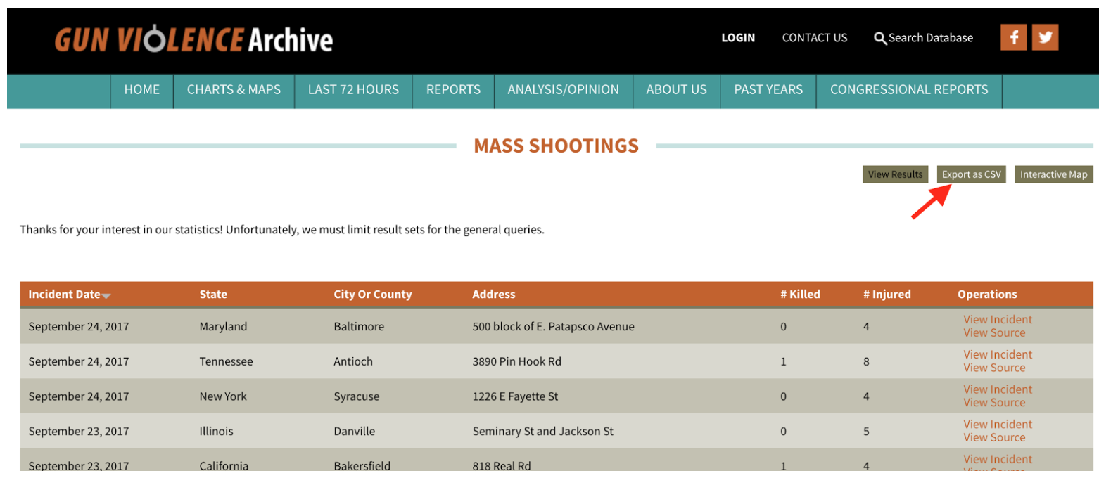
To download the datasets as CSV files, follow the link, click on each year, and click on “Export as CSV” in the top right corner.
Combine all datasets into one spreadsheet
Since all the datasets are formatted the same way, they can easily be combined into one larger file. The simplest way to do this is just to copy and paste all of the results from each of the files into a single file. To avoid Excel/CSV warnings about needing to paste the data into cell A1, don’t copy the header row after the first sheet.
Because the entire “Operations” row is N/A, we can delete that from our dataset. We can also rename “# Killed” and “# Injured” to be “Victims Killed” or “People Killed” in order to make labels cleaner once we open the data in Tableau. Save the CSV as something recognizable.
Getting started with Tableau
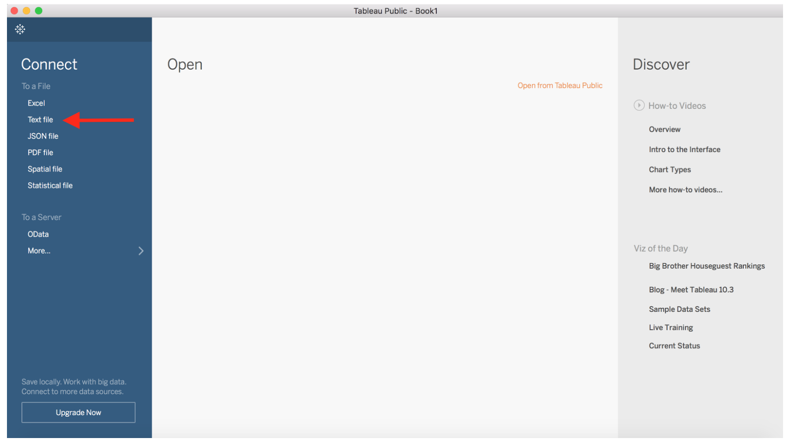
Hopefully if you are reading this you have already downloaded Tableau or Tableau Public. If not, there’s a simple, free download and account setup process for Tableau Public. Once you have Tableau set up, open it and click “Text File” under the “Connect” tab to locate the CSV file stored on your computer.
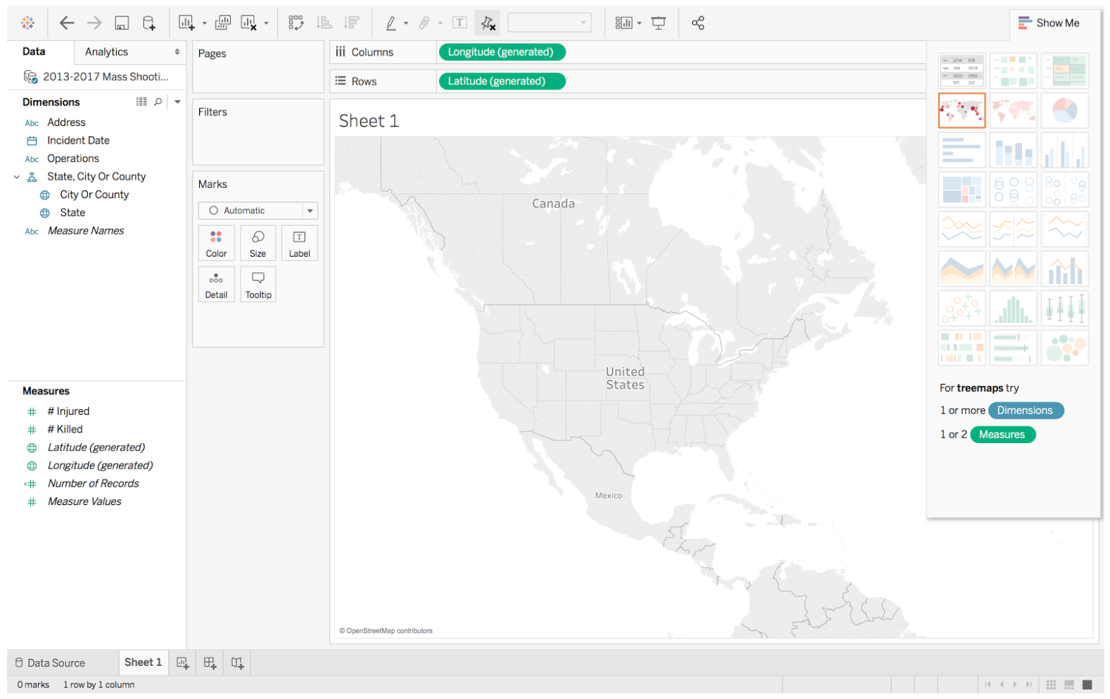
From there, Sheet 1 should open on the application. This is a platform for you to begin visualization.
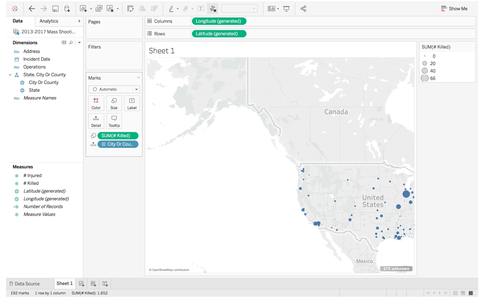
You’ll see that the page lists a number of dimensions and measures on the lefthand column for you to choose from. To initialize your visualization as a map, drag the automatically generated longitude to the “Columns” line at the top of the page and the generated latitude to “Rows.”
Fixing data discrepancies within Tableau
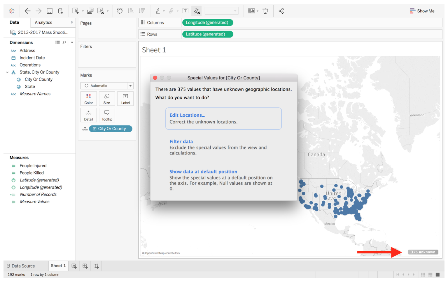
After this, drag the “City or County” tab to the “Detail” box under the “Marks” tab. This will make every city or county where there was a mass shooting between 2013-2017 pop up on the map in equal size and color. However, if you notice in the lower righthand corner, there is a small gray box indicating “375 Unknown,” meaning that Tableau cannot place 375 of the city names to a location. Many of these are because the “City” column does not yet know that it depends on the “State” column, so only U.S. cities with unique names are highlighted.
To fix this, click on the gray box listing the number of unknowns. A box will pop up to ask how you would like to rectify this issue. Click “Edit Locations.”
Once there, you can set the “State/Province” Geographic role to the “State” field of your dataset. This will fix most of the errors.
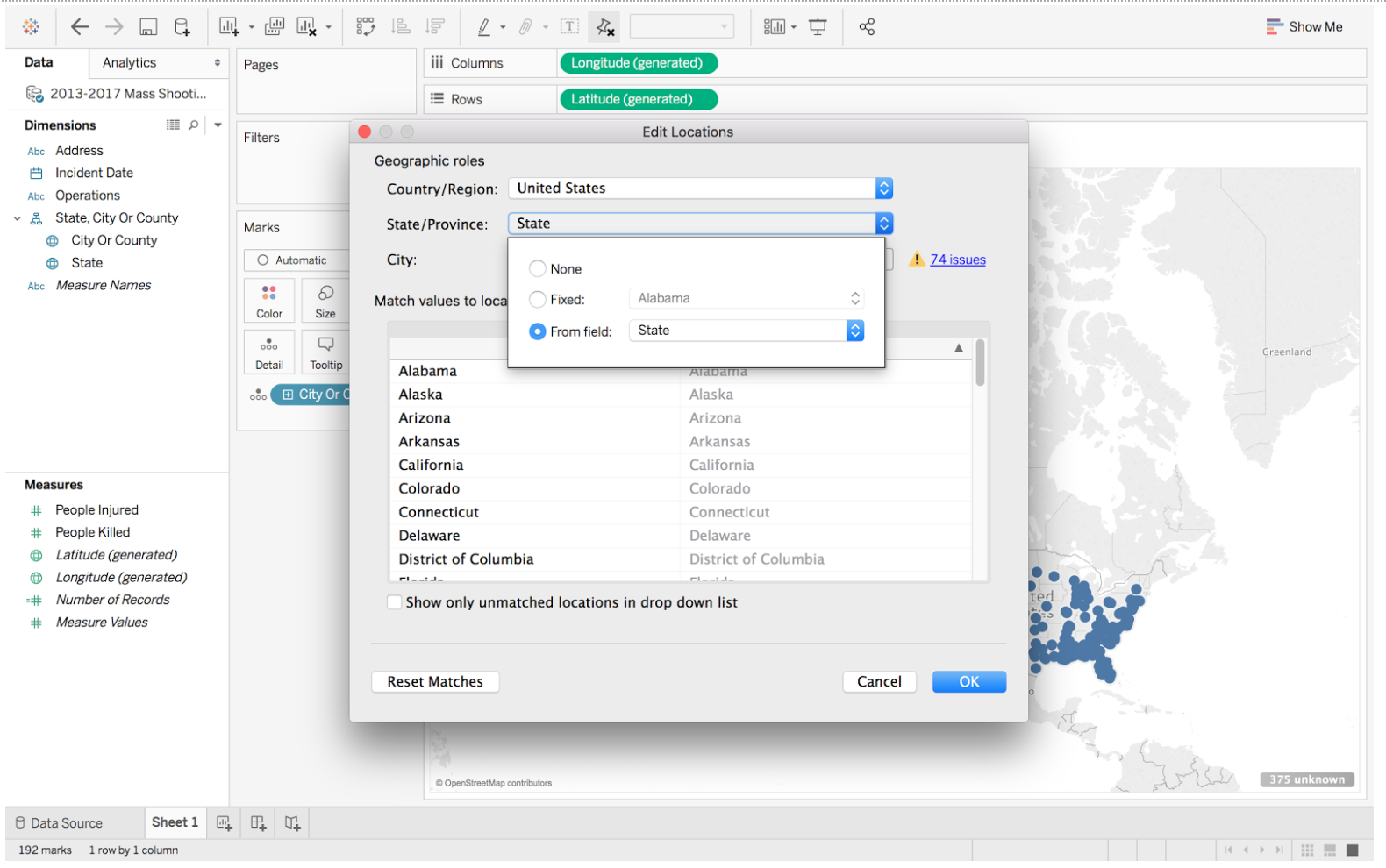
Even after this fix, you will see that there are still a number of issues with the City field. Many of these stem from unclean data, such as cells that list a city and then a neighborhood in parentheses, like “New York (Manhattan),” or counties that have “(county)” after their names.
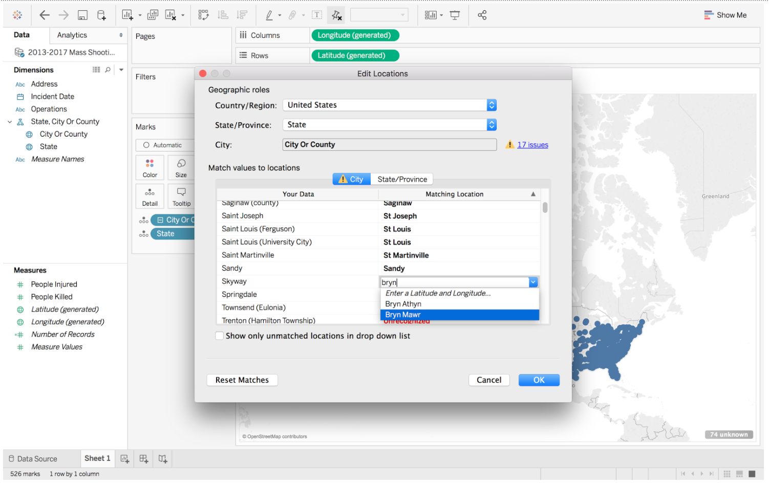
You can choose to either amend these issues using Excel methods in the CSV dataset and then reload it in your Tableau workspace, or you can alter the data within Tableau itself. The latter allows you to see what fields you have fixed and which ones are still unknown, but must be done manually. However, with this size of dataset and only 75 items to cross reference, the job may only take up to half an hour for a savvy web searcher.
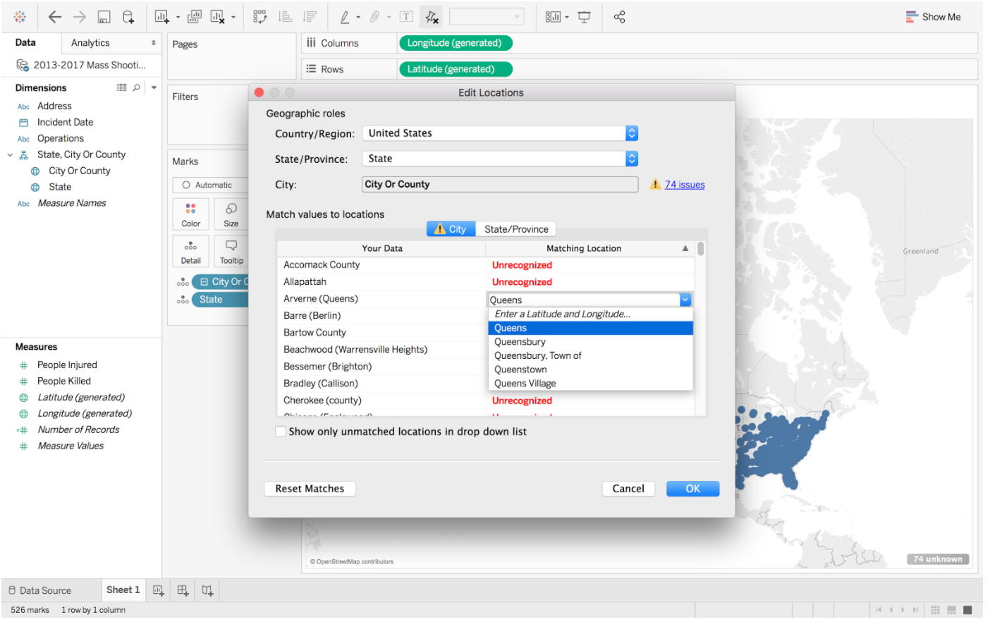
For locations that you can’t match up to Tableau geography, which should end up being fairly few, return to the option menu and select “Filter Data” to omit them. Be sure to note how many cases you omitted when you publish the graphic.
Now that the problems with our data are resolved, let’s make something of it.
Initial visualization
To make the city markers vary in size based on the number of victims who died in the shooting, drag the “# Killed” measure to the “Size” box under “Marks.” Now, the city circles will be bigger depending on the number of people killed in mass shootings there (a key appears to the right to show the correlation in difference in size).
Notice that these are sums of mass shooting deaths in that city and not counts from individual incidents. To view the latter, hover over “# Killed” under “Marks,” click the dropdown and click the word “Dimension.” Because the location data is tied to city names and not precise locations, markers for cities where there were multiple shootings will overlap each other, so you have to move your mouse minimally to observe the different cases when you’re viewing the data points all at once.
Both the sum and individual incident numbers are okay representations to use as long as you make it clear to viewers what they are looking at.
If you also want to show differences based on the number of people injured in mass shootings, drag the “# Injured” measure to the “Color” box under “Marks,” which will make the color of the city markers darker shades of blue for higher numbers of injured victims associated with a city.
Oh, and if you want to change the color scheme, hover over the key on the right side of the screen, click the dropdown arrow and select “Edit Colors.”
And, finally, filtering
The fact that it took 1,000 words and several steps to get to the interactive aspects of data visualization is a clear display of a universal truth in data visualization: The legwork of data cleaning and problem solving takes much longer than the actual visualization stage.
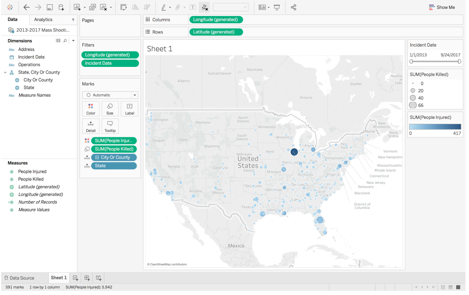
Since you have already used several of the factors in creating the visualization, an obvious data choice to filter by would be the incident dates. So, drag the incident date dimension to the neighboring “Filter” box. Another box will pop up asking how you would like to filter by date. You can explore the different filtering options, but one of the simplest options is to select “Range of Dates,” the second feature down.
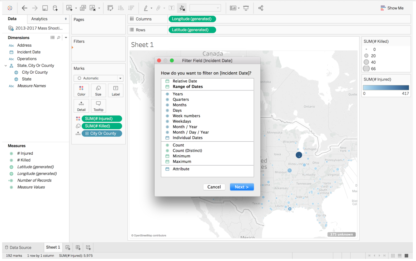
After selecting this, a window of the preset start and end dates pops up and, unless you want to limit the date range, you click “Okay” to continue working on your dataset.
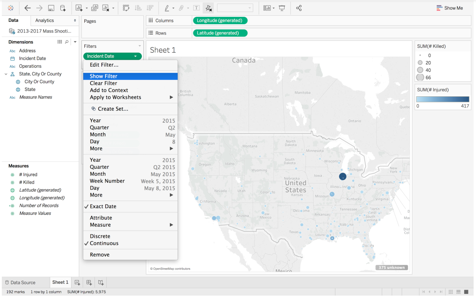
Now you will see the Incident Date bar shows up in the “Filters” box. Hover over it, click the dropdown arrow and click “Show Filter” to get a slidable bar on the righthand side of the sheet. If you move either of the ends of the bar, you can see just the mass shootings which occurred within that date range. Fiddle with the filter for a bit to see how the data changes, and potentially to cross-check your work and make sure there are no errors.
You could also create a filter to only view incidents that included a certain number of casualties. To do this, drag the “# Killed” measure to the “Filters” box. Another window will pop up to ask you to choose what you want to filter on it. To filter by individual incident casualties, choose “All Values,” click “Next” and then “Okay.” Make the filter show up in the right sidebar the same way as you did with the date filter.
Again, play with this filter. You’ll notice that once you get above 16, there is only one shooting that shows up on the map, which is the dot on Orlando, Florida. Thinking back on the past few years you’ll realize that this marks the Orlando nightclub shooting in June, 2016, that was the deadliest mass shooting by a single shooter in U.S. history. On the other end of the spectrum, you’ll see that there are a large number of mass shootings in which no people are killed.
When you’re done making alterations and personalizing the viz, create a new dashboard and drop the sheet in it, rearrange the filters and keys how you see fit, and give the chart a name, data citation and editor’s note about any assumptions, important definitions and data issues.
These filtering techniques (and more) can be applied to many datasets on an unlimited number of topics, so explore data and see what you can do with a few clicks and some reasoning.