
Six ways Alberto Cairo thinks you can improve your data visualizations
There’s a pesky little number that many in the data visualization community would just as soon ignore – one-third of Americans can’t properly read a scatter plot. Newsrooms and other organizations finding themselves dedicating more resources to the discipline, are we leaving the general public behind?
 Renowned data journalist and data visualization expert Alberto Cairo raised these concerns at Northeastern University last week during one of his “Visual Trumpery” lectures, a series aimed at creating more adept readers of data visualization. Cairo was inspired to start this year-long tour after noticing a widespread lack of “graphicacy” – the ability to read graphics – despite the growing prevalence of visualizations in the mainstream.
“Even if the graphics and the numbers served in the stories have nothing to do with the content of the message, the message still becomes more persuasive for the sheer presence of numbers and for the sheer presence of graphics,” Cairo said of data visualizations accompanying news stories. “So I believe that we are facing, so to speak, a ‘perfect storm’ of misinformation.”
Cairo outlined several principles to improve graphic literacy, as well as ethical guidelines for creating and sharing them. Storybench scooped up as many as it could.
Don’t look at visualizations: read them
Readers must fully read data visualizations in order to understand their content. “We need to convince people that data visualization — charts, maps, graphs, etc. — they are not just pictures. They are not meant just to be seen, they are meant to be read,” said Cairo.
Visualizations have their own grammar, vocabulary, and symbolization systems. As such, they must be interpreted carefully.
“Pictures don’t speak for themselves,” Cairo said. “A chart doesn’t speak for itself. Data never speaks for itself.”
Note the sources
Ask yourself whether the graphics are using the right sources of data and whether they are disclosing those sources. “When a news organization doesn’t link to the primary sources they have used, that’s a huge red flag,” said Cairo.
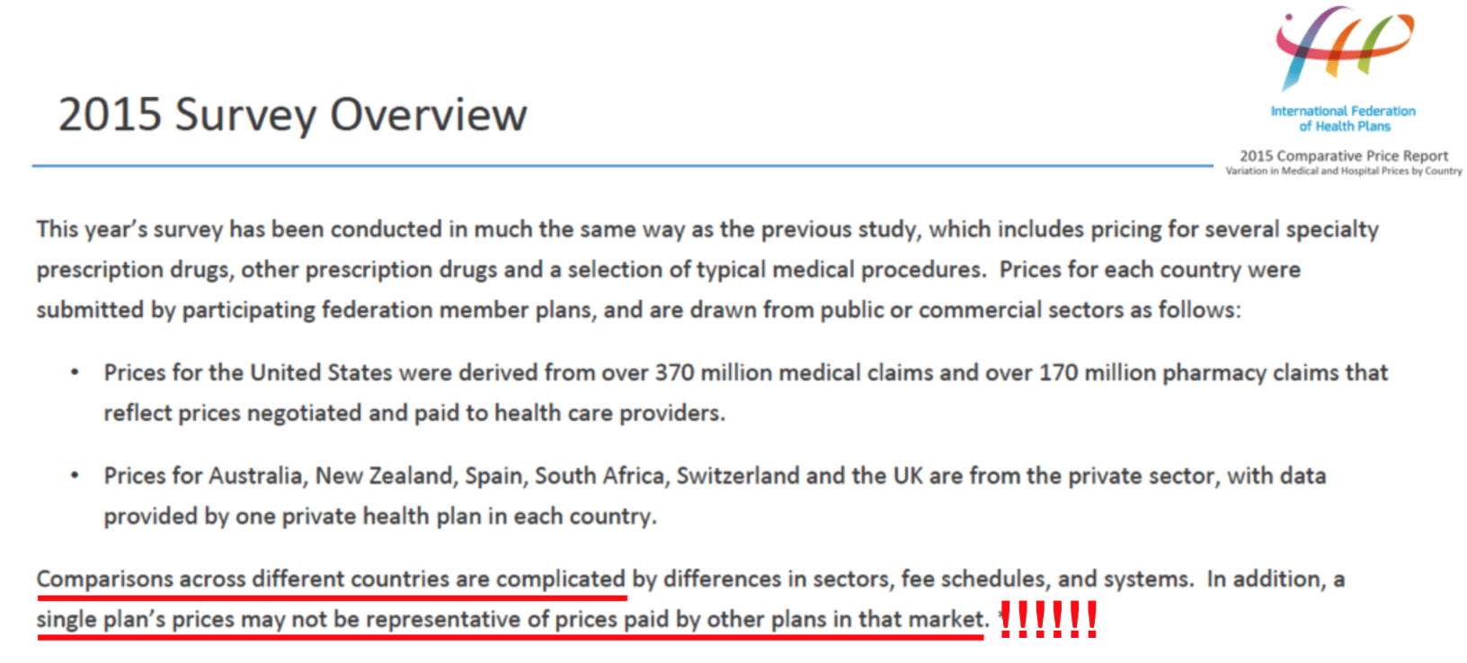
Cairo shared a chart by Vox entitled “America’s health care prices are out of control. These 11 charts prove it,” which showed the cost of a cataract surgery in four different countries. The U.S. data was drawn from more than 170 million pharmacy claims. However, upon Cairo’s further inspection, the source of the data for the other three countries represented on the chart came from the private sector and only took into account one private health plan in each country. The data was not comparable to the U.S. data. Vox’s charts were therefore unreliable.
Don’t read too much into visualizations
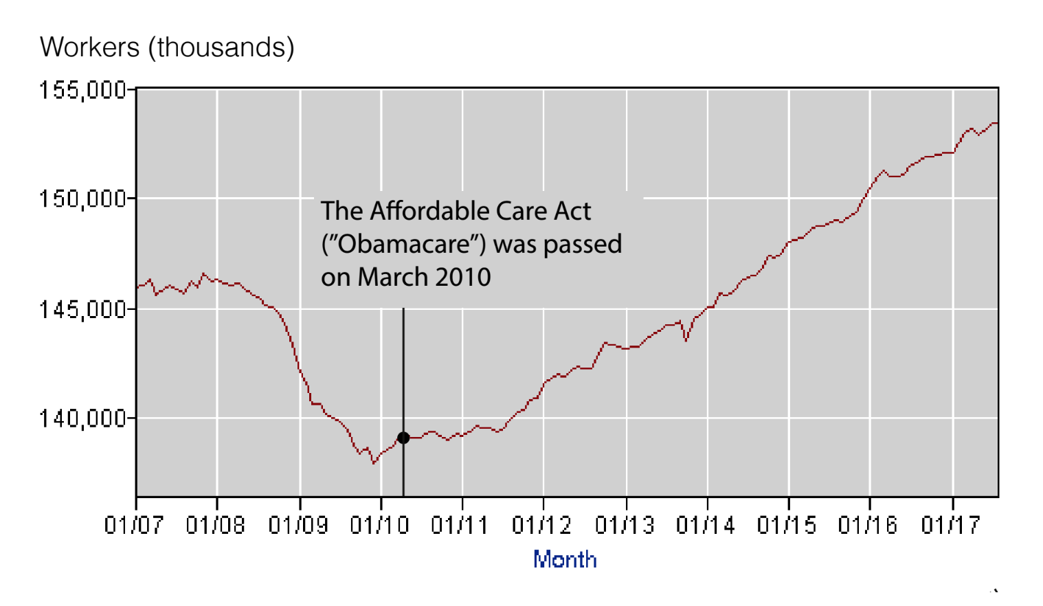
“We tend to infer too much on the data that is presented,” Cairo said. “Sometimes we do this for political reasons. We are very ideological. Whenever we see a graphic that confirms what we already believe we tend to use it as an argument to defend our own positions.” In a PowerPoint slide titled “Always tell yourself: ‘A chart shows what it shows — and nothing else,” Cairo illustrated this point with a graphic pushing a Democratic agenda.
The graph, which consisted of a timeline representing the number of American workers from 2007 to 2017, is annotated with the date that the Affordable Care Act, or “Obamacare,” was passed. The graph draws a false correlation between ACA and the health of the economy. “The chart itself is showing two unconnected phenomenon and it is only here that we make the connection just because we are ideologically driven.”
Make sure charts show appropriate amounts of data
“I come from the role of journalism and in the world of journalism everybody speaks about simplification,” Cairo said. “We should never over-complicate a story with complex numbers, but with simplification you may end up oversimplifying a story by showing too few numbers.”
Instead of simplification, he said data teams in newsrooms should focus on clarification.
“In order to clarify, sometimes you need to increase the amount of data that you show, the amount of complexity, the amount of density of data in order to put the data in context. A number usually means very little if you don’t compare it to other numbers,” he said.
Get comfortable with uncertainty
“Whenever you see a chart representing a sort of data, a graphic that shows the data with very sharp boundaries, very clear-cut boundaries, you should never see those boundaries as clear cut,” Cairo said. “You should see a cloud in there, like a cloud of uncertainty surrounding that particular point estimate.”
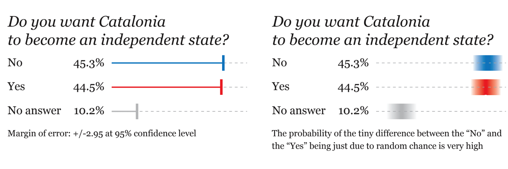
Cairo offered the example of a headline indicating that a majority of people in Catalonia did not support independence from Spain. The data, however, shows that 45.3 percent of people did not favor independence and 44.5 did, with 10 percent of participants saying they didn’t want to respond to the question. The margin of error on these estimates is buried in the story: 2.95.
With that large of a margin of error, the survey results are inconclusive. “All that you can claim is that they seem to be tied,” Cairo said.
Update your ethical principles to change with the times
Cairo raised the idea of focusing on ethical thinking, an approach where data visualization creators must be careful not to allow their biases to impact their graphics.
“We will never be able to get rid of them. We are human beings, we are not machines, so we cannot be perfect,” Cairo said. “But just improving it, just being able to avoid our cognitive biases or our ideological biases 10 percent or 20 percent of the time can take us a very long way.”
Cairo pointed out that people should be truthful in their arguments and avoid using poor data visualization just to prove a point. “We need to win arguments using good arguments, using good data, using good evidence and, as an extension of that, using good visualization.”


Watched CSPAN broadcast of professor Cairo on 10/19/2019. I have been training and consulting data visualization content for 11 years. I authored the first Tableau training manual in the world after leaving Tableau. I emphasize a number of key points too long for this post but several include: who is your content consumer; what are your data sources; what device does the content consumer use to see the visual.