How to create a barplot in R
In playing with the fivethirtyeight R package for another Storybench tutorial, we learned some basics of plotting a bar chart in R using data from a csv. Below, we’ve outlined the steps we’ve taken to create a barplot in R using murders_final_sort.csv, cleaned and created in this tutorial.
Load the csv
In RStudio, load the csv file.
murders_final_sort <- read.csv(file="murders_final_sort.csv")Read the column names in RStudio’s console with names(murders_final_sort).
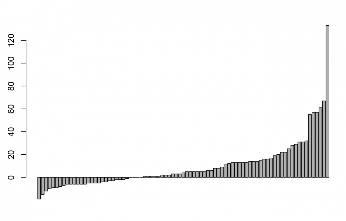
Create a simple barplot
Using barplot(murders_final_sort$change) you can plot the “change” column. Run the script and you’ll see this:
Extend the y-axis
To extend the y-axis to -20, add:
barplot(murders_final_sort$change,
        ylim = c(-20, 120))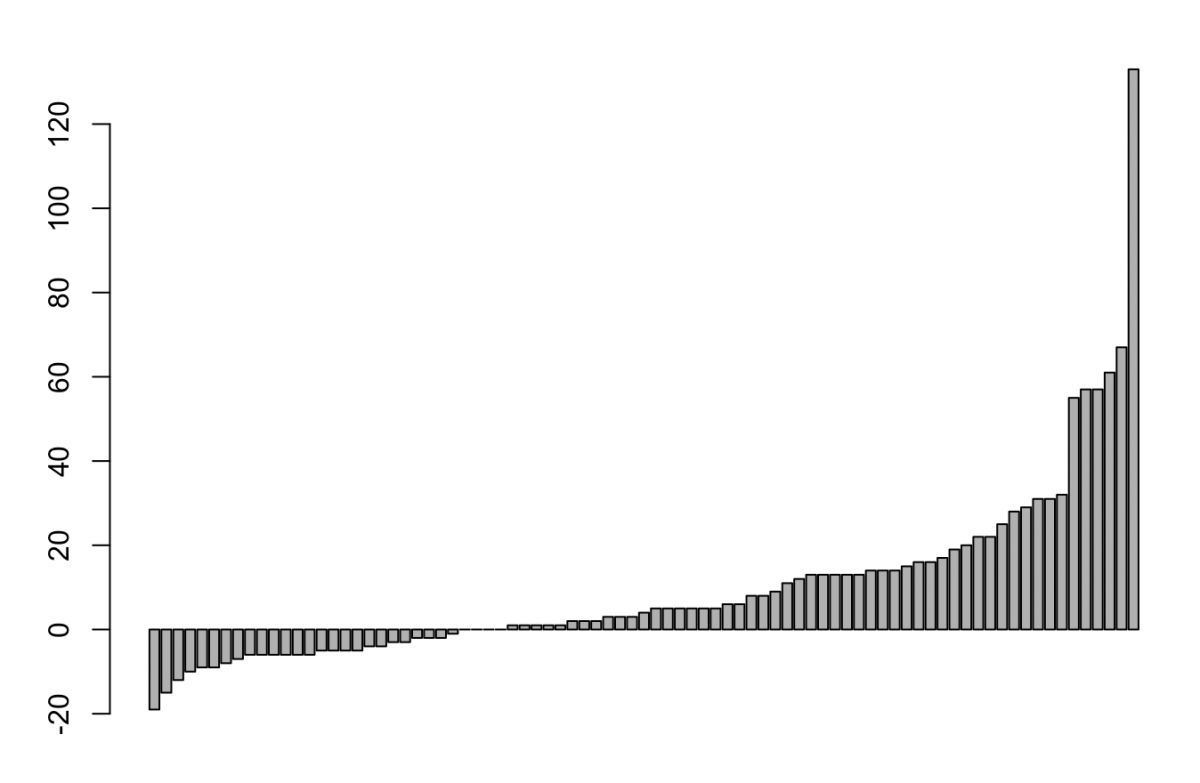
Add labels
Finally, we’ll add some labels. There are many different ways to add labels in R. Let’s start with simple labels, added with names.arg, whose font is made smaller with cex.names. They are made perpendicular with las = 2.
barplot(murders_final_sort$change,
        ylim = c(-20, 120),
        names.arg = murders_final_sort$city,
        las = 2,
        cex.names = 0.6)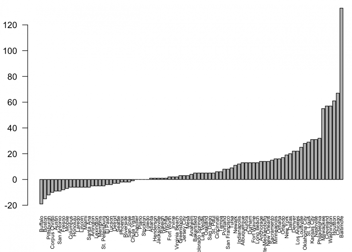
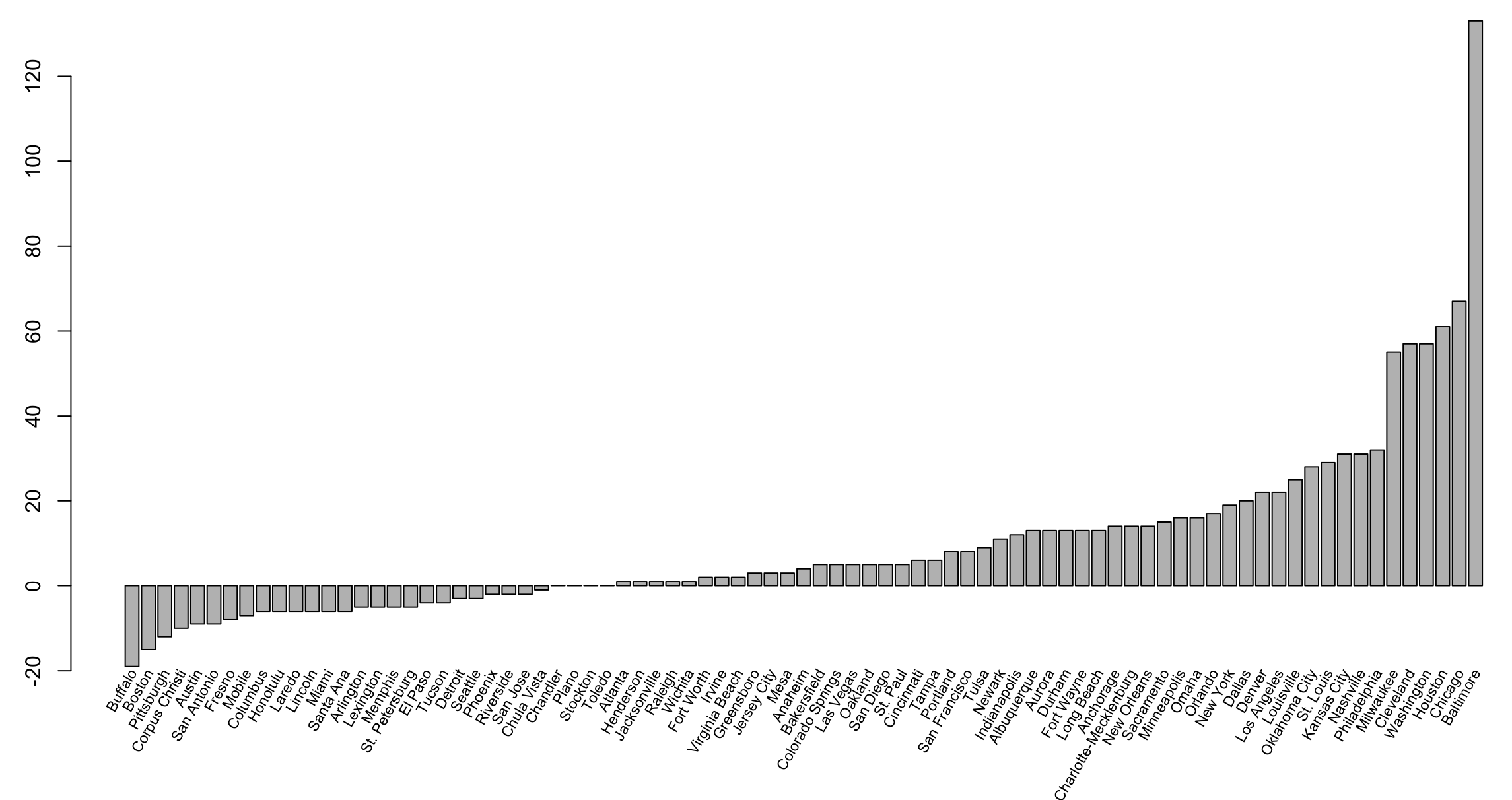
Add a title and place labels at 60 degrees
The following code gets a little complicated and there are several other ways to achieve this end result. Notice srt = 60 places the labels at 60 degrees while y = -20 and offset = -0.1 help move the labels around. Finally, pos = 2 justifies them right. To read more about those, go here.
midpts <- barplot(murders_final_sort$change,
                  cex.axis = 1.0, cex.names = 0.6,
                  ylim = c(-20, 120), main = "Change in murders from 2014 to 2015"
)

text(murders_final_sort$city,
     x = midpts,
     offset = -0.1,
     y = -20,
     cex = 0.5,
     srt = 60,
     xpd = TRUE,
     pos = 2 )
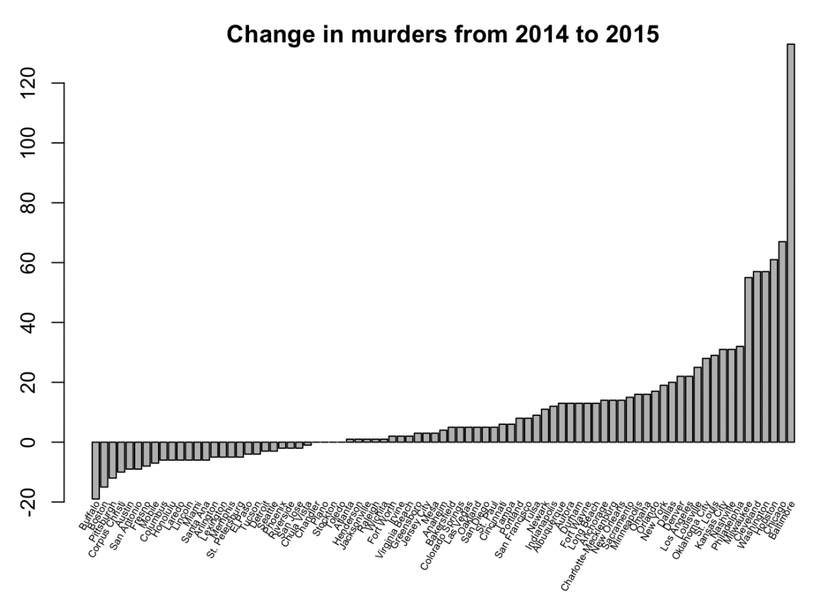
The final barplot should look like this:


Thanks for the information, it’s very great.
Please can you help me with how to create a grouped bar chart using a CSV file?