How to build a map of rodent infestation complaints in your city
A city’s calls for service can be an interesting proxy for the problems it’s facing. In collaboration with Northeastern professor Mike Beaudet’s investigative reporting class, we decided to explore rodent infestation complaints in Boston and build a map to visualize them. The maps were later aired and published on Boston’s WCVB. Here’s how we did it:
Download the dataset
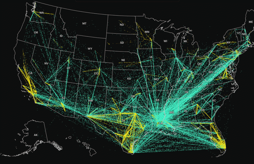
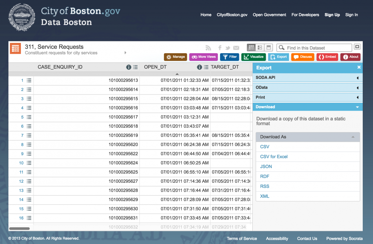
Looking at the City of Boston’s data portal, we found a database of 311 service requests. Here are 311 datasets for New York City, San Francisco, Washington D.C., and Houston.
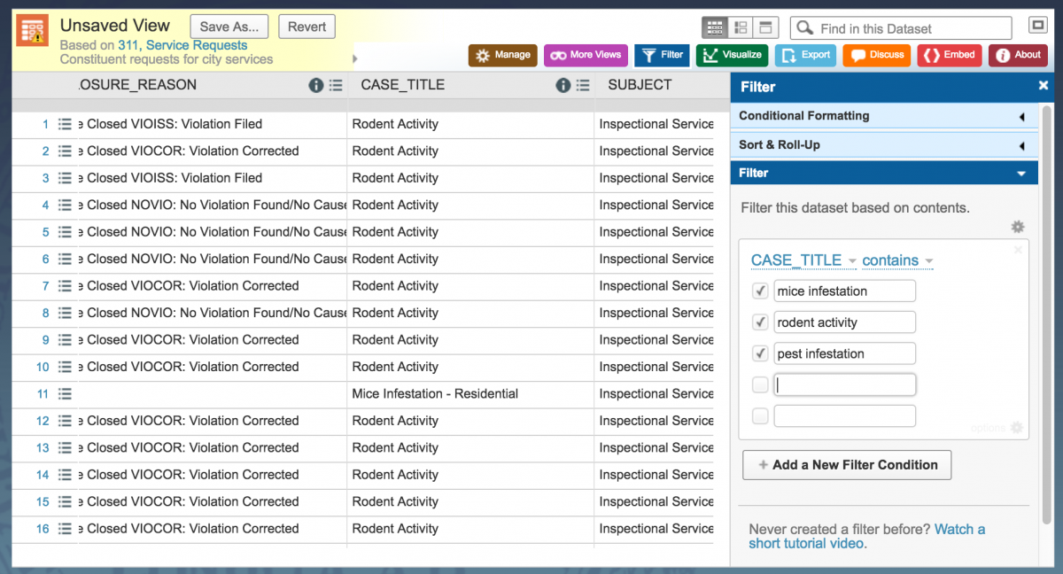
We decided to try the Filter function within the data portal and after reviewing the categories under CASE_TITLE, decided to filter for all instances of the terms “mice infestation, rodent activity, and pest infestation” in the CASE_TITLE column. Then, we clicked Export and selected CSV.
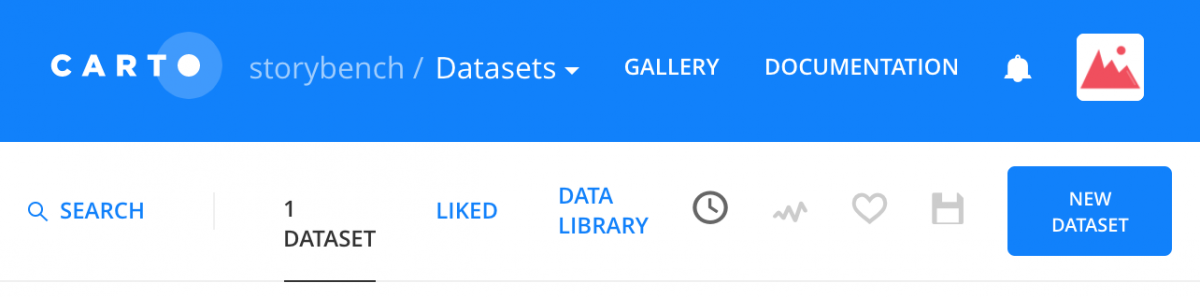
Import the data into Carto
Carto, a digital mapping platform, makes it easy to explore your dataset while visualizing it. Sign up for a free account and navigate to this screen:
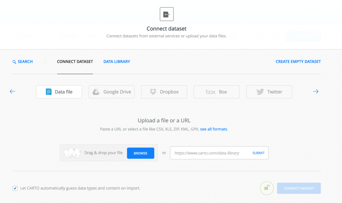
Click New Dataset. Click BROWSE to upload the dataset you just downloaded.
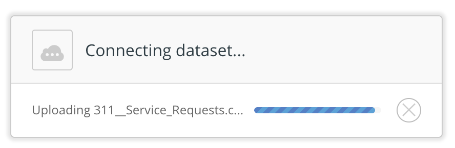
Wait for the dataset to be uploaded.
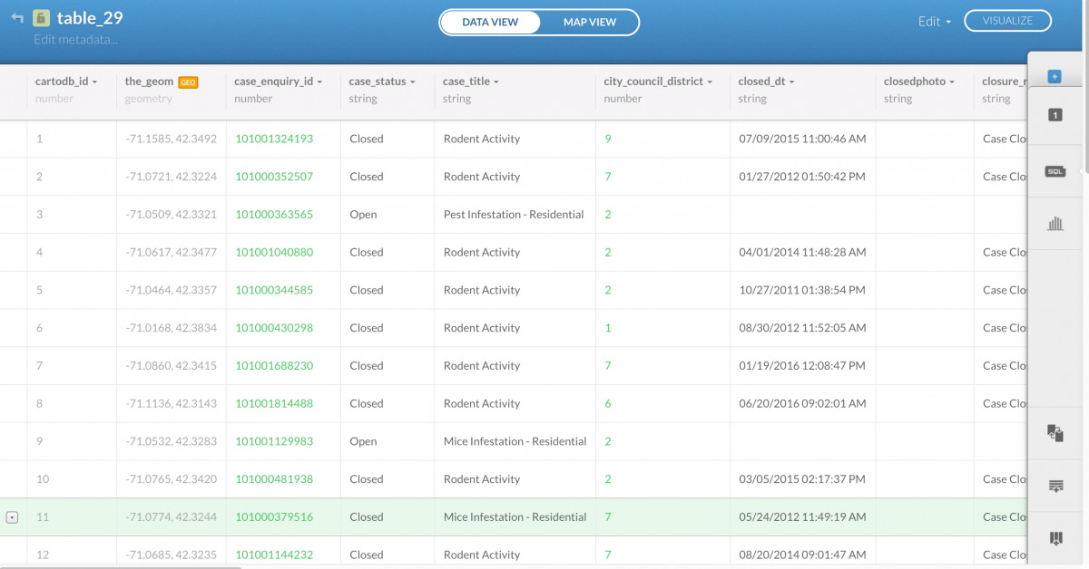
Carto has its own spreadsheet visualization.
Visualizing your data
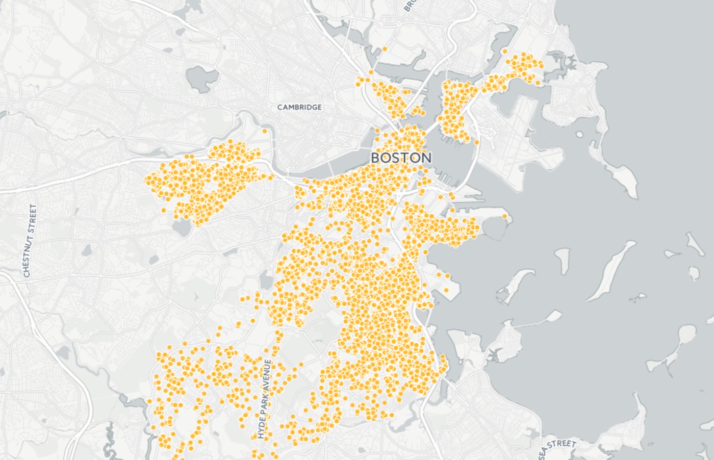
Notice is automatically created a the_geom column that united the latitude and longitude coordinates that your dataset already had. This allows Carto to plot those coordinates as point data on a map. Click MAP VIEW to see them all.
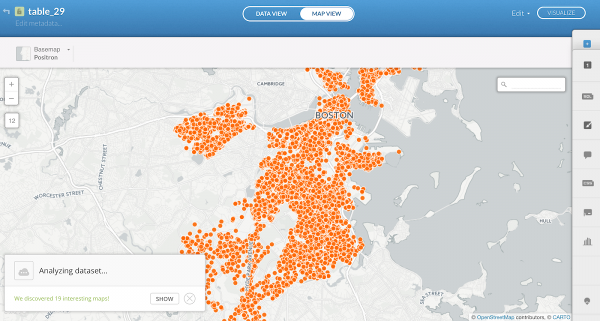
Finding stories in the data
Now, to dig into the data and try to find some stories. Carto automatically offers a few options in the bottom-left corner, “19 interesting maps” in this case. Check those out for an idea of how it is visualizing different dimensions of the data. But let’s ask some questions of our own.
Click the filters button in the right menu to reveal the following:
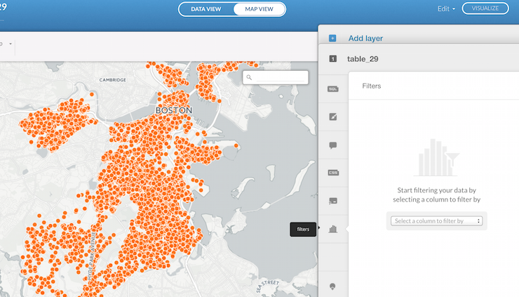
By selecting open_dt – when the 311 complaint case was opened – in the “Select a column to filter by” drop-down menu, and then entering 2011, 2012, 2013, 2014, 2015 or 2016, we can watch the 311 rodent complaints over time.
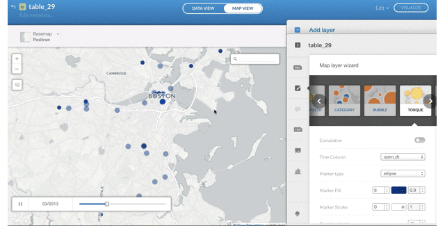
How to animate the data
Go back to the DATA VIEW and convert the open_dt column type from string to date. There’s a drop-down menu when you click string. Convert it. (Carto will say that you may lose data in the conversion process. Anything that it doesn’t recognize as a date it will mark as null. For brevity’s sake, we’ll allow this, but ideally we’d go through the entire dataset and clean up the date column.)
Next, go back to MAP VIEW, click the wizards tab on the right-hand menu and navigate over to the TORQUE option.
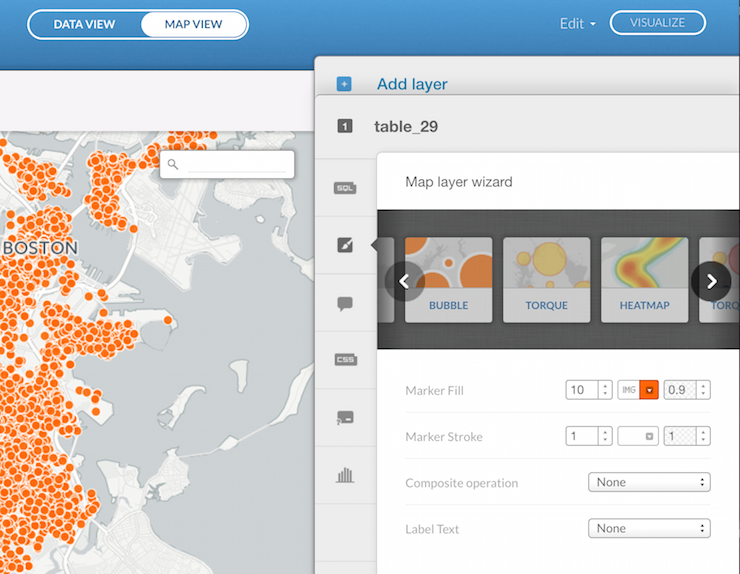
Click TORQUE and make sure the Time Column is set to open_dt.
You can set the speed, the size of the dots, the color and other aspects of your animation. To embed on your website, click Publish and copy the iframe embed code.