How to build a weather map in CartoDB
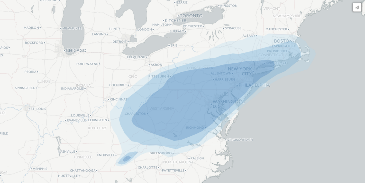
A historic winter storm has just blanketed the Mid-Atlantic and New England regions of the United States, effectively shutting down cities like Washington D.C. and New York for the weekend. Before it hit, and in the aftermath of the storm, several news agencies produced maps.
https://twitter.com/AP_Interactive/status/691612266215665665
From sourcing the data to building a map in CartoDB, Storybench wanted to demonstrate how news organizations could create similar maps for a future storm forecast.
Getting the data
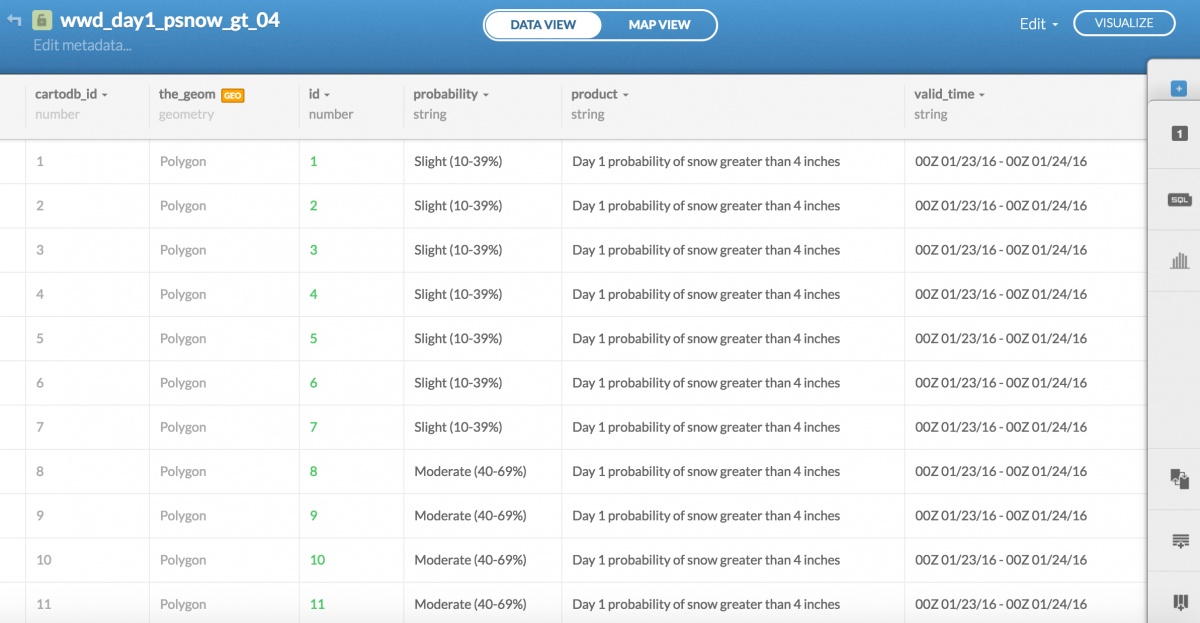
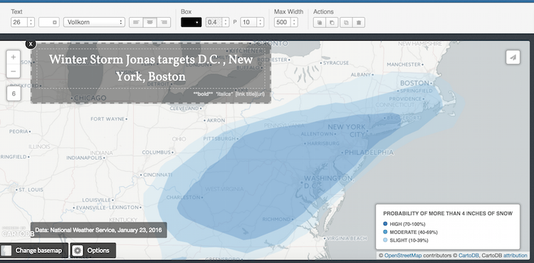
The National Weather Service’s Weather Prediction Service produces shapefiles of its weather forecasts which, as opposed to point data, convey probabilities of weather phenomena in a certain geographic region. The NWS provides the coordinates that define these regions as well as the probability that the phenomenon will occur there.
To find what NWS was forecasting for snow accumulation for Saturday, January 23, Storybench poked around the NWS website’s server until we found shapefiles dated “20160123” in the wwd/shapefiles/day1/ directory.
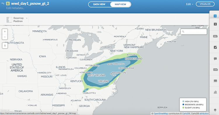
Note: It’s important to know what we’re downloading. According to the NWS documentation, the shapefiles we’re going to visualize (day1_psnow_gt_04_2016012300.tar) is the 1-day probability of snowfall exceeding 4 inches.
Uploading the data to CartoDB
CartoDB is an online mapping tool. Under datasets, click the green New Dataset button. Browse and upload the .tar file you downloaded from the NWS website. You can also download it here.
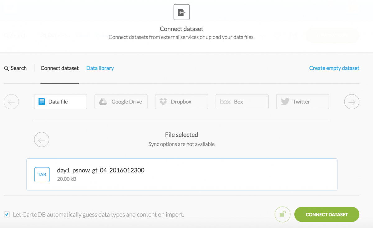
Click Connect Dataset.
Create a map from your shapefile
CartoDB will automatically recognize your shapefile and once you click Map View, you will see the data superimposed over a map of the United States. Cool, it’s starting to look like a forecast map.
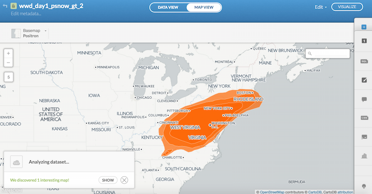
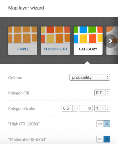
CartoDB has a suggestion feature on the bottom-left. It’s helpful to see what patterns they recognize. Click Show. CartoDB automatically color-coded the probability column. This is exactly what we want to do with the forecast data, but we’ll fix the colors and design.
To understand what CartoDB did, click the wizards tab on the right menu and notice that Category is selected, with probability selected under column and some default colors chosen for the three categories in your dataset. Let’s keep designing this map so that it looks a little nicer.
Designing your map
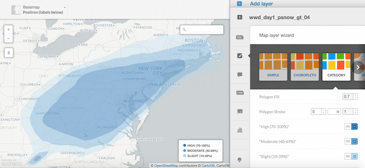
To differentiate between probabilities of snowfall, we will use a color scheme of all blues that progressively gets darker as the probability increases. For High and Moderate we used two default blues from CartoDB. For Slight, we entered the lightest blue HTML color code manually: #b4dbf4. We made the Polygon Stroke 0 to remove the white border around each polygon and, finally, changed the Basemap to Positron (labels below).
To lighten the shading of our colors and make them semi-transparent, go into CartoCSS and change the opacity of your polygons from 0.7 to 0.3. This can be done by altering this line: polygon-opacity: 0.3.
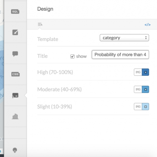
Click Visualize on the top right to see what the finished product will look like. Our legend needs some help: we’ll click Legends in the right menu and edit the title to add a title that clarifies our legend.
Adding a title and text box
Once our map has been published, we can add a text box and title using the Add Element dropdown menu on the top left. Simply drop in text and title boxes and fill in the text, and change the font and size.
Finally, click Publish! You can embed or share the link to your map.


