Catching up with Tableau’s Midori Ng about data visualization, finding inspiration and combating fake news
Representatives from data visualization company Tableau recently held a workshop at Northeastern University to walk students through simple charting, mapping and interactivity with the program. Midori Ng, academic programs coordinator at Tableau who introduced attendees to the software, said that if they could create appealing and interactive data viz, it could open doors for them in the future when searching for jobs.
Storybench caught up with Ng before the workshop and asked her about how Tableau is being used in a journalistic setting. (For a Storybench tutorial using Tableau, click here.)
How can the skills from this workshop be applied in a journalistic setting?
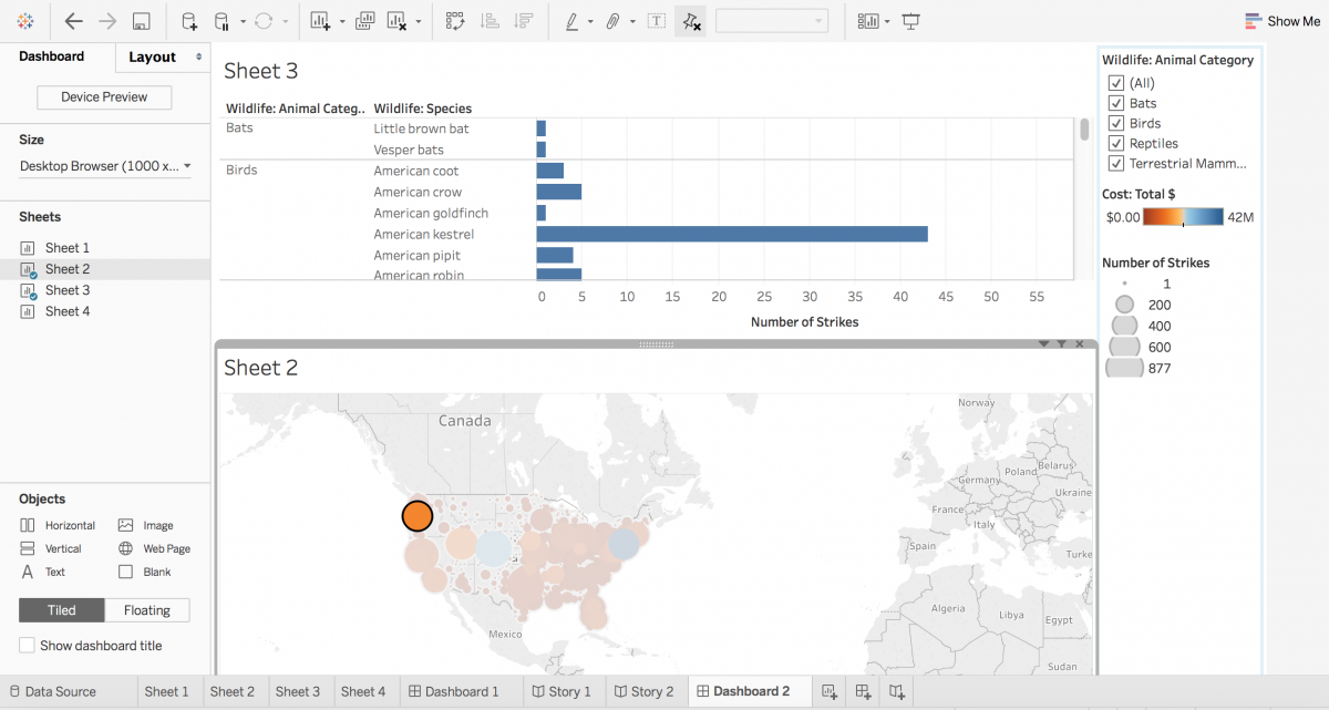
The workshop today is an “Introduction to Tableau” workshop, so what we’re really covering is the interface of Tableau, how to connect to data, how to build basic visualizations, and two separate ways that you can publish your data.
The way that we see it used a lot in journalism is not necessarily dashboards, but what we call “Story Points.” It’s basically Tableau’s way of doing PowerPoint, or a way to tell a story with data. So you can actually, after you’ve built different visualizations, put it into a Story Points format and then from there share that and publish that on Tableau Public. Tableau Public is a free tool that anyone can use and publish their work, and that’s where we see a lot of reporters or journalists using the program.

What capabilities do you think Tableau offers that journalists aren’t utilizing enough?
I mean, I hate to get political but I think in this era we’ve just had a lot of fake news and stories that don’t necessarily come from a good source of data, or a statistic that gets pulled from somewhere that is used out of context. When you use something like Tableau, you are able to connect to the raw source, the actual data, and then build a story behind that and maybe pinpoint one point that you want to showcase. But by doing that, and using Tableau as a way to tell that story, if you have a reader who is curious not just about that one statistic you pulled, they can actually go in and see all of the data accompanying it, where the data is from.
Is data journalism a good way to combat “fake news?”
Personally, I definitely think so. I think the reason behind it is it just empowers the reader to really be able to ask their own questions and ask more questions. And that is a big part of journalism and I think storytelling is creating that conversation for people. I also think that when you’re looking at just a journalist’s job, it is really to state the facts, and by using data your argument is a lot stronger.
Are there any dangers of misuse of the software by journalists?
Make sure you know how to use the program. There’s ways you can use it that make it really easy and then ways that you use it that make a story more powerful. Make sure it’s interactive, it’s a nice design, the colors are not outrageous, it’s adding to the story — not necessarily just being there. You want it to kind of add something to the story. But I think if you follow those you’ll be good.
What do you think is important for journalists to know before they start experimenting with Tableau?
Find inspiration from other ways that journalists have been using it and other ways that Tableau has been used before. I talked a little bit about Tableau Public. So just looking at ways that other people have maybe done it to show, “Okay, how can I create a story that’s similar?” or “I have a story to tell that’s similar to that, how did they visualize it?” and then go off of that and then from there make your own thing or put your own spin on it. I also think just knowing to rely on the community that’s already there to help fuel your learning is important.
How much familiarity with data and statistics do you need to have to use Tableau?
When you’re using Tableau, the good news is that the program is all drag and drop, no coding necessary, so generally speaking if you are a journalist that doesn’t have data analytics experience or experience using Excel or experience using other data visualization programs, that’s okay. You don’t need it. We want the interface to be intuitive and that’s how it has been built. If you think you have a question and you just start clicking around within Tableau, you will probably find your answer because the product was just built to basically map out how you are thinking.


