How to make small multiples in R using geom_line()
We’ve been exploring and visualizing datasets from the fivethirtyeight R package for various Storybench tutorials. (See our tidyr tutorial and our barplot tutorial). Below, we’ve written a tutorial to create a grid of line charts that all use the same scale and axes in R – otherwise known as small multiples.
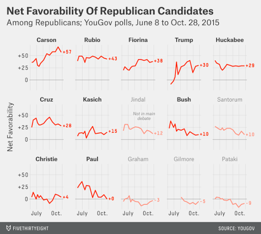
Small multiples are a popular choice for visualizing a series of graphs to allow easy comparison. FiveThirtyEight is fond of using them.
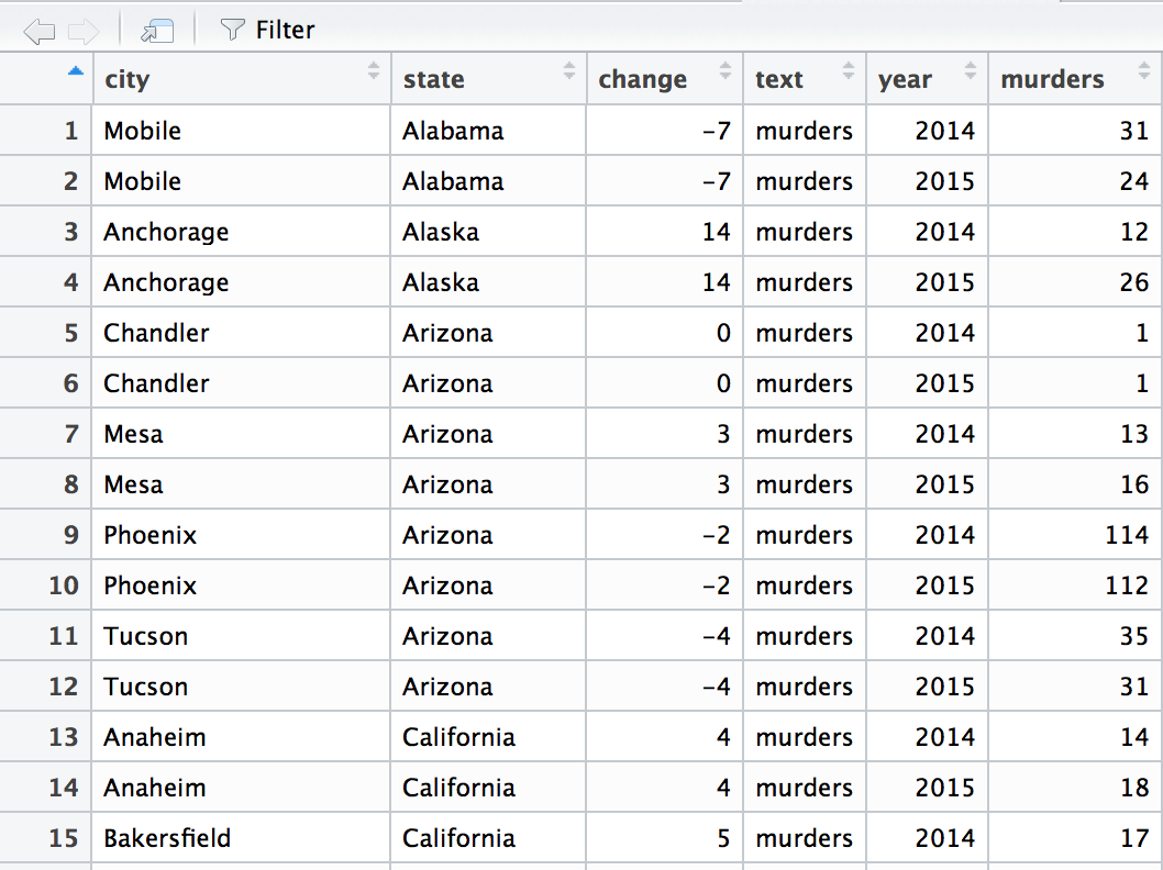
The following tutorial uses data about 2014 and 2015 murders in U.S. cities from the murder_2015_final dataset found in FiveThirtyEight’s R package. The tutorial uses murders_separate.csv, which was cleaned and created in this Storybench tutorial.
If you’re new to R, start here. If you’re new to data visualization in R, start here.
Load ggplot2 and the csv
Load library(ggplot2) and then the csv with:
library(ggplot2)
murders_separate <- read.csv(file="murders_separate.csv")
View the dataset in RStudio
Once you’ve called the dataset, you can view its column names with names(murders_separate) or see the data table in RStudio using View(murders_separate). Note the capital V in View.
Plot all cities to see change in murders between 2014 and 2015
Using ggplot(), call on the murders_separate dataset and then create a line chart plotting year on the x-axis and murders on the y-axis. By grouping by city, ggplot will create one line for each city. Next, add a plus sign (+) and then geom_line() to draw the chart. Adding scale_x_continuous(breaks=c(2014,2015)) will remove the extraneous ticks – like 2014.25 and 2014.50 – and just mark 2014 and 2015 on the x-axis.
ggplot(murders_separate, aes(x=year, y=murders, group=city)) +
  geom_line() +
  scale_x_continuous(breaks=c(2014,2015))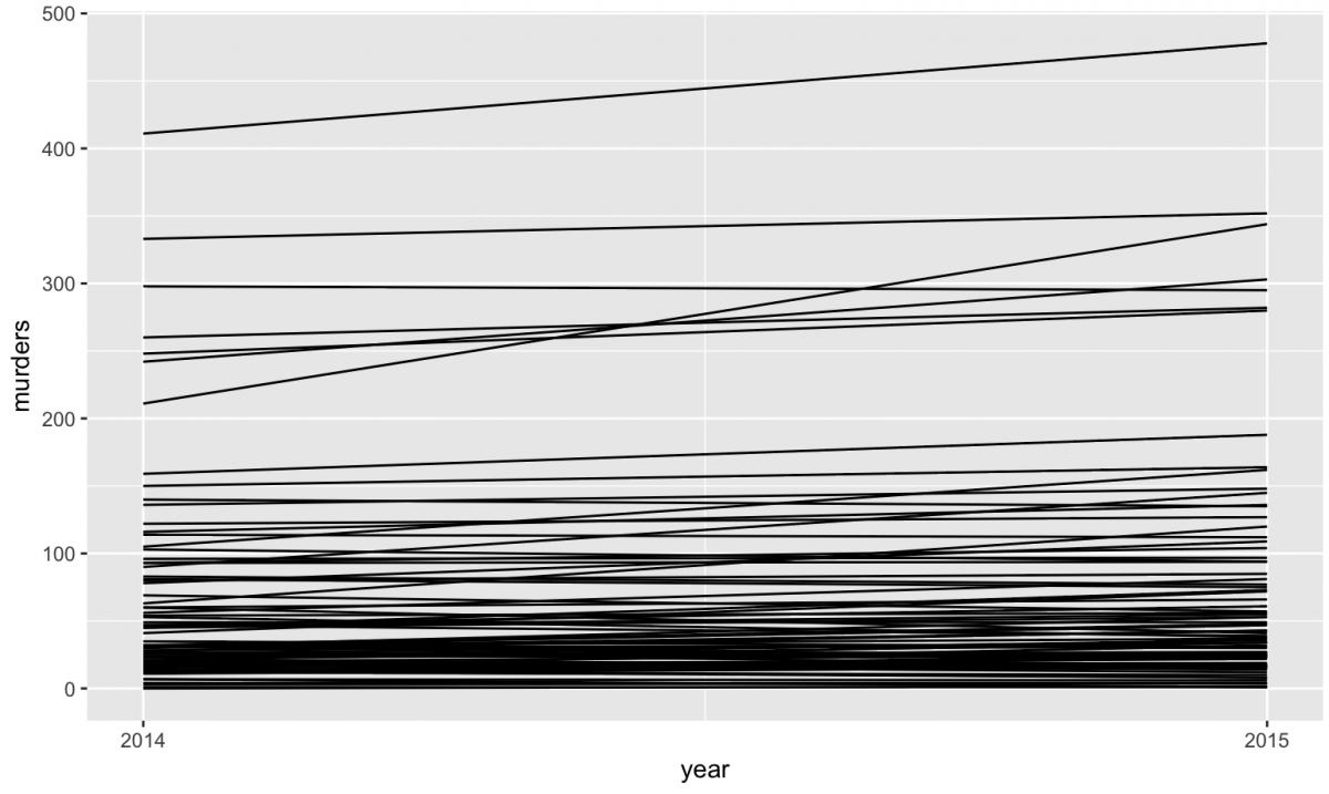
Add color and a legend
Add color=city to add a legend and color to each of the lines.
ggplot(murders_separate, aes(x=year, y=murders, group=city, color=city)) +
  geom_line()+
  scale_x_continuous(breaks=c(2014,2015))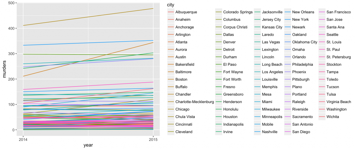
This is a pretty busy graphic, so why don't we limit the dataset to only cities with at least 150 murders?
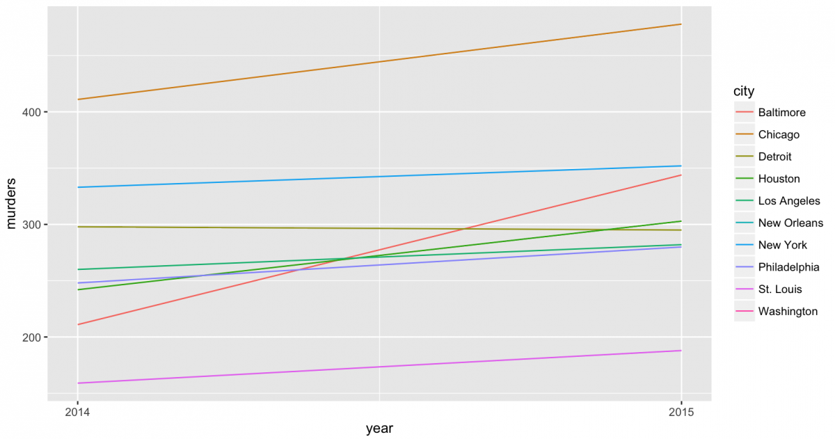
Plotting only the 10 cities with over 150 murders
Using subset is one way to constrain the dataset. We've used ggplot(subset(murders_separate, murders > 150) in the following way:
ggplot(subset(murders_separate, murders > 150), aes(x=year, y=murders, group=city, color=city)) +geom_line()+
  scale_x_continuous(breaks=c(2014,2015))
That will produce the following chart:
Using facet_grid() to stack line plots
Now, to start making small multiples. ggplot's facet_grid(), documentation here, will split a plot into individual panels. By using facet_grid(city ~ .), we can stack the seven cities with over 200 murders.
ggplot(subset(murders_separate, murders > 200), aes(x=year, y=murders, group=city, color=city)) +geom_line()+
 facet_grid(city ~ .)+
 scale_x_continuous(breaks=c(2014,2015))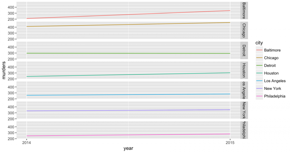
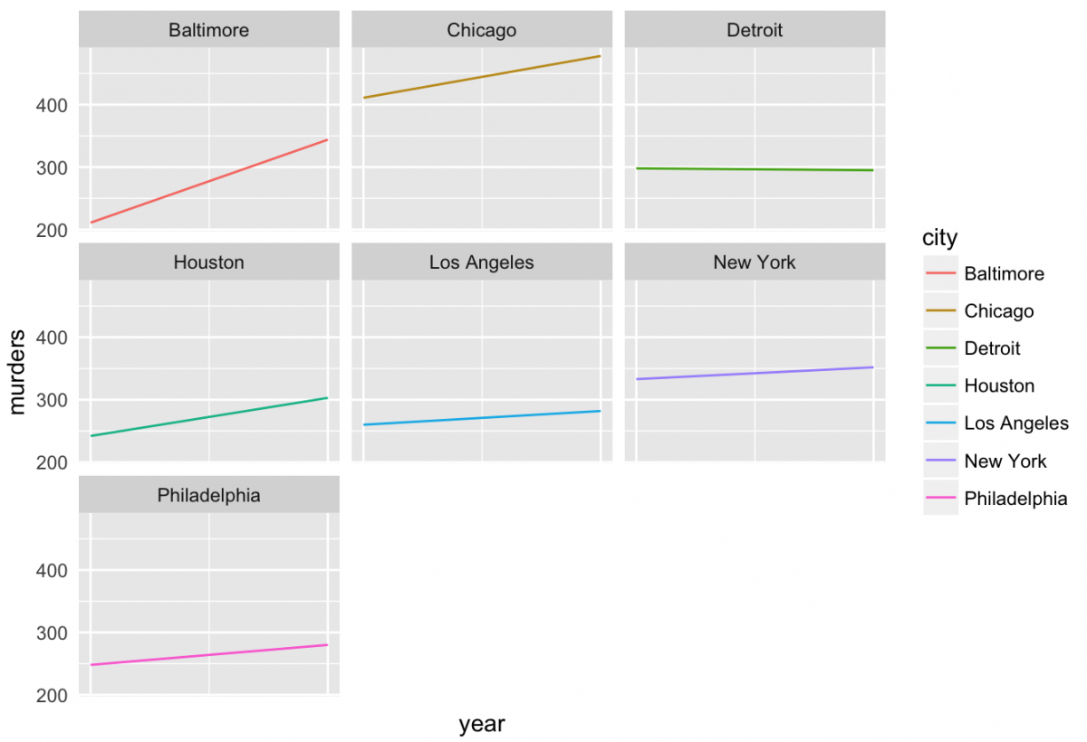
Create small multiples with cities with murders over 200
Finally, we can use facet_wrap(~ city) to split these into a matrix of small multiples.
ggplot(subset(murders_separate, murders > 200), aes(x=year, y=murders, group=city, color=city)) +geom_line()+
  facet_wrap(~ city)+
  scale_x_continuous(breaks=c(2014,2015))
To add a title, use + labs(title = "Murder change between 2014 and 2015"). If you want to remove the legend and 2014 and 2015 labels, use + theme(axis.ticks = element_blank(), axis.text.x = element_blank(), legend.position = "none").
ggplot(subset(murders_separate, murders > 200), aes(x=year, y=murders, group=city, color=city)) +
  geom_line()+
  facet_wrap(~ city)+
  labs(title = "Murder change between 2014 and 2015")+
  scale_x_continuous(breaks=c(2014,2015))+
  theme(axis.ticks = element_blank(), axis.text.x = element_blank(), legend.position = "none")