Diagnosing the accuracy of your linear regression in R
In this post we’ll cover the assumptions of a linear regression model. There are a ton of books, blog posts, and lectures covering these topics in greater depth (and we’ll link to those in the notes at the bottom), but we wanted to distill some of this information into a single post you can bookmark and revisit whenever you’re considering running a linear regression.
Background
This tutorial is based in part on the excellent book that came out last year, “Analyzing Baseball Data with R” by Max Marchi, Jim Albert, and Ben Baumer. This is the second edition of the text, and most of the changes are converting the previous edition to tidyverse principles. And if you’ve been following along with Data Journalism wtih R, you know that means the code in the book is easier to read and there are some solid underlying principles.
Getting baseball data
Baseball is one of the most quantified sports on the planet. Just about everything gets measured and, thanks to Sean Lahman, those measurements are available to analyze. The Lahman R package contains all the tables from the ‘Sean Lahman Baseball Database.’ Lahman is a hero for sports stats junkies because he’s worked so hard to make sports data freely available. We will need Lahman and the tidyverse packages for this tutorial, so we load them below.
library(Lahman)
library(tidyverse)
library(skimr)
library(inspectdf)
library(janitor)
library(ggrepel)
library(qqplotr)
The Washington Nationals just won the World Series on October 30th, 2019. The series went all seven games, and the Nationals miraculously won all on their games while they were the away team.
This is the first World Series appearance for the Washington Nationals since 1933 (who were then known as the Senators). We are going to explore the relationship between runs and wins for the 1933 Washington Senators, and for the current Washington Nationals. We’ll extract the historical data leading up the World Series appearance. The code chunk below identifies the teamID for each Washington team.
# get the teamID
Lahman::Teams %>%
  dplyr::filter(yearID == 1933 & str_detect(name, "Senators")) %>%
  utils::head()
Lahman::Teams %>%
dplyr::filter(yearID == 2018 & str_detect(name, "Nationals")) %>%
utils::head()Now we head over to the Teams table and get the Washington teams (WashingtonTeams) using the teamIDs.
washington_teams <- c("WAS", "WS1")
WashingtonTeams <- Lahman::Teams %>%
  dplyr::filter(teamID %in% washington_teams)
Why might you consider running a linear regression model?
Linear regression models are typically used in one of two ways: 1) predicting future events given current data, 2) measuring the effect of predictor variables on an outcome variable.
The simplest possible mathematical model for a relationship between any predictor variable (x) and an outcome (y) is a straight line. We know that baseball games are won by one team outscoring the another team, and s teams’ score is based on the number of runs. So it makes intuitive sense that if a team sores a lot of runs over the course of a season, it would also have a lot of wins. In the current baseball example, we’re thinking that as the number of runs goes up, the number of wins should also go up. Linear relationships don’t have to be positive. For example, we could also imagine a model where the number of errors has a negative linear relationship to the number of wins. Linear regression models are based on the premise that there is a straight line relationship between two measurements.
The thing we’re trying to predict is usually called the ‘outcome’ or ‘dependent’ variable, and the things we’re using for prediction are called ‘predictors’, ‘independent’, or ‘explanatory’ variables. I’ll stick with outcome and predictors in this tutorial, because I like to use ‘independent’ and ‘dependent’ when I am referring to experimentation (where the variables are under control of the experimenter). We’re going to be doing the second, because we’re assuming a causal relationships between runs and wins (i.e. a team wins because it outscores it’s opponent).
The outcome variable
The outcome in this example is the wins, but we want to look at the number of games each team won as a percentage. A percentage is better because it gives us the ratio of wins (W) to the total games played (W + L), or wins / (wins + losses).
WashingtonTeams <- WashingtonTeams %>%
  dplyr::mutate(win_perc = W / (W + L))
The predictor variable(s)
In order to predict winning percentage (win_perc) from the number of runs a team scored, we should consider the number of runs a team has scored against them. For example, if my team scores five runs, but allows eight runs to be scored against them, then those five runs aren’t contributing in a positive way to the winning percentage.
Marchi, Albert, and Baumer call this the ‘run differential’, and we can calculate it using the following code:
WashingtonTeams <- WashingtonTeams %>%
  dplyr::mutate(run_diff = R - RA)
Great! Now that we have the two variables we’ll be using in our model, we can start exploring some of the assumptions.
Spoiler alert: This example is adapted from the section of that text on linear regression, so if you’re wanting to learn how to perform linear models and interpret the output, I suggest reading this section of the text. Instead, we will be going over some of the assumptions for linear regression, how to check them, and how to bundle these steps into a single function call.
Why do statistical assumptions matter?
Every statistical model is based on a set of assumptions about the world (more importantly, about the measurements and data from that world).
Linear regression is one of many parametric tests that assume the data come from a normal
distribution. Parametric models also have assumptions about variation and independence, (covered below), and they rely on the mean and standard deviation.
Checking assumptions is important because if the world we’re assuming the data came from doesn’t track with reality, then the model we’re using to make predictions is worse than useless–it’s misleading. Models have no way of telling us that they’re being used incorrectly.
Independence
Independence is an assumption we can’t really evaluate in a graph. Independence means each value of the outcome variable comes from a different source (like a different team). For example, if all the outcome variables came from the same team, these would all be dependent on each other. I like to think of this as, “I shouldn’t be able to compute the outcome variable using the predictor variables.”
Normally distributed error terms
The assumption of normality in regression refers to the errors (or residuals) in the model, or how well the data fall along the straight line we’re assuming we can draw between the predictor and outcome.
The normal distribution
Before we can assess the assumption of normality, we’ll get an idea for what a normal distribution looks like. We can do this with ggplot2s stat_function() by setting fun to dnorm. A normal distribution is usually bell-shaped, and in a standard normal distribution, the mean would be 0, and the standard deviation would be 1. We create this distribution below.
NormalData <- data.frame(
  norm_x = stats::rnorm(n = 1000, mean = 0, sd = 1),
  norm_y = stats::rnorm(n = 1000, mean = 1, sd = 3)
)
NormalData %>%
  ggplot2::ggplot(aes(x = norm_x)) +
  ggplot2::stat_function(fun = dnorm) +
  ggplot2::labs(
    title = "The Normal Distribution",
    subtitle = "Mean = 0, SD = 1",
    x = "Random Variable (X)",
    y = "Density (Y)")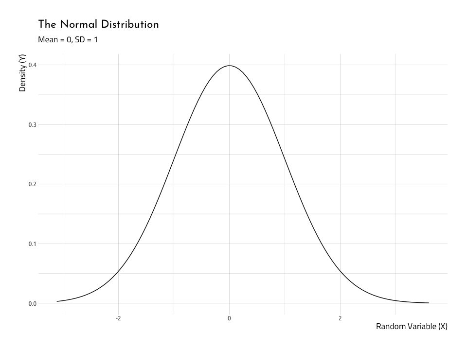
The ‘middle’ and the ‘spread’ in normal distributions
Its important to point out the shape of the bell changes a lot when we change the relationship between mean (a measure for the ‘middle’ of the data) and the standard deviation (the ‘spread’ of the data). We can see this relationship using gganimate.
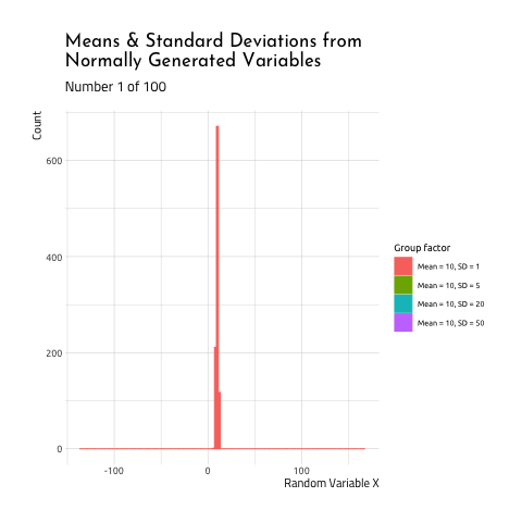
This graphic displays four different sets of data generated using R rnorm function.
Each number was generated with from one of the four following groups:
- Mean =
10, SD =1(the standard deviation is 1/10th the size of
the mean) - Mean =
10, SD =5(the standard deviation is 1/2th the size of
the mean) - Mean =
10, SD =20(the standard deviation is 2X the size of the
mean) - Mean =
10, SD =50(the standard deviation is 5x the size of the
mean)
As you can see, when the mean and standard deviation are close to each other, the graph is tall and skinny. When the standard deviation becomes large relative to the mean, the distribution takes on a flatter, wider shape. If you want to see how this graphic was created, check out the code here.
Ok, now that we have a better understanding of a normal distribution should look like, we can see if our baseball data (specifically the relationship between win_perc and the run_diff) satisfy these assumptions.
But…what is a residual?
Think residue: “a small amount of something that remains after the main part has gone or been taken or used.” In linear regression, we use the data to draw a straight line, and the residuals are the bits left over (also referred to as ‘model errors’).
In some parametric tests, normality means that the variables in the model came from a normal distribution, but don’t let that confuse you. In linear regression, we want to know if the residuals are normally distributed.
Consider the horrible drawing below:
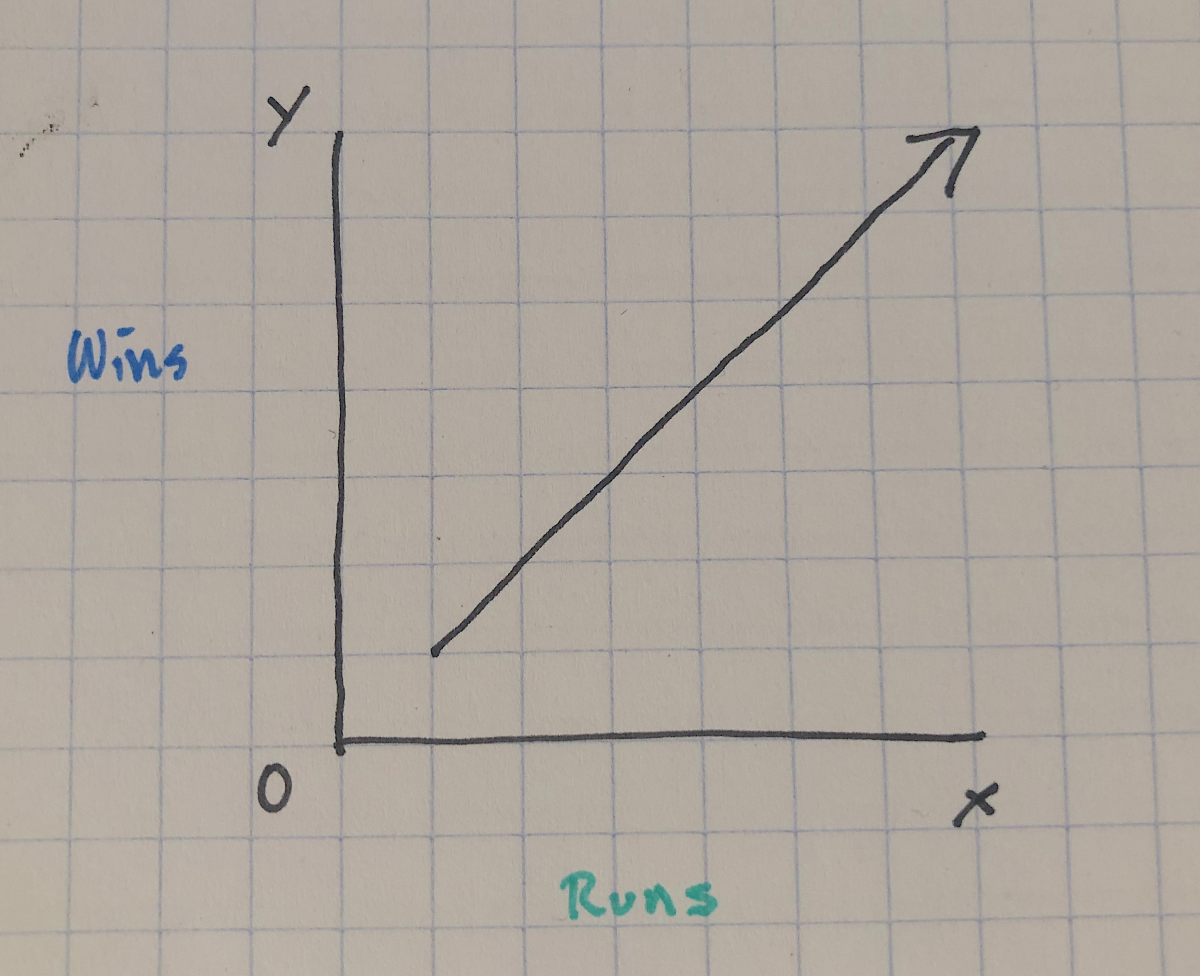
We assume there’ll be a straight line relationship between the run differential and winning percentage such that as the number run differential increases (i.e. teams score more runs than they have scored on them), the wins will also increase (i.e. teams will win more of their total games).
So if we were to start adding data to this graph, we should assume they won’t all land on that line perfectly. That would mean for every single additional run scored (on the x axis), a team wins another game (on the y axis). If this was true, baseball would be a very different sport (and making money by betting on teams would be much easier).
In reality, we’re probably expecting something like the awful sketch below:
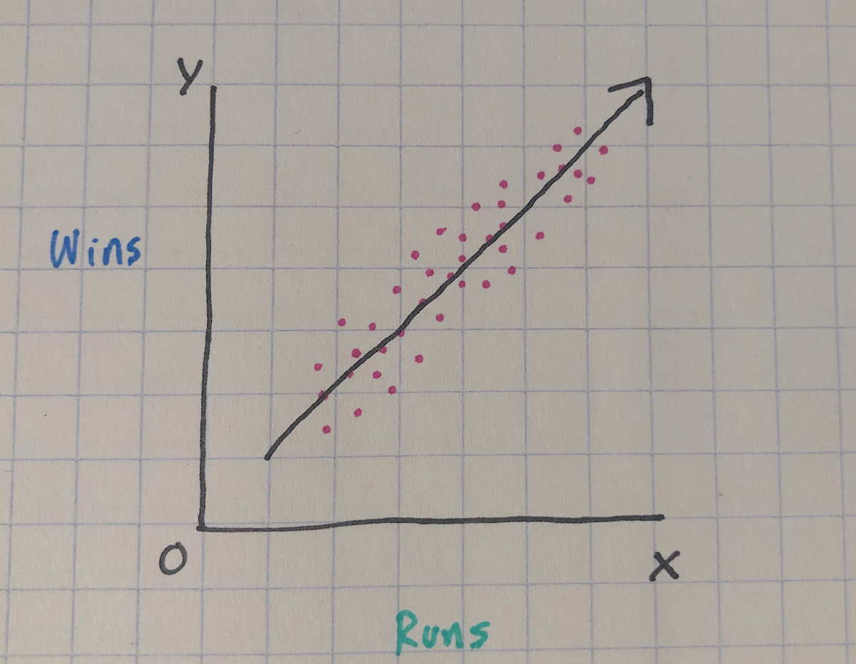
The purple points are imaginary scores for runs and wins, and we can see that although not all of them land perfectly on the line, they have a general positive linear trend–as runs go up, so do wins. The line we drew through the points represents our ‘best attempt’ to estimate the relationship between the two variables.
An important thing to remember about this line is that it passes through the mean for both x and y variables, and the distance from the line for each purple point is the error, or how far the data deviates from our ‘best attempt’ straight line.
So, in a linear regression model, the residuals quantify the distance each point is from the straight line. Normally distributed residuals means that the differences between the predicted data and the observed data are usually 0, and if there are differences larger than 0 it doesn’t happen too often.
The quantile-quantile plot
So now we know what normality looks like, and what normally distributed residuals are, how do we check to verify these assumptions are met? The first way we’ll do this is with the Quantile-Quantile plot.
Quantiles are the proportions of cases that are below a certain value. In a qq-plot, all of the data get sorted and ranked, then each value is given a number that corresponds to the predicted value we could expect if they’re in a normal distribution. The normality of the residuals can now be represented as how closely the data fall along the diagonal line.
First we are going to create a plot with data we know are normal (so we know what the graph should look like), then we will plot the win percentage and run differential.
- Step 1: We need to create a linear model object with
lm()and
store this in thelinmod_y_x. The syntax takes the form of
lm(norm_y ~ norm_x, data = NormalData).
linmod_y_x <- lm(norm_y ~ norm_x, data = NormalData)- Step 2: We can get the fitted (
.fitted) and residual (.resid)
values withbroom::augment_columns()and store these in a new data
frame,AugNormyNormx. Learn more about thebroompackage in this
vignette.
All the new variables have a.prefix.
AugNormyNormx <- broom::augment_columns(linmod_y_x, data = NormalData)
AugNormyNormx %>%
  # new added values
  dplyr::select(contains(".")) %>%
  dplyr::glimpse(78)
#> Observations: 1,000
#> Variables: 7
#> $ .fitted <dbl> 0.9957671, 1.0732238, 0.9478991, 1.0540506, 1.2987865, 1…
#> $ .se.fit <dbl> 0.15001845, 0.10786328, 0.18401547, 0.11602377, 0.181159…
#> $ .resid <dbl> -0.9713237, 0.2731276, 2.7918169, 5.3450375, 1.1879154, …
#> $ .hat <dbl> 0.002358908, 0.001219464, 0.003549199, 0.001410963, 0.00…
#> $ .sigma <dbl> 3.090191, 3.090332, 3.089075, 3.085698, 3.090115, 3.0901…
#> $ .cooksd <dbl> 0.000117187667, 0.000004779160, 0.001460104920, 0.002118…
#> $ .std.resid <dbl> -0.31483836, 0.08847924, 0.90546112, 1.73168209, 0.38525…With this new data object, we can build the QQ-plot with help from the qqplotr package.
ggNormQQPlot <- NormalData %>%
  # name the 'sample' the outcome variable (norm_y)
  ggplot(mapping = aes(sample = norm_y)) +
  # add the stat_qq_band
  qqplotr::stat_qq_band(
    bandType = "pointwise",
    mapping = aes(fill = "Normal"), alpha = 0.5,
    show.legend = FALSE
  ) +
  # add the lines
  qqplotr::stat_qq_line() +
  # add the points
  qqplotr::stat_qq_point() +
  # add labs
  ggplot2::labs(
    x = "Theoretical Quantiles",
    y = "Sample Residuals",
    title = "Normal Q-Q plot for Simulated Data"
  )
ggNormQQPlot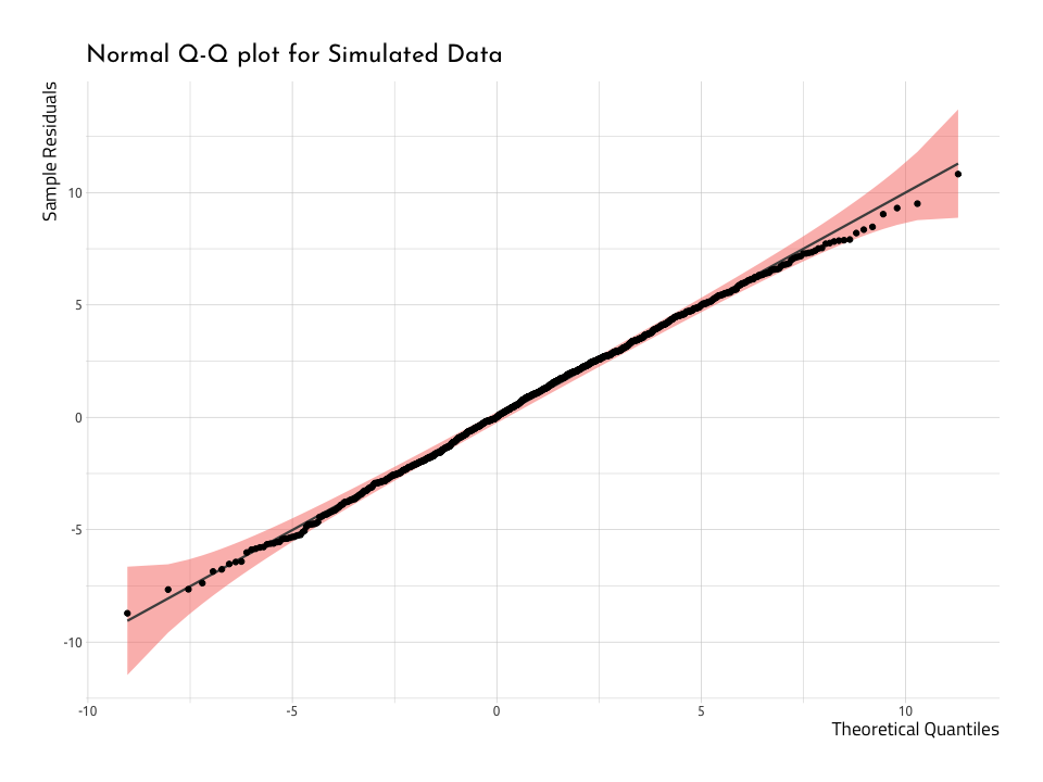
Here we can see that very few points deviate from the diagonal line going through the plot. And that makes sense, because we know these data are normally distributed. Now we have a reference in our mind for how this should look, we can repeat the process with the WashingtonTeams data.
First we build the model with lm() and broom::augment().
linmod_rundiff_wins <- lm(win_perc ~ run_diff, data = WashingtonTeams)
AugRundiffWins <- broom::augment_columns(linmod_rundiff_wins,
  data = WashingtonTeams
)
Now we use the new AugRundiffWins to plot the run_diff and see how well they land along the quantiles.
ggWinRunsQQPlot <- WashingtonTeams %>%
  # name the 'sample' the outcome variable (norm_y)
  ggplot(mapping = aes(sample = run_diff)) +
  # add the stat_qq_band
  qqplotr::stat_qq_band(
    bandType = "pointwise",
    mapping = aes(fill = "Normal"), alpha = 0.5,
    show.legend = FALSE
  ) +
  # add the lines
  qqplotr::stat_qq_line() +
  # add the points
  qqplotr::stat_qq_point() +
  # add labs
  ggplot2::labs(
    x = "Theoretical Quantiles",
    y = "Sample Residuals",
    title = "Normal Q-Q plot for Baseball Data"
  )
ggWinRunsQQPlot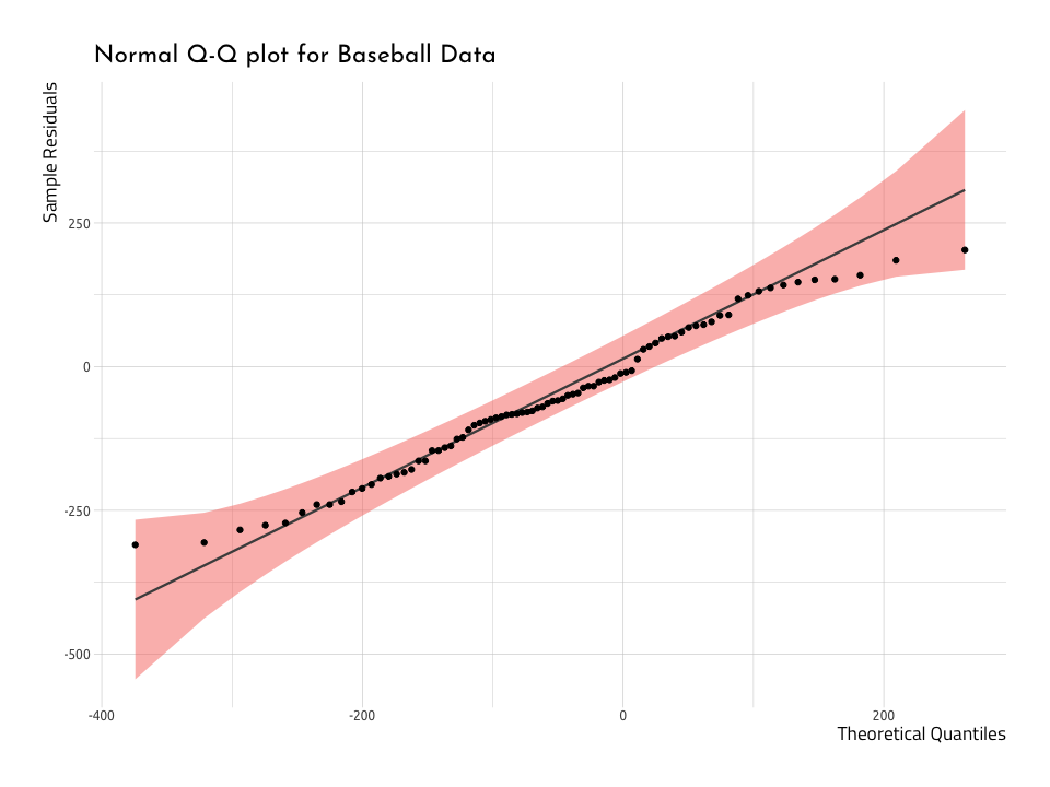
The graph above deviates from the diagonal towards the upper end of theSample Residuals and Theoretical Quantiles. This tells us the data that are deviating from the straight line aren’t normal. We can verify this by dropping the dorm function over a histogram, too.
ggHistNormResid <- AugRundiffWins %>%
  ggplot2::ggplot(aes(x = .resid)) +
  ggplot2::geom_histogram(aes(y = ..density..),
    colour = "darkred",
    fill = "firebrick",
    alpha = 0.3,
    bins = 30
  ) +
  ggplot2::stat_function(
    fun = dnorm,
    args = list(
      mean = mean(AugRundiffWins$.resid, na.rm = TRUE),
      sd = sd(AugRundiffWins$.resid, na.rm = TRUE)
    ),
    color = "darkblue",
    size = 1
  ) +
  ggplot2::labs(
    x = "Residuals",
    y = "Density",
    title = "The Residuals vs. Normal Distribution",
    subtitle = "Using Baseball Data"
  )
ggHistNormResid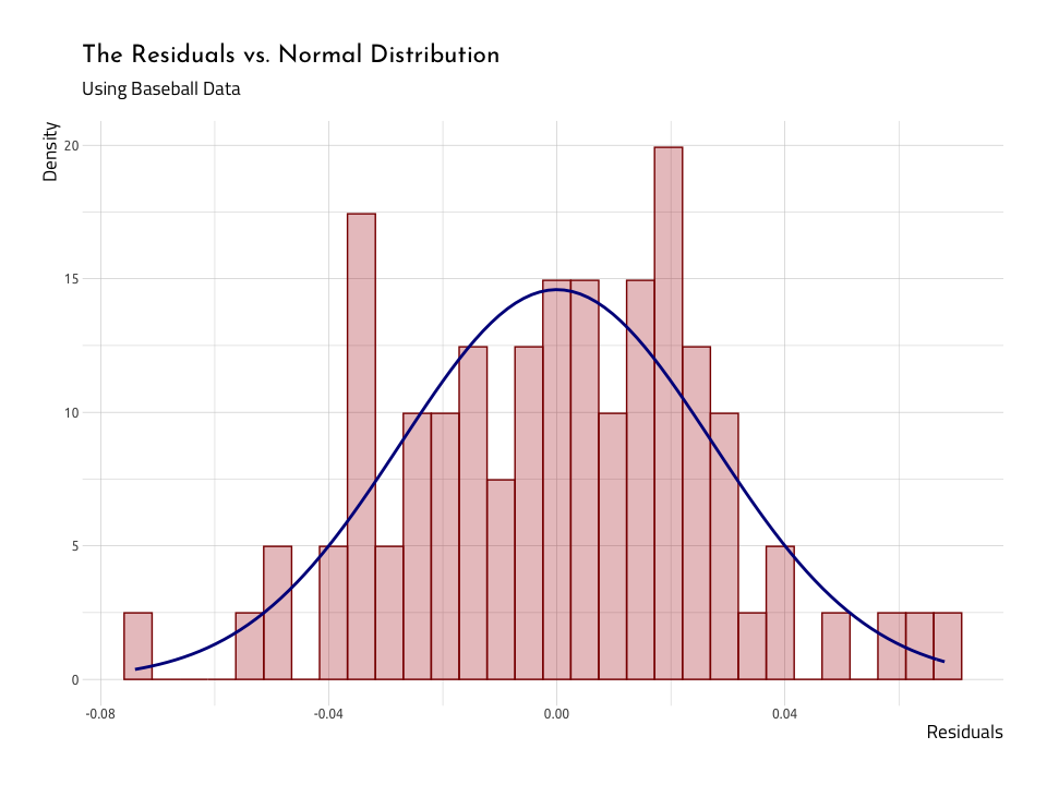
Again, we see that when we lay the normal distribution over the histogram of the residuals, they are two humps poking out above the blue normal distribution (i.e. the residuals have heavier tails). We will continue to see if these data meet the assumptions.
Linearity
It might seem redundant, but the next question we will ask ourselves is, “does a linear relationship makes sense?” We can confirm linearity with a scatterplot of the .resid and .fitted values. If data are normally distributed, there will be more points above and below the 0 line (which runs through the center of the plot).
Residuals vs. fitted values
The graph below is called the Residual vs. Fitted Plot and it puts the .fitted on the x axis, and .resid on the y.
# get outliers for the data
NonNormalResid <- AugNormyNormx %>%
  dplyr::arrange(dplyr::desc(abs(.resid))) %>%
  dplyr::mutate(
    norm_x = base::round(norm_x, digits = 3),
    norm_y = base::round(norm_y, digits = 3)
  ) %>%
  utils::head(5)

ggResidVsFit <- AugNormyNormx %>%
  # fited on the x, residuals on the y
  ggplot2::ggplot(aes(
    x = .fitted,
    y = .resid
  )) +
  # add the points
  ggplot2::geom_point(
    size = 1.2,
    alpha = 3 / 4
  ) +
  # add the line for the points
  ggplot2::stat_smooth(
    method = "loess",
    color = "darkblue",
    show.legend = FALSE
  ) +
  # add the line for the zero intercept
  ggplot2::geom_hline(
    # add y intercept
    yintercept = 0,
    # add color
    color = "darkred",
    # add line type
    linetype = "dashed"
  ) +
  # add points for the outliers
  ggplot2::geom_point(
    data = NonNormalResid,
    aes(
      color = "darkred",
      size = .fitted
    ),
    show.legend = FALSE
  ) +
  # add text labels for outliers
  ggrepel::geom_text_repel(
    data = NonNormalResid,
    color = "darkblue",
    aes(label = base::paste(
      NonNormalResid$norm_x, ",",
      NonNormalResid$norm_y
    )),
    show.legend = FALSE
  ) +
  ggplot2::labs(
    x = "Fitted values",
    y = "Residuals",
    title = "Residual vs Fitted Using Simulated Data"
  )
ggResidVsFit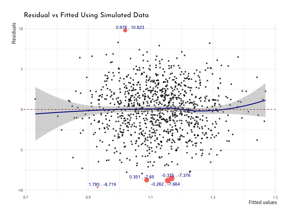
We’ve plotted five points with the highest .resids, and we can see they’re also the furthest from the center line. The blue loess line curves above and below the zero line at the edges of the data, and the standard error bands (the gray areas) get larger. This would be concerning, but there are about just the same number of points above as below the red zero line.
We’ll repeat this process for the baseball data in AugRundiffWins (after creating the NonNormResidRunsWins data frame).
# get outliers for the data in NonNormResidRunsWins
NonNormResidRunsWins <- AugRundiffWins %>%
  dplyr::arrange(dplyr::desc(abs(.resid))) %>%
  head(5)
# plot ggResidVsFitRunsWins
ggResidVsFitRunsWins <- AugRundiffWins %>%
ggplot2::ggplot(aes(
x = .fitted,
y = .resid
)) +
# add the points
ggplot2::geom_point(show.legend = FALSE) +
# add the line for the points
ggplot2::stat_smooth(
method = "loess",
color = "darkblue",
show.legend = FALSE
) +
# add the line for the zero intercept
ggplot2::geom_hline(
# add y intercept
yintercept = 0,
# add color
color = "darkred",
# add line type
linetype = "dashed"
) +
# add points for the outliers
ggplot2::geom_point(
data = NonNormResidRunsWins,
aes(
color = "darkred",
size = .fitted
),
show.legend = FALSE
) +
# add text labels
ggrepel::geom_text_repel(
data = NonNormResidRunsWins,
color = "darkblue",
aes(label = base::paste(
NonNormResidRunsWins$name,
NonNormResidRunsWins$yearID
)),
show.legend = FALSE
) +
ggplot2::labs(
x = "Fitted values",
y = "Residuals",
title = "Residual vs Fitted Using Baseball Data"
)
ggResidVsFitRunsWins
The plotted points are telling us where the linear model does worst in predicting wins (win_perc) from runs (run_diff). The majority of the outliers are from the Washington Senators before 1960, and only 1 (the 2018 data point) is from the Washington Nationals. We’re going to stop here and check the 2019 World Series winner a bit.
The outlier: 2018 Washington Nationals
Max Marchi, Jim Albert, and Ben Baumer give a great example on how to demonstrate the utility of the linear regression model with a single example. We’re going to repeat the method here we performed above because we think it really ties the statistics from the broom::augment() function into a practical use.
Consider below:
AugRundiffWins %>%
  dplyr::filter(yearID == 2018) %>%
  dplyr::select(win_perc:`.std.resid`)
Perhaps it isn’t surprising that the 2018 Washington Nationals are an outlier in terms of the .resid values, but we want to know how far off they are in terms of prediction.
We can get the difference between the actual value of the winning percentages (win_perc = 0.5061728) and the fitted values of the model (.fitted = 0.559191), but we also need to multiply it by the number of games in the season (162).
This calculation is going to give us the number of games that runs didn’t do a good job in predicting the win.
# actual - predicted
(0.5061728 - 0.559191) * 162
#> [1] -8.588948This results in the predictions being off by -8.59 games (which is more than you’d like if you’re betting in Vegas).
Homogeneity of variance
Wikipedia does a great job describing homogeneity (and it’s opposite, heterogeneity),“they relate to the validity of the often convenient assumption that the statistical properties of any one part of an overall dataset are the same as any other part”
Convenient is aptly used here, because it’s inconvenient when that statement is not true. If the variance is homogeneious, this means any variation in the outcome variable (wins_perc) should be stable at all levels of the other variable (run_diff).
Let’s add another term to the word-salad we’re creating: heteroscedasticity. Data are considered heteroscedastic if the variance of their residuals change as a function of the outcome value. Conversely, data are homoscedastic if the variance is the same across all values of predictor variables. The graph we use to assess these two measures is called the Scale-Location plot (or Spread-Location plot).
We’ll build a Scale-Location graph below using the AugNormyNormx data. Recall this model used norm_x as the predictor and norm_y as the
outcome.
ggScaleVSLocation <- AugNormyNormx %>%
  # here we plot the fitted and we get the squared root of the absolute value
  # of the std.resic
  ggplot2::ggplot(aes(
    x = .fitted,
    y = sqrt(abs(.std.resid))
  )) +
  # add the points
  ggplot2::geom_point(na.rm = TRUE) +
  # add stat smooth
  stat_smooth(
    method = "loess",
    color = "darkred",
    na.rm = TRUE
  ) +
  # add the labs
  ggplot2::labs(
    x = "Fitted Value",
    y = expression(sqrt("|Standardized residuals|")),
    title = "Scale-Location Using Simulated Data"
  )
ggScaleVSLocation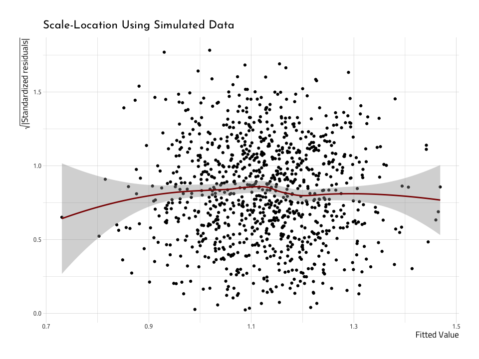
The Scale-Location (or Spread-Location) plot puts the squared root (sqrt()) of the absolute value (abs()) of the standardized residuals (.std.resid) on the y (that’s a mouthful!). The .fitted values go on the x. If the data are homoscedastic, we should see a relatively straight line through the center of the plot, and an equal number of points above and below the line.
Scale-location plot
We’ll rebuild the Scale-Location plot, but this time use the AugRundiffWins data frame.
ggScaleVSLocRundiffWins <- AugRundiffWins %>%
  # here we plot the fitted and we get the squared root of the absolute value
  # of the std.resic
  ggplot2::ggplot(aes(
    x = .fitted,
    y = sqrt(abs(.std.resid))
  )) +
  # add the points
  ggplot2::geom_point(na.rm = TRUE) +
  # add stat smooth
  stat_smooth(
    method = "loess",
    color = "darkred",
    na.rm = TRUE
  ) +
  # add the labs
  ggplot2::labs(
    x = "Fitted Value",
    y = expression(sqrt("|Standardized residuals|")),
    title = "Scale-Location"
  )
ggScaleVSLocRundiffWins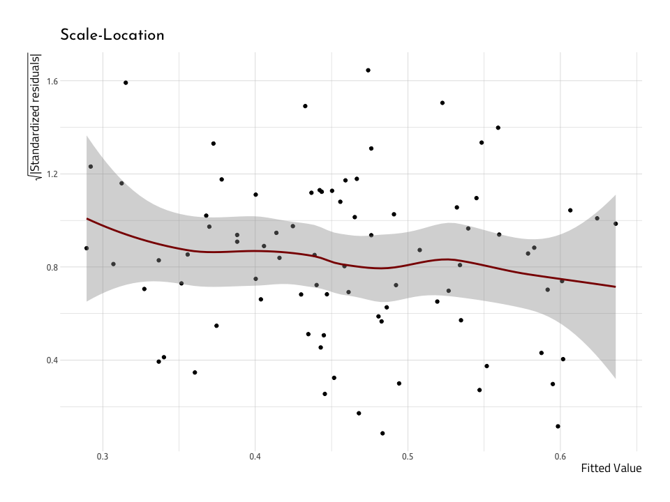
This doesn’t look much like the nice normally distributed data above. First off, the gray area around the red line indicates a large standard error. Second, the red line isn’t very straight across the horizontal axis. But these together, and it’s not looking like these data are very homoscedastic, which makes them heteroscedastic (which is, indeed, inconvenient).
Plotting influential cases
The next graph we’ll use to test the model assumptions will give us an idea for how a single value might be affecting the overall fit of the linear model. Before we stated the residuals give us a measure of the overall error (i.e. how much the data points fall along the straight line we’ve drawn). Well, Cook’s distance gives us an idea for how much a single value influences the model’s ability to predict all values.
Cook’s distance is “a common measure of influential points in a regression model.” If the data are normal (like those in our NormalData data frame), then the model should look like the one below.
First we check to see if there are any values with a Cook’s distance greater than 1 (Cook and Weisberg (1982) suggested this was an appropriate threshold) and store these in the CooksDGTEQ1.
CooksDGTEQ1 <- AugNormyNormx %>%
  dplyr::filter(.cooksd >= 1)
CooksDGTEQ1
Looks like there weren’t any in the AugNormyNormx–but this is what we’d expect from a dataset with normally distributed numbers like those in AugNormyNormx. Instead, we will label the top 5 highest values for .cooksd and put them in the Top5CooksD data frame.
Top5CooksD <- AugNormyNormx %>%
  dplyr::mutate(index_cooksd = seq_along(.cooksd)) %>%
  dplyr::arrange(desc(.cooksd)) %>%
  utils::head(5)
Top5CooksD %>% utils::head()
#> # A tibble: 5 x 10
#> norm_x norm_y .fitted .se.fit .resid .hat .sigma .cooksd .std.resid
#> <dbl> <dbl> <dbl> <dbl> <dbl> <dbl> <dbl> <dbl> <dbl>
#> 1 1.61 -7.42 1.21 0.180 -8.63 0.00354 3.01 0.0145 -2.86
#> 2 2.84 -3.98 1.34 0.287 -5.32 0.00902 3.02 0.0142 -1.77
#> 3 2.08 8.23 1.26 0.219 6.97 0.00526 3.02 0.0141 2.31
#> 4 -2.25 -5.41 0.772 0.238 -6.18 0.00622 3.02 0.0132 -2.05
#> 5 1.08 -8.95 1.15 0.140 -10.1 0.00213 3.01 0.0120 -3.34
#> # … with 1 more variable: index_cooksd <int>Even though none of these are above 1, we will use them to label the five highest values of Cook’s distance.
Cook’s distance plot
The plot puts the Cook’s distance on the y axis, and the observation number on the x (the x axis will equal the number of observations used in linear regression model). We also use the values for the .cooksd as the labels (but we can adjust this in the next plot).
# create index_cooksd in AugNormyNormx
AugNormyNormx <- AugNormyNormx %>%
  dplyr::mutate(index_cooksd = seq_along(.cooksd))
# plot the new variable
ggCooksDistance <- AugNormyNormx %>%

  ggplot2::ggplot(
    data = .,
    # this goes on the x axis
    mapping = aes(
      x = index_cooksd,
      # Cook's D goes on the y
      y = .cooksd,
      # the minimum is always 0
      ymin = 0,
      # the max is the max value for .cooksd
      ymax = .cooksd
    )
  ) +
  # add the points with a size 0.8
  ggplot2::geom_point(
    size = 1.7,
    alpha = 4 / 5
  ) +
  # and the linegrange goes from the 0 on the y, to the point
  # on the y axis
  ggplot2::geom_linerange(
    size = 0.3,
    alpha = 2 / 3
  ) +
  # these are the labels for the outliers
  ggrepel::geom_label_repel(
    data = Top5CooksD,
    aes(
      label = Top5CooksD[[".cooksd"]],
      # move these over a tad
      nudge_x = 3,
      # color these with smoething nice
      color = "darkred"
    ),
    show.legend = FALSE
  ) +
  # set the ylim (y limits) for 0 and the max value for the .cooksd
  ggplot2::ylim(
    0,
    max(AugNormyNormx$.cooksd, na.rm = TRUE)
  ) +
  # the labs are added last
  ggplot2::labs(
    x = "Observation Number",
    y = "Cook's distance",
    title = "Cook's Distance"
  )
ggCooksDistance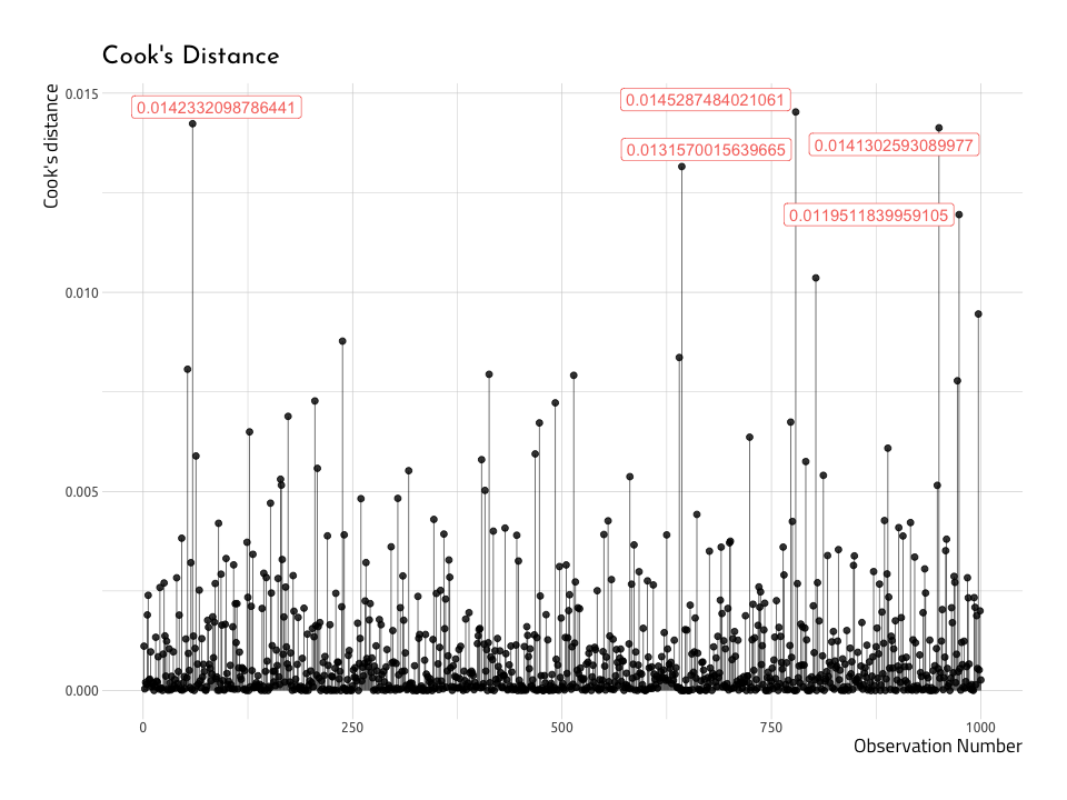
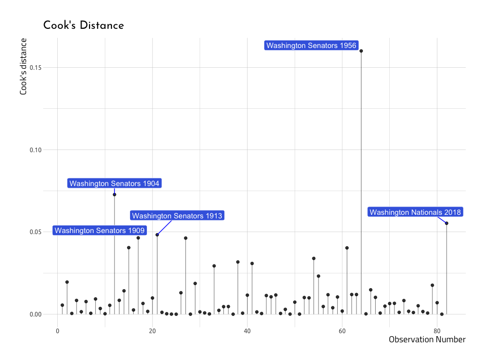
Now–we can create a similar plot with the baseball data (AugRundiffWins), but this time we will only label the top five .cooksd data points (not those with a .cooksd greater than 1). This time we’ll label the name and yearID variables in the top five .cooksd.
Top5CooksDRunWins <- AugRundiffWins %>%
  dplyr::mutate(index_cooksd = seq_along(.cooksd)) %>%
  dplyr::arrange(desc(.cooksd)) %>%
  dplyr::select(dplyr::starts_with("."), index_cooksd, name, yearID) %>%
  utils::head(5)
Top5CooksDRunWins %>% utils::str()
#> Classes 'tbl_df', 'tbl' and 'data.frame': 5 obs. of 10 variables:
#> $ .fitted : num 0.315 0.292 0.559 0.523 0.312
#> $ .se.fit : num 0.00599 0.00671 0.00461 0.00374 0.00608
#> $ .resid : num 0.068 -0.0405 -0.053 0.0617 -0.0361
#> $ .hat : num 0.0475 0.0595 0.0281 0.0185 0.0488
#> $ .sigma : num 0.0265 0.0273 0.027 0.0268 0.0274
#> $ .cooksd : num 0.16 0.0727 0.0553 0.0483 0.0464
#> $ .std.resid : num 2.53 -1.52 -1.96 2.27 -1.34
#> $ index_cooksd: int 64 12 82 21 17
#> $ name : chr "Washington Senators" "Washington Senators" "Washington Nationals" "Washington Senators" ...
#> $ yearID : int 1956 1904 2018 1913 1909Now we will use the Top5CooksDRunWins to plot the top five .cooksd values in the AugRundiffWins dataset.
# create index_cooksd in AugNormyNormx
AugRundiffWins <- AugRundiffWins %>%
  dplyr::mutate(index_cooksd = seq_along(.cooksd))
# plot the new variable
ggCooksDistRunWins <- AugRundiffWins %>%
  ggplot2::ggplot(
    data = .,
    # this goes on the x axis
    mapping = aes(
      x = index_cooksd,
      # Cook's D goes on the y
      y = .cooksd,
      # the minimum is always 0
      ymin = 0,
      # the max is the max value for .cooksd
      ymax = .cooksd
    )
  ) +
  # add the points with a size 0.8
  ggplot2::geom_point(
    size = 1.7,
    alpha = 4 / 5
  ) +
  # and the linegrange goes from the 0 on the y, to the point
  # on the y axis
  ggplot2::geom_linerange(
    size = 0.3,
    alpha = 2 / 3
  ) +
  # these are the labels for the outliers
  ggrepel::geom_label_repel(
    data = Top5CooksDRunWins,

    # combine the name and yearID
    aes(label = base::paste(
      Top5CooksDRunWins$name,
      Top5CooksDRunWins$yearID
    )),
    fill = "royalblue",
    color = "white",
    segment.color = "blue",
    nudge_y = 0.007,
    # nudge_x = 2,
    # remove the legend
    show.legend = FALSE
  ) +
  # set the ylim (y limits) for 0 and the max value for the .cooksd
  ggplot2::ylim(
    0,
    max(AugRundiffWins$.cooksd, na.rm = TRUE)
  ) +
  # the labs are added last
  ggplot2::labs(
    x = "Observation Number",
    y = "Cook's distance",
    title = "Cook's Distance"
  )
ggCooksDistRunWins
And what do we see on the graph? We can spot at least a few of the same values we identified in the previous Residual vs Fitted Plot. Lets overlay these points with another layer (thank you ggplot2!).
Top5NonNormResid <- AugRundiffWins %>%
  dplyr::mutate(index_cooksd = seq_along(.cooksd)) %>%
  dplyr::arrange(dplyr::desc(abs(.resid))) %>%
  head(5)
# add the residuals
ggCooksDistRunWins +
  ggrepel::geom_label_repel(
    data = Top5NonNormResid,

    # combine the name and yearID
    aes(label = base::paste(
      Top5NonNormResid$name,
      Top5NonNormResid$yearID
    )),
    fill = "darkred",
    nudge_x = 5,
    segment.color = "darkred",
    color = "ivory",
    # remove the legend
    show.legend = FALSE
  )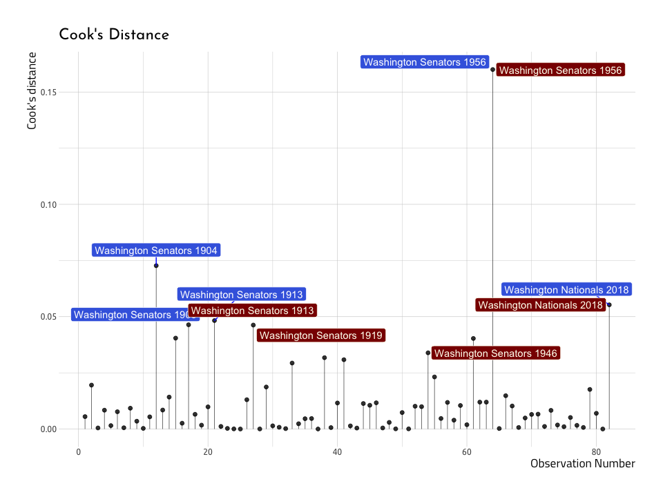
The graph above shows us that three out of the five teams with the highest Cook’s distance are also the highest in terms of the residuals (Washington Senators in 1913 and 1956, and the Washington Nationals in 2018). This re-enforces the notion that not all outliers are equally influential in a model.
Residuals vs. Leverage
As we can see from the Cook’s distance graph above, outliers aren’t all created equal with respect to linear regression models. That means sometimes excluding these outliers won’t make any difference on the model’s performance (i.e. predictive ability). In this final graph, we will graph the Leverage (stored in the .hat column of the broom::augment() data frames) vs the standardized residuals (stored in .std.resid).
ggResidLevPlot <- AugNormyNormx %>%
  ggplot2::ggplot(
    data = .,
    aes(
      x = .hat,
      y = .std.resid
    )
  ) +

  ggplot2::geom_point() +

  ggplot2::stat_smooth(
    method = "loess",
    color = "darkblue",
    na.rm = TRUE
  ) +

  ggrepel::geom_label_repel(
    data = Top5CooksD,
    mapping = aes(
      x = Top5CooksD$.hat,
      y = Top5CooksD$.std.resid,
      label = Top5CooksD$.cooksd
    ),
    label.size = 0.15
  ) +

  ggplot2::geom_point(
    data = Top5CooksD,
    mapping = aes(
      x = Top5CooksD$.hat,
      y = Top5CooksD$.std.resid
    ),
    show.legend = FALSE
  ) +

  ggplot2::labs(
    x = "Leverage",
    y = "Standardized Residuals",
    title = "Residual vs Leverage With Simulated Data"
  ) +

  scale_size_continuous("Cook's Distance", range = c(1, 5)) +

  theme(legend.position = "bottom")

ggResidLevPlot
In linear regression models, the leverage (.hat) measures the predictors distance from the other observations. On this graph, we’re interested in the points that end up in the right corners of the plot (upper or lower). Those areas are the places where observations with a high Cook’s distance end up. We’ve labeled them in this plot so they are easier to spot.
Below is the same plot with the baseball data in AugRundiffWins, with the top five Cook’s distance variables labeled.
ggResidLevRunWinsPlot <- AugRundiffWins %>%
  ggplot2::ggplot(
    data = .,
    aes(
      x = .hat,
      y = .std.resid
    )
  ) +

  ggplot2::geom_point() +

  ggplot2::stat_smooth(
    method = "loess",
    color = "darkblue",
    na.rm = TRUE
  ) +

  ggrepel::geom_label_repel(
    data = Top5CooksDRunWins,
    mapping = aes(
      x = Top5CooksDRunWins$.hat,
      y = Top5CooksDRunWins$.std.resid,
      label = base::paste(
        Top5NonNormResid$name,
        Top5NonNormResid$yearID
      )
    ),
    label.size = 0.15
  ) +

  ggplot2::geom_point(
    data = Top5CooksDRunWins,
    mapping = aes(
      x = Top5CooksDRunWins$.hat,
      y = Top5CooksDRunWins$.std.resid
    ),
    show.legend = FALSE
  ) +

  ggplot2::labs(
    x = "Leverage",
    y = "Standardized Residuals",
    title = "Residual vs Leverage With Baseball Data"
  ) +

  scale_size_continuous("Cook's Distance", range = c(1, 5)) +

  theme(legend.position = "bottom")

ggResidLevRunWinsPlot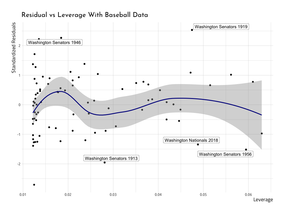
We can see they aren’t too far into the corner, so we won’t need to remove them. But there is a clear, reoccurring theme: the Washington Senators in 1913 and 1956, and the Washington Nationals in 2018 don’t seem to fit very well into the straight line we are trying to predict.
In closing…package it up into a function or package
That was a lot of code! Building these plot once is helpful to understand how they work, but we definitely don’t want to re-create these plots from scratch every time we want to diagnose a linear regression model. So we can either bundle everything up into a function (like this one), or we can use the amazing lindia package.
# devtools::install_github("yeukyul/lindia")
library(lindia)
lindia::gg_diagnose(linmod_y_x)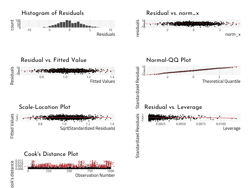
lindia::gg_diagnose(linmod_rundiff_wins)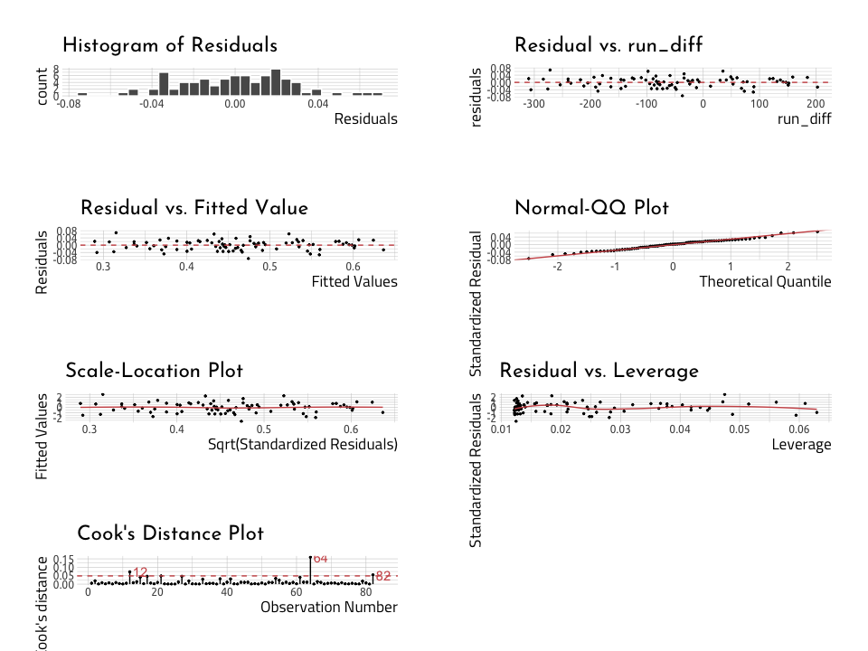
Read more about linear regression here:
- Linear regression tutorial from the UC Business Analytics R Programming Guide
- Data Analysis Using Regression and Multilevel/Hierarchical Models by Andrew Gelman and Jennifer Hill
- Linear Models in R by Julian J.Faraway
- R regression models workshop notes
- Getting started with stringr for textual analysis in R - February 8, 2024
- How to calculate a rolling average in R - June 22, 2020
- Update: How to geocode a CSV of addresses in R - June 13, 2020


