How the WSJ Simulated Liberal Facebook and Conservative Facebook, Side by Side
With recent allegations that Facebook massaged their own algorithms to intentionally suppress conservative news in its user’s feeds, the Wall Street Journal unveiled a visualization they’d been working on for a while: two Facebook feeds that were politically polar opposites. One displayed content that might be shared by users classified as “very liberal,” and another displayed content that might be shared by users classified as “very conservative.” The classifications and inspiration for the project came from a study published in the journal Science by researchers at Facebook.
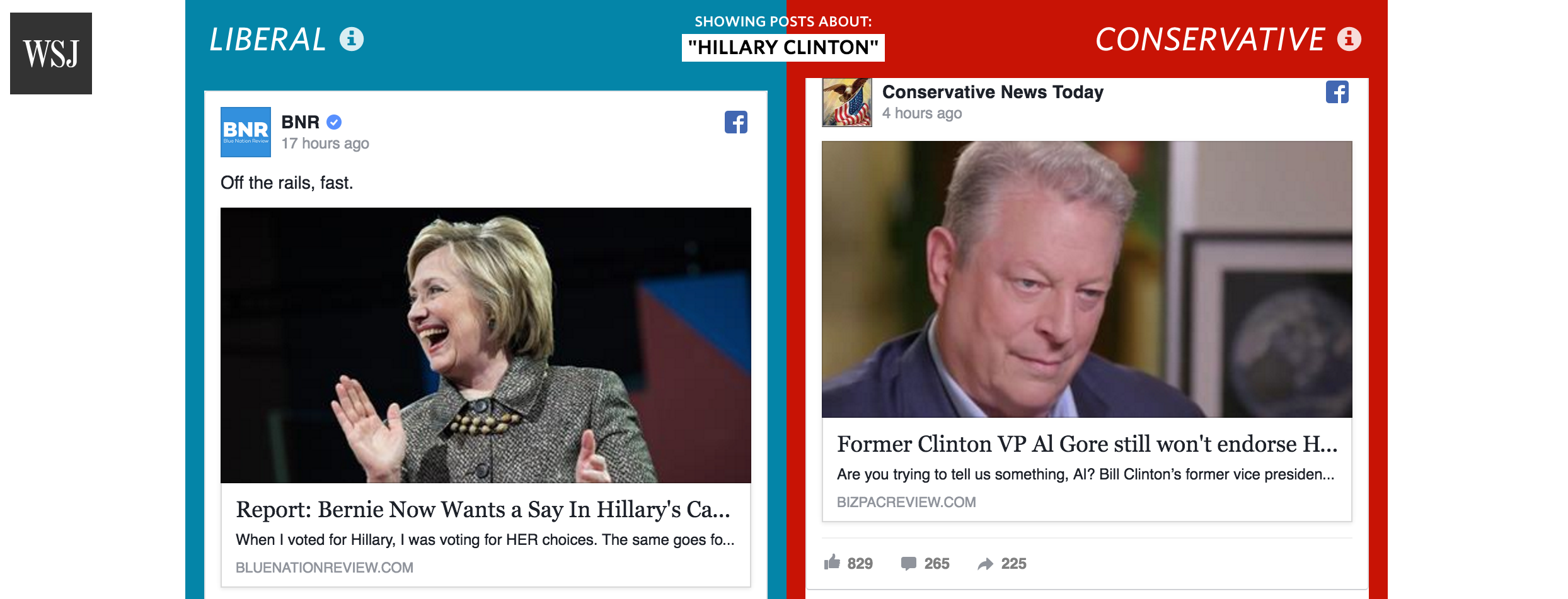
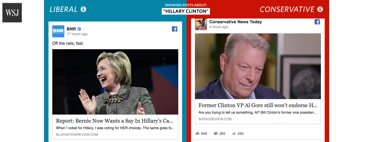
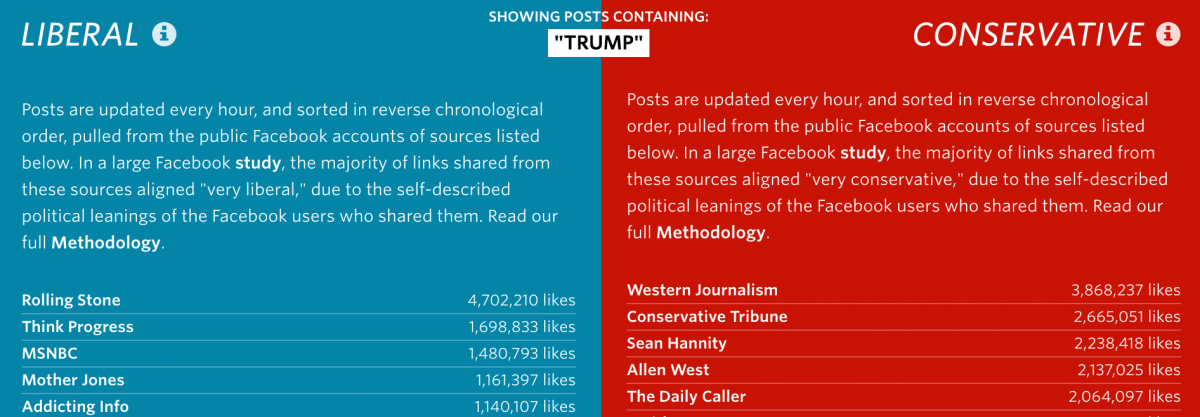
The juxtaposition is staggering to witness. Search for posts related to Hillary Clinton, for example, and you’ll see such opposing stories as “Bernie Now Wants a Say In Hillary’s Cabinet Picks” on the left and “Former Clinton VP Al Gore Still Won’t Endorse Hillary” on the right.
Storybench spoke with Jon Keegan, a visual correspondent for the WSJ who built the visualization “Blue Feed, Red Feed,” which updates hourly.
What was the goal with this project?
Our main goal was to use this data – which gives us a rare glimpse into the Facebook ecosystem – to build a view of the current news cycle that is very hard to create for a typical user. We also took time to make sure that our description of Facebook’s study and data were accurate, by communicating with the authors of the study ahead of publication.
Tell us about the news outlets and how the study authors organized the data
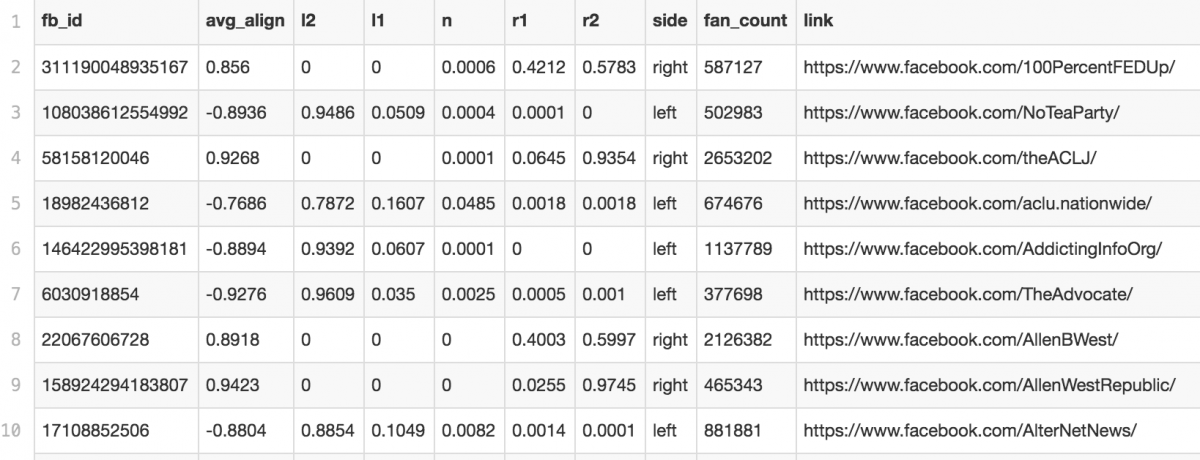
The list of sources came from data released by Facebook that was used in their 2015 study of 10.1 million users, over six months. These users, who had self-identified their political leanings in their profile, were anonymized and Facebook tracked the “hard news” stories that they shared. All of these users were placed into one of five groups based on the description they entered for their political identity: Very Liberal, Liberal, Neutral, Conservative or Very Conservative. Each link that was shared was scored based on the percentage of users from each group that shared that link. Then, the links were group by source, and each source was scored by the percentage of links shared by each group.
How did you slice the study data?
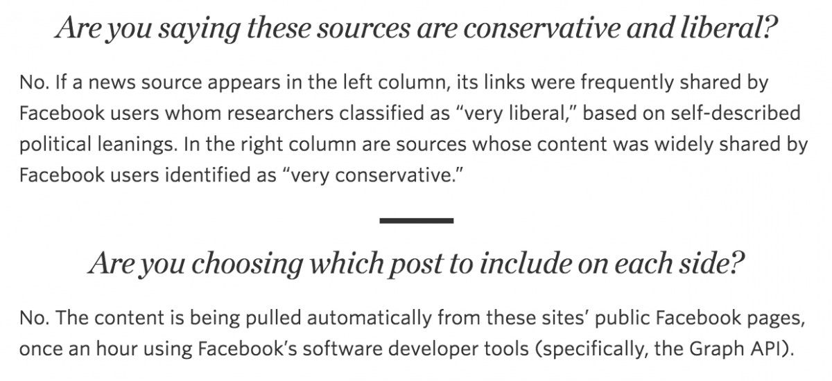
Facebook released a list of the top 500 sources with their replication data at when they published their research in the peer-reviewed journal Science. We included sources from this list where a majority of the links that were shared were from people in the “Very Conservative” and “Very Liberal” groups. We did not include broad sources like YouTube, Twitter or Wikipedia and removed some that were no longer active. And we filtered the list to only include sources with 100,000 followers (likes) or more. We ended up with 130 sources (you can see that list here).
How did you use Facebook’s API to pull the stories?
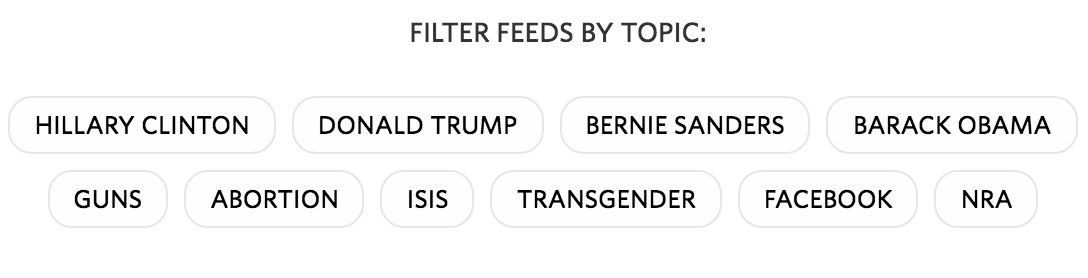
Using Facebook’s Graph API (Ed note: an application programming interface that allows users to query and extract Facebook content), we pull new stories from the public Facebook pages of these sources hourly, and filter them by a simple keyword search topic view.
What was the most challenging thing about adapting a research article from Science into something any reader could understand?
We worked very hard to write a clear, comprehensive Methodology note, as we wanted people to be very clear about what our intent was for this project. People often have an emotional reaction to the content they see on one side, and we wanted to be very transparent about exactly how Facebook scored these sources, and how we were using them.
For more information on Keegan’s “Blue Feed, Red Feed,” read the methodology here.