How the Financial Times built a story on invasive insects that buzzes with interactivity
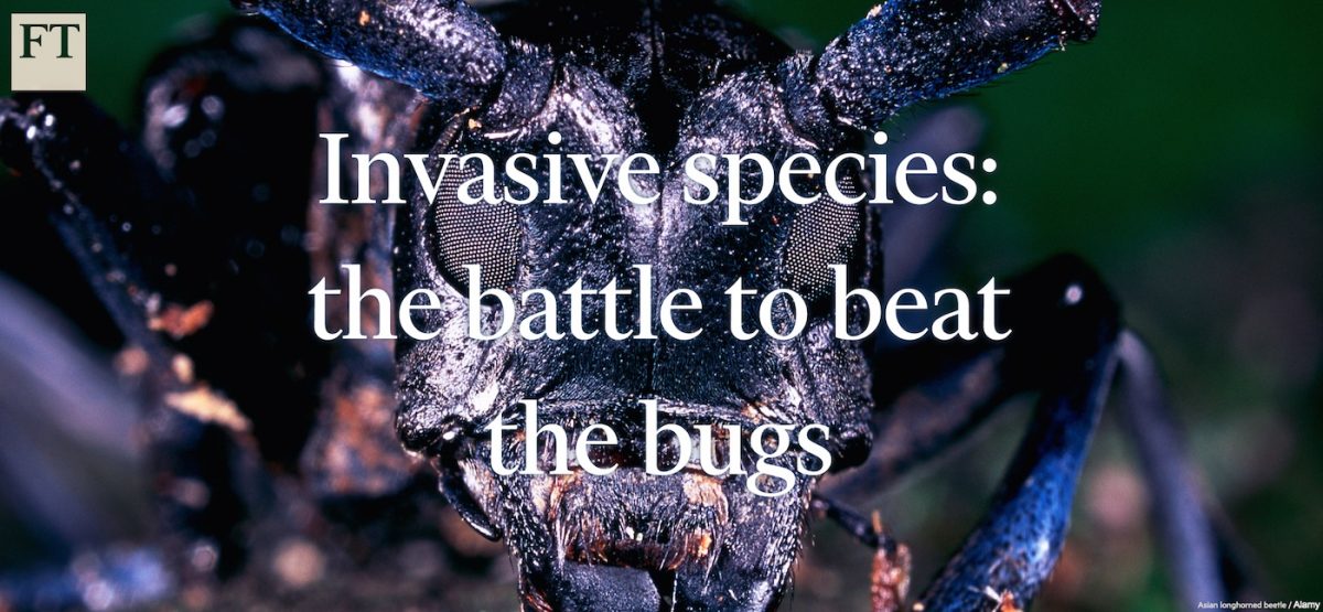
This month, The Financial Times published a story about invasive bugs, from emerald ash borers and Asian longhorned beetles to yellow crazy ants, and the weaponry humans have developed to halt their spread across the globe. The 1,800-word “Invasive species: the battle to beat the bugs,” was published with several maps and bands of creepy crawlies that crawl and fly across the screen. Storybench asked John Burn-Murdoch, a data journalist at The Financial Times, about how he and freelance journalist Nicola Davison put the project together.
What did you and Nicola envision when you pitched this story to your editors?
Nicola came to The Financial Times‘ interactive team with the idea a month before the project was published:
Davison: I’m working on a piece on “biosecurity”, a rather dramatic term applied to invasive species and the threat to biodiversity (in case you were wondering!) After habitat destruction, biosecurity is considered the second biggest threat to biodiversity worldwide.
There’s reams of data on this subject that I thought could make an interesting interactive graphic – and a fun one, too, since this is about bugs (box hedge caterpillar, emerald ash borer, Asian longhorned beetle, etc)
Both the enthusiasm and color with which Nicola described it, and the subject matter as a whole — quite far removed from any story I had previously worked on at the FT — immediately got me thinking about new and creative treatments we could give to a piece like this.
What other projects, in terms of coding and design, inspired you?
The first thing that came to mind was Bryan James’ beautiful project Species in Pieces. I had already read the ‘making-of’ post, and both the core concept of bringing animals to life in the page and the technical challenge of making intelligent use of CSS to minimize the amount of Javascript in the page were steps I was keen to work into our piece. Another source of inspiration was the Guardian U.S. Interactive Team’s work moving animated presidential candidates around the screen to fill in their results maps, which was published on Storybench.
That being said, I didn’t want to simply replicate either approach, so I settled on the idea of building a visual metaphor around the theme of invasive species, which would see the insects invade the screen but also give users the opportunity to “swat them away”. Separately, I was in the final stages of another project at the time which involved creating maps from gridded climate data. Knowing that showing the migrations of invasive species over space and time would be a core part of the storytelling task, I was keen to make use of what I had learned on the El Niño piece, and track down information for each of the seven species that would allow the creation of unique and detailed data visualizations in addition to the more rhetorical animations.
What was the biggest challenge in coordinating and developing this story and its graphics?
The biggest challenge overall was corralling and transforming the various datasets required for the maps. Nicola started things off by pulling together a list of national and international agencies across the five countries and regions we were looking at. Academic papers are another great resource for projects like this, so I also headed to Google Scholar with a list of the species’ Latin names to see what work we could draw upon. In the end, we spoke to more than a dozen academics and another ten or so organizations to track down the data we needed.
The next challenge was getting everything into the right format:
- The U.S. data on the Emerald ash borer and Asian longhorned beetle were stored in raster images, which I ran through the raster package in R to transform into tables of latitude and longitude, and then aggregated in order to reduce the geographical resolution. This allowed me to export flat CSV files small enough for me to use with d3 to create SVG images for use both online and in print.
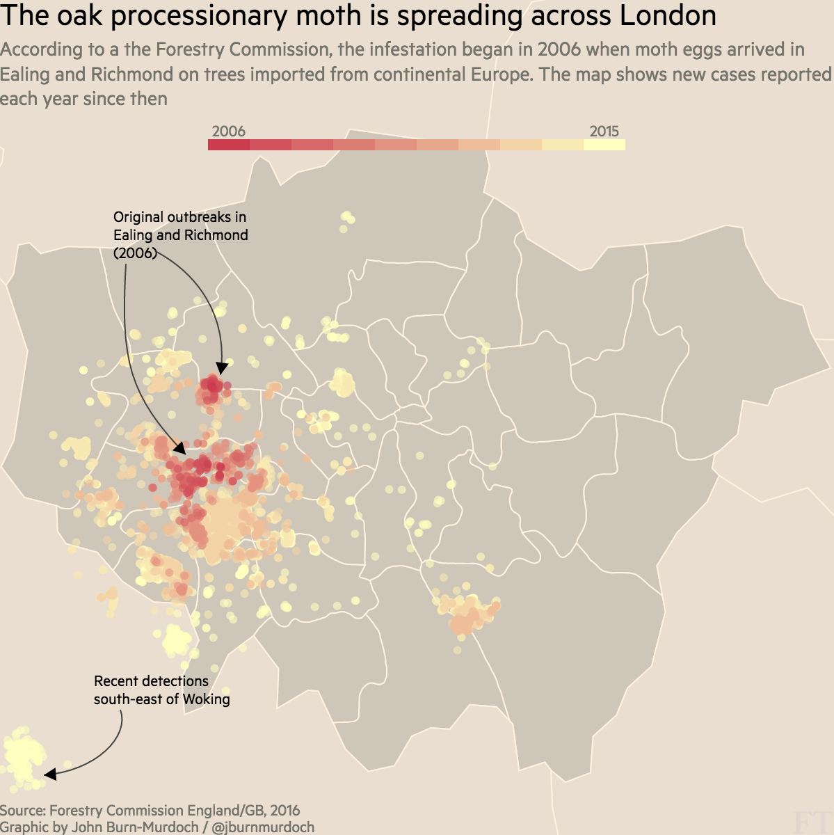
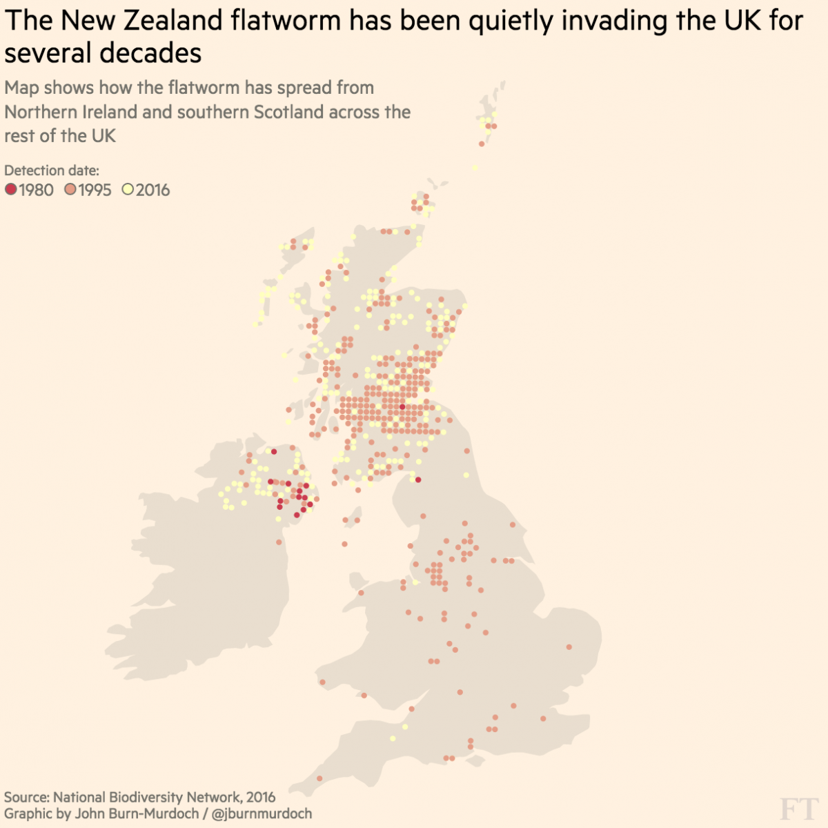
- Data on the New Zealand flatworm and Harlequin ladybird came in the British Ordnance Survey grid reference format, namely as 10 km by 10 km squares. This was a format I had never previously worked with, but luckily I found another friendly R package for converting these into lat/lons. This task was further complicated when the data extended into Ireland, which has its own entirely distinct grid system, so I wrote a script that would take a given Irish grid reference and scrape the relevant page from a very convenient independent website, providing lat/lons in those cases.
- Information on the spread of the Asian hornet came in the form of European NUTS regions across six countries, but some were at different levels of geography to others, so both the numeric data and the underlying geographical polygons had to be created as bespoke objects.
- The Oak processionary moth data came in Eastings and Northings. A friendly R document once again came to my rescue.
- Mercifully, the Australian academics who gave me the data on ‘tramp ants’ provided it in good old lat/lon format from the outset, so this one was a simpler task.
Most weeks I work on projects involving millions of rows of data, but it’s fair to say this one gave me more headaches than any before it.
This invasive insects story lives on a standalone page. Can you tell us a little about the philosophy behind this decision?
Like all digital news organizations, the different platforms we publish on each come with slightly different technical constraints. In our case, the requirement to have insects flying around the page necessitated going beyond our standard article format.
Early on in the planning phase of the project we decided against publishing two pieces — a standard story working within the constraints of our CMS and a standalone, visually-rich piece featuring the maps and animated insects — since this would have divided our audience, and past experiences tells us that standalone visuals get far less traffic than when they’re bundled with what you might call the core editorial piece.
The way we ended up delivering this piece meant that visitors using our web app would see a static page containing all of the text and maps, but anyone navigating to the same URL outside of the app would be silently redirected to the full interactive page complete with animations.
What did you use to build the maps and can you tell us something about FT’s branding, colors and style choices?
After dealing with the intricacies of geographical transformations described earlier, the maps were relatively straightforward d3 graphics. In each case I used QGIS to modify background shapefiles from Natural Earth where any customization was required, ran them through Mapshaper to simplify boundaries and export topojson, and then drew them with d3, overlaying the species points or polygons. The annotations you see on some of the maps were done using Adam Pearce’s swoopy-drag plugin.
The need to produce formats that could be used in print as well as online meant the output from d3 had to be SVG images even though leveraging HTML5 canvas would have been a more suitable fit for the very detailed U.S. maps had they been web-only.
The colors are based on the “YlOrRd” Color Brewer palette, but specially tweaked for the FT’s famous pink background by Caroline Nevitt, one of our senior designers and our color-genius-in-residence.
Could you tell us how you coded the insects crawling and flying across the screen?
CSS animations ftw! The flapping of the hornets’ wings, the bugs’ movement from side-to-side of the screen, the path they follow vertically, and getting them to always face in the direction of travel: all CSS. Javascript only comes in when the user swats the insects away or generates new ones.
I began with the idea of using a single sprite image as the background image on a DIV, and then shifting it quickly back and forth using the background-position property to create the impression of movement.
To test the concept, I sat down with some photos of emerald ash borers and a Youtube video of a beetle in flight, and sketched several frames of a bug going from a resting position to full flight:

I then built these into a GIF:
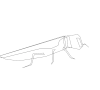
Thankfully this approach was well received, so we commissioned Daniel Long to create more detailed and colored illustrations of all seven insects. I then quickly found that all of the insects’ movements could be written as CSS animations, and before long I had all the fundamentals working.
I made some small adjustments so that the flatworms and caterpillars moved more slowly than the beetles and hornets, but the core principles remained the same.
Finally came the Javascript: the core function generated either 1, 3, 5 or 7 copies of a randomly chosen insect, and staggered the point at which their animations began in order to arrange them in a ‘flying-V’ formation. A setInterval() loop would then remove these insects and generate a new swarm every 60 seconds.
Another function detected when a user either hovered over or tapped an insect, determined which direction the insect was moving in, and sent it shooting off in the same direction.
Then, anticipating that most people would at some point want to get rid of the invading insects and read the piece, I added the ‘Shoo!’ button which would remove any and all bugs from the screen and stop any subsequent swarms from being automatically generated.
One thing I still wasn’t entirely happy with was that CSS animations can be thrown out of sync by the browser when the tab in which they’re running becomes inactive, i.e when the user leaves the tab open but begins reading another one. To deal with this, I added one final line that used the ‘visibilitychange‘ event to check if the tab became ‘visible’ after a period of being ‘hidden’, and in such cases removed the current swarm of insects and generated a new one, resetting the animations in the process.
The Financial Times website works with something called Origami. What is it and how has it made your life easier?
In summary, it allows those of us on the interactive team to work with core components, styles and layouts from the FT’s continually developing digital identity without having to start from scratch each time. In this project I used it for things like the page footer, social sharing buttons/dialogues and stylings for the button used to remove the insects.
Finally, what advice do you have for young coder-journalists or designer-coders that want to do this kind of work?
I think the key requirements for a piece like this can be broken down into three categories:
- Read and play with as much stuff as you can. Inspiration is everywhere, and had I not seen the Guardian’s animations or Species in Pieces, I would probably never have come up with the idea for this piece.
- Find good ways to test your ideas. My quick attempt at animating a beetle and some rough maps I produced in R before moving to d3 allowed to me see whether these visual treatments were worth pursuing.
- When you’re stuck, just ask Google. Before I began this project I didn’t know how to work with raster data or OS grid references, but now I do. When you hit a wall, it can be super easy to give up, but 99.99% of the time, somebody has had — and solved — the same problem.