How to build a chart with Medium’s Charted.co
I started playing around with Charted.co, the online charting application that Medium recently released. It’s pretty nice. Here’s their tour.
Gut reactions
- Cool branding, but you can’t store data at Charted.co and therefore you can not embed a chart you’ve made with it unless you install it on your own server. Hack update: We embedded the above in a classic iframe. The problem here is: it’s still editable!
- Screenshots of your charts may be a better option.
- However, you have no control over labelling axes.
I decided to chart some global Starbucks locations data I had from a previous How To on mapping with Google My Maps.
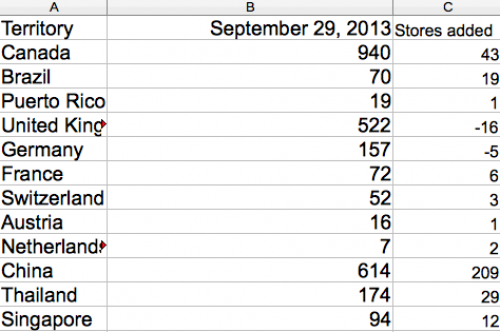
I saved my spreadsheet with a .csv extension (comma separated values) and uploaded it to our server via FTP using FileZilla. Feel free to download my starbucks_locations.csv.
I then told Charted.co where to find my data.
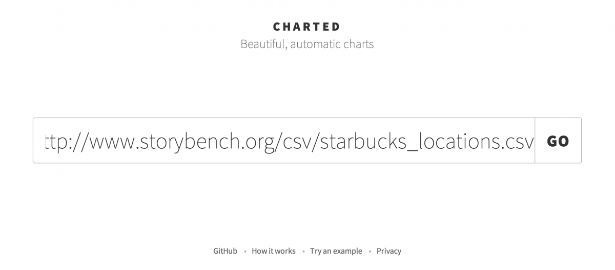
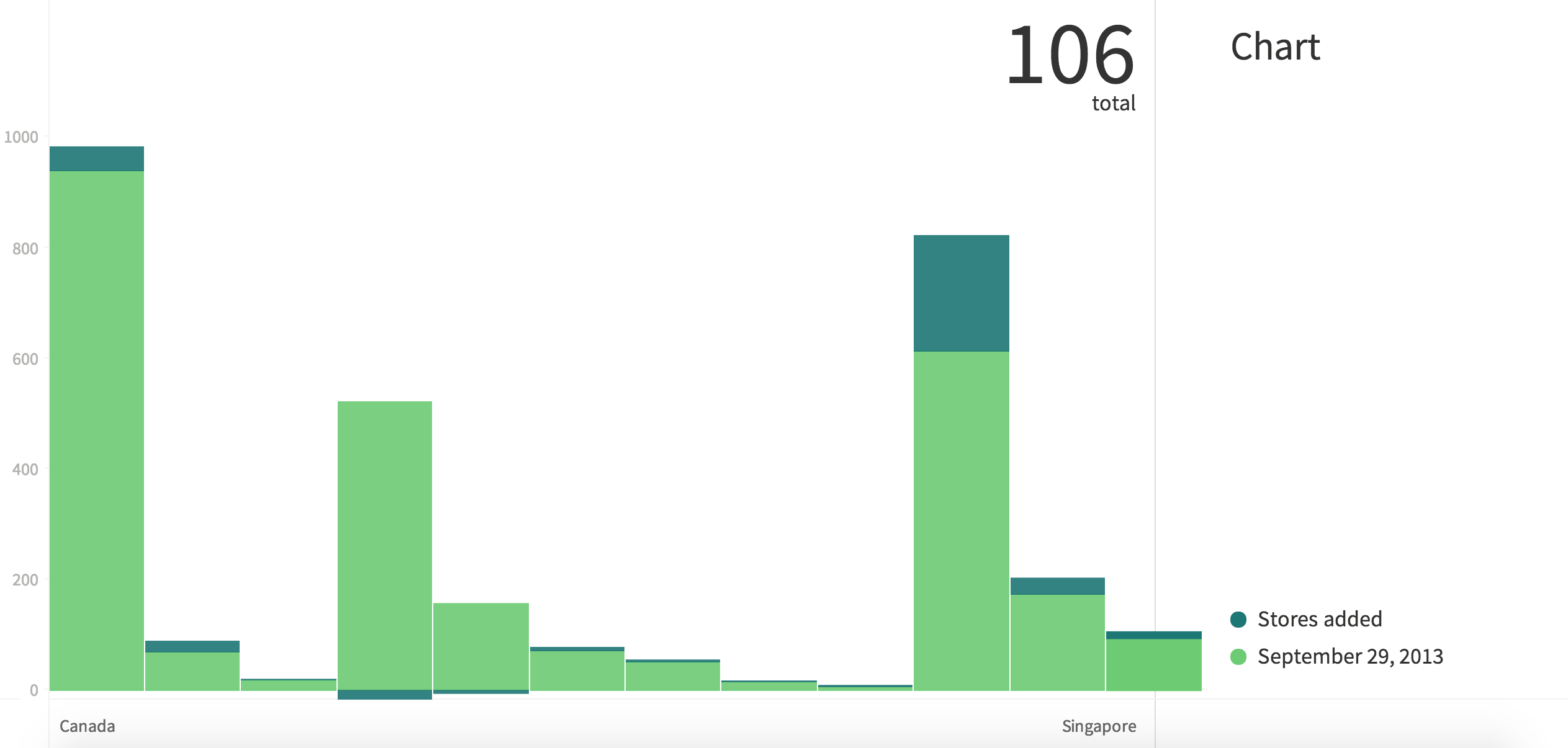
This is what I got.
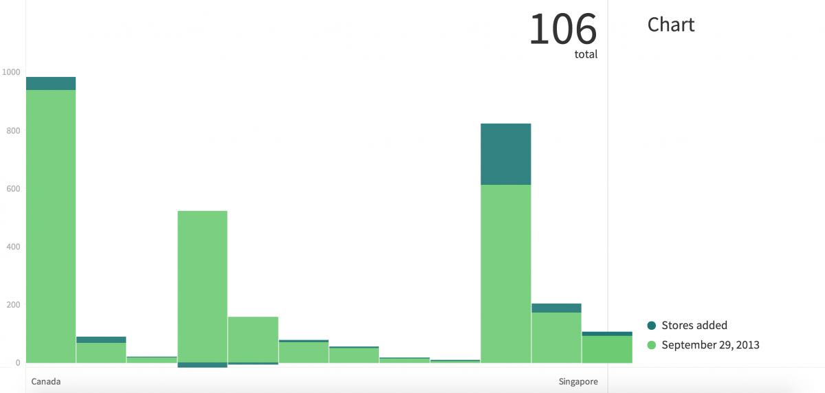
Next, I started formatting the chart anywhere Charted.co would let me.
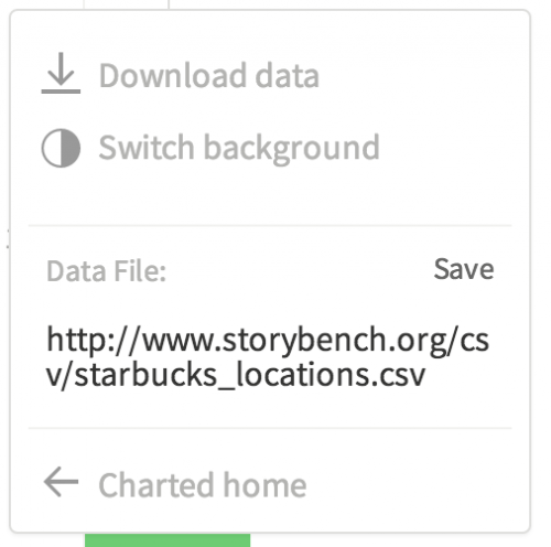
Finally, I was left with a couple options. I took a screenshot of each with my mouse hovered over the growth in Starbucks locations in China.
Here’s one:
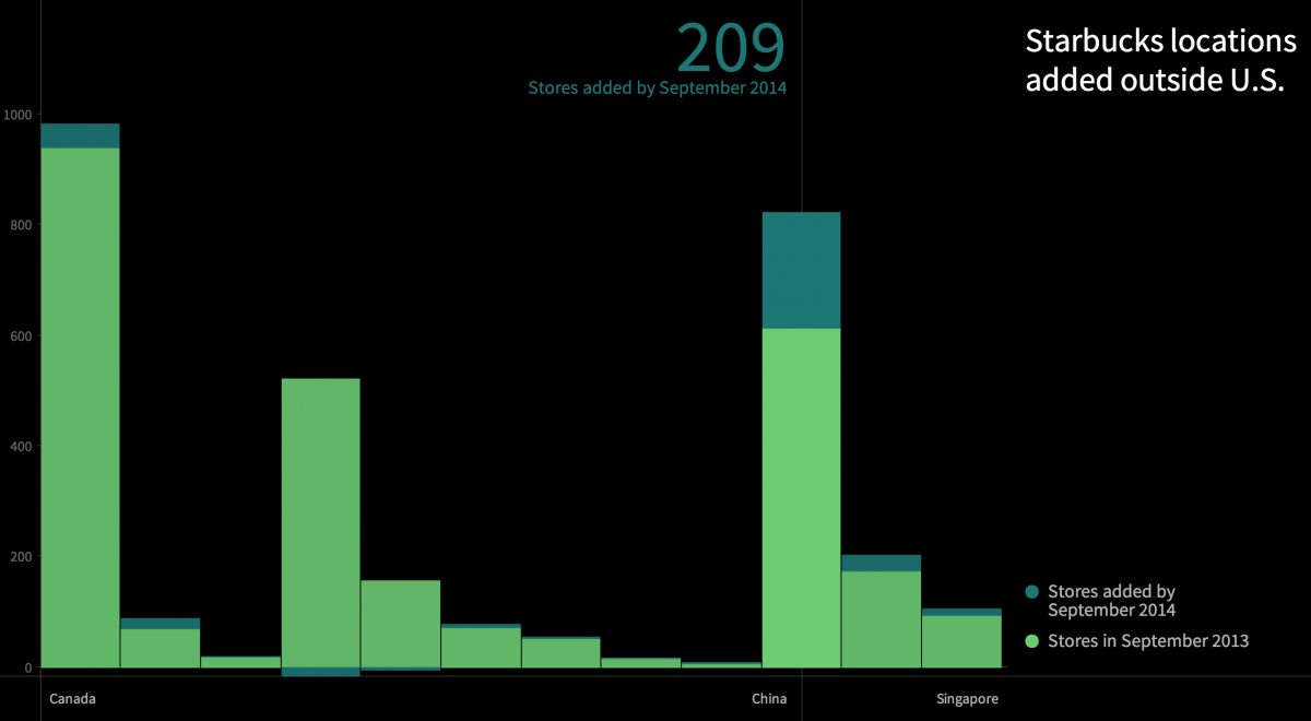
And here’s the other:
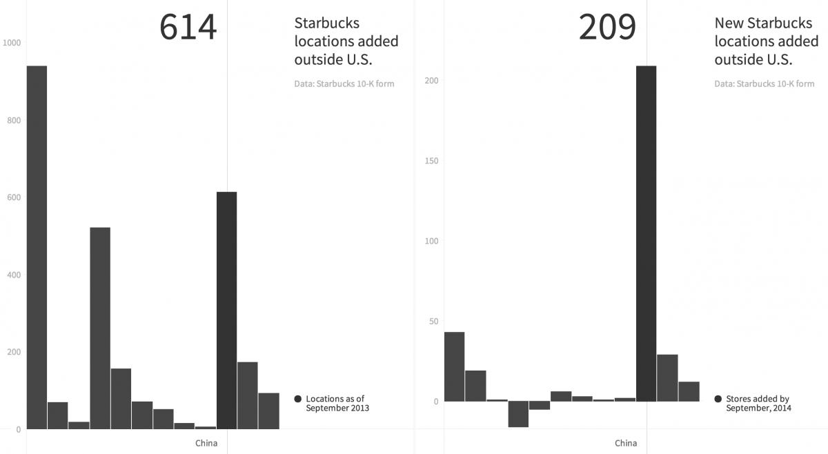
Too bad I can’t embed that.
Charted.co is all open-sourced on Github so I could conceivably run this whole thing on my own server. But what we’re missing here is the ability to embed and interact with the chart.



Love it! What a useful overview of a new tool. How does it compare to Quartz’s Chartbuilder? I’ve used that in the past for small data sets, but Charted seems like it could handle more cells with (much) less retyping.
No interactivity with Chartbuilder, and you can only download as a table, a PNG or SVG. With the lattermost, you could animate using D3js. But that’s more work…