Mapping toxic waste release sites using the Python library GeoPandas
Plotting positional information on maps can reveal geographic trends and makes for an effective visualization to accompany an article. In this tutorial, we’ll use Jupyter Notebook and a Python library called GeoPandas to map where toxic waste was released in Massachusetts in 2019. Parts of this method are adapted from a post that Ryan Stewart wrote for the blog “Towards Data Science,” so kudos to Ryan for the great introduction to mapping!
Downloading the data and getting started
The Environmental Protection Agency has kept a Toxics Release Inventory (TRI) since 1987, and we’ll dig into these data to make our map.
First, we’ll download the 2019 TRI data here, and a shapefile that we can use to draw Massachusetts, with towns outlined, here. The shapefile is called TOWNSSURVEY_ARC_GENCOAST.shp, and it’s in a folder called townssurvey_shp. If you haven’t used Python before, we suggest installing the Anaconda distribution.
Importing libraries and reading files
First, we need to import all the libraries we’ll be using, so we’ll set up our first block in Jupyter Notebook like so.
import pandas as pd
import matplotlib.pyplot as plt
import descartes
import geopandas as gpd
from shapely.geometry import Point, Polygon
import pyproj
import numpy as np
%matplotlib inline
Next, we’ll read the CSV containing data from the TRI program into a dataframe called df and read the shape file that we’ll use to draw Massachusetts into a GeoDataFrame called mass.
df = pd.read_csv("path/to/chemical_release_2019.csv")
mass = gpd.read_file("/path/to/TOWNSSURVEY_ARC_GENCOAST.shp"
Trimming waste data and converting between coordinate systems
The TRI dataframe is huge and unwieldy, so we’ll trim it down and give the columns shorter names.
## Select Massachusetts data
df_mass = df[df['8. ST'] == "MA"]
## Select the relevant columns
df_mass_small = df_mass[['4. FACILITY NAME', '5. STREET ADDRESS', '6. CITY', '12.
LATITUDE', '13. LONGITUDE', '15. PARENT CO NAME', '34. CHEMICAL', '44. UNIT OF
MEASURE', '59. ON-SITE RELEASE TOTAL', '101. TOTAL RELEASES']]
## Rename the columns
df_mass_small.columns = ["facility", "street", "city", "latitude", "longitude", "parent", "chemical",
"unit", "onsite_total", "total"]
Use the head command to see the first five rows of the dataframe and check that everything looks okay.
df_mass.head()
Plot latitude and longitude coordinates on a map
Now that we have a list of latitude and longitude coordinates and a shape file showing Massachusetts, we’ll put the two together.
The shape file of Massachusetts is in the Lambert Conformal Conic projection, while the waste release dataframe is in latitude and longitude, so we’ll start by standardizing the coordinate system. We’ll convert the waste release dataframe to the Lambert Conformal Conic projection rather than the inverse because maps look squished when they’re drawn on flat surfaces using latitude and longitude.
Coordinate systems have ESPG numbers associated with them, so called because they’re assigned by the European Petroleum Survey Group.
## Convert df_mass_small to a geopandas dataframe called gdf
gdf = gpd.GeoDataFrame(df_mass_small, geometry=gpd.points_from_xy(df_mass_small.longitude, df_mass_small.latitude))

## Define the coordinate system that gdf starts in
gdf.crs = {"init": "EPSG:4326"}

## Convert gdf to the Lambert Conformal Conic projection by referencing its code: 26986
gdf_lam = gdf.to_crs({'init': "EPSG:26986"})
Plotting the map and the points together
Now all we need to do is put the points on the map!
## Define the plot area
fig, ax = plt.subplots(figsize = (15, 15))
## Draw the map
mass.plot(ax = ax)
## Add points where waste was released
gdf_lam.plot(ax = ax, markersize = 20, color = "red")
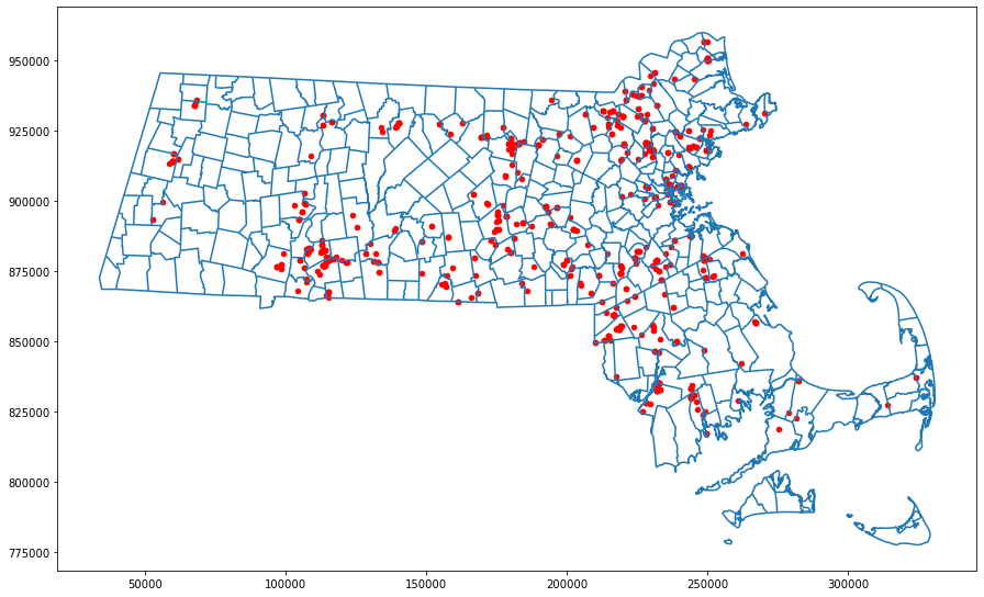
And now we have a map with waste release sites marked on it!
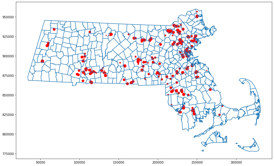
Changing the point size
We can also change the sizes of the points on the map to reflect the amount of waste that was released in each location. The TRI lists the amount of waste released on-site, and the total amount released, but it doesn’t say anything about the locations of off-site waste releases. We’ll adjust the point size based on the amount of waste released on-site because we don’t have positional information for the rest of it.
## make a numpy array containing the onsite_total column from gdf_lam
size = gdf_lam['onsite_total'].to_numpy()

##play around with scale factors until the dots are reasonably sized
##here, we’re taking the log2, then multiplying by 7
s = np.log2(size)*7

## define the plot size
fig, ax = plt.subplots(figsize = (15, 15))
## draw the map
mass.plot(ax = ax)
## plot waste release sites, feeding the vector called s into the markersize parameter
gdf_lam.plot(ax = ax, markersize = s, color = "red")
Many data sets include positional information, whether it’s for bikeshare stations, post offices, or chemical weapon releases in Syria. GeoPandas takes a bit of work to get the hang of, but once you’re familiar with its conventions, it becomes a versatile tool for visualizing this information. Go forth and map things!