Crowdsourcing maps of ISIS and other Middle East conflicts
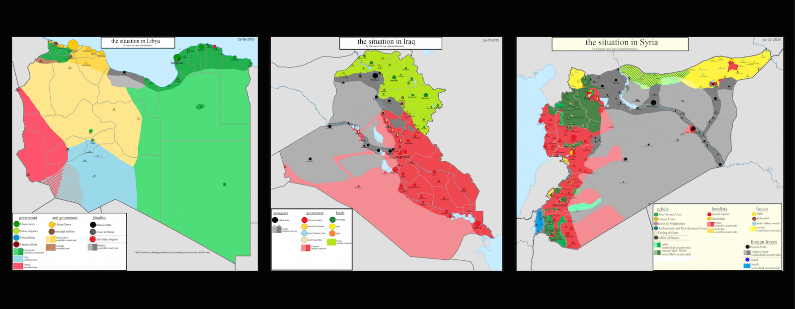
Thomas van Linge recently tweeted a photo of a munitions truck being blown up in Syria, presumably by the First Coastal Division, a faction of rebels affiliated with the Free Syrian Army. In his tweet, which was sent to his more than 13,000 followers, van Linge linked to a YouTube video of the explosion, and included its location: “near Joureen, Ghab plain.” He then cross-referenced the location with a home-made map to make sure he had the most up-to-date movements of the Syrian rebels.
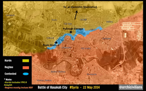
No, Thomas van Linge does not work for the U.S. State Department and he’s not a journalist. He’s a 19-year-old high school student in Amsterdam and he’s joining a growing movement of citizen cartographers mapping violence in the Middle East. It’s an endeavor few media outlets have replicated as consistently as van Linge and his cohorts, sites like archicivilians, and grassroots intelligence organizations such as the Institute for United Conflict Analysts.
Beyond the audience of his significant Twitter following, van Linge’s maps are frequently shared on Reddit and by analysts researching conflict in the Middle East. Pieter Van Ostaeyen, a Belgian IT engineer who uses his masters degrees in medieval history and Arabic and Islamic Studies to research and write about the Middle East, has featured Van Linge’s maps on his blog to illustrate the dynamics of freedom fighters in Syria, Iraq and other Middle Eastern countries currently experiencing civil war. Van Ostaeyen says his posts featuring Thomas’s maps are some of the most popular. “Thomas makes the maps, I provide the other content,” says Van Ostaeyen, whose most recent post looks at the Turkish border with Syria.

Filling in a “huge gap”
Eliot Higgins, founder of Bellingcat, a U.K. website focused on investigating and verifying underreported issues worldwide, spoke of the role of Van Ostaeyen’s blogging and van Linge’s mapping work. “They do a good job filling in the pretty huge gaps left in the reporting of the conflicts,” says Higgins. “Something like mapping the conflict in Syria is hugely useful simply because there’s no real mainstream sources that produce those regular updates for public consumption.” Keep reading to understand why it’s been tough for news outlets to keep up.
Government agencies and intelligence organizations also follow Van Ostaeyen’s analysis and van Linge’s maps–their Twitter followers include dozens of Middle East analysts and think tanks from around the world.
Van Ostaeyen and van Linge’s work appears to reflect the emergence of a new, grassroots intelligence community. With so much information on Middle East conflict available online, continuous tracking and visualization is increasingly falling on citizens who have become just as connected—if not more—than intelligence organizations like the Brookings Institution, Quilliam and the International Centre for the Study of Radicalisation and Political Violence (ICSR).
The question is, how much verification is actually being done by citizen cartographers? This is where organizations like Storyful have stepped in to add value–and verification–to unconfirmed reports. Storyful then licenses the content it has verified to news organizations. Storyful was bought by News Corp in 2013.
Where are news organizations in mapping conflict?
The continuous surveillance and visualization of geopolitics and civil war dynamics has increasingly moved away from news organizations and into the hands of people like Thomas van Linge, in part because media needs to choose its own battles, and can’t afford to have staff focused singularly on updating maps in real time.
Furthermore, verifying every single report would take too much time, says Sergio Peçanha, a graphics editor with The New York Times who works on interactive maps of the conflicts in the Middle East.
“We would love to be able to have constant coverage of all these conflicts, but we just don’t have enough people to research, report and create maps for all of them,” says Peçanha. “We can’t just keep updating maps, showing who gained which territory, day by day.”
“I think a better use of our time and skills is making pieces that put the conflicts in context and really help people get why events are unfolding the way they are,” he says.