How to create a simple line chart in R
R can be used to explore, clean, analyze and visualize data. The following tutorial will get you started using R’s ggplot2 package to make a simple line chart from a csv of data.
New to R? Storybench has published an introductory tutorial on R and R Studio as well as a tutorial in R for geocoding addresses in a csv.
Install the ggplot2 package
We’ll need ggplot2, a graphing package, to plot our data. To install it in R Studio, open a new R script in “File” > “New File” > “R Script.” Type install.packages(“ggplot2”) on line 1 of the top-left pane. Click “Run” or hit Shift-Command-Return. You should see the package downloading and installing in the console pane.
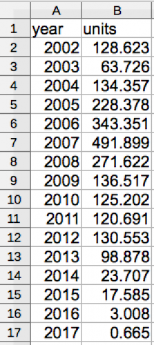
Inspect your csv
We’ll be looking at collapsing car sales in Venezuela, replicating a line chart that Quartz published last week. Quartz open-sources the data behind its graphics on The Atlas. More Storybench coverage of that here.
Open the csv and change the column names to year and units.
Load the csv in R
The following line reads the csv and stores it as the variable venezuela.data.
venezuela.data <- read.csv(file="venezuela.csv")
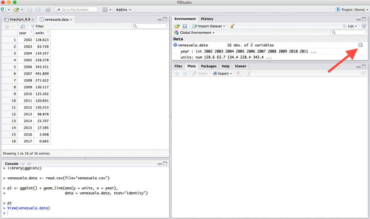
Preview the csv
Use the view function, see below, to open a preview of your data. You can also click the chart icon on the top-right environment pane. That will open up the csv's data in a separate tab on the top-left pane.
view(venezuela.data)
Plot the data
To create a line chart, we'll use ggplot's geom_line and aes functions. Pass the name of your y axis and x axis inside the aes function, which stands for aesthetic mappings. Make sure these are the same as the names of your data columns. Next, tell it where to find the data by using the venezuela.data variable.
Finally, write another p1 to visualize the plot.
p1 <- ggplot() + geom_line(aes(y = units, x = year),
                 data = venezuela.data)
p1
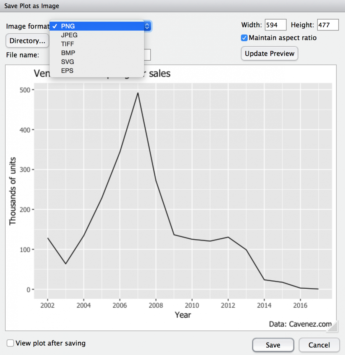
Add title, caption, and new axis names
To add a title, caption and change the name of the axes, use the labs function and the self-explanatory names title, x, y, and caption.
p1 + labs(title = "Venezuela's collapsing car sales", x = "Year", y = "Thousands of units", caption = "Data: Cavenez.com")
Add more ticks to your axis
Add the following line to add a new label for every 2 years:
scale_x_continuous(breaks=seq(2002,2016,2))
Change the font
Using the theme function to change the font family of the text.
theme(text=element_text(family="Tahoma"))
Run the script
Click "Run" or hit Command-Shift-Return to run the script and see the plot in the bottom-right "plots" pane.

Download the line chart using the "Export" menu in the bottom-right "plots" pane. You can select one of several file extensions and resize to your heart's content.
Final script:
Anything to add? Comment below!


Hello Bajak,
Thank you for sharing this tutorial.
It is so useful.